
A bit less than a year ago we launched the VIP zone on our Playground, with the promise that we would keep adding fancy visualizations to it as a special treat for our loyal subscribers. We already delivered on this promise with the personalised Listening Trends and Music Universe visualisations, and today we’re delivering some more.
This time around we got inspired by the WOMRAD 2010 paper Rocking around the clock eight days a week: An exploration of temporal patterns of music listening. By applying some nifty circular statistics formulas, we managed to create an interesting new visualisation that shows at what times of the day a given Last.fm subscriber has been listening to music over a certain time period. Here’s an example:
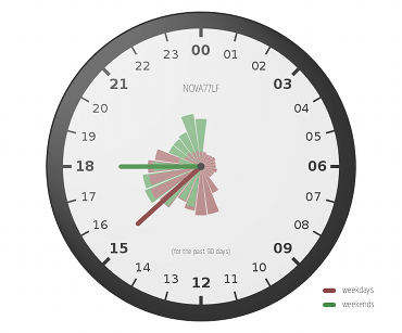
In this case we’re looking at Norman‘s listening behaviour for the past 90 days. Red and green represent weekdays and weekends, respectively, and the longer the hand the more the listening was focused around the time to which it points. Generally speaking, Norman seems to listen to music at later times of the day in weekends than on weekdays, and his listening seems to be less restricted to certain hours in the weekend. It’s also quite clear that he tends to listen to music from 10AM to 7PM on weekdays, which isn’t that much of a surprise since those are our working hours here at Last.fm. He accidentally left his radio playing overnight a few times though, as indicated by the smaller red bars from 8PM until 9AM.
Our beloved LAST.HQ‘s listening clock for the same time period is a more extreme example:
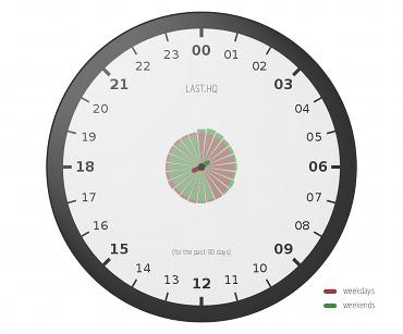
Since we use this account for the reception radio in our offices — which plays pretty much 24/7 — the listening is spread out across all times of the day, leading to two hands that are extremely tiny and cute.
We very much hope you’ll enjoy playing around with this new visualisation, and that some of you will point to particularly interesting listening clocks or discuss potential improvements in our Playground forums. Meanwhile, we’ll start working on the next one!
Comments
Leonid Bugaev
6 September, 13:34
Cool!)
PS. Please set normal favicon for playground site :)
michael
6 September, 13:35
If you set the days to 365 the user is set to the user name justinfasse.
Klaas Bosteels
6 September, 13:47
@michael: Sorry about that, there was a small caching glitch – should be fixed now.
contect haviour,
6 September, 14:24
No worries! I was just wondering. Anyway, cool visualization!
Thomas R. Koll
6 September, 15:54
Yay, I pretty much rock around the clock :)
Except for 4am to 7am. It’s an awesome idea, thanks guys.
http://skitch.com/tomk32/dikwc/listening-clock-last.fms-playground
pichenettes
6 September, 16:48
Hooray to our new pycairo overlord!
Andy Cotgreave
7 September, 13:43
I love the fact that last.fm is doing such groovy things with the data: you have so much data, it must be a joy to explore it. Knowing when I listen to most music is a really interesting thing to investigate so I applaud this.
However, this viz has several main problems, mainly as a result of the desire to make a funky design more important than the need to see the story in the data:
1. A 24 hour radial scale used within a 12-hr clockface metaphor. This means that I can’t use my knowledge of how clocks works to quickly relate the position on the dial to the relevant hour of the day.
2.Confusing overlays – the bigger bar is always under the smaller bar. This avoids occlusion but is visually confusing
3. No y-axis – ie, what does the length of the bar/spoke mean?
This info would be much easier to interpret in a simple bar chart. Yes, that may not be so “bling”, but surely your aim is to make the story of the data apparent?
Klaas Bosteels
7 September, 17:37
@Andy: I guess we do tend to make our visualisations a bit more funky than strictly necessary, but I don’t think it ever really got in the way of communicating the story.
The goal here is to generate a nice-looking picture that gives people an idea of when they listened to music, not creating a very efficient illustration for a scientific paper. It’s a bit of a balancing act of course, but so far we haven’t had much feedback telling us that people weren’t able to understand our visualisations or felt they are misleading, whereas we’ve seen lots of indications of people liking their funkiness.
You’re more than welcome to prove me wrong by using our API to create some visualisations that people might like more though.. :)
Michael
15 September, 23:08
I’ve really enjoyed visiting the blog every so often to see what’s new as I’m pretty much obsessed with Last.fm. I think it’d be really great if you made the blog far more visible to others who might not scroll allllll the way to the bottom – mic180
Markus
22 September, 00:08
Very nicely designed statistics.
But not only interesting for the listeners, of course, for them as entrepreneurs.
So you can then plan a targeted advertising;)
Regards from Germany
Comments are closed for this entry.