Anatomy of the UK Charts. Part 4 - Survival of the Flattest

Friday, 15 July 2011
by matthias
filed under Trends and Data
Comments: 15

This week Matthias has let loose his signal processing tools to track the history of loudness in the UK singles charts. He shows in detail how pop music has become louder and flatter, and explains why loud doesn't have to be noisy.

There's no doubt that music keeps changing. The music psychologist Carol Krumhansl recently conducted an experiment in which she played 400 millisecond snippets of pop music to individual participants. Surprisingly, from this tiny amount of information her participants could often predict the decade the music had been created in - even if they did not recognise the track itself.

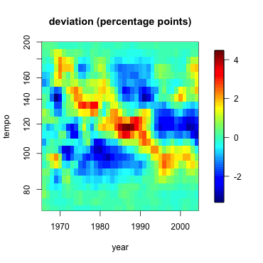
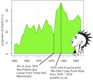
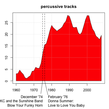
We assume that changes in musical style are motivated by fashion or social factors, and not due to developments in the recording or post-production process. For example, the rise of punk music (as traced in my second blog post) appears to have been triggered mostly by social factors. Old-school disco bloomed and faded quickly, like a fashionable jeans cut. But when it comes to the 80s things are less clear: we suspect that the introduction of new technology, specifically drum machines, substantially changed dance music styles, and find some evidence for it (third blog post).

So, are music fashions caused by people wanting to listen to some music more than to other? - They like it, buy it, and it gets into the charts? Well, probably, but only until record producers found out that they could make people listen to their music, simply by making it louder, so it stands out from the crowd. And that's exactly what they did, spurred by the advent of the CD in the 1980s. Just as trees evolve to grow higher so they can outgrow other trees in the race for sunlight, music grew louder and louder in the race for attention. At least that's what people have found examining many examples of popular music. There's an excellent Wikipedia article on this phenomenon dubbed the Loudness War. Is the phenomenon really as wide-spread as we think it is? Can we really find increased loudness in the charts, and can we track down loudness's evil brother dynamic range compression?

The Higher Level

An audio engineer's measure of loudness is decibels relative to full scale (dBFS), and it's really just a measure of audio level. Essentially, dBFS is the logarithm of the energy in an audio waveform, minus the value of the loudest sine wave that you can fit on the recording medium (the “full scale”). So a full scale sine wave will have 0 dBFS, which is very loud, and most other sounds will have negative values.

If a music track is well-engineered, then the loudest samples of the waveform are already nearly at maximum level, so you can't make it much louder without changing the shape of the wave form, i.e. without making it sound different. If you still want the track to sound louder, you have to shape the wave form so that more parts of the signal approach maximum level. The route many mastering engineers have therefore taken is to squeeze the waveform peaks down and use the resulting room to blow the whole signal up again - this is dynamic range compression, and it means that the signal gets louder on average.

Below we have plotted the average dBFS value for tracks from the UK singles charts from 1964 to 2009, as a cloud of very light grey dots (the highest 5% and lowest 5% are hidden for better visualisation of the rest). In order not to get fooled by more or less normalised tracks, we subtracted every track's maximum dBFS value. The red curve we plotted on top is a local regression curve, complete with the dashed simultaneous confidence band (at 99% confidence, see Further Reading, below). The tight confidence band shows us that the real underlying curve is unlikely to be far from the one we estimated.

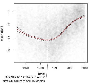
The average dBFS value for a typical 80s charts song was around -18 dBFS, but things have changed since then. Our data shows that the loudness war definitely happened, and it started shortly after the introduction of the CD in 1982. We marked Dire Straits' Brothers in Arms (1985), the first CD album that sold a million copies, in the plot. From there, it just goes up and up, to an average level of about -15 dBFS in 2009, or 3 dB higher than in the mid-80s. You can see that in the 70s, too, the dBFS values were relatively high. We believe that recordings of that time simply never had much dynamic range, due to limits of recording technology. Not everyone will agree with using dBFS as a measure for loudness though because it does not take into account the way humans perceive loudness at different frequencies. Do we have a measure for that, too?

It's Getting Louder all the Time

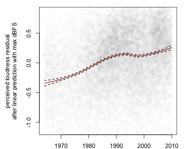
There are indeed computer algorithms that imitate how humans perceive loudness (see Further Reading). We applied such a measure of loudness to our singles charts tracks. Again, in order to make this measure independent from the maximum value used in the track we corrected for maximum dBFS value (this time by using linear prediction and plotting only the residuals). Measuring loudness this way shows a slightly different curve, an almost uninterrupted rise of loudness from the seventies through to the first decade of the 21st century (find the figure here). A more intuitive way of thinking about it is this: we take a loudness value that's very high at the beginning of our year range (in 1964), the 90% quantile. That means that only 10% of the charts in 1964 are louder than this value. We've then plotted the percentage of the tracks that were louder than the 1964 value for every year of the charts in the figure below.

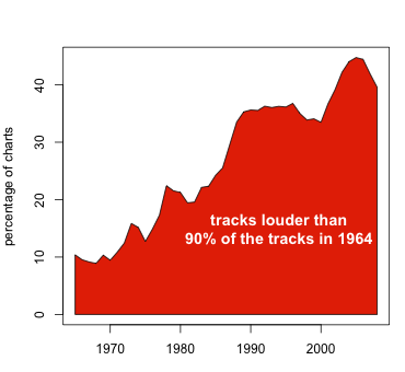
The percentage of loud tracks has increased from 10% in 1964 (by definition) to over 40% in recent years. So music has got louder. Well, isn't that in the spirit of Rock'n'Roll? Sadly, it isn't, because the increase in loudness has led to worse sound quality. Granted, it's louder, but boy is it flat!

The Death of Dynamic Range

If you fight the loudness war, whoever your competitors are, your victim will be dynamic range - an important part of sound quality. Here's why: I've already described to you the process of making a tracks sound louder by compressing the peaks, then blowing it up again. And the problem is just that: the peaks will sound compressed relative to the average recording. Drums have less punch, song sections intended to sound really loud will be at the same level as softer sections. This is all described very well in the Wikipedia article on the Loudness War. So we wanted to look at the development of dynamic range in the charts. We have actually measured the dynamic range of the music by a measure called crest. On every one-second block of a song, the crest is the difference in dB between the maximum value and the mean dBFS value. As in the figure above, we have plotted all tracks as a cloud of grey points, with the local regression and 99% confidence bands overlaid.


... and what we found exceeded our worst expectations. The charts tracks lost around 2 dB of dynamic range in the 20 years from 1985 to 2005 despite ever-improving technology, in energy terms that's 20% dynamic range lost. The picture is even more depressing when you look at individual artists. Madonna's tracks from the 80s have crest ranges of around 13.5 dB, with many tracks exceeding the average. But she goes with the loudness trend and gradually kills off 3dB of dynamic range, with her later recordings scoring around 10.5 dB. Hard to blame Madonna though, she's not alone! U2 seem to have resisted the trend for a long time, but then they fully embraced it, with their latest hits among the least dynamic of all. Oasis never had much dynamic range to begin with, so they've just kept on doing their thing, one might argue. Take That disbanded in 1996, then re-formed in 2005, but it looks as if they'd been going on all along: they're almost exactly on the loudness trend. Quite refreshingly, Robbie Williams and Moby do not seem to have followed the trend: while not topping the dynamic range chart, their tracks have actually grown more dynamic over time. And Beyoncé must be the queen of dynamics, most of her songs have well above the average dynamic range.

One of the arguments designed to convince artists not to make their music as loud as possible (beside the quality argument), is that modern software music players (including Last.fm's) adjust the volume so that loudness differences are less of an issue than they used to be. And some artists seem to have learned their lesson. The Red Hot Chili Peppers, for example, were criticised for their incredibly loud, and hence poor-in-dynamics, album Californication. Consider the very low dots with only approximately 9.5 dB dynamic range around the year 2000 in the figure above (with Red Hot Chili Peppers selected), way below even the average pop dynamic range. It's nice to see, however, that they steered back and their later recordings are more dynamic again.

compressed vs. dynamic
 Red Hot Chili Peppers - Give It Away, 1991, very dynamic (15.0 dB crest)
 Red Hot Chili Peppers - Californication, 2000, very compressed (9.2 dB crest)
 Red Hot Chili Peppers - Dani California, 2006, quite dynamic again (11.2 dB crest)

“No, no, I mean, are they LOUD?”

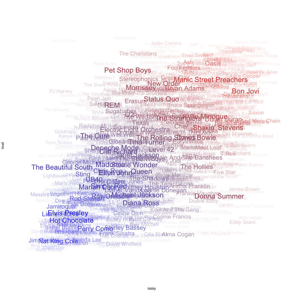
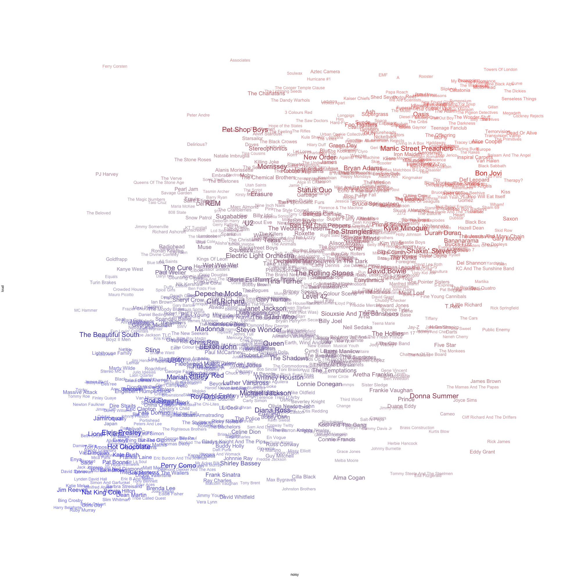
You might have noticed that artists whose tracks have a low dynamic range are not necessarily renowned for being loud. Is Madonna louder these days than Beyoncé? The “loud” that we think of when talking about bands is concerned with the volumes involved while making the music, that is, however loud you mix a Take That track, Megadeth will sound louder. Cues for a band being really loud are distortion (distorted guitars in particular) and prominent cymbal sounds. The spectra of such sounds have the characteristic that spectral peaks are not very prominent, and that there's an emphasis on high frequency content. As it happens, we can measure these, too. Our inharmonicity metric measures the prominence of broadband noise relative to peaks in the spectrum, and high-frequency content is detected by a low 1st MFCC coefficient. Normalising these metrics and taking their geometric mean gives us a measure of noisiness. The picture below was compiled by positioning artist names by noisiness versus loudness. The font size and opacity of the names correspond to the number of singles in the UK charts.

So maybe the combination of loudness and noisiness gives you a better indication of the kind of “loud” that you like. Does it?

While today's post has been quite technical, next time we're going to look at the lighter side of things, with a special on songwriting.

Anatomy of the UK Charts series so far

Percussiveness and the Disco Diva - on the rise of disco in the mid 70s

Clash of Attitudes - on automatically telling punk from art rock

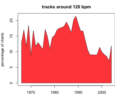
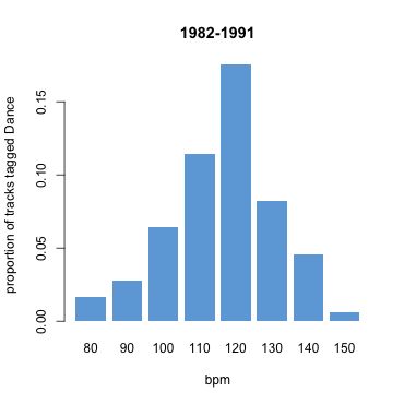
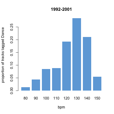
The Curse of the Drum Machine - on how 120 bpm dominated the 80s

Survival of the Flattest - this post

Further reading

The Wikipedia article on the loudness war.

The Echonest's Paul Lamere has also written a nice article showing evidence for the loudness war with many great examples.

Carol Krumhansl's article on the musical memory and the 400ms pop snippets: Plink: "Thin Slices" of Music, Carol L. Krumhansl, Music Perception: An Interdisciplinary Journal, Vol. 27, No. 5 (June 2010), pp. 337-354.

If you want to calculate loudness, inharmonicity and crest from a music file, try the libxtract Vamp plugin.

Local regression curves and confidences bands can be calculated using the locfit library, most easily using the interface to the R programming language.

Edit: The technical arm of the European Broadcasting Union EBU has a website with recommendations on the measurement and normalisation of loudness.

Anatomy of the UK Charts. Part 3 - The Curse of the Drum Machine

Friday, 1 July 2011
by
filed under Trends and Data
Comments: 13

This is the third part of the series, in which our Research Fellow Matthias analyses thousands of recordings from the UK singles charts using audio signal processing techniques. You can read Part 1 here and Part 2 here.

How does music change over time? Does it get faster, more complex, more diverse? In the course of the last few weeks we have learned that many aspects of music don't seem to follow that kind of simple trend. Rather, changes happen in less predictable ways. One of the most surprising examples of that emerged when we looked at the development of rhythm regularity in the UK charts...

The 80s Regularity Hump

The figure below visualises data that we've already used in the first part of this series to look for disco songs: rhythmic steadiness, or "rhythm regularity", as we will call it in here. To measure rhythm regularity we have written some audio analysis code that outputs a high value if the rhythm in an MP3 file often changes between consecutive 16 second sections, and a low value if consecutive sections don't change much. Our regularity extractor is based on a mathematical description of the rhythm in every second of a track known as Fluctuation Patterns (see Further Reading, below). When we plotted rhythm regularity over the years, to our surprise we didn't find a simple trend in either direction...

Instead, we found a regularity hump, right at the beginning of the 80s: the dark blue area shows the proportion of the charts in every year that is taken up by the most rhythmically regular tracks. Around the start of the 80s, the proportion of the most regular tracks increases noticeably, while the proportion of the most irregular ones diminishes. What could have fuelled this trend? One obvious suspect is the introduction of new technology. We have marked the release date of the first widely used drum machine, the Roland CR-78 in '78, and the first influential digital sampler, the Linn LM-1 in 1980 in the figure. We can't prove the connection but it's certainly a striking coincidence. Why does the proportion of highly regular tracks wane again in the mid 90s? Maybe people were fed up with very rhythmically regular music, or maybe drum machines simply got better at producing more diverse rhythms.

In either case, if this hump is really related to drum machines and samplers, we'd expect to see the trend in other kinds of data as well.

The 120 bpm Tempo Crunch

As the 80s seems to have been an unusual time for rhythm, it would be no surprise if we also saw striking things in the tempo of 80s music. We ran our tempo tracking software on the whole charts collection to measure the tempo of each section of each track in beats per minute (bpm). We then picked a single bpm value for each song by choosing the one attached to the most seconds of audio. At a first glance a plot of the average tempo per year didn't look very interesting (you can see it here). But then we noticed something unexpected. Have a look at the image below.

The heat map above shows you which tempos (in bpm) were unexpectedly popular in which years. For example, see the dark orange dot around tempo 100 in 1969? That means that tempos around 100bpm were more popular than usual that year (up by more than 2 percentage points). Admittedly, what's more striking is that there seems to be a downward pattern, as if some kind of music was getting slower and slower over the years. There's also a a strange cluster of tracks around 120 bpm from the early 80s to the early 90s - the big red blob in the middle.

Some tracks from the red blob:
 Prince - 1999 (120 bpm)
 Frankie Goes To Hollywood - Relax (117 bpm)
 808 State - In Yer Face (120 bpm)

Before we ask what this cluster means, let's make sure that this trend is really there, i.e. that the proportion of tracks around 120 bpm is really higher from 1982 to 1991 than in the rest of the time. It may seem obvious from the figure below, which plots the proportion of tracks between 116 and 124bpm over time. To be really confident that this is not due to chance we use a statistical test, a "2-sample test", which can check whether the difference is significant... and it is, with 95% confidence we can say that the difference is between 5.5 and 8.1 percentage points (details).

Our first thought was that songwriters in the 80s must have turned on their drum machines, loved what they heard and wrote a song to that beat - without changing the default tempo setting of 120 bpm. I would love this to be correct, but I have a hunch that it's not, especially after having found this highly interesting manual for writing a hit single written by The KLF in 1988. They say that "the different styles in modern club records are usually clustered around certain BPM’s: 120 is the classic BPM for House music and its various variants, although it is beginning to creep up", and also, "no song with a BPM over 135 will ever have a chance of getting to Number One" because "the vast majority of regular club goers will not be able to dance to it and still look cool".

In this track the KLF follow their own advice.
 The KLF - 3 a.m. eternal (120 bpm)

It seems that the KLF have a point. We wanted to know, and compared the tempo estimates to our Last.fm tags, especially the "Dance" tag. The figure below suggests that the KLF were really right. We took all tracks within ranges of 10 bpm (75-85, 85-95, ... , 145-155) and plotted the proportion of them that were tagged "Dance". It turns out that the KLF had quite a good grasp of what was true from 1982 to 1991. The proportion of tracks tagged as Dance is clearly highest around 120 bpm...

So was the drum machine a curse? It's been a blessing for many dancers, and it has undeniably led to the emergence of whole new genres of music, often dance music. And dancers have taken it from the club to the charts. Incidentally, somewhere along the way they must have learned to look cool even at higher bpm rates... what we see for the years 1992 to 2001 suggests a rather radical change to quicker dance music quite different from the KLF's suggestion that the tempo is "creeping up". Check the figure below.

Dance music in the 90s has clearly moved on, even the songs that did get into the charts, and its got faster. However, there seems to be another current of music that counter-balances this, as our tempo heatmap further up suggests (though it doesn't prove it).

As a reward for trying to understand all our data visualisations today we leave you with two of our new multi-tag radio stations.

Last.fm 80s + Dance Radio

Last.fm 90s + Dance Radio

Next week, bring some some earplugs, as we will try to find out where all the racket comes from in The White Noise Boys [Edit: title changed to Survival of the Flattest].

Anatomy of the UK Charts series so far

Percussiveness and the Disco Diva - on the rise of disco in the mid 70s

Clash of Attitudes - on automatically telling punk from art rock

The Curse of the Drum Machine - this post

Further Reading

The original article on the Fluctuation Patterns feature is by Elias Pampalk, Simon Dixon, and Gerhard Widmer: On the evaluation of perceptual similarity measures for music. In Proceedings of the Sixth International Conference on Digital Audio Effects (DAFx-03), pages 7–12, 2003.

If you want to detect the tempo of a track automatically, try Matthew Davies's tempo tracker in the Queen Mary Vamp plugin library or Simon Dixon's BeatRoot.

Anatomy of the UK Charts. Part 2 - Clash of Attitudes

Thursday, 23 June 2011
by
filed under Trends and Data
Comments: 9

As promised last week our resident Research Fellow Matthias has been hard at work data-mining our music recordings for this new instalment of our Anatomy of the UK Charts series...

Not everyone is into dancing. As I showed you in last week's post our audio analysis algorithms can trace the rise of disco after 1974, but around that same time a colourful range of other new styles emerged, including hard rock, glam and art rock... and then there was that other genre: punk, the attitude-laden antidote to "established" music.

While we haven't actually come up with a measure of attitude in music, the fact that punk was the anti-establishment, non-musician's music made it relatively easy to track down...

The Democratisaton of Making Music

"This is a chord. This is another. This is a third. Now form a band."

According to the Guardian's History of Modern Music these legendary instructions were first printed in the punk zine "Sideburns" in 1977. They are famous because they summarise the anyone-can-play attitude of early punk - the democratisation of making music. Well, if there's any truth in that, looking for harmonically simple music without fancy changes in sound colour should get us straight to punk. Will it?

We have a variety of signal processing algorithms that take an MP3 file, extract musical features from it, and then measure how much these features change over different time scales, from note to note, chord to chord, phrase to phrase or even between sections of a song. Looking at these rates of change can give us a good measure of musical complexity.

To see how complex the harmony of a song is, for example, we first extract "chroma" features. Chroma describes which notes are sounding at any time in the song. Then we look at how much the chroma changes over a time scale of around 3 seconds, which is the length that a chord is typically sustained. Using this method, lots of chord changes will lead to a high value for harmonic complexity.

Likewise for sound colour, usually called "timbre" in scientific circles, we start by computing a particular spectral feature that is heavily used in speech recognition: Mel-frequency cepstral coefficients (MFCCs). The rate of change of these MFCCs at a time scale of about a second should get us a measure of timbral complexity. If the instructions from the zine are accurate then punk shouldn't have much harmonic or timbral complexity.

In the figure below we have plotted timbre complexity against harmonic complexity. The grey dots show the positions of all songs in our charts database from 1975 to 1980, and we have overlayed some colourful stars, each representing an artist with more than 5 hits. We selected the six least and the six most "complex" artists as ranked by the sum of the squares of our two complexity measures. The centre-point of each star is the median average of the artist's songs. You can select your favourite combination of artists from the list below. The play buttons start playback of the track that's "most typical" of the corresponding artist, i.e. that which is closest to the centre of the star.

No Future!


Let them eat cake!


We find it fascinating that - as we would expect - all the famous punk bands such as The Sex Pistols, The Jam, The Stranglers, Buzzcocks and The Clash really do huddle together in the bottom left half of the chart; they really are the least complex of the lot. On the other end of the spectrum we have theatrical and arty performers such as Kate Bush and Queen.

In real life, there certainly was a clash of attitudes. When The Sex Pistols' Sid Vicious met Queen's front man he's reported to have asked: "Ah, Freddie Mercury, still bringing ballet to the masses are you?" to which Mercury replied "Oh yes, Mr Ferocious, dear, we are doing our best." While we can choose whether or not to believe that Mercury subsequently kicked Vicious out of the dressing room, we can clearly see that, in musical terms, punks and brainy rockers made sure they stayed clear of each other's territory.

Not Just Punk

Some rock bands not normally associated with punk seem to dispute the uncomplicated space of the 'real' punk rock bands: in the figure above, the down-to-earth Status Quo show up in an area quite close to the Buzzcocks. What's more if we rank not only artists with more than 5 hits but all with more than 3, it becomes clear that Status Quo are not the only rockers who have slipped in. Hard rock band Saxon leads the pack.

1. Saxon
2. The Sex Pistols
3. Black Sabbath
4. UK Subs
5. Cockney Rejects
6. Motörhead
7. Generation X
8. The Stranglers
9. The Jam
10. Secret Affair
11. Buzzcocks
12. Status Quo
13. Dave Edmunds
14. The Dickies

... the full list is here.

So while our measures of complexity do have a negative correlation with punk, they also correlate with other music. It seems as if we still have to develop that attitude detector in order to precisely nail down punk music. What we can quite confidently say though is that the second half of the 70s favoured "simple" music, as shown in the figure below.

Among all 15,000 chart tracks, we selected those 20% with the lowest squared sum of our two complexity measures and plotted what percentage of the charts they occupy in each year.

Between 1963 and 1975 the percentage of "simple songs" in the charts doesn't deviate much from around 12%, then there's a dip in 1976, followed by a steep rise. That rise coincides with what can be called the birth of punk: The Sex Pistols' gig at the Lesser Free Trade Hall, Manchester. Only three years later, in 1979, the simplicity trend peaks at over 20%. We can only guess why the proportion then sinks again - does commercial punk not work, maybe? Today's punk purists seem to regard as real punk only stuff that happened before 1979 (punkfm.co.uk writes: "We ONLY play Punk Rock from 1976 to 1979.").

Further on in our series we'll see that punk was not at all a passing fad, as we uncover the re-birth of simple music in the late 80s, on a scale that makes the 70s punk wave seem a mere ripple. Before that we'll dissect the early eighties in next week's instalment: "The Curse of the Drum Machine".

See also

Last week's instalment of the Anatomy of the UK Charts series.

Andy's beautiful images of lyrics by genre.

References and More Info

You can calculate your own Mel-frequency cepstral coefficients with the Vamp plugin software developed at Queen Mary, University of London. A plugin for chroma is available here, or you can read my paper about it. Unfortunately, the complexity measure is not publicly available yet, but we will make an update once it is.

The info on punk history was mainly taken from the Guardian's History of Modern Music. The "Punk Girl" is a Creative Commons-licensed image from Vectorportal.

Data cheat: we did not have data for all singles of The Sex Pistols from 1975 to 1980 and therefore used all their songs (irrespective of chart date).

Lyric clouds, genre maps and distinctive words

Wednesday, 22 June 2011
by andrew
filed under Trends and Data
Comments: 20

One of the interesting things that sets even superficially similiar genres of music apart is their lyrical content. Last.fm tags can overlap to a great degree, but we were interested to see what the words can tell you about the subtler shades of meaning that go along with those tags. As usual around here, the best way to answer questions like these is by asking the data.

So I downloaded the musiXmatch dataset, a collection of lyric tables for nearly 240,000 songs from all around the world (and the musical universe). They are tables in the sense that they don’t contain the intact lyrics of each song, but rather a list of words present in each song, along with the number of times that word occurs. No use for karaoke, but perfect for investigating the overall properties of a genre. I then matched up the songs in the dataset with tracks in our own catalogue, and correlated this with Last.fm tag data, in order to count the number of times a given word appeared in each of several prominent genres.

Lyric clouds

Of course, lists of words and frequencies are a little dry, but thankfully IBM have released a Word-Cloud Generator which can take a weighted list of words and display it graphically, as seen on the Wordle website. The more often a word appears, the bigger it will be rendered. Here’s what it came up with for the genres I tried — the software did the layout, but you can blame me for the font selection.

Click to open full images in a new window.

Warning: they contain lyrics you may find offensive. Not safe for work.

Blues

Country
 

Electronic

Folk

Goth
 

Hip-hop

Indie

Metal
 

Rap

Rock

Soul

I did a bit of pre-processing to remove common ‘stopwords’ that don’t really hold any information about the topics of the lyrics (and, for, I, you, the, plus many more), but this only took into account English words — and if you look closely, you’ll see a few common words from German, French and Spanish (and probably others) that are from foreign-language songs in the dataset. But what’s most striking for me about these is not how much they differ, but in fact how often some of the words appear prominently across genres. Almost everyone sings about love, for example, with the exception of Rap and Hip-Hop, and time comes up… time and time again.

Genre maps

A limitation of word clouds is that while they’re great for showing the comparative popularity of words within a genre, they’re not so good for looking at the overall similarities or differences of several genres at once. To do that, you need some measure of similarity which can be rendered graphically as a kind of ‘genre neighbourhood map’. So I measured the similarities between the word lists for each genre, ranked by popularity, using a method which was developed to compare the result rankings from different search engines. This gives a single value for how similar the lyric choices are between each pair of genres, where differences towards the top of the lists (the most popular words) are considered more important than differences further down. A bit of extra number crunching in R can convert these similarity scores into a 2D map, which I imported into OpenOffice to render:


Click image to open larger version in a new window.

This map is really interesting for its combination of expected and unexpected neighbours, and also for the way it clearly shows Rap and Hip-Hop as outliers from the main axis on the left. Goth and Metal, which may appear similar to the un-trained ear (and eye!), are considerably separated, while Metal and Folk are — surprisingly — much closer. Electronic (a very broad tag) is clustered together with Soul and Blues, presumably because of the soulful origins of house music, which is one of the more lyrical electronic sub-genres. And Rap and Hip-Hop, which might be considered synonymous by the layman, are about as different as Indie and Country in terms of lyric ranking.

Distinctive words

The word clouds as shown draw the viewer’s attention to the very frequent words, but these also tend to be the ones like love and time which are popular across genres. This is a problem if you want to find out which words are most distinctive or characteristic of a given genre — the words which, if used as search terms for example, would be best at selecting songs from that genre correctly (true positives), while minimizing the number of songs retrieved from other genres (false positives). Once again, information retrieval (the science behind search engines) can help us — the F measure or F score is specifically designed for measuring the tradeoff between true positives and false positives in a set of results. It’s a score between 0 and 1, where 0 means “no relevant documents retrieved”, but 1 means “all relevant documents retrieved” and “no additional spurious documents retrieved”.

So I calculated the F score that each word would have as a search term for each genre in some notional lyric-based search engine: “how relevant would the results be if I searched for Indie tracks with the search term friend“ for example. This doesn’t take into account the number of times each word occurs within a song, just the fact that it occurs at all, but it does let us redraw the lyric clouds with each word’s size determined by its F score for that genre. As you can see, this brings out the words that are characteristic of each genre, rather than emphasizing those that are globally popular:

Click to open full images in a new window.

Warning: they contain lyrics you may find offensive. Not safe for work.

Blues

Country
 

Electronic

Folk

Goth
 

Hip-hop

Indie

Metal
 

Rap

Rock

Soul

I think they bring out the unique character of each genre much more effectively, and the variation in size between the words is much less, so the less prominent words are easier to see. There are some interesting quirks visible too. For example, many German words are much more clearly visible in the Goth cloud than they were before, reflecting both the comparatively large number of songs in German in that genre, and the lack of German lyrics in most other genres. Country for example is entirely English.

Finally, a little extra present from the data. The word with the highest F score in the whole dataset is Christmas, with an F score of 0.3892 for the tag… Christmas. So, unseasonal greetings from the data crunchers here at Last.HQ!

Thanks to musiXmatch for making the lyric database available, and Thierry Bertin-Mahieux for helping me to reconstruct the full words from the stems in the database.

Anatomy of the UK Charts. Part 1 - Percussiveness and the Disco Diva

Thursday, 16 June 2011
by
filed under Trends and Data
Comments: 15

Matthias and the MIR team have been hard at work analysing pop music using signal processing algorithms. Over the next few weeks they’re going to reveal some of their findings in a special series: Anatomy of the UK Charts…

Everyone’s their own music expert. Some know more and some know less, but I challenge anyone to have listened to the entire catalogue of the UK charts. It stops being fun after a while. That’s why at Last.fm we’ve programmed our computers to listen to music.

We fed them around 15,000 tracks from the UK singles charts between 1960 and 2008 and discovered some fascinating results we’d like to share with you. It all starts with the discovery that just before the middle of the 70s something in the data changed…

The Explosion of Percussiveness

The explosion of percussiveness is one of the most distinctive patterns we have observed in our audio data. In the figure below we’ve plotted the proportion of “percussive” tracks in the UK charts over time. In order to decide how percussive a track is, we use our audio analysis framework to read the MP3 file and create a series of graphs known as spectrograms. In a spectrogram, vertical patterns indicate percussive elements, and the strength of these patterns, averaged over a whole track, is a good measure of its percussiveness.

What you see in the figure are the top 20% percussive tracks of all 15,000 tracks, and how much of the charts in a particular year they occupy.


 Donna Summer – Love to Love You Baby
 KC And The Sunshine Band – Sound Your Funky Horn

We were surprised to find such a huge leap around 1974 – so what happened to make the charts go percussive?

The simple answer: Disco. In the figure above, we’ve marked two songs that were in the first wave of successful Disco tracks in the UK, “Blow Your Funky Horn” by KC And the Sunshine Band (topping at number 17 in December 1974) and Donna Summer’s ground-breaking erotic Disco song “Love To Love You Baby” (number 4, February 1976). In fact, if we look at all the percussive tracks from 1974 to 1979, Donna Summer is the leading artist:

Artists with highest number of “percussive” hits (1974-1979):
7 – Donna Summer. Example:  Hot Stuff
5 – Hot Chocolate. Example:  You Sexy Thing
4 – Eric Clapton. Example:  I Shot The Sheriff
4 – KC and the Sunshine Band. Example:  I’m Your Boogie Man
4 – Tina Charles. Example:  Love Me Like A Lover
3 – Barry Biggs. Example:  Work All Day
3 – Bob Marley & the Wailers. Example:  Could You Be Loved
3 – Earth, Wind and Fire. Example:  Let Me Talk
3 – Rose Royce. Example:  It Makes You Feel Like Dancin’

Now there’s not only Disco in those tracks but also some reggae, not least because Eric Clapton went reggae. We’ll have to look beyond percussiveness in order to find out more about Disco.

Donna the Disco Diva

So can we find out what’s really Disco? For the sake of the argument, let’s say that Disco is 70s music that’s percussive and has a steady rhythm. As it happens we have a measure for “steady rhythm”, calculated using our new measure of rhythmic change (see Audio Flowers). We calculate it this way: “rhythm steadiness” = 1 – “rhythmic change”.

In the figure below, we have plotted the values of percussiveness against this “rhythm steadiness”. This time it’s not about individual songs, but about artists. The position of each circle shows the average percussiveness and steadiness of all the artists’ tracks (1974-1979), while the sizes of the circles indicate how many hits they had. We’ve added artist names for those who had more than 8 hits.

One does get a feeling that Donna Summer is somehow special. Among all artists with more than 8 hits, her tracks are by far the most percussive and rhythmically steady… she’s so Disco! ABBA have a softer touch of Disco, much less percussive, but often quite steady, whereas Elton John is revealed as seriously non-disco – despite his (rather late) 1979 attempt to cash in on the craze with Victim of Love.

But Elton and co had already had their share of the cake – there’s so much more to the 70s than Disco! Check back next week for “Clash of Attitudes” (edit: find it here), the second part of our Anatomy of the UK Charts.

Further Reading

Charts: the official UK charts; the independently-maintained Chart Stats.
Music Information Retrieval: technical paper on audio analysis of rhythm; Last.fm’s Audio Flowers (for rhythm steadiness/change); general introduction to content-based Music Information Retrieval.

Never Mind The Royals

Friday, 6 May 2011
by
filed under Trends and Data and Found On Last.fm
Comments: 9

Last Friday, 29th of April, was a big day for Prince William and Kate Middleton, and a great excuse for a party for the rest of us… We even set up a special radio station for the big day. But we spotted a bit of an oddity in the scrobbling logs. Not everyone, it seems, was caught up in the wave of patriotic royalism that swept Britain that weekend.

Sitting at number 84 in the UK chart for that day was the Sex Pistols‘ anarchist anthem, God Save The Queen.

About 1 in every thousand listeners in Britain scrobble God Save The Queen on a typical day (not counting Last.fm radio listens), which isn’t bad going. But on the day of the Royal Wedding it hit nearly five times that, far more than on any other day in the last 12 months.

Originally released in 1977 for the Queen’s silver jubilee, the track was banned by the BBC and other broadcasters for its incendiary lyrics, but shot to the top of the charts nonetheless.

Even in 2011, with Sid Vicious long since departed and Jonny Rotten making TV ads for butter, the song has kept its angry appeal — as the chart above shows.

So here’s to our listeners for keeping the punk spirit alive — we mean it, maaaaaaan.

Happy Valentine's Day from Last.fm

Monday, 14 February 2011
by
filed under Trends and Data
Comments: 24

We all know Last.fm listeners are achingly hip, resolutely individualistic, and far too cynical to be taken in by the annual cards-and-roses marketing-fest called Valentine’s Day, right?

Well… perhaps not. We wondered, with years worth of data at our fingertips, if we could see whether February 14th brought out the sentimental side of our listeners.

This Is Not A Love Song

In order to listen to love songs, you have to find them first. So we started our investigation with the tags Romantic and Love Songs. Tags are supplied by listeners, so their presence alone is enough to give away the fact that at least some of you are softies at heart.

Of course, ‘Romantic’ music can also refer to 19th-century pieces by the likes of Brahms and Schubert, so we went to our database and extracted the top-scoring tracks associated with both Romantic and Love Songs.

This gave us a stack of 30 songs by the likes of Lionel Richie, Barry Manilow, Bryan Adams and Ronan Keating.

What Time Is Love?

We wanted to find out whether there were specific times when our listeners were feeling particularly loved-up. So we scanned our scrobbling logs for 2010, and for each day counted the number of listeners who’d played at least one of the love songs in our test set. 30 songs is a tiny fraction of the millions of tracks scrobbled to Last.fm every day, but even so there’s a clear spike on February 14th:


Click image for full-size version.

Put It In A Love Song

But tags are only one way of looking at the data. They tell us what people say about their music, but we wanted to turn the question around: what artists do people listen to especially on Valentine’s Day?

To answer this question, you can’t just look at the top 10 or top 100 artists. After all, Last.fm listeners’ music taste is incredibly diverse, and for the most part the overlap is made up of the latest hits. For example, here’s the top 5 tracks played on Valentine’s Day 2010:

1. Lady Gaga – Bad Romance
2. Ke$ha – TiK ToK
3. Lady Gaga – Poker Face
4. Owl City – Fireflies
5. Lady Gaga – Paparazzi

Could be any other day in February 2010 really. But by comparing people’s listening habits on Valentine’s Day to another day of the year you can see what music becomes temporarily more popular than usual when people are in the mood for love.

So, we took the scrobbling logs for February 14th for the last six years and pulled out a shortlist of the artists who made it into the top 1000 that day but not seven days later (the 21st – a relatively unromantic day).

We added up the number of times an artist appeared in the shortlist between 2005 and 2010 and ranked them by this score, breaking ties by average popularity on Valentine’s Day.

So, after all the number-crunching, here’s the Top 10 Valentine’s Day artists for Last.fm listeners:

1. Barry White, the undisputed master of romance
2. BoA
3. Pete Yorn
4. Sixpence None the Richer
5. Tiga
6. Wire
7. Sam Cooke
8. Shania Twain
9. Mandy Moore
10. Daphne Loves Derby

So there you have it. The late and lamented Barry White, leader of the Love Unlimited Orchestra, melter of the hearts of housewives everywhere and crooner of the likes of Can’t Get Enough Of Your Love, Babe, You’re The First, The Last, My Everything and It’s Ecstasy When You Lay Down Next To Me, takes his rightful place on top of your Valentine’s Day chart.

The runners-up span a vast range of tags — from Romantic and Love of course (Shania Twain, Mandy Moore and Sam Cooke), to Electroclash (Tiga) and Post-Punk (Wire); what a diverse bunch you are.


For more technical details about this post, see Andrew’s journal.
Last.fm is hiring! If you like crunching big data, come and work for us as a Data Scientist.