Welcome to your new home!

Monday, 24 June 2013
by Paul Blunden
filed under Announcements and Design
Comments: 2

We’re always striving to give you the best possible experience from the moment you arrive on Last.fm. It’s important to us that the most interesting content is easy to find and looking sharp. Last week, we released an update with some significant improvements to the user home page, one of the most useful but overlooked pages on Last.fm.

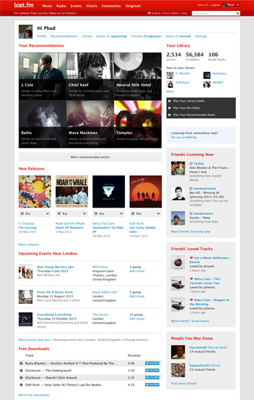
The redesigned home page features the same great content, but reorganised and given a much needed facelift. Your recommendations are now featured front and centre, with bigger images and a neat new layout. There’s also a new library section in the right hand column that gives an overview of your personal stats and recent activity. The changes aren’t all on the surface though; your new releases, events, and free downloads recommendations are now better quality, displayed more intelligently (based on your recent listening habits) and programmed to shuffle on each visit to the page. It’s never been easier to discover new music!

So, what if you’ve just joined Last.fm? Some of the most exciting changes are only apparent when you’ve got a brand new account. In this case, the redesigned home page helps to welcome you to the world of Last.fm with a simpler design and clear messaging about how to get your first recommendations and start scrobbling.

The improvements for new users don’t stop there – we’ve also updated our sign-up experience. Back in April we introduced a new account setup process which includes 3 simple steps. New users are guided through starting their library, setting up scrobbling, and completing their profile, before arriving on their home page with music and event recommendations ready and waiting. You can always revisit these steps, so if you haven’t seen them yet, check them out – the library builder is a lot of fun to play with!

In the coming weeks we’ll be making further improvements to the new home page, including the ability to dismiss recommendations. As always, we’re keen to hear your feedback on the changes we make and new features we introduce – please leave your feedback on the forums.

Design Changes to Last.fm

Friday, 3 August 2012
by Simon Moran
filed under Announcements and Design
Comments: 49

For the last few months, we’ve been working on some design improvements, and after a couple of weeks in beta, we’re ready for our first full release. We’re pretty excited, and we wanted to share some of the details of the new design with you.

What’s new?

On almost every page on the site, we’ve moved the secondary navigation menu from the left side of the page to the upper right. This gives you a wider page, with more space for what matters: the content. On pages where there are a lot of items in the navigation menu, we’ve grouped the less frequently-used items into a small dropdown menu on the right.

Old navigation:

New navigation:

We’ve also redesigned Artist, Album and Track pages from scratch, and rebuilt the page templates completely. Have a look:

An Artist page: http://www.last.fm/music/The+Maccabees
An Album page: http://www.last.fm/music/Rihanna/Loud
A Track page: http://www.last.fm/music/Micachu/_/Golden+Phone

There are three main aspects to the changes:

Tidier, more rational layout.

These pages are very rich in information, and as the site has developed we’ve added more and more content to them. Our user research indicated that it was time to step back and take a fresh look at how the pages were laid out.

The new design groups actions and information together logically so that it’s easier to locate things on the page, and it’s laid out hierarchically, with the things most people use most often nearer the top of the page. We’ve also removed some less-important things from the main page, though most content is still accessible through the menu at the top of the page.

Fresher visual design

We regularly go out and talk to people about Last.fm, and ask how we can improve things. In response to user feedback, we’ve updated the visual design of the page with more emphasis on images, more legible text, and cleaner, simpler graphics.

New page templates

We’ve built brand new page templates, which are more flexible and dynamic, so that your pages load faster and you spend less time waiting for pages to refresh. We’ve only just started to explore the possibilities of the new templates, so expect more optimisations and speed improvements in coming weeks.

We’ve also taken the first steps towards “responsive design” – which means pages working just as well on your mobile and tablet as they do on a full-size web browser. There’s still more work to do before we can release this, so stay tuned!

What’s next?

We’re going to continue updating the site gradually, over the coming weeks and months. We’re also going to address the feedback we’ve already had, from the beta release, with further tweaks and improvements to get the pages just how you want them.

Thanks for reading! We’d love hear what you think of the new designs, either in the comments here or in our forums

Top 10 festivals to find the fastest growing stars of 2012

Tuesday, 29 May 2012
by graham
filed under Trends and Data and Design
Comments: 9

Last.fm can already recommend the most compatible festivals based on your current music taste, but what about discovering new music? We decided to use a bit of 10% time* to see if Last.fm listening data could be used to recommend the best festivals for seeing the future stars of summer 2012.

If you want to see a bigger version of this image, click it or click here.

Omar started by looking at new artists playing in festivals this summer to see which have a high “hype score”. Hype is our measurement of how fast an artist’s audience is growing over a short period of time. Then Omar looked at historical data for all festivals over the last few years to see how many artists had become successful (i.e. grew in audience) directly following the festival. This gave us a ranking of how influencial festivals were in growing new artists. We pulled out the top 10 for our infographic, and then highligthed the artists with the most hype.

As we tend to call artists that have big audiences “stars” I thought I would use stars in my infographic (I find these dazzling leaps of lateral thinking exhausting). The hype scores would be represented as the brightness of the star. However, when I tried to convert the hype scores into percentages to scale the circles in my infographic, some were massive and other came out microscopic. So I called Omar over and he said “ah yes, skewed distrubution. Just use log or square root”.

Eh?

It must be strange for Omar to be working so closely with an idiot. A short math lesson later and I had a nice range of percentages to play with (and I felt a bit smarter, almost ready for my own PHD ;).

* staffers are given 10% of their time to work on self-driven projects, providing the work is related to music data (I have been told off for spending too much time working on a diorama of Jabba’s palace for my Star Wars figures)

We All Want Love

Thursday, 9 February 2012
by
filed under Trends and Data and Design
Comments: 3

“We don’t have the time for psychological romance –” Larry Blackmon, Cameo

As my missus will testify, I’m not very romantic and greetings cards make me nauseous. So I wasn’t looking forward to designing a feature for Valentine’s Day.

Then I realised it might be interesting to use music data to see if anyone else felt like me or if the world was full of hopeless romantics playing Somebody To Love by Jefferson Airplane back-to-back like saps. So I went to see Omar

Omar the Oracle

I don’t pretend to understand what Omar does.

I like to think his job involves “running things through the computer”. Actually, he works for the Data team at Last.fm. He is always very patient with me, even when I ask stupid questions like: “Do you think David Hasselhoff‘s audience was affected by the drunken cheeseburger vs floor-as-plate incident?” (The Hoff gained an extra 400 scrobbles that week).

Omar was more than happy to dig into the Valentine’s Day stats, especially when I said I wanted to compare “romance” with “sex” (he’s always running the word “sex” through the computer – it never takes long).

To get a clean set of Valentine’s data to analyse, Omar compared the listening behaviour on 14 Feb over a number of years to the behaviour on any other day of the year, thereby sifting out the tracks unique to Valentine’s Day. Then we went to work with the location and genre tags. In his own words:

I had a little look at our tags pages and selected two sets of tags to investigate:

‘Romantic’ Tags: love, love songs, love song, romance, romantic
‘Sexy’ Tags: sexy, sex, erotic

Each city was then given a score based on how many people listened to sexy or romantic tracks on Valentine’s Day, and how many people have tagged these tracks with sexy or romantic tags. This gave us a ‘sexy’ and ‘romantic’ score for every city. Balancing these scores (there was a global bias toward romance) allows us to compare them, and find out which way a city leans: is it more sexy, or more romantic?

Infographic show which cities play the most

Male vs Female Valentine’s Tracks

Usually, if you run a chart for a given day of the year, the same answers keep emerging; Adele, Lady Gaga, Coldplay, or Radiohead. This time Omar tried to find something a little different: how do listening behaviours change on Valentine’s Day? I’ll let him explain again…

To do this I found out how females and males usually listen to tracks, on an average day. This involves counting daily listeners for every track listened to since the start of 2006.

Then I ask exactly the same question, but for Valentine’s days only.

So, our Valentine’s charts show you the tracks which see the largest, most consistent increases in listeners on Valentine’s days. These are the tracks that ladies and gentlemen turn to on Valentine’s Day.

You can see who topped those charts yourself!
If anyone needs me, I’ll be in Fresno.

By popular demand

Friday, 8 January 2010
by pichenettes
filed under Announcements and Design
Comments: 30

When we released Tube Tags to our loyal subscribers back in October, we promised to launch more data visualisations features soon.

Since then, we received lots of positive feedback about the infographics created for the newspaper edition of our Best of 2009 feature, including a mention in Fast Company for the “Local vs Global” comparison charts. Many of you asked for personalised versions, so that’s exactly what we’ve done! They’re now available to all subscribers in the VIP zone of our Last.fm ‘Playground.’


Listening Trends allows you to create the same kind of comparisons we did for the “London & New York vs. The Word” graphs, but on a smaller scale for your friends or neighbours. Or, if you’re not into comparisons, you can always get a classic stream graph visualisation of your listening trends over time.


Music Universe shows the artists you listened to the most in 2009. The artists are grouped by tag, depicted as moons orbiting tag planets! Building this visualisation was a particularly long odyssey through circle packing algorithms, font format madness, color tweaks and disapproving cats.

Please send us feedback or join the Playground Group to discuss these features.

Guerrilla user testing in central London

Saturday, 31 May 2008
by mattb
filed under Design and Tips and Tricks
Comments: 25

Our new baby, beta.last.fm, has been out of the office incubator for about a week now, and as we feed and water her, we’re keeping a careful eye on how she’s been getting on in the subscriber enclosure before we release her into the wild.

First up, MASSIVE thanks and ‘nuff respect (as the kids say here in London town) to everyone for their feedback, suggestions and ideas so far.

We’re always experimenting with loads of ways to help make the Last.fm experience more and more awesome: in-page feedback and commenting, the Last.fm Beta Group, Get Satisfaction, chatting to our mums, impassioned debate over ping pong or in the ball pool; the list goes on. One of the most fun ways, though, is getting out there on the street, face-to-face with people, chatting and finding out how we can make stuff better. So, yesterday, I strode into central London with a laptop, some screengrab software and the promise of free coffee and cake.

Grabbing a seat at the nearest café with wifi, I arranged to meet a few people in the area (long-time users who’ve been with us for years; new users still discovering what we do; friends and relatives; random people off the street; anyone with a spare twenty minutes, really) to show them beta.last.fm and watch them having a play with it. Loose, informal user testing — or, to use its technical term, ‘chatting to and watching people try out our new ideas over some free coffee and cake’ — is fascinating, great fun to do, and, combined with our other feedback-recording methods, as I believe Mr. Matthew Ogle, Esq. will discuss, reveals fantastically rich layers of information that really help us improve the Last.fm experience.

Right now, back at HQ, we’re working flat out (though, at the time of writing, it is Friday, so we’ll be having a few down the Arthur too), mashing all this feedback and observation together to help us tweak, polish and rethink our ideas and plans as we move forward to a public release of beta.last.fm as soon as possible.

Once again, thanks, and big up to everyone for the feedback so far. We’re listening to everything, and working directly with your help, so keep keep keep it coming.

PS fidothe, alexmuller, molluskii, camilondon, brooner, and clacaby – pleasure to chat to you today.