Top 10 festivals to find the fastest growing stars of 2012

Tuesday, 29 May 2012
by graham
filed under Trends and Data and Design
Comments: 9

Last.fm can already recommend the most compatible festivals based on your current music taste, but what about discovering new music? We decided to use a bit of 10% time* to see if Last.fm listening data could be used to recommend the best festivals for seeing the future stars of summer 2012.

If you want to see a bigger version of this image, click it or click here.

Omar started by looking at new artists playing in festivals this summer to see which have a high “hype score”. Hype is our measurement of how fast an artist’s audience is growing over a short period of time. Then Omar looked at historical data for all festivals over the last few years to see how many artists had become successful (i.e. grew in audience) directly following the festival. This gave us a ranking of how influencial festivals were in growing new artists. We pulled out the top 10 for our infographic, and then highligthed the artists with the most hype.

As we tend to call artists that have big audiences “stars” I thought I would use stars in my infographic (I find these dazzling leaps of lateral thinking exhausting). The hype scores would be represented as the brightness of the star. However, when I tried to convert the hype scores into percentages to scale the circles in my infographic, some were massive and other came out microscopic. So I called Omar over and he said “ah yes, skewed distrubution. Just use log or square root”.

Eh?

It must be strange for Omar to be working so closely with an idiot. A short math lesson later and I had a nice range of percentages to play with (and I felt a bit smarter, almost ready for my own PHD ;).

* staffers are given 10% of their time to work on self-driven projects, providing the work is related to music data (I have been told off for spending too much time working on a diorama of Jabba’s palace for my Star Wars figures)

Our new football table and how we got it

Monday, 21 May 2012
by sven
filed under Lunch Table
Comments: 14

We work hard at Last.fm to give you and millions of users the services you have learned to love and to come up with new ideas. To keep the spirit high it’s sometimes helpful to break out of the zone for a moment, get some distance between you and the problem you try to crack, have a short break and then come back to your desk with fresh ideas. Many of us at Last.fm like to enjoy a game of table football to fill those moments.

Now our football table has seen better times. The pitch is anything but level, and the last time we moved it to a new place we almost broke it. Twice. So it was time for something different.

Back in April three of us (DavW, marekventur and I) took part in the London Realtime hack day. We managed to impress the jury with YouChoose, a collaborative YouTube playlisting web site. We won a prize and walked away with a brand new iPad… between the three of us.

Rather than complain we sold the iPad to another member of staff and decided to put it towards a new football table. I added my half of the Spotify award of last year’s London Music Hackday to the stock, but it still wasn’t quite enough for a good table.

It would be a shamelessly hubristic act to believe that we would keep winning prizes, but we gave it a try. Two weeks after London Realtime we went to the Buckinghamshire countryside and took part at Game Hack. The three of us were joined by tdhooper. Within 24 hours of hacking and very little sleep, we created a little browser game and we won the prize for the best HTML5 browser game, awarded by Mozilla and Turbulenz.

That gave us a good budget for a shiny new table, funded solely with money we won at hackdays.

And now it is here. We ordered it from Kicker Klaus, a German mail order shop that specialises in all things table football. The Vector III weighs 125kg and we got it in Last.fm red, with red and black players, just as you would expect. I would like to tell you more about it, but I have been challenged to a game, and then it’s back to work: the database doesn’t code itself.

Musings from The Great Escape

Wednesday, 16 May 2012
by steve
filed under Lunch Table
Comments: 7

Last week I attended The Great Escape which is a fantastic festival and conference in Brighton. In a previous life I built the Great Escape website for the Mama group and I’ve been to the festival for the last two years. I love it.

If you have never been to TGE, then I’d highly recommend you check it out next year. Spread out over 30 venues it is a great place to listen to new and upcoming bands as well as some more established artists. The vibe of the festival is chilled and when the sun shines, there’s no better place to be than Brighton.

On Friday morning I attended a conference about New Music Radio and listened intently about how curated radio is changing with an interesting panel of podcasters, radio entrepreneurs and DJs, one of which kindly let me crash at his family’s house (thanks Darren!) for the duration my stay.

When the debate was opened up for questions from the audience Duncan Geere from Wired asked how the panel see services like Last.fm. The response from Matt Young who runs Song By Toad was interesting and although I know he has a vested interest as a ‘radio presenter’, what he said was simply not correct. And I quote:
“I really think Last.fm and Pandora are fucking pointless. Whenever I log in to Last.fm, it just plays me 20 songs I already know. There’s no way to listen to anything new”.

Well Mr Young.. have you not checked out your personalised recommendations? Have you missed the new release recommendations, have you checked out Discover? Ever tried Your Recommended radio? browsed music by tag or tried multi-tag radio? There are SO many ways to find new music via Last.fm that the potential to discover tracks and artists you like but haven’t yet listened to is enormous. Better yet, we can offer a choice to account for the needs of the people you seem to have overlooked… people who WANT to listen to music they know and like.

The point was well made by Mr Trick – which thankfully added a reality check to the statements from others on that panel – and that is… not everyone has a desire to have a DJ ‘throw them a curve-ball’. They actually want to listen to, and be recommended, music that we know they will like.

The fact that new, upcoming and independent artists have uploaded almost 4 million of their tracks to be discovered in and amongst the entire catalogue of almost 15 million streamable tracks and the fact that our Last.fm users have scrobbled and added rich data for more than 50 million artists should tell you that the scope to discover new music with Last.fm is huge.

It is interesting to note that the poll running on Wired’s site currently shows that 70% of people (at time of writing) are listening to less traditional radio because of Last.fm.

So, Matt Young, please come on over to Last.fm anytime and join us for a techmosis session, perhaps one Friday. We’d love to show you how good Last.fm really is and why millions of people all around the world know for a fact that what we are doing here is far from “fucking pointless”.

Tasty Tasty Music

Monday, 30 April 2012
by Michael Horan
filed under Stuff Other People Made
Comments: 9

At Last.fm, we always enjoy seeing how developers take advantage of our API and what incredible products they come up with. This week, Lurpak® are releasing a new UK-only radio product, called FoodBeats, that serves up music based on what you’re cooking.

Simply type in the name of the dish you’re making, how long you’ll be preparing it, and Last.fm serves up a playlist based on what you’re cooking. FoodBeats tailors specially selected songs into a playlist based on the listener’s chosen recipe and learned musical preferences. So, for example, anyone cooking sausage and mash might be served anything from 60’s mod rocker vibes through to the fun Britpop of the 90’s.

Next time you plan on preparing a dinner, try it out!

I’ve got some Stuff to talk about

Wednesday, 14 March 2012
by omar
Comments: 8

This month’s Stuff Magazine features Last.fm in their Best of British feature. We’re alongside two of my favourite things: McLaren and Alan Partridge.

I made a visualisation on UK listening trends to accompany this. It shows off our data nicely, condensing listening statistics for 2.5 million artists across the 8,760 hours of 2011, to find the artists that best characterise UK listening for each hour of the day.

You can see it below, or download the full version (pdf) for a proper look. It’s loosely based on the listening trends graphs that subscribers can access on our playground.

The exact meaning of the statistical methods used to create this can be a little unclear, so I thought I’d try to explain. I’ll focus on giving a general feeling for why each artist shows up in the visualisation, rather than going into detail about the sums.

What does it mean?

The visualisation shows the top-ranked artists in the UK, for every hour of the day. So how does an artist top the ranks?

Each artist is given a score—for each hour of the day—that is based on how many more listeners they have in that hour. This is compared to their usual hourly activity. What you see in the visualisation are the artists that score highest in each hour.

I’ve shown some average hourly listener counts for a selection of artists that made it into the visualisation in the image below. Note that the vertical scale starts at 20; I want to highlight the differences between each artist, rather than the numbers themselves.

Artists like Zero 7 and Duffy come on strong in the morning, compared to Ludovico Einaudi who has a much flatter listener count throughout the day, but continues until late at night. Similarly, McFly gains popularity in the late-afternoon but drops off relatively quickly as bedtime approaches.

The key to these artist scores are the differences between their listener counts at various points in the day, and how they change relative to other artists.

What’s going on at night?

The far left and right sides of the visualisation show night time listening. The top artists here are those that usually top our charts. I’ll explain why.

First, I should point out that their scores are negative. That means that they see a reduction in listeners during the night, which makes a lot of sense. The reason they are ranked top is because their score falls the least overnight.

There is another aspect to the night time calculation. I filtered out hourly scores that fell below 25 listeners, as a noise reduction measure; this is because we need a reasonable amount of data to allow the statistics to work.

I have taken the above graph and thrown in Adele, to further illustrate how the score works.

You’ll see that her listening graph dwarfs those of the other artists in the visualisation. However, her ranking remains relatively low during the day because she has no particularly strong hourly trends that separate her from other artists.

Newfangled technology

Thanks to Stuff Magazine for featuring us, and also for explaining what Last.fm is to my mum; it’s the first time she’s really understood what it is, and what I do here.

balance.fm

Friday, 2 March 2012
by Marcus
filed under Code and Announcements
Comments: 6

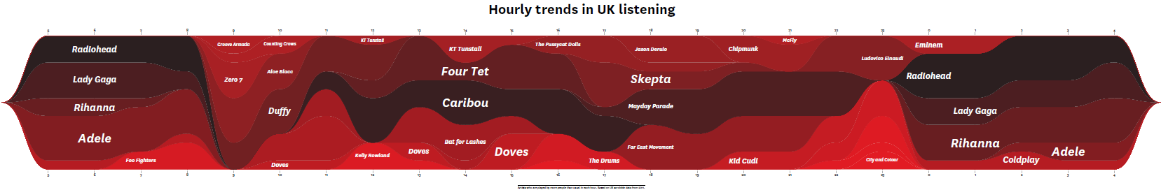
The open source tool balance is an essential part of the service infrastructure here at Last.fm. Multiple instances of balance are running on each and every web server node, on the various production back end servers, and also on our development machines. So at any given time there are probably thousands of instances running simultaneously on our machines.

What does it do?

balance is a so-called load balancer. It is generally used as a proxy to distribute a large number of incoming requests to a group of servers. In other words it is responsible for balancing the load between all the servers in a group. Quite often, load balancers are dedicated hardware products. However, balance is a software load balancer, which means it can just run as an additional program on any server.

In addition to load balancing, balance also supports a scheme called failover. This means you can define a second group of servers and balance will route requests to the second group if all servers in the first group fail. This failover scheme is used by most of our backend services at Last.fm. We usually have a main server and a backup server that kicks in once the main server fails.

End of story?

Certainly not! There are some subtleties in the use of balance that have given us headaches in the past. By far the biggest problem is that there are cases when failover just doesn’t work right in our environment. So here’s a real example…

One day we had to take down the main server for one of our backend services to replace a hard drive. The backup server was running fine and we relied on balance to take care of routing all requests through to the backup box. Unfortunately, shortly after the main server went down, we noticed that most requests to the service failed.

What had happened? balance has a configurable connect timeout, i.e. it tries to connect to a service and then waits for a certain amount of time until it figures out that it can’t connect. If the server machine is running, the connect will fail almost instantly if the service itself is unavailable. However, if the server is down, it’ll wait until the connect timeout has elapsed. So in our case, balance was trying to connect to the main server (which was down) and then waiting for 5 seconds before attempting to connect to the backup server. In the meantime, the client had already given up (it was using a much smaller timeout). balance would only notice that the client had given up by the time it had established the connection to the backup server. The next time the client tried to connect, the same thing would happen all over again.

But someone else would certainly have had the same problem before?

I’m quite sure of that. And I guess that’s what caused the autodisable feature to be added to balance. When this feature is being used, balance will automatically disable servers that it fails to connect to. The downside, though, is that there’s no way to automatically enable servers again. And manually enabling them isn’t really an option given the number of instances of balance we’re running and given that it could cause all servers to be permanently disabled in case of, for example, temporary network failure.

So what now?

We had to face the fact that in theory we had a really nice redundancy scheme, but it could fail quite miserably in practice. So I began to look around for alternatives to balance and found a couple of other open source load balancers. Sadly, all of them had either been abandoned by their authors, failed to build out of the box or just didn’t fulfill our requirements.

balance was actually just what we needed. The only thing it was missing was support for monitoring all back end connections and dynamically disabling and enabling them as they fail or pass the monitoring checks.

So eventually I started looking into adding exactly that functionality to balance.

balance.fm

Implementing monitoring for balance was relatively straightforward, even though it made me aware of how much I had gotten used to developing software in C++. With balance being written in pure C, I was really missing exception handling and the C++ standard library.

The amount of code changes was massive considering the rather small code base of balance. As of now, more than a thousand lines of code have changed and another thousand lines have been added. So we decided to fork the original project and rebrand it as balance.fm.

It took about a week to refactor the existing code and finally add the monitoring feature. Along the way of adding monitoring, quite a few bugs have been fixed as well (for details, just have a look at the commit log if you’re interested) and I hope these fixes make up for all the bugs that I’ve undoubtedly introduced by adding loads of new code.

The balance.fm code has since been reviewed by the MIR team here at Last.fm and is available from github.com/lastfm/balance.fm.

If you have an application for balance.fm, please give it a try and let us know what you think and like or dislike about it!

We All Want Love

Thursday, 9 February 2012
by
filed under Trends and Data and Design
Comments: 3

“We don’t have the time for psychological romance –” Larry Blackmon, Cameo

As my missus will testify, I’m not very romantic and greetings cards make me nauseous. So I wasn’t looking forward to designing a feature for Valentine’s Day.

Then I realised it might be interesting to use music data to see if anyone else felt like me or if the world was full of hopeless romantics playing Somebody To Love by Jefferson Airplane back-to-back like saps. So I went to see Omar

Omar the Oracle

I don’t pretend to understand what Omar does.

I like to think his job involves “running things through the computer”. Actually, he works for the Data team at Last.fm. He is always very patient with me, even when I ask stupid questions like: “Do you think David Hasselhoff‘s audience was affected by the drunken cheeseburger vs floor-as-plate incident?” (The Hoff gained an extra 400 scrobbles that week).

Omar was more than happy to dig into the Valentine’s Day stats, especially when I said I wanted to compare “romance” with “sex” (he’s always running the word “sex” through the computer – it never takes long).

To get a clean set of Valentine’s data to analyse, Omar compared the listening behaviour on 14 Feb over a number of years to the behaviour on any other day of the year, thereby sifting out the tracks unique to Valentine’s Day. Then we went to work with the location and genre tags. In his own words:

I had a little look at our tags pages and selected two sets of tags to investigate:

‘Romantic’ Tags: love, love songs, love song, romance, romantic
‘Sexy’ Tags: sexy, sex, erotic

Each city was then given a score based on how many people listened to sexy or romantic tracks on Valentine’s Day, and how many people have tagged these tracks with sexy or romantic tags. This gave us a ‘sexy’ and ‘romantic’ score for every city. Balancing these scores (there was a global bias toward romance) allows us to compare them, and find out which way a city leans: is it more sexy, or more romantic?

Infographic show which cities play the most

Male vs Female Valentine’s Tracks

Usually, if you run a chart for a given day of the year, the same answers keep emerging; Adele, Lady Gaga, Coldplay, or Radiohead. This time Omar tried to find something a little different: how do listening behaviours change on Valentine’s Day? I’ll let him explain again…

To do this I found out how females and males usually listen to tracks, on an average day. This involves counting daily listeners for every track listened to since the start of 2006.

Then I ask exactly the same question, but for Valentine’s days only.

So, our Valentine’s charts show you the tracks which see the largest, most consistent increases in listeners on Valentine’s days. These are the tracks that ladies and gentlemen turn to on Valentine’s Day.

You can see who topped those charts yourself!
If anyone needs me, I’ll be in Fresno.

Building Best of 2011

Monday, 16 January 2012
by
filed under Announcements and Trends and Data
Comments: 6

Earlier this week we released our Best of 2011 charts. 2011 saw you spend over 71 thousand years listening to music and scrobble more than 11 billion tracks. We’ve been churning through all of this data to find out what truly defined 2011.

New for this year is the discoveries chart. We went back to the beginning of time (well, to 2003) and checked every one of your 61 billion scrobbles to work out which artists were first scrobbled in 2011.

We’ve also broken these charts down by country and tag. Whatever you’re interested in, from experimental music in Mexico, the latest innovations in Finnish pop, or just what’s Big in Japan, you now have a means to browse them.

Following on from last year we are providing you with a data download. Musicbrainz IDs are now included in this data (where we have them) as part of our continued collaboration with Musicbrainz.

Producing the ‘Best of’ Charts is a very different process to our usual weekly charts. What follows is an overview of the process. In particular I’ll explain how we determined the new albums and discoveries of 2011, and how we turned these into the charts you see on the site.

New Albums

Our top artists are calculated based on albums released in 2011. One issue with albums is that they are typically released many times in many locations. To get around this we used a new version of the Musicbrainz database to find track listings for albums that were first released in 2011.

Of course, that isn’t the end of the story. Our library doesn’t always match up with Musicbrainz. Such issues need to be handled when we align album information from Musicbrainz with our own scrobble data. It’s one of the reasons we’re improving our Musicbrainz ID coverage .

New Discoveries

We label an artist as a new discovery if they were first scrobbled in 2011. As I mentioned previously, this can only be decided by checking through all of the scrobbles we have ever received.

This task is complicated by misspelled artist names, collaborations, and remixes. A nice example is Britney Spears’ collaboration with Sabi. Britney is certainly not a new discovery, even though this incorrectly-titled artist was first scrobbled in 2011. We avoid this by mapping artist names to their correct versions, before sorting through their scrobbles.

Our Human Computer

Our final step was to send the charts to our secret weapon: the music team. They pored through thousands of the top artists of 2011, matching them against their own databases and removing/adding artists that were incorrect or missing.

Data Download

This year we have two data downloads: the first – like last year’s – contains the top artists and albums of 2011; the second contains only the top artists, because they do not all have associated albums. In the data you’ll find all of the artists and albums from Best of 2011, along with play and listener counts, top tags, and image links.

In both cases we have added Musicbrainz IDs to the data. You can use these on our own API, BBC Music, and The Guardian. Use the data as you please; we look forward to seeing what you come up with!

2011's New Discoveries

Friday, 13 January 2012
by matts
filed under Announcements and Trends and Data
Comments: 3

Every year when Best of rolls around, we look at the chart to see if our data could have predicted who’d make it big. While there are a few in there we saw coming * cough * Adele * cough * the reality is that every year things get harder and harder to foresee.

That’s one of the reasons we launched our New Discoveries chart; to show off just how diverse your year in music really is.

Sure, it’s full of credible indie acts; Purity Ring, Death Grips and Work Drugs all did fairly well, while Wugazi – an album of mash-ups between Wu Tang Clan and Fugazi – made it to 13th place after getting huge buzz over the summer.

Someone we might have expected big things from was former Oasis frontman Noel Gallagher. He made it to number three on the New Discoveries chart, but only to 69 on the overall UK chart. That’s not quite as high as we might have expected. Similarly, Gaslight Anthem side project The Horrible Crowes made it to number 12 on the New Discoveries chart, largely off the back of Gaslight Anthem fans trying it out.

Further down the list GLaDOS makes an appearance. The Aperture Science Psychoacoustics Laboratory made it to number 7 on the chart after Valve released several albums worth of material from Portal 2. Soundtracks often jump to the top of the Hype Chart after hardcore fans flock to new releases, and while none of the artists on Drive were eligible for the New Discoveries chart they all got a huge boost when that came out.

Up until the last minute it looked as if the New Discoveries chart would be topped by none other than Rebecca Black. The “Friday” singer was number one on the chart right up until December, but while her video has collected some 17.5 million views on YouTube Last.fm’s music community only played the song 320,000 times between them.

Our first New Discoveries list is actually topped by Youth Lagoon, the project of Boise, ID native Trevor Powers. His dream-like album shot up the Hype Chart in autumn, and appeared to become a fixture throughout the winter for many listeners. He also creeps into the US overall top chart at 100.

For a taster of what these artists have to offer, listen to our New Discoveries playlist on the recently launched Discover app.

In case you missed it yesterday then our design team played with an early cut of our New Discoveries chart to create this neat little poster as a bit of a bonus. Don’t forget that you can also filter the chart to find the New Discoveries that best reflect your tastes using the Country and Tag options.

Here’s to another unpredictable year in music!

Best of 2011 is here!

Thursday, 12 January 2012
by Sarah Ransome
filed under Announcements and Trends and Data
Comments: 10

Best of 2011 is a reflection of the year in music, highlighting the most popular and hottest new artists all based on the tracks you’ve been scrobbling.

This year’s ‘Top Artists’ chart was compiled by looking at scrobbles for albums released between 1st January and 31st December 2011. As in previous years, we aren’t counting live albums, greatest hits collections, EP’s and singles. You might not be all that surprised when you see who’s sat at number one, but dig a little deeper using our lovely new Country and Tag filtering options to find the No. 1 which suits you!

Another new feature for 2011 we’re really excited about is our ‘Top New Discoveries’ chart. This was compiled by looking at the number of listeners for artists who had their first scrobble between 1st December 2010 and 31st December 2011. Discovering new music is core to the Last.fm experience; so we wanted to highlight the artists who caught your attention this year and who you should keep an eye on during 2012. Again, use the filtering options to personalise your view.

Additionally, we took a look at the Year In Music to see what our data had to say about 2011. We hope you’re as fascinated as we were by the impact of music news on your scrobbles.

For developers, we have provided the chart data as TSV and XML files. Download and start hacking, we’d love to hear what you come up with.

Finally, as a little easter egg, we’ve created a commemorative poster of this year’s New Discoveries chart. The eagle-eyed amongst you will notice that it’s slightly different to what you see online; we made this before taking all of December’s data into account. You can download the poster here.