
For the last few months, we’ve been working on some design improvements, and after a couple of weeks in beta, we’re ready for our first full release. We’re pretty excited, and we wanted to share some of the details of the new design with you.
What’s new?
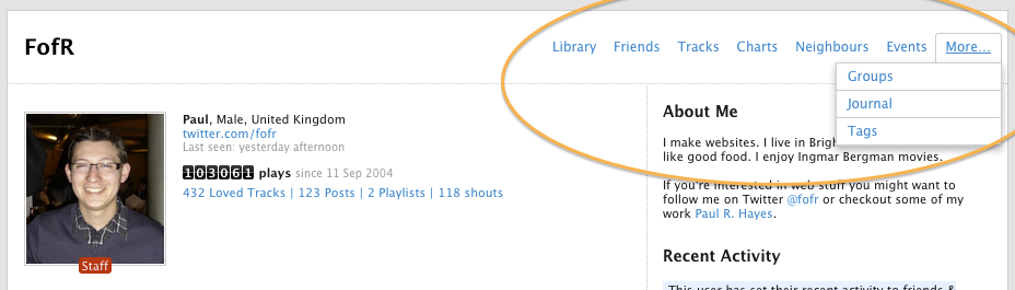
On almost every page on the site, we’ve moved the secondary navigation menu from the left side of the page to the upper right. This gives you a wider page, with more space for what matters: the content. On pages where there are a lot of items in the navigation menu, we’ve grouped the less frequently-used items into a small dropdown menu on the right.
Old navigation:
New navigation:
We’ve also redesigned Artist, Album and Track pages from scratch, and rebuilt the page templates completely. Have a look:
An Artist page: http://www.last.fm/music/The+Maccabees
An Album page: http://www.last.fm/music/Rihanna/Loud
A Track page: http://www.last.fm/music/Micachu/_/Golden+Phone
There are three main aspects to the changes:
Tidier, more rational layout.
These pages are very rich in information, and as the site has developed we’ve added more and more content to them. Our user research indicated that it was time to step back and take a fresh look at how the pages were laid out.
The new design groups actions and information together logically so that it’s easier to locate things on the page, and it’s laid out hierarchically, with the things most people use most often nearer the top of the page. We’ve also removed some less-important things from the main page, though most content is still accessible through the menu at the top of the page.
Fresher visual design
We regularly go out and talk to people about Last.fm, and ask how we can improve things. In response to user feedback, we’ve updated the visual design of the page with more emphasis on images, more legible text, and cleaner, simpler graphics.
New page templates
We’ve built brand new page templates, which are more flexible and dynamic, so that your pages load faster and you spend less time waiting for pages to refresh. We’ve only just started to explore the possibilities of the new templates, so expect more optimisations and speed improvements in coming weeks.
We’ve also taken the first steps towards “responsive design” – which means pages working just as well on your mobile and tablet as they do on a full-size web browser. There’s still more work to do before we can release this, so stay tuned!
What’s next?
We’re going to continue updating the site gradually, over the coming weeks and months. We’re also going to address the feedback we’ve already had, from the beta release, with further tweaks and improvements to get the pages just how you want them.
Thanks for reading! We’d love hear what you think of the new designs, either in the comments here or in our forums
Comments
jacques
3 August, 11:25
Last.fm is the only site I know that gets uglier/messier at every redesign.
xerx
3 August, 13:47
I agree, this was an unnecessary change.
All elements are too big now and it looks very chaotic.
Daniel
3 August, 13:55
I like the new design, yes. But I hope that improvements will be increase. For example, only on-line friends should appear in the public profile page, and the Recsplorer must be improve a lot.
Flor
3 August, 14:45
Very choatic, lots of redundant and/or useless information. Hope this gets rectified, but I’m not optimistic.
Sleepless
3 August, 16:48
These little changes are good, but they are too conservative. I hope the site gets a complete redesign soon. It’s getting old. It needs a shake-up, a fresh design and NEW FEATURES.
Adrienne
3 August, 16:54
Is there data that a lot of people using Last.fm use tablets? Can you even scrobble from tablets?
I like elements of the design, but I agree that several sections are way too big. I hope Last.fm rethinks this tablet-oriented design. I don’t think tablets will ever replace PCs, and scrobbling isn’t compatible with the limitations of tablets, many of which don’t even have USB ports. Designing for tablets when your users all use PCs is misguided.
But I agree 100% that the old design was dated and didn’t function as well as it should have, so I’m glad Last.fm is finally working on it.
Grzech
3 August, 17:31
Where are the links to wikipedia, discogs, official sites?! That was really important for me when discovering new bands, now it’s all gone!
couldtryharder
3 August, 17:55
@Grzech – those links are now on the Bio page. For example: http://www.last.fm/music/The+Shins/+wiki
ras222
3 August, 18:27
I like the new design – very clean.
Zara Ahmed
3 August, 18:28
Wow.. I like the changes.. :)
rich
3 August, 18:48
it doesn’t look good and everything is too big, and looks all over the place :/ can there at least be a setting for the old one? I understand why before the last redesign there couldn’t but I don’t see why this time it can’t
jeremy197
3 August, 23:50
The now bigger size of elements induces a lot of scrolling, which is pretty bad in my opinion.
Getting down to the shoubox takes forever: a sticky inline nav would be useful.
Batiste369
4 August, 02:38
I know I’m (obviously) in the minority here, but I LOVE the new layout! I especially love how prominent the images are this time. The site looks more colorful and the chart statistics (on the artist pages) are more noticeable than ever. I seriously haven’t found a flaw yet…Thanks Last.fm!
Fitoschido
4 August, 03:36
I like the changes too. There will always be complainers for everything.
Technooo
4 August, 06:04
Can i recommend larger plays box, 2x would make it look really well with the new layout. There is a lot of empty space with the new layout.
Maybe
4 August, 09:41
As someone already mentioned, the bigger size of the elements is a problem. Don´t want to scroll forever… For example are the pictures of “Top albums” way to big. So are the size of elements under “Concerts” and, to some degree, “Simular artists”. No need for them to be so big. Strive for a minimun amount of scrolling needed, to get to the bottom of the page (without destroying the overall design).
David
4 August, 10:57
Ugly, so long, oh god… I haven’t words for this.
xer.
4 August, 14:12
At least give us a choice – as @rich mentioned – give us a possibility to switch the view to the old one.
Ztephphe
4 August, 15:35
Very happy to see some change fiiiiiinally. It’s felt so stagnant and never-changing.
Hope to see some absolutely crazy stuff when the robot sound tech is fully functional.
I want those graphs and even crazier words describing every song I hear.
anne
4 August, 17:23
this new design is pretty good, but now my last fm free music player doesn’t work!
Tony G.
4 August, 18:07
Love the new changes to the site. Very nice looking and appealing!
NINa
4 August, 18:35
It’s OK, not distracting but not loading faster that much if (1Mb/s). I wish you just put journal in the first row instead of neighbours for a user page.
The artist pages look cool w/ store/buy/share icons, recalling ReverbNation design. Also buy on CDBaby.com would be great.
Bayou16
4 August, 22:06
OMG the new design is so f*cked up !!!!!!
Jolly roger
4 August, 22:27
Looks great especially on tablet. Glad to see some forward thinking for a change
siq
4 August, 23:19
i can’t put my displeasure with the new design into words, but one thing that really angers me, is that it’s apparently impossible to add artist manually to my music collection now. try harder next time.
Hatsuked
5 August, 03:19
It’s refreshing to see changes, but I’m not a huge fan of them.
Lucija
5 August, 07:16
It takes time reach profile button while refreshing, there’s no number of shouts on artist pages (which are terribly arranged), also, ‘friends who also listen’ function is annoyingly reordered. Everything is way too large…
I suggest more new options like:
- ‘listen later’ button for each artist
- exchanging ‘top listeners’ (which make no sense) with charts of users who played certain artist most
- red/black last.fm bar on top of the page should remain on top while scrolling down the page
Svenja
5 August, 13:48
The new design is absolutely awful in my opinion. Everything is way too big and confusing, I feel very uncomfortable with this. I want the old design back ;(
Peter Spedition
5 August, 22:17
I love the new design, it´s look very fresher – thanks!
Dan
6 August, 14:25
How about pairing up with Shazam and SoundHound to provide scrobbling of music through those apps? That way, we could scrobble whatever we hear, regardless of the source. Possibilities: concerts (that would be so cool), radio in the car, tunes from the DJ in a club, elevator music (j/k but not), etc. I searched your blog but could not find anything similar being discussed. Is this a feature of the last.fm app? Or am I just missing something? Cheers.
Blog of Nancy Templeton
7 August, 05:00
I found this post useful.I was trying to find this. Really refreshing take on the information. Thanks a lot
blog site
7 August, 07:08
Great You have a very nice webdesign here on your page i like it very much and have add your blog to my favorites
hunkydoris
7 August, 08:30
ok, on the artist’s page where is the ‘add to library’ button? it was useful when you haven’t listened to sth yet, but you don’t want to lose it. also, why isn’t the page showing total number of scrobbles, just mine? it was interesting to know. also, please please bring the ‘friends who listen’ section back to the top, it was good to see at the first moment when visiting an artist’s page. and, of course, everything is way TOO BIG.
xxxx
7 August, 15:06
I like the new design a lot!!!. I wait for more improvements.
Dawn
7 August, 15:47
The style is nice and I like the big prominent images but everything else is also so huge that it all competes for my attention. A bit chaotic.
For example, the top tracks does not have to be as large as it is.
And I think the horizontal size of the page is way too long. Sometimes my web browser is sized narrower, then things start getting cut off.
I do love the listening trend part, though.
kadin modasi
7 August, 16:35
It’s refreshing to see changes, but I’m not a huge fan of them.
NINa
8 August, 08:00
Could you please add Journal link to the top right drop down menu (when a user name appears) to enter directly from a dashboard http://www.last.fm/home when logged in? There are: Home, Profile, Friends, Recommend, Library, Events, Settings links but no Journal. That’d be very helpful for those who post the music news to own profile and groups!
Nastik
8 August, 09:08
Awful is the word I have to describe new LAST.FM redesign. What a shame! I expected more and even gave feedback on how can they make the website even more awesome. Just Pathetic!
koniiiik
8 August, 21:27
sigh Yet another redesign and again a step backwards IMO. The best last.fm design I’ve seen was the really old one – from then it only went downhill.
With that really old design you could see practically all information about a user immediately and you didn’t have to scroll like a monkey halfway through the page to find the actual stats, shoutbox etc. It could use some facelifting, true, but as far as ease of use goes, this one was by far the best.
Well, as for me, I don’t really care about this redesign as since the last major one I don’t really use the last.fm web anymore, it’s just too impractical for me.
baoyu42
9 August, 13:11
Too chaotic.
grey
10 August, 13:40
Too big! 5 comments only fit on screen, not good changes.
invertedquestionmark
15 August, 08:46
I also feel like many of the elements on the page are way too big. I don’t mind the placement but I used to be able to see much more information at just a quick glance.
Alexis Yukiko
16 August, 18:09
Bad interpreters of design doesn’t equal to Bad design, thank you Last.fm i love the layout!
I don’t understand why it confused some people, when its so clean and neat. I don’t have a problem with scrolling but it seems like the majority of people do. So maybe that’s the thing that has to change. Like dropdown open/close options? But if everything is in one screen in one glance without scrolling, won’t it be sandwiched altogether? ._.
Anyway the team already said they are still working on it. A lot of us are thankful enough, don’t give up Design team!
7alacol
22 August, 05:58
I like the new design a lot ::)
rosaelefant
26 August, 19:13
I did not prolong my subscription due to the design changes. Good day, sir.
iPowers
26 August, 22:09
I hated this design at first but now i like it. Just takes a bit getting used to. The two things i like about htis new look is how the similar artists are bigger and the graphs on the bottom. That is something I really like. As for the rest, ehhhhhhh.
eugenesucks
29 August, 16:07
Hey, where did the “events recommended to you” go? I can’t seem to find it via the interface now. Also I RSSed it back when I knew how to get to it and the feed is still working but seems to think I live in southern California now. ?
koniiiik
4 September, 23:44
What the… I just found out that on artist pages, there is the number of your scrobbles and the number of listeners near the top of the page on the right, but there is no total scrobble count. If you want to find that number, you have to scroll halfway through the page to the place where there is the number of your scrobbles and the number of listeners AND the total number of scrobbles. What the hell I don’t even! Was this really a conscious design decision?
Dan
13 September, 11:11
I like, a lot! Looks fresher and it is easier to find things.
Comments are closed for this entry.