About 6 weeks ago I started a short internship at Last.fm. For my project I wanted to explore Last.fm’s data to learn how listening preferences vary with the listener’s age and gender. Apart from the science, the most important thing I found is that you can make awesome plots with this information.
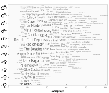
I started by making a chart to show what kind of music you “should” be listening to if you really want to fit in with the most common artists in your age range and gender:
The sizes of the artists’ names indicate how popular they are, while their position shows the gender mix and average age of their listeners. Based on the positions of the larger names, it’s already obvious which age category is most common amongst Last.fm users.
So, you can now use this plot to decide which music you might want to listen to. For example, if you are a healthy young male in your early twenties, you probably should listen to bands such as Iron Maiden and Metallica. Gorillaz and Radiohead might just be acceptable. If you get older you can then switch to artists like Neil Young and Genesis. It’s all quite obvious really.
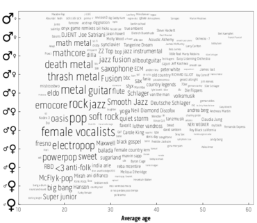
Of course, when I realized what nice plots I could make, I tried it on several other types of data as well. Tags for example:
You can use it in the same way as the previous plot. Apparently females like using band names as tags (Super junior, McFly), while males prefer finding lots of ways to say the same thing (metal, jazz). Most importantly we have just used science to prove that men don’t listen to much k-pop.
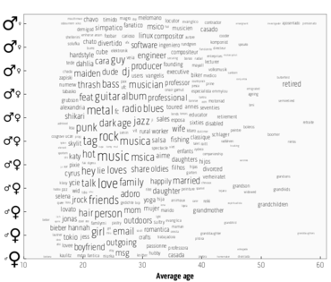
Obviously music is the most important data that’s available at Last.fm, but there are some other profile items that can be interesting too. The words used in the ‘About Me’ section on users’ profile pages might even lead to the most interesting plot of them all:
There are actually so many fun facts about this plot that it’s just best to check it out yourself. The most obvious one is which hobbies you “should” have depending on your gender. Or you can find out at what age you should retire.
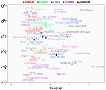
I used all of this to create a fun new playground demo that enables all Last.fm users to compare themselves with their friends. This is the plot for the data and recommendations team for example:
We’ve even thought of those of you who like to print their visualisations as a poster by providing a bigger PDF version that has more artist names on it.
Hopefully you’ll enjoy this demo as much as we did. In any case, we’d love you all to let us know what you think.


Comments
Leniel Macaferi
22 September, 15:18
Really cool and interesting information!
Keep up the good work…
ben
22 September, 15:31
nice. i dont understand how you can have a scale of gender though…
Ellie
22 September, 15:32
Awesome
Web Developer Dude
22 September, 15:33
Interesting correlations in those charts, speaks volumes about our culture. :P
Tecfan
22 September, 15:37
yep, keep up the work!
Farhan Mannan
22 September, 15:38
This is brilliant. Possibly relatedly, it’s amazing how deep-seated gender stereotypes are and how they control us.
Kev-_-
22 September, 15:43
Really interesting, resolution makes it kinda difficult to see some of the smaller groups though
Rafael
22 September, 15:46
Hey, great tool!
I did enjoyed it.
If someone needs to know what kind of music or artist is in, for example, to put in ad or something like that…
jirka
22 September, 15:58
Wow this is the best tool ever! I love digging up this musical information.. Showed me that I am only a little older than I actualy am, and that makes me satisfied :)
More like this please :)
Ballaberg
22 September, 15:59
Great, it sayz that I’m half that old and bisexual :)
Mary Spiro
22 September, 16:00
According to this data plot my music listening habits indicate that I am a 20 yr old male. LOL! Way off.
Ian Zammit
22 September, 16:05
Hi,
cool stats, did you use and statistical methods to validate if there is actually a significant difference in artist for gender ratios?
and @ ben :
nice. i dont understand how you can have a scale of gender though…
the scale if gender is the ratio of males and females listened that listen to a specific artist
timurrrr
22 September, 16:10
Very cool feature!
Can you please also somehow show how the “mean value” changes over time, e.g. like a fading trail with a dot for each month/quarter?
Thanks!
Hannes
22 September, 16:12
interesting study and great visualization! Thanks!
D_ni
22 September, 16:21
wow, that’s great! very fun tool. great for those who love statistics, like me (:
BioMSU
22 September, 16:30
Hey Joachim! Nice work.
What about the same thing but with countries except of age and gender?
FloraJL
22 September, 16:34
Jeebus! Way too many 40-year-old grandmothers out there!
Glad to know I’m not “average” on these plots. I don’t think one single thing applied to me; and I’m proud of that!
Peter
22 September, 16:50
Maybe interesting for bands (and their promo teams) to plot a heatmap of the popularity of a given band in the age/gender space.
Ylixia
22 September, 17:23
Interesting read.
My gender plot was an almost perfect diagonal line from the bottom-left corner up to the top-right… I have no idea what that says about me :s
al-yazdi
22 September, 17:43
Awesome !
Obviously, most of the data you have is around 21-24 years old … did you thought about leveraging your data with your number of sample ? Or at least, display it alongside with it ? I would then expect the size of the Group to change.
funkycoder
22 September, 18:49
It would be great to see that information on the artist’s pages (an age histogram and percentage of m/f/genderless users).
Also, how many users don’t disclose their age or gender? (I don’t because I don’t see last.fm as a social network, I can barely stand the term “friends” being used here, it should be like Apple Ping, where you can unilaterally follow people whose taste you like, without them being bothered by your presence)
Andrew Platts
22 September, 19:04
What tools did you use to create the graph – Its a really good visualization of the data ?
Megan
22 September, 19:12
This is some conformist bullsh*t. Why do you even suggest that people “should” listen tocertain groups based on age/gender? Why can’t the information be presented without judgment calls or normative expectations? We all have different music and we should not be shamed into liking a musician just because others our age/gender like them too.
Kevin
22 September, 19:26
I appreciate the work that went into this but I think I have to agree with Megan, although in a much nicer 38-year old tone.
I also find it weird that my listening habits are supposedly much closer to people 10-15 years younger than I am. Really strange considering some of those bands are from when I was in high school/college.
Kat
22 September, 20:27
Cool! I don’t think there’s any conformist suggesting going on here — just a recommendation of things you might like based on your age and gender. If you don’t like the typical stuff for your age and gender, those are your tastes and no one’s asking you to apologize for them. From a statistical point of view, it’s interesting stuff.
Nick
22 September, 22:09
Very good work. Is there any way you can include Geographical location into the data somehow?
Nick
22 September, 22:10
Very good work. Is there any way you can include Geographical location into the data somehow?
Tim
22 September, 22:25
is this normalized to account for age/gender discrepancies? I’d assume that there are imbalances on both axes. IE more males than females use the service, and therefore data is biased toward male listeners.
Celine
22 September, 23:17
One of the most interesting data uses I’ve seen on last.fm! Well done!
Ian
22 September, 23:20
I would love to see this as an animation showing multiple graphs across a span of time. For example, it would be neat to see a series covering the last few years for a particular artist and watch as their name moves and scales on the plot. I expect that some artists would make a straight horizontal shot across the graph as they continue to be carried along by their initial (aging) audience members, while I expect other artists to sort of float about in the same place as they continue to be carried more by a particular demographic than a specific group of people. Still others could make more interesting movements, such as a diagonal or some sort of cyclic pattern.
Thanks for making this available!
strange_fire
23 September, 01:00
I agree with Megan; unlike Joachim, not everyone chooses their music based on what others consider “acceptable” or “popular”.
“I started by making a chart to show what kind of music you “should” be listening to if you really want to fit in with the most common artists in your age range and gender”
How about just making a chart to show what your listeners are enjoying based on their age and gender? Leave the expectation to fit in out of it.
“if you are a healthy young male in your early twenties, you probably should listen to bands such as Iron Maiden and Metallica. Gorillaz and Radiohead might just be acceptable.”
First of all, healthy young males? As opposed to unhealthy young males? Second, instead of telling the reader what they should and shouldn’t do, just present the information objectively, without directives. So you could have said, “if you are a young male in your early twenties, you are likely listening to X, Y, Z.”
“If you get older you can then switch to artists like Neil Young and Genesis.”
Oh boy, we can? Really? So you’re giving us permission to switch our musical preferences? Gee thanks!
“It’s all quite obvious really.”
Actually this is not obvious from the chart. The change in music tastes has nothing to do with getting older; it has everything to do with the age of the listener and which music they grew up listening to. Someone who listens to Metallica now will not wake up one day in ten or twenty years and magically prefer Genesis. Why? Because they never liked Genesis to begin with.
For example, the difference in music tastes between me and my older brother is not because of our age, but because of the different music that we grew up listening to. When he was 19, he liked Genesis. Now he’s 38, and he still likes Genesis. When I was 19, I liked Ani Difranco. Now I’m 31, and I still like Ani Difranco. When I am 38 I will not like Genesis. When he was 31, he did not like Ani Difranco. See? Nothing to do with aging, everything to do with generation.
Joachim, it seems that you are just getting your feet wet with blog posts. Please use this as a learning opportunity: when posting on a popular website that is used by a diverse audience, consider choosing your words a little more wisely next time. You’re not being witty or clever here, you’re being patronizing and encouraging assimilation.
Adam
23 September, 03:04
Jesus God.
He was being FACETIOUS about telling you what you “should” listen to.
Preferences across gender and generations DO EXIST.
Good stuff. Great visualization.
Young people, feel free to listen to Glenn Miller. Nobody can put you in a box!
Lola
23 September, 03:30
I don’t know any of the groups in my age bracket and the music genres created by my generation are most popular with other generations, not mine ?
Hmmm
Arne
23 September, 09:18
Very nice! Would be funny if you would show the percentage of male/female listeners and the average age on the artist page.
And, that you would show top and new, aspiring artists for several gender/age groups.
Just fantasizing.
Christina
23 September, 09:44
This seems to be based on German data – many of the artists featured are not known in the Uk or US.
Christina
23 September, 09:57
Or at least skewed towards a German audience – are Germans perhaps overproportionally using LastFM?
Jo(e)
23 September, 11:00
Looking at this backwards, all the outliers amongst us can find our “true” musical age.
Seems to place me twenty years younger, and with hermaphrodite tendancies.
Joachim Van Herwegen
23 September, 11:56
Wow, lots of comments. Thanks!
To the people with suggestions:
Tomorrow is my last day, so unfortunately I won’t have the time to add any new features. But I’ll definitely pass the suggestions on to the rest of the team.
About the ages:
Yes, the ages are indeed biased by the user base. I tried some normalization but I didn’t like the results, so I left it like it was. When I checked the graphs I actually didn’t pay much attention to the exact ages, so maybe I should have spent some more time fixing that. I would advise people to pay more attention to the relative positions of the dots and less to the actual numbers, especially if you’re far from the 18-22 age range.
To the people that might be a bit offended:
Please don’t take the text in this blog too seriously. :) As you can see on the graph, I’m also not exactly where I’m ‘supposed’ to be. Of course the data is generated by the more popular choices, but that doesn’t mean that everyone should make that choice. Would be a bit boring if everyone listened to the same music. :)
JA
24 September, 01:22
wheres the Pearl Jam?
Dennis
26 September, 16:26
Awesome tool and a very funny read. Saw some fun facts about my scrobbles. Apparently the ladies like The Knife!
Nico
27 September, 07:13
Hi Joachim
Just a small question: due you take the date that the music was played into account? I mean: I have had this account for at least 5 years now. Through these years I have, unfortunately, aged. So when you map bands I listened to back then to my current age, that would probably also give a misrepresentation of the average age of the audience for that music. Of course there are lots of people who stick with there favorite bands, but I can think of some bands that always appeal to people of a certain age no matter what the age of that band is.
Farhan Mannan
28 September, 00:12
I think the “suggestions” made are tongue-in-cheek :P
Mike
28 September, 08:44
Wow but where is Pink Floyd? Totally surprised not to see them at all unless I just missed it.
shubhaj
28 September, 12:21
Cool feature
NajaNajaDuck
28 September, 18:43
I loved this! Thanks! I loved checking it out!
Jovan
30 September, 09:47
I am totally out of this statistics with my taste, yet it is very strange that hip-hop/rap isn’t immanent at all.
Interesting.
Joe Mama
1 October, 01:50
Not a single membership of Wutang or Wutang affiliates — very unusual…
..or it just shows the younger generations listen to crap
heatherjrock
2 October, 11:19
Love seeing Asian bands on here <3
Jordan
3 October, 12:19
Heh, I love the linux and software around the 30 year old bracket on the male side :)
Iskierka-
10 October, 08:55
Why is ALI PROJECT not on the list chart? Is this restricted to popular-american music?
jzakour1
18 October, 12:07
This is awesome, It’s interesting to see in the last week I’ve been listening to older and more masculine music. I’ve also been generally happier in my personal life, thinking this through it would be awesome if it could include a date component as well, maybe on a Z axis or perhaps as an animation with date plots on weekly or monthly periods.
Very very cool though :)
Independent People
19 October, 11:59
http://www.last.fm/music/Independent+People
hogi
30 October, 06:51
i have an account but noooooooo not gonna let me in gonna act like i dont have an acouunt so i waste my time tryin to sign up over and over and over and over and over again weeeeeeeeeeeeeeeeeeeeeeeeeeeeeeeeeeeeeeeeeee how fun
blog
30 October, 16:32
thanks for your sharing,I like it ! wellcome to my blog!
roman2
1 November, 21:47
I don’t know if anyone has pointed that out yet. But the most interesting part is (regarding the tag graph), that the older you are, the more german you get :)
Andrea Martin, Claudia Jung, James Last, Roy Black, Bernhard Brink, etc. are all german artist, and tags like Volksmusik, 50er Schlager or Tanzmusik are german too.
The downside is, all these artists belong to the german folk movement. And german folk is really, really, crappy music :D
Comments are closed for this entry.