
UPDATE: We’ve had to close comments so that this page can load (over 2000 of them!), but please continue telling us what you think in the feedback forum. See you there.
—
Back in May we unveiled our project to build a new version of Last.fm. Our goal was to lay the foundation for an online music experience more compelling, accessible, and discoverable than anything that had gone before.
But modernising a service powered by the people since 2002—touching on everything from the core of Audioscrobbler engine to the look & feel—wasn’t something we could do alone.
So we turned to you—Last.fm subscribers and users—and wow, you sure came through. Here’s a look at the past eight weeks of beta testing:
- 13,234 individual pieces of beta toolbar feedback
- 7,856 posts on the beta forum
- 1,866 coffee pods consumed by Team Last.fm
- 634 Trac tickets closed
- 2 sessions of guerrilla user testing
- 1 Mr. Clock Radio
We’ve been listening hard, trying out new ideas, and making tons of changes in response to your feedback. Today we’ve taken the next step in this process, bringing the new Last.fm to everyone.
Turn up the volume and have a look around
For those of you who are veteran Last.fm users, you’ll notice we’ve taken a step back to make our feature set more coherent. Don’t worry, we haven’t taken much away*, just re-organised.
Along with putting straight our clutter, we’ve cleaned house too: the user interface has been re-aligned to be a more robust foundation for features to come, and we’ve updated the look and feel. This is an evolution of the Last.fm interface, and it won’t stop developing either—we’re inspired by iterative change and dedicated to adapting the service.
Some critical pieces to the Last.fm experience have been added, and a few old pieces dusted and polished. Here’s a tour of the new place:
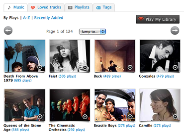
Library
Browse your entire music profile, down to every last play. Add any song or artist with a click. Listen to your library from wherever you are.
Import your listening history
Sync your iPod / media player when you sign up to last.fm to instantly fill your library. Your profile updates when you sync your iPod / iPhone too!
Instant recommendations
Music recommendations just got way more powerful, and now appear in seconds instead of weeks.
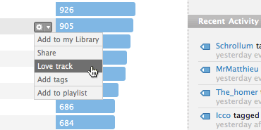
Real-time chart updates
Listen to a song and the charts on your profile immediately reflect the play. The way it should be!
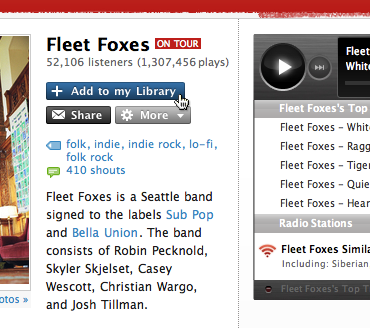
Evident playability
Listen to tracks or radio from a shiny new player, present on almost every page.
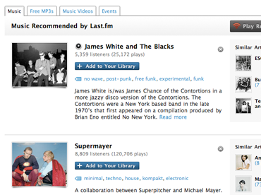
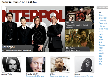
Better browsing
Not sure what music or videos to check out? Head over to the all-new Music and Videos pages for some popular and up-and-coming tunes.
We hope the new Last.fm makes it easier to play, discover, and share great music.
Where’s the afterparty?
We’re just getting started. There’s lots more to come, and you may spot some quirks, so head over to the feedback forums to leave us a comment. This is just the beginning of the new Last.fm platform and we’re counting on you to help us make and shape this generation of Last.fm.
—
*A few missing pieces will reemerge, phoenix-like, in the coming weeks. I’m looking at you ;-)
Comments
igl
17 July, 15:44
Whatever.
How can i get the old layout back?! This is back to the 90ties.
dopaminecloud
17 July, 15:46
What a surprise! I thought it would take longer. Good to see the new Last.fm. Keep up the great work. Cheers!
(lolitas_last)
17 July, 15:46
how can i switch back to the old one?
Katie
17 July, 15:48
I think the new site is wonderful
I just prefered the look, layout and feel of the old version
Can we have a switch button switch back?
Russ Sargeant
17 July, 15:48
LOVE the new look!
Xiong Chiamiov
17 July, 15:49
Ah, I was wondering why the page layout suddenly changed while I was listening to music. The Beta went live! Good job guys, though, from the brief time I looked at beta feedback, I’m sure you’ll have lots of suggestions.
purple_prince
17 July, 15:49
Loving the library. It’ll take a while to get used to the new layout but it looks good to me!
Einar
17 July, 15:51
Sweet! I was also expecting it to take longer. Especially since the Events section was never a part of the beta. I’m looking forward to checking it out now though :)
shadedballroom
17 July, 15:51
I like it!
Tim
17 July, 15:52
Woot!
j
17 July, 15:52
This is terrible! I can’t figure it out! I don’t want to use a site I can’t navigate. The only change I wanted was to be able to play all of the tracks of an artist.
dinog
17 July, 15:53
lol
Liiviko
17 July, 15:54
I would like to get the old version back.
Someone please help me:’(
Derang3d
17 July, 15:55
Ah let the “Can I have the old one back please” comments commence!
Give it a couple of days or so, you’ll get used to it!
Frenki
17 July, 15:55
personally i dont like this new page, maybe i should just get used to but.. can we get back to the old one? i dont think so.. if yes please let me know!
alex
17 July, 15:55
Yeah, how can we switch back?
Joo
17 July, 15:55
i hate it..
Vanished_Life
17 July, 15:56
Where the fuck did the “Weekly Top Artist” chart go? The one generating each sunday…. This new layout really sucks big time!
The_Lurker
17 July, 15:57
This is craptastic. Nothing works. The player says “oops, error connecting.” The top artist tab won’t switch settings (for example, from overall to 7 Days or 3 Months, etc.) when I click on it. Neighbors are no longer displayed on the page. Shouldn’t this thing be debugged completely before it goes live?
Robert
17 July, 15:57
It’s kind of horrific-looking. How do I change it back?
Greg_x7
17 July, 15:57
oooh, the flood of “where’s the <old layout> switch” comments.
News for you all: there is and will be none.
Waiting for the reply tracker, hope you’ll listen to the still ignored/unresolved beta forum comments. The rest will need a little getting used to.
james
17 July, 15:57
Wow. I’m very new to Last.fm and I guess this layout is old? Looks great to me.
Ben
17 July, 15:58
Why is last.fm so slow today? I can barely get the site to load! :(
hemlokk
17 July, 15:58
The old format is better, scrap this.
cross
17 July, 15:58
Hey! Why is the shoutbox so much down ?
someone
17 July, 15:58
please can we at least have the option of the old one? i think it was a lot more modern-looking. and this isn’t very user-friendly.
amodern_man
17 July, 15:59
What has happened to private messaging? I hope you’re not going to tell me I’ve lost all of the messages I had saved…? Also, why not make the profile details bigger and clearer? Despite being at the top of the page they seem a little lost.
Amour_Noir
17 July, 15:59
The new layout is great, but there should be an option for those of us who prefer the old one
ANGRY
17 July, 15:59
I hate it, i hate it, i hate it. I want the old one back. PLEASE say we can have the old version back. You literally just switched it without a fucking word. SWITCH IT BACK. I do not WANT IT. I paid MONEY for the service as it was.
Greg_x7
17 July, 15:59
OLD SCHOOL WEEKLY CHARTS!
are under the Charts tab > view by weekly snapshot.
purple_prince
17 July, 16:00
Just noticed that many of the playcounts have changed! What’s that about?
P-b
17 July, 16:00
cool, cool work man, loving it here =D
Keep up the good work
daveb
17 July, 16:00
Can’t say I care for it at all. I’d prefer the old layout and a choice to opt out of this change.
SweetHeartGirl
17 July, 16:01
I want the old too! Please return it. The new version is unhandy
CitizenX
17 July, 16:01
i want the old layout back too :’(
luckymustard
17 July, 16:01
at least you get something. all i get is a blank window/screen. :(
nymph_
17 July, 16:01
new version SUCKS SUCKS SUCKS!!!!!!
Imothep
17 July, 16:01
Old one >>> new one imo :(
InfernalTide
17 July, 16:01
No, no, no. This is horrible.
Is there any way to get back the old version?
Jester-NL
17 July, 16:02
Cheers guys… if you now manage to get a bit of speed in it ;)
Well done!!
Simon Little
17 July, 16:02
Looks very smart. Well done folks.
One question…. How do I get into the Music Manager section now?
xunk
17 July, 16:02
Honestly the new layout really sux :/
I know it takes time to adapt to a new design, but i’m really not satisfied with this one.
Eg, why take so much space to display the recently listened tracks ?
/me is disappointed :’(
knifeintheback
17 July, 16:03
The new layout isn’t too bad but I really dislike all the red/white. If there was a “Paint It Black” option like on the previous version, I would be all for this. So I guess I’ll be the third to ask how to get the old layout back until then..
amodern_man
17 July, 16:03
Oh and did I mention it now feels like I’m part of some sort of HMV or Virgin project in market surveyance? You know, many of us felt Last FM had more of a Fanzine aesthetic. Your high gloss imparts an air of insincerity AND cod-professionalism. Who are you trying to impress?
Scott Mallinson
17 July, 16:03
I love it! Great work guys, though a little slow at the moment.
FeelSurreal
17 July, 16:03
Kinda looks like amazon
Crazy-Heart
17 July, 16:03
I love it, well done!
Aeghast
17 July, 16:03
LOL I subscribed two days the beta was officially out—talk about bad timing. Overall, I don’t like the new design but I’ll get used to it (and gonna have to, anyway). I’d like to be able to see album artworks in the charts.. I miss that
apaxucka
17 July, 16:03
looks great, let’s see how it feels :-)
Eleanor17
17 July, 16:04
Please tell me it is possible to switch back to the old design… The new structure and features are really great, But I don’t like the new design at all :(
Neverlandean
17 July, 16:04
That was sudden, I didn’t even get to take screenshots of the old beloved version. :(
What about country pages??
MP
17 July, 16:04
I kinda of want the old version back :( is there an option to switch it back?
Becca
17 July, 16:04
The new features sound really good. But the layout..its not great. I loved the old layout because everything was so compact and easy to find. This is just too clunky. Is there any chance we can have a choice to go back to the old one?
Babs
17 July, 16:04
This is a dumbing down of an already fantastic site. For shame.
Claire Cramer
17 July, 16:04
As I said in my feedback to the “beta” version, the new design is hideous. It’s difficult to navigate, unattractive, and much more cluttered. I can’t even bring myself to explore whatever new features you have unveiled because I dislike navigating the new site so much. Please at least give us an option to use the old interface. Otherwise my days of watching my Last.fm dashboard are over.
penguindevil
17 July, 16:05
Great! I’ve been using the new beta for weeks now and I really prefer it. Better information, a more modern and more aesthetic appearance… Though it did take a bit to get used to it at first, I would say that it is a great new look and functionality in all ways.
Thanks!
Mark0990
17 July, 16:06
It’s a huge change but after a couple of time of getting used to it we never want the old look anymore.
Great work!
nancykitten
17 July, 16:06
Oh dear.
xsinthorasx
17 July, 16:06
I’d like to have a black version, too!!
KingTreehouse
17 July, 16:07
Not so much.
The_Lurker
17 July, 16:07
WTF? The charts have been chopped down from top 500 tracks/artists to top 200. That really sucks. No really, it SUCKS.
Neverlandean
17 July, 16:07
Oh and GIFS still don’t work.
The library is EXTREMELY cool though.
vintageways
17 July, 16:08
I don’t hate it (I’m sure I’ll get used to it) but did the playlists become subscriber only? Or is this just a bug?
Tony Dodd
17 July, 16:08
@knifeintheback: Matt’s post did infer that such features would be making a return at a future date – the not-so-subtle link to The Rolling Stones – Paint it Black.
@Simon Little: There’s a link in the footer over on the left hand side, this should get you into the music manager.
CHBtash
17 July, 16:08
the new beta version suxxx!!!!!!!!!!
rocket, golden
17 July, 16:08
“Whatever.”
i agree. and i pay for this ugly … baaahhewfwbL?!
jacky88
17 July, 16:09
the new look is effin terrible…
CHBtash
17 July, 16:09
where is the old version ? I need the old version. jesus christ!
BR
17 July, 16:09
No more Paint It Black? The PIB group is going to be mighty disappointed.
mja0
17 July, 16:10
Love the new layout! Keep up the good work :)
Corbiau-
17 July, 16:10
I want the old one back. :D
Musrum
17 July, 16:10
How can I get the old Last.fm back!?!?
PLEASE make a setting so people can choose which one they prefer….
---
17 July, 16:10
ah man! i LOVED the look of the old one. This looks like emusic or something. we need a button to go back to classic.
idiotsdream
17 July, 16:10
Last.fm’ starting all over again.It’s a new world.Sortof.
And also, no black, or blue skin options?!
GiveMeBackMySon
17 July, 16:10
Hey, anyway we can switch back to the old-layout? This one is making me feel claustrophobic. Cheers.
flybob
17 July, 16:10
I don’t mind learning a new layout, but I miss features like just “play similar artists,” and reading my messages from other users — had some great recommendations there that I didn’t write down. Now more clicks to get to fewer features. I, too, miss the old, faster version.
s129
17 July, 16:11
Dreadful, dreadful, dreadful.
Sorry, but this really is dreadful.
FateGuy
17 July, 16:11
i dislike it. i would love to have the old one back, please!
CHBtash
17 July, 16:11
any chance to get the old version ?
osteri
17 July, 16:11
i’m so dissapointed too!
.‘horrible!
I want old last.fm back…
This new version really sucks… Last.fm is SO slow at the moment..
I don’t like this new version at all.. but maybe in future.. someday.. perhaps..
notlikethat-
17 July, 16:11
I don’t like it!
sh4rky
17 July, 16:12
oh, i see death from above 1979 on the screenshot! i love this band =)
copy666
17 July, 16:12
i hate the new layout! :(
Sptembergurl
17 July, 16:12
What a mess!
I am trying to play my library and I get a cut off message that says “This feature is only availabl”. What does this mean????
I can’t play my list now. Why is that?
MrBingo
17 July, 16:12
Now the list of Top artists and tracks reaches only Top 200. Let’s hope it will go back to the Top 500 if not beyond that.
Jester-NL
17 July, 16:13
To all people complaining about the lack of a change of colour: Have you actually [i]read[/i] Matthew’s blog, or did you just barge in screaming murder?
Andrew
17 July, 16:13
Wow it’s here already.
You guys are sensational!
Senne
17 July, 16:13
Am I the only one who likes the new look better than the old one?
aargh
17 July, 16:13
hey let me already see this new horrific design :P
all i get is a “blank page”, for hours.
Sun Walker
17 July, 16:14
The new designs feels a bit like an iPod plugin. I hope there will be some more customization options available! Agreed about the high-gloss…
nancykitten
17 July, 16:14
So they take something everyone loves and many people (myself included) were happy to pay for, and they change it so much it looks entirely different. How is that good business?
The new features (ie. the library and the instant scrobbling to the overall charts) could have been added without this massive change of look.
LFC
17 July, 16:14
can i switch to the old one?
K
17 July, 16:14
WE WANT THE FORMER LAST.FM BACK!!!
WE WANT THE FORMER LAST.FM BACK!!!
WE WANT THE FORMER LAST.FM BACK!!!
WE WANT THE FORMER LAST.FM BACK!!!
WE WANT THE FORMER LAST.FM BACK!!!
WE WANT THE FORMER LAST.FM BACK!!!
WE WANT THE FORMER LAST.FM BACK!!!
WE WANT THE FORMER LAST.FM BACK!!!
WE WANT THE FORMER LAST.FM BACK!!!
WE WANT THE FORMER LAST.FM BACK!!!
WE WANT THE FORMER LAST.FM BACK!!!
WE WANT THE FORMER LAST.FM BACK!!!
WE WANT THE FORMER LAST.FM BACK!!!
WE WANT THE FORMER LAST.FM BACK!!!
WE WANT THE FORMER LAST.FM BACK!!!
WE WANT THE FORMER LAST.FM BACK!!!
Darkritual
17 July, 16:14
Great job guys, I appreciate the fact that you have worked so much on the new features and functionalities but most of us seem to have gotten used to the old look. I personally prefer that over this one. Maybe its a matter of time.
lotse
17 July, 16:15
It looks ugly and it seems to be kind of similar to that more uglier myspace.
“paint it black” option would be the best.
I hope that everything will be more improved because now it looks like pre-alfa…
Bhanuj
17 July, 16:15
Meh.
add me to the i want the old one back brigade.
this is just too trendy for my taste.
not to mention it really clogs up bandwith on my slow as hell connection.
removable
17 July, 16:16
I like it! especially the fact I’m able to see what horrendous music I used to play three years ago. ;) Could be a little faster atm + the lack of a new message indicator worries me.
Keep up the good work, lads & lassies! :)
Infernal Pagan Necrogoat
17 July, 16:16
well, it will take me some time before I get used to it, but now… it sucks terribly. It’s modern, plastic, without soul :D much like modern metal scene (fight it darkthrone!)… anyway, you didn’t warned us that you will change the interface. All of a sudden, I see this, and I’m amazed, I mean… wtf? Nah, but I really look forward to see shoutboxes of my favorite artists without that stupid comments and spam from random idiots (e.g. darkthrone, burzum etc…). But if the shouboxes stay the same, go kill yourself! hahaha :D
CHBtash
17 July, 16:16
I think I will delete me. byebye last.fm
Tony Dodd
17 July, 16:16
@Septembergurl: Thanks! Bug. We’re working on fixing that now.
Laura
17 July, 16:16
Don’t like it :(
Could there not be an option such as that of myspace, where you can toggle between the ‘classic’ and ‘updated’ layout of the site?
Would solve the problem of the “older” people not liking the layout so much + letting people keep it if they think it’s better :)
Mannaz230
17 July, 16:17
Not fond of it right now at all. I’ll see if it grows on me, but I liked the old layout a lot more.
The new one seems a lot messier, in a Myspace profile kinda way. Not good.
alex
17 July, 16:17
not bad…
Balorean
17 July, 16:17
I HATE the new site!
tigerbomb13
17 July, 16:17
I wouldn’t have minded the new layout, but I’m not happy that over have of my play count is gone.
kay
17 July, 16:17
i don’t like, it’s awful i dunno may take some time to get used to it
sranje_box
17 July, 16:17
disgusting
LoFi
17 July, 16:18
I dont like it, just 15 artist for the charts, the pix is too big, the box are too big, the pix of the artist are too big, gosh, its really suck, the old was too much better.
Duygu
17 July, 16:18
i hated the new one.
Ganymede
17 July, 16:18
What a complete mess I’ve just logged into. And nothing actually plays. I can’t believe people are saying they like it. I dearly hope Last FM didn’t ACTUALLY pay anyone for this. It looks like something designed by a teenager in a basement somewhere in 1989. And did I mention it doesn’t play anything? DO YOU REALISE SOME OF US ARE PAYING FOR THIS? Why is this service getting progressively worse? And no, I’m not “old”!!
pinkyshortycake
17 July, 16:18
the charts are pretty up to date, good thing….
but the ‘recently listened track’ are like ew. you can only see covers from albums wtf is that? It’s confusing! I want those artist pics back D:
also I’m not fond of the size for the user avatars (ways too small) as well as the square on subscriber avatars
you can only see your neighbours by clicking on the page… sucks. sorry to say that
a few futures are quite nice but I could live without them.
Teodor
17 July, 16:18
Sorry but..well, i hate it :D but.. u did a splendid job, really. It would be real nice if there is a switch button, so that we can use the old version,though.However, i will use this version and hope that i’ll get use to it ^^.
Chris
17 July, 16:18
This is pretty awful. I’m now fully unable to play any of my friend’s radio stations (or now “Libraries”) without being a subscriber. I can understand forcing one to pay to listen to their own Library, but I want to be able to hear my friend’s libraries as well without having to fork out cash. Aren’t you making enough money off of ads?
Alberto Walrus
17 July, 16:18
I do not like this
sam
17 July, 16:18
i dont really care wat it looks like i just want to be able to play music but everytime i try and go on my playlist it does that oops error thing! plus this new new website is very slow and i cant even be bothered to keep refreshing pages to see if it’l work the next time!
Endotriad
17 July, 16:18
Ahh, the “I hate it. It sucks. Give me my ____ back.” rants of users. Sounds like a typical IT migration!
I like the general, more modern, push toward a simpler Google-esque feel, although the header graphic seems like a placeholder IMHO.
Speaking of Google (specifically iGoogle), are there any plans down the road to implement the ability to add/drag/delete content sections?
gpberlin
17 July, 16:19
yay! always better! that’s exciting… wonderful, it’s like having a new toy to play with :) new features… new design… thanks!
(well site’s performances are suffering a bit right now)
Luke
17 July, 16:19
C’mon, at least give us a choice of which Last.fm (Beta or older) we want to use. I’m missing the Sunday charts already, and it’s only Thursday! The older one was a lot clearer.
vanh
17 July, 16:19
Could we switch back to the old skin ? You have done a great job. However, the old layout is more like it for me .
swarm
17 July, 16:19
new version sucks!!!
Charlotte
17 July, 16:19
God, THIS IS MY WORST NIGHTMARE…
I loved last.fm so much and, being a beta tester, thought you’d listen to the thousands of people who hated this new layout.
I almost want to stop using the site – but unfortunately there’s nothing else like it.
Please, please, please change it back. Your users will be so happy. And this is really unfair to the subscribers – unknowingly paying for this horrid new site.
Tom Storr
17 July, 16:20
My flippin station won’t load?
trisha.
17 July, 16:20
i honestly do not like the new layout. it reminds me a LOT of purevolume. and all my play counts changed. D:
but i’m not going to bash you guys. this is still one of my favorite websites.
Amy
17 July, 16:20
CAN WE PLEASE HAVE OLD VERSION OPTION PLEASE!!!!!
Hel
17 July, 16:20
Hey guys – I know you’re getting a lot of complaints, but I want to commend you on what looks like a lot of hard work. I’m guessing that it’s slow right now just because so many people are checking it out.
I do have a few suggestions, though. – It would be nice to be able to choose either not to display our recent activity, or to delete certain activities we don’t care to have shown. I don’t really feel like displaying which groups I left. – I really liked having the “top artists this week” prominently displayed – I would always come to check it out. Can we bring that back? Or when we have the “top artists” and “tops tracks,” can it tell us when that was last calculated?
Again, thanks for all your work. Good job.
DONOTWANT
17 July, 16:21
Awful, I thought we had another week or two at least to get comments in because this is just horrid.
HORRID!
pissed off
17 July, 16:21
oh my god, honestly, this new site totally sucks, how can I get the old one back? I WANT THE OLD VERSION PLEASE!!!!!!!!!!!!!!!!!!!!!!!!!!!!!!!!!!!!!!!!!!!!!!!!!!!!!!
lynndelione
17 July, 16:21
BRING MY LAST.FM BACK!
khollohk
17 July, 16:21
i preferred the old layout. this new one is too spread out and looks like a bad facebook page. not to mention that this took away over 500 play counts from me for no reason which i’m not happy about at all. what gives here? the old layout was perfect.
Claire Cramer
17 July, 16:21
Okay, now that I had a pissy fit on this blog, I will state that I’ve found some of the new functions and I really like them. I think the tabbed navigation for settings and the like is well done, and I’m also glad that the search has been improved. Hope to see even more improvements with the Events section – some changes to what you can do with the venues and this site will be even better.
h3avyduty
17 July, 16:21
This new style seems a little muddled to me. I like the new library and browsing features, but the profile splash page needs tightening (i.e. simple like the old one) imo. For example, you have a library section, and a top artists section, showing basically the same thing… also, neighbours aren’t there, and friends are way smaller. I used to like flicking through peoples neighbours to find new music, as that was always more reliable than the recommendation engine, esp for popular artists. Also, i’m not using it till I get the black option, its very unbecoming for a metalhead such as myself :D
notyourproperty
17 July, 16:22
bring my alfa back!
I loathe this new interface …!!!
zeynep kaya
17 July, 16:22
i really hate the new version of the page.well maybe i am narrow minded but i want the old look back. i really never can’t get used to this.There must be an option to choose which version to use. I am sorry that i never gave feedback on beta but i never thought it would be that bad. With this layout last .fm for me looks like it’s lost it’s character and became a web site like any other music site.plzz i want my page back!:(
Kupuntu
17 July, 16:22
This looks lot like Facebook or something. Why you had to do the chenge so fast? Things like Musicmanager, reply racker etc. are missing.
Lndp4
17 July, 16:22
I’m going to echo everything above…i wish i had the option to use the old layout. something about the new style and setup completely repels me.
the old page was something i would visit several times a day for the fun of it, that’s why i donated to begin with :/
…maybe i’ll calm down in a few days about the new layout but right now it looks like a cheap uk webstore.
spotkriszta
17 July, 16:22
Simply don’t like it. This layout is ugly, I miss the latest version. It was simple, but fresh and elegant.
The site is still smart, love the new features like the library, but the colors and the whole layout sucks.
ConsumedImpulse
17 July, 16:22
Anyone else losing their play counts? I lost close to 35,000 tracks played. Maybe it’s taking time to catch-up…
Tony Dodd
17 July, 16:22
@Chris & Sam: Thanks for letting us know, it’s a bug. We’re working on it! =]
RG
17 July, 16:23
paint it black, overall!
KKND
17 July, 16:23
Looks horrible…
How can i switch back to the old one? Where is black skin?!
musaqueen
17 July, 16:23
Old last.fm was soooo wonderful and I really loved spending my whole day on this site.
What did you do??? It looks like crap, its f*cking slow and nothing works!!!
I WANT OLD LAST.FM BACK!!!!
NotStyro
17 July, 16:23
it’s too…white. too…sparse. just have to wonder if they are going to allow background color/image schemes, but that can go bad real fast (see myspace pages).
Maybe a profile page(s) builder with sane choices could be added…
Daniel
17 July, 16:23
S U C K S !
Bring back the old desing!
How can I be gruntled?
17 July, 16:24
The old look was so many many many times better. I’ve added my own stylesheet (God bless Firefox extensions) so that I never ever have to look at something as pointless and Facebook-wannabe as a recent feeds box, especially my own…. Gah. And why do the top artists and top tracks charts cut off after only 15 places? I liked on the old site that I could scroll down my user page and just be given as much information as possible about my listening, now I’m going to have to click through to another page, great, and there’s this pointless library box in the middle, and everything’s more crowded. Way to ruin your site.
danulienka
17 July, 16:24
this is terrible, please take it back…
Maroder
17 July, 16:24
Yeah yeah, the new design is strange, but in time I’ll get used to it I suppose.
There’s another more serious matter though: Earlier today I listened to various playlists, but not anymore!! Why can’t I listen to playlists anymore without being a subscriber (am I the only one who have noticed this?)? BOOOO!
LilThitter
17 July, 16:24
Thanks for crapping up the tags and the album art YO
Nay
17 July, 16:24
I think it’s damn messy. And I kind of feel alienated from my friends.
I hate it, I’m sorry.
nmodesto
17 July, 16:24
it sucks! really bad layout. at least give us the option to stayng with the old.
i really really hated it
pissed off
17 July, 16:24
this site fucking sucks
jane
17 July, 16:24
must confess i’m not a fan of what has just happened to the look/page.
bad_wisdom
17 July, 16:24
PLEASE let us have the old one back. I appreciate that you guys created this new one and I’m sure there was a lot of effort put into it, but I feel like I’m stuck with a twisted nightmare freak baby of Last.fm and Facebook, half the site just doesn’t work and the colour scheme is just wrong.
sco666
17 July, 16:25
The older version was much better. This looks really messed up…
deathvalent
17 July, 16:25
i want old layout back!!!!!!!
this beta is ugly, it so…. stupid and SLOW!!!!!!!!!!!!!!!!!
previosly was more simple
so please, make peoples make their own choice, are they take this new beta or are they keep old last.fm..
cali girl
17 July, 16:25
man, this bites. makes me want to unplug my scrobbler…
dude, please. plastic surgery on aging celebrities looks better than this!!!
where’s my weekly chart? Oh I know, so you can put up 8 big pictures of artists in my top ten. so what? talk about throwing the baby out with the bathwater…
ugg….
Stranger
17 July, 16:25
No. Just no.
CHBtash
17 July, 16:25
:(
Julikaa
17 July, 16:25
shit, i wanna my old layout back!!!!!!!!!!!!!!!!!!! i hate this one!!!!!!! yeah guys, you added new options.. but pff you made it uncomfortable, ugly and awful! that’s a shame!! GIVE ME IT BACK!
horseyofgormy
17 July, 16:25
It looks like MySpace. Hopefully it doesn’t become as annoying as MySpace.
banaanitytto
17 July, 16:26
no no no!
i don’t like it at all.
the only thing i like is that “Real-time chart updates”.
hamstersoldier
17 July, 16:26
mmm, has anyone else noticed the “playlist issue”?
“You need to be a subscriber to listen to this playlist.”
“Subscribers can listen to playlists once they contain 45 tracks by 15 different artists”.
Why only subscribers?
I made a playlist with some music from my own label that worked as a radio (it played in shuffle mode) at the label’s website, and it was fine, a great promotional tool. Now it doesn’t work anymore, look:
http://www.hamsterloco.com/0play.htm
A worried user.
metal_penguin_j
17 July, 16:26
I really, really, really dislike it. One, the charts have less stats listed. I don’t like the alignment of the profile (example shoutbox is poorly aligned on the profile now). Beside the unappealing visual aspect of it takes FOREVER to load & my computer is fast! Omg…please change it back or let us choose which version we want our profiles to be shown as.
khollohk
17 July, 16:27
and yes, you really need to give us an option to view the site the way it used to be. this new layout sucks really hard. i can’t see a single thing that makes it better than the old layout.
also it seems i’m not the only one who lost play counts. that’s just really really shitty. i lost over 500 plays :(
sloncek
17 July, 16:27
I want my old LMF back!
LoneWolf
17 July, 16:27
in one word the new last.fm look is DISGUSTING .. no offense not intentional but this really sucks :(
come on the previous version was loved by millions why change it ? something new is appreciated always if its worthy of the appreciation. . . but this just totally sucks. utter rubbishlynndelione
17 July, 16:28
I always thought last.fm owners knows why we love last.fm and they would never do anything to make us hate it. meh, guess i was wrong.
KEEP UP THE “GOOD” WORK!
matth
17 July, 16:28
Option to stick with the old layout please.
CHBtash
17 July, 16:28
new last.fm sux !!!
MaJax3
17 July, 16:28
Yeah, I agree, can you make an option to use the oLd one?
music critic
17 July, 16:28
bigger longer stronger
AapBart
17 July, 16:28
meh.. tooooo much whitespace, i liked the idea of all the little pictures of artists and ppl from last.fm together..
Also get many many formatting errors in IE6.
hermindseye
17 July, 16:29
It’s AWFUL… just another youtube, jamendo, artistdirect, zune, mog, soundclick etc. layout ripoff. The whole reason I love last.fm is because of it’s thin minimal VERTICAL layout. You can see everything in one linear scroll. Now it’s all fat and bulky and HORIZONTAL like all the other music sites. That and all the squares/divided areas leave it with a more isolated feeling.
mart
17 July, 16:29
oh Christ, please please please give us back the old version.
Fox Amoore
17 July, 16:29
Thanks for taking the time to create a new layout, it looks great. I’ll be honest though and say that I do prefer the older look, it just seems easier for me to keep track of things.
I think a lot of people, including myself, would appreciate the option to choose the style.
Thanks very much!
Ann
17 July, 16:29
Oh my god.. I was realy like this site till this horrible version.. I think about delete my acount because I just cant stand this version…
Vile
17 July, 16:29
Website layout is absolutely horrible in my opinion. Not only is it dreadfully sluggish, but the design has made features that are unintuitive that weren’t previously and also a hassle to navigate. Would be nice if you guys could implement a feature that could let users choose between using the old version of the site and the new one.
lfat
17 July, 16:29
arg i don`t feel like checking it no more now
in_cognitus
17 July, 16:30
Back!Back
New is Horrible!!!
morsmodre
17 July, 16:30
Its terrible!
last.fm doesn’t need a myspace look and feel! thats what make it diferent: focus on music and not in the crapy “lets make 10000 friend that we never see”
Its ok to give us an OPTION so put it configurable!
and jesus … who is your usability enginheer? a blind guy?
_I mean … SO many things wrong! from an engeneering point of view AND from an user point of view!
– the space ocupied by everything – the vertical organization – few contrast (or color for the matter) – the fotos way to big or way to smalljust for starters …
Seriously guy, I love this website/ideia but this sucks big time!
ZombieTrent
17 July, 16:31
id just like it if lastfm couldnt figure out that “cave, & the bad seeds” is nick cave &… like it figures Dylan, Bob means Bob Dylan, if we could have an option of searching for the correct artist name or editing it or something
Matt
17 July, 16:31
I like it!
But Id like to see animated GIF back in avatars .. my avatar just sucks now..
announ
17 July, 16:31
i hate it. it’s slow and ugly! i want the old design back!!!
i hate it. it’s slow and ugly! i want the old design back!!!
i hate it. it’s slow and ugly! i want the old design back!!!
i hate it. it’s slow and ugly! i want the old design back!!!
i hate it. it’s slow and ugly! i want the old design back!!!
i hate it. it’s slow and ugly! i want the old design back!!!
i hate it. it’s slow and ugly! i want the old design back!!!
i hate it. it’s slow and ugly! i want the old design back!!!
i hate it. it’s slow and ugly! i want the old design back!!!
i hate it. it’s slow and ugly! i want the old design back!!!
i hate it. it’s slow and ugly! i want the old design back!!!
i hate it. it’s slow and ugly! i want the old design back!!!
2ool
17 July, 16:31
yay, it just deleted all my Russian Circles scrobbles.
mararie
17 July, 16:31
why? :’(
thule
17 July, 16:31
this is soooooo hard.
You force us?
put back the button or many will go and i will help them go. (Do not take me wrong, but admins can not do what they like to, you are relieable for that what you started)!
trainstobrasil
17 July, 16:31
I really like the new version, and I’ve had some advance time to get used to it. But I also love the old version as well. Is there any possibility of being able to switch in-between the two when wanted? I have different uses for wanting to switch between them and also, for people with slower internet connections it would be helpful.
electechnica
17 July, 16:31
I just lost all interest in visiting this site ever again. I DON’T WANT TO BE A SUBSCRIBER ANYMORE.
I want my money back.
kay
17 July, 16:32
i want my weekly charts back!!!!!
BRING BACK THE OLD LAYOUT THIS ONE SUCKS
aargh
17 July, 16:32
btw. what happened with the weekly neighbors ??
twit
17 July, 16:32
My initial reaction was pretty much “What the? Gimme the old look back!” but I guess it’s growing on me. The interface seems really sluggish though but I hope it’ll pick up over the next couple of days or so. Considering the old interface was painstakingly slow on an old machine I can’t imagine what this new look would be like, thankfully my ‘puter is decently new :)
What I really don’t like is how the interface only uses around 3/5ths of my monitor width, too much waste on the sides.
john
17 July, 16:32
i’m really not liking it.
plus nothing works.
all i wanted to do was listen to some random tunes related to lamb and now i’m struggling to find the way to do it.
and of course nothing is actually playing.
the old style was excellent.
why not just revamp that.
it wasnt broke. dont erase it to fix it.
Septembergurl
17 July, 16:32
Thanks for trying to fix the bug.
Also, what happened to the feature that allows you to play a a little embedded pop-up window on your screen rather than having to control it from the website itself?
I miss this!
Angie59
17 July, 16:32
Ah, shit!
The previous one was better. Much better.
new design sucks.
abandapart
17 July, 16:33
Impossibly slow loading and as of yet I am unable to get the music player to function.
homikus
17 July, 16:33
Well, it was quite a surprise to see it now, without any warning ;)
It definitely looks better than a few weeks ago, I’m even starting to like it. But it’ll take some time to get used to.
Congratulations and thanks for your work, I know how much effort it costed and still costs!
still thule
17 July, 16:33
do something or you ship will become kinda very small!!!
nnsa
17 July, 16:34
Nononono. I’m really not sure if I’m using last.fm anymore. Why change such a good site for this? I hope that there will be an option to use the old version… This is really horrible.
LoFi
17 July, 16:34
So, more compelling? Gosh, its too slow, for navigate around the pages it take 10 minutes, it’s horrible!
Jason
17 July, 16:34
Congrats, Last.fm looks like a bad version of Facebook.
Most of everyone dug the old layout and would have been happy with improved features and new additions, the new visual look seems like last.fm is just trying to capture the success of other sites with a similar look. Where as I always liked Last.fm as it was original and doing something that had not been done before.
Anurem
17 July, 16:34
Is the worst last.fm ever, sorry but i don’t like it this version, i give out of last.fm you loose a ecxelent boy.
www.last.fm/user/Anurem
Infernal Pagan Necrogoat
17 July, 16:34
Sto ljudi, sto ćudi!
Sto žena, dvisto cica!
Veith75
17 July, 16:34
The old look was very unique and constituted its own brand. The new one is just horrid in my opinion. I wish there was a button which could take me to the old verion I so got used to and loved so much.
I am also trying to learn how to manage my artist/label and am failing to do so as yet.
Gosh, this is all quite depressing lol
Thanks for the effort put into creating something new but I am sorry… I mainly dislike it :-/
thesilentera
17 July, 16:35
Why? Why fix what wasn’t broken? I LOVED the old last.fm. It was simple, user-friendly, aesthetically pleasing. To be honest, from a web developer’s point of view, the site looks like garbage. It is way too busy. It takes forever to load. You have pictures all over the place. I realize that maybe some people like to see artist and album pics but all that really does is look confusing and slow things down. To make it worse, half the time text runs into pictures because it’s not loading properly. To be honest, your search function is terrible now. Again, what’s with the pictures? When I search for something I want TEXT. I think the old player was better and more-efficient. I could go on and on. I really don’t think it could be much worse. Remember, less truly is more.
Please, please, pleeeease allow us lovers of the old layout to have that option.
Kordian459
17 July, 16:35
To be honest I don’t like this new layout at all. It could be useful to let choose to users between old and new site.
Me
17 July, 16:35
Sorry to be ungrateful, but I really don’t like it. As subscribers we should at least have the opportunity to change it back!!
miguel
17 July, 16:35
ok. i LOVE last.fm. and i really apreciate your hard work you guys, but i hate the new platform. where are the weekly charts? and i’m not talking about the last 7 days charts. and can we “paint it black”???
sorry, i just hate it.
lfat
17 July, 16:35
ctrl+z
jim ross
17 July, 16:35
This is the big bad beta i feared … fraid my feeling is close to many of the oh no!!s above
the tight design and visual coherence of the old last fm was a big plus for a design proffessional like my self… Don’t chase the other social network shites with you grafic style … it is crass … over commercial … stinks
please … have some sence … at least offer us ‘skins’ of the old page to keep us old timers happy
and my animated gif has died
what a day
Michelle
17 July, 16:35
If anything, I’d like to see the caching speed up.
WE WANT THE FORMER LAST.FM BACK !!!
17 July, 16:36
WE WANT THE FORMER LAST.FM BACK!!!
WE WANT THE FORMER LAST.FM BACK!!!
WE WANT THE FORMER LAST.FM BACK!!!
WE WANT THE FORMER LAST.FM BACK!!!
WE WANT THE FORMER LAST.FM BACK!!!
WE WANT THE FORMER LAST.FM BACK!!!
WE WANT THE FORMER LAST.FM BACK!!!
WE WANT THE FORMER LAST.FM BACK!!!
WE WANT THE FORMER LAST.FM BACK!!!
WE WANT THE FORMER LAST.FM BACK!!!
WE WANT THE FORMER LAST.FM BACK!!!
WE WANT THE FORMER LAST.FM BACK!!!
WE WANT THE FORMER LAST.FM BACK!!!
WE WANT THE FORMER LAST.FM BACK!!!
WE WANT THE FORMER LAST.FM BACK!!!
WE WANT THE FORMER LAST.FM BACK!!!
WE WANT THE FORMER LAST.FM BACK!!!
WE WANT THE FORMER LAST.FM BACK!!!
WE WANT THE FORMER LAST.FM BACK!!!
at least give as options and choices !! this is not “social music revolution” anymore
Dirk
17 July, 16:36
Sorry but I hate it!
Please don’t follow the netlog lay out.
All our work in the left bar of Classic Rock group is gone. At least let us have the choice between the normal and the new look. I guess the most will take the old one!
fuelbomb
17 July, 16:36
I want a “paint it black” option, I hate red and white!
I also don’t like seeing the band photos in my recently played tracks list. :(
c0rt3z
17 July, 16:36
i like the new last.fm… especially that you can see, where you last posted somethin into a shoutbox and all that stuff. dont listen to all those haters, they always appear when something changes…
its good =)
hermindseye
17 July, 16:37
Get a f’ing clue! We don’t like it! It’s sluggish, too much BS to navigate around, and too commercialized. Back with the old simple yet futuristic style where we could see everything/one in one page more or less. What the hell were you guys thinking?!
I don’t think I’ll be hanging around as much anymore… just might take my music down as well.
spotkriszta
17 July, 16:37
From nancykitten: “The new features (ie. the library and the instant scrobbling to the overall charts) could have been added without this massive change of look.”
Exactly. We appreciate your hard work on the new site, the new features are absolutely great, but… you know it. :)
Tecfan
17 July, 16:38
just because you suck at navigating doesn’t mean that the site sucks.. although it was slow, and I’m missing the first page of shouts on the front page, the site is great
ghcursino
17 July, 16:38
WE WANT THE FORMER LAST.FM BACK!!! [12873617852937218472917321]
Jerry
17 July, 16:38
Haha, wow, I know we were pretty harsh on you guys with the last relaunch, but I don’t recall it being as bad as this! I guess I’ll grow accustomed to it like I did last time.
I am glad you finally ditched the glossy Aqua look, though. I never could stand it. This layout is a lot more modular, can’t wait to see what other features you have planned. Just… please… don’t start with the Facebook-type apps, aight? :)
Rabenbaer
17 July, 16:39
are you working on making the list for the charts any longer? it is so much shorter than the old one, so much of my charts are lost now :( e.g. before it showed all my artists including those I played 10 times, now it’s at 35!
FuGen
17 July, 16:39
dear madams and sirs,
you pissed off a lot of people. good job!
yours faithfully,
FuGen.
britpopgirl
17 July, 16:39
I’d like the option to switch back to the old layout :(
Alastair
17 July, 16:39
The layout is vile. Whoever did the front-end design on this should be sacked, it’s a joke. Far from looking more engaging, it’s actually horribly disjointed and extremely second-rate. You’ve destroyed everything that was good about the page layout. It’s SO ugly! I can see I’m going to be spending a LOT more time on iLike from now on…
Big mistake people.
cross
17 July, 16:40
@Tony Dodd: Hi, I quite like new design. BUT pls … can I move the ShoutBox to the top?
Sorry for my bad english, I hope you understand.
Pascal
17 July, 16:40
I like it and I even liked when it was back in beta. Looks clearer and all around better than the dusty “old” version. Let’s see how many of the whiners will accept the new style in a few days, because most of those guys who want to boycott stuff or want to do similar stuff seem to change their mind pretty quick. :D
trainstobrasil
17 July, 16:40
actually, the only thing I like about the new version is the option to look at ALL of your old shouts. I really appreciate that feature and it’s quite useful. But if you could somehow implement that tiny feature into the old version and get rid of the Beta version altogether. A switch between versions button PLEASE! and I also have lost a lot of scrobbles :(
Burkman
17 July, 16:40
Dude, Last as I know it is gone.. I liked it as it was before. I feel raped.. Guess that I’ll learn to love it though, I mean, the staff has got to have great intentions behind this idea, and I can’t do anything but to trust them. Really hope that the site will speed up though. Kinda slow atm ><
Agree with hermindseye btw, but let’s see.
xGeraldx
17 July, 16:40
WE WANT THE OLD LAST.FM BACKKK!!!
WE WANT THE OLD LAST.FM BACKKK!!!
WE WANT THE OLD LAST.FM BACKKK!!!
WE WANT THE OLD LAST.FM BACKKK!!!
sorry but this one doesn’t even look nice!
arsonist
17 July, 16:40
what is this? facebook.fm?
soundofsuburbia
17 July, 16:40
(I’m pretty sure this is covered above, but what the hey.) This is awful. For instance: One of the things I love with Last.fm is watching what my friends are listening to. That “box” has been degraded, now I have to scroll to get to it.
I had faith in this redesign. I thought things wouldn’t change so much. Last.fm used to be damn near perfect and now it’s not.
sundown_orange
17 July, 16:40
The old look is more cohesive and visually appealing.
Will
17 July, 16:40
Wow; I like the new layout. This huge outburst reminds me of when Facebook changed to the newsfeeds. Over time people will shut up.
Elouise
17 July, 16:41
Disappointed I am with the new site :(
I almost cried when I saw the site.
Oh, well… Looks like I’ll have to get used to it.
musaqueen
17 July, 16:41
It was perfect ♥
But then you ruined everything with that shitfucking beta site!!!
I don’t think I’m gonna stay longer here if you dont change it. You see that more than 95 % hate this betaversion!!!
Its time to change it back
cansu
17 July, 16:41
it would be good if there is a switch back to the old view. i really don’t like the new one. it is a big mess. it looks so bad and it’s not useful. there should be a switch back to the old one for the ones who hated the new one.
CHBtash
17 July, 16:41
the new shoutbox is terrible. I need it on the left site or on the top!
charts top 15 ? I need the top 50!!!
charts top 200… I need the whole top 500!!
kelsey
17 July, 16:41
i cannot stand to look at the site now. it is absolutely disgusting. there NEEDS to be option to use the old layout.
Ju
17 July, 16:41
Well… design can be ok but… I hope it’s just a matter of time before we have our Top 50 back again. Top 15 is just… not enough and quite disturbing!
So are there plans to bring the Top 50s back? And Weekly Charts too, of course…
DeadLyRoSe
17 July, 16:42
Lol…didn’t expect that. im kinda confuse with that new look. well guess i’ll get used to it. and i like some of the new stuffs but….i want Last.fm in black anyway.
tigerbomb13
17 July, 16:42
I really like the real-time updating charts. I must say the old layout was much better however and I’m not happy that 10,000 songs vanished from my play count. Also I much prefer when it showed my top 500 instead of 200.
angry man
17 July, 16:42
Someone already said it but:
WTF? The charts have been chopped down from top 500 tracks/artists to top 200. That really sucks. No really, it SUCKS.
I agree 100%
Julian
17 July, 16:42
Why the hell did you change it completely???
Why did you decide to “build a completely new version”??? Who does that?
Change should be incremental, you could’ve integrated everything in the “old” last.fm!
MidwinterSun
17 July, 16:42
This new look is TERRIFIC! I am really sorry to say this, but the old one was so much better. At least leave an option for the old design to be used! This was Last.fm, for God’s sake, not some stupid copy of MySpace! People were supposed to be able to see WHAT I LISTEN TO, not some other stupid things. 15 artists? Who, on earth, limits their taste to ONLY 15 ARTISTS? And songs? Where is my shoutbox, huh? At the bottom! One of the best parts of your site and you threw it on the bottom. I can’t even make the red colour disappear like I was able to before, it’s annoying.
You failed, guys. I don’t know what’s the big thing about web 2.0 but it’s really making me mad already. I can’t even look at this site anymore.
P.S. Oh, yeah – and besides, it’ slower than ever. It takes centuries to load!
residueofbliss
17 July, 16:42
God… I want the old layout back too, this just looks all like a mess and reminds me of more website conforming to a MySpace/Facebook look. The last layout was so much more original and, well, convenient. Everything just lost its shiny.
Hannah
17 July, 16:42
The new layout is hideous! It takes forever to load, and forever to find things. There’s so much wasted space in the recent tracks section, and seriously, why have the “library” in addition to the “top artists”? It’s redundant and takes up a lot of space. Before everything felt simple and integrated. Now it is messy and juvenile. I really appreciated the old aesthetic, and will probably leave the site if this doesn’t get better.
KD
17 July, 16:43
I really hate when sites do this. They decide to change the layout and ‘spruce’ things up a bit. Myspace did the same thing, but atleast they give us a choice of what layout to use. I want to have a choice, please! I can’t even see all of my top artists.
Helio
17 July, 16:43
I want the old back too!!!
cara
17 July, 16:43
i hate it. it looks like facebook… plus i still can’t get my head round why you won’t allow people to block each other.
Moioui
17 July, 16:44
Where is the playlist? D:
To I have to subscribe to listen to it? …
.ghcursino
17 July, 16:44
kkk vosës söa engarsados bjs viva o brasil
richard dixon
17 July, 16:44
mine does not play now—what do i do??
Suki
17 July, 16:44
what’s this new site trying to be? some kind of myspace? why did you put the focus away from music, charts and statistics? why do you make things complicated and irritating? and no, i won’t get used to it when i get to know the new site better. i hate it and i want the old last.fm back. without the unnecessary crap which is in the forground now. please let users decide wether they want to use the classic style or the new stye! :(
ihatethenewlast.fm
17 July, 16:44
THIS IS BOLLOCKS
amodern_man
17 July, 16:45
I wish you wouldn’t assume it’s simply a case of ‘people getting used to it’. It’s terrible.
Jordan
17 July, 16:45
I think I could get used to the new layout. I’ll sorely miss the relative width, though. It’s a rare breed of website that can execute that well, and Last.fm was one.
seffe
17 July, 16:45
well, new functions seem to be quite cool. but i agree with the fact that it is all too big. every box, every item needs too much space. a lot of scrolling. but well, maybe i get used to it.
dirtyskunk
17 July, 16:45
where can we see who’s attending which event(who clicked it today)? That feature was really helpfull as you had a good view where your friends are going… now it’s not so visible + you must really browse hard to find new events. I liked the old one better!
music critic
17 July, 16:46
aight now everybody calm down. it’s time to realise that last.fm isn’t a democracy m’kay ?
you’ll get over it ;-)
Disappointed
17 July, 16:46
I miss the old looks, PLEASE give us an option to stick with it. The only good thing about the new last.fm is the real-time chart updates.
PLEASE
17 July, 16:46
can we get a switch back option? the new layout is just awful. it feels like facebook.
newlast.fmsucks
17 July, 16:47
Get the Old Version Back! The new Last.fm is terrible.
sid
17 July, 16:47
How much time’s gonna pass by before you give up and bring the old version back?
Can’t you see almost everybody hates it?!
I’M ON STRIKE FROM NOW ON !!!!!!!!!!!!!!!!!!!!!!!
I’ll immediatly log out now for a long time!!!!
stoppingthetime
17 July, 16:47
Some things are really cool but what bothers me the most is that the small font makes my eyes hurt and you now have to scroll way down to leave a shout. That’s so annoying!
The Soilborn
17 July, 16:47
gimme my old last.fm back….
the new one looks freaking ugly =(
Kate
17 July, 16:47
bring back the old one!
tifosi3
17 July, 16:48
The new interface is very bad and chaotic :( I want my informations on the LEFT of my profile, like in the old interface. We read from LEFT to RIGHT and not right to left !!!!!!!!!
and sorry for the approximative english….
kate
17 July, 16:48
i agree with others to have the option of choosing the old or new layout…
the new one simply isn’t as aesthetic pleasing or as easy to use as the old one.
j stephenson
17 July, 16:48
thats the last you will see of me to good bye
Tom21
17 July, 16:48
I can’t say i’m a fan of this new layout at the moment. It seems like you’re trying to change something that didn’t need changing – maybe a few new graphics here and there would have gone down nicely but everything’s too bulky and there’s too much white space.
The new charts that display on profiles don’t give a good enough overview of somebody’s listening and overall the new looks really ISN’T pleasing to the eye at all. I’m a fan of the ‘player’ on each page because it does look great and lets you stream songs pretty quickly, but previous version was just so much simpler and there was nothing wrong with it!
If it ain’t broke, don’t try fixing it!
bullfroggreen
17 July, 16:48
On the former last.fm page for my profile I/others could view my TOP 50 favorite artists, now it’s cut down to 15 ???
Yeah, I prefer the former last.fm much more than this. Sorry.
Cid
17 July, 16:48
I just wish i could listen to my playlist like before (in other words, without needing to subscribe)
and of course, a black skin (reds not bad, but black is way better)
Marko
17 July, 16:49
Oh f#CK!!!What did you do to the website!
Oh my , oh well I guess I’ll need another year to get used to it.
O_o
XexxonvaldezX
17 July, 16:49
WE WANT THE FORMER LAST.FM BACK!!!
WE WANT THE FORMER LAST.FM BACK!!!
WE WANT THE FORMER LAST.FM BACK!!!
WE WANT THE FORMER LAST.FM BACK!!!
WE WANT THE FORMER LAST.FM BACK!!!
WE WANT THE FORMER LAST.FM BACK!!!
WE WANT THE FORMER LAST.FM BACK!!!
WE WANT THE FORMER LAST.FM BACK!!!
WE WANT THE FORMER LAST.FM BACK!!!
WE WANT THE FORMER LAST.FM BACK!!!
WE WANT THE FORMER LAST.FM BACK!!!
WE WANT THE FORMER LAST.FM BACK!!!
WE WANT THE FORMER LAST.FM BACK!!!
WE WANT THE FORMER LAST.FM BACK!!!
WE WANT THE FORMER LAST.FM BACK!!!
WE WANT THE FORMER LAST.FM BACK!!!
WE WANT THE FORMER LAST.FM BACK!!!
WE WANT THE FORMER LAST.FM BACK!!!
WE WANT THE FORMER LAST.FM BACK!!!
joey
17 July, 16:49
seeing as how absolutely no one likes the new layout, there needs to be an option to get the old one back. work it out.
Jedi_Amara
17 July, 16:50
I strongly object to the new look – it’s far too spaced-out (space is good, but not so much – especially on 1024×768, which is still used by about half the web community) and hard to find things, it’s slow to load and nowhere near as user-friendly. It’s forcing Flash player load (I have dialup; I used Last.fm partly because I didn’t have to load all those annoying Flash files), important stuff is no longer above the fold – I have to page-down four times just to get to my shoutbox. There’s no room to customise, it feels like you’re trying to turn this place into a much less functional version of Facebook – “lastbook”, as it were. The database is the same – surely it can’t be that difficult to offer an option for the old layout, at least?
I’ve created a group for those who would like to see the option available – join us at http://www.last.fm/group/Bring%2Bback%2Bthe%2Bold%2BLast.fm (or click my name) Despite having MADE the group, I don’t seem to be listed as a MEMBER (or as group leader, though I seem to be able to do group leader stuff – happens with my other groups too) – well done, Last.fm.
sallysitwell
17 July, 16:50
This is hella slow, you guys. Speed it up, Johnny.
Matzoe
17 July, 16:50
Sorry, but I strongly dislike the new look and arrangement, as it has been discussed in the beta forums – space isn’t used accordingly/sensibly and this crayon-like red/dark grey highlights look like some kindergarden-website.
matt
17 July, 16:50
Wow, is there a way to get the normal theme back? I’d like to have a cool site to look at, not a generic piece of garbage, please.
barlw
17 July, 16:51
What is this top 15 bullshit.
Half of the page is pictures of 6 bands.
This sucks
Lynsay
17 July, 16:51
I’m not sure about the new layout but I think it’s going to take a while to get used to. Would there be a chance of letting users decide whether to use the new layout or the old layout (like a skin switcher)?
CL
17 July, 16:51
Please stop trying to be facebook. I liked you being last.fm. Ick.
Skills
17 July, 16:51
Please change back, even though the new layout looks fresh and modern, i prefered the last one. The music player wont load either and it takes ages for pages to load.
Kraldyo
17 July, 16:51
It kinda feels isolating, but nothing much, it’s actually really nice, loved it, anxious to see how will it look on black though. :}
Scrobbling is offline, so, is a big update for the software coming? And about the avatars, mine was an animated .gif, it’s not animated anymore, should I bother re-uploading it, will it go back to normal in some time, or are you getting rid of gifs for good and I’ll have to find a new avatar?
fourpumpkins
17 July, 16:51
i hate it, now its just like everwhere else like myspace and facebook :-(
how do i change it?!
nina
17 July, 16:51
I’m not sure if I wanna keep last.fm now…this new look is horrendous.
evilhomestereo
17 July, 16:51
change it back or at least give the option to change it back. this is horribly disorientating and cluttered. i don’t like it at all and i think you should take note of the overwhelming negative response and change it back.
John
17 July, 16:51
Fuuuuuuuuuuck I hate this beta bull shit shit shit! Pleeease make an option to use both versions of the site or something.
Why did they even make the new one…it’s horrible. They could have saved much precious time and energy by just fixing issues that needed to be dealt with in the older version.
frostiblack
17 July, 16:52
Do not want.
ghcursino
17 July, 16:52
I think you are going to lose some subscribers :D
Pomai
17 July, 16:52
i really really REALLY like the new last.fm!
i don’t know what else to say!
Andylat
17 July, 16:52
don’t likeeeeeeeeeee the new format :(
tha old was good and smoth, the new one is dizzy
Adriaan
17 July, 16:53
I love the new lay-out! It is a massive improvement from when the beta was first launched. Good job!
Dave
17 July, 16:53
Tom21:
“It seems like you’re trying to change something that didn’t need changing”
I think that just about sums it up. The site was sleek and functional, displayed all of the information you wanted to see and used all of the space available.
This new version is a step backwards, far too much blank space and yet the useful information is somehow still a cluttered mess. If it wasn’t for all the shiny Web 2.0 nonsense taking up the space where the data which the site is supposed to present should go, I’d assume this was some kind of Version 0.001 of the old site.
bobhall
17 July, 16:53
dear god, it’s disgusting looking
Stephan
17 July, 16:53
Well, it’s definitely different..
Anyway, many sites have options to choose your own layout, so maybe add some option how you want your Recently Played Tracks displayed.
I mean, I kinda liked the ‘square’ with the 10 songs/artists, with the list next to it. It had less open spaces and it just looked great ;D ..
frommel1972
17 July, 16:53
change it back or give me the possibility to use the old layout. THIS SUCKS THIS IS TERRIBLE THIS IS UGLY. I HATE IT!!!!!!!
aBitGone
17 July, 16:53
Love it, love it, love it.
I reckon there’s a lot of people who aren’t telling you what a fab job you’ve done – people are quick to say what they don’t like, but not so quick to say what they like.
Well done team Last.fm!
thisisall1word
17 July, 16:53
I have been having a go with the beta for a few days – didn’t think the go live was happening so soon!
It’s just all a bit loud and scary!
The old site was simple, clean and with lots of white space to make it easy on the eyes.
New site is a bit ‘busy’ on the eyes, chunky and softer.
Not loving it at the moment but I’m sure that my opinion will mellow out over time.
Its either stick with it or revert to keeping copious paper records of my listening habits before sending weekly digests of them to close friends via carrier pigeon.
Dirk
17 July, 16:53
Can’t find my inbox anymore !!!
HELP !
Still hope this is a bad dream. A very bad dream.
Jedi_Amara
17 July, 16:53
I’m rather thinking you need to fix the bug where groups are listed as having “0 members” and no leaders.
dave
17 July, 16:54
this is horrible, go back to the old layout
Mormon88
17 July, 16:54
so many little babies on this site that can’t handle change, apparently.
my only problem is that my avatar is no longer animated… come on now. fix that please
belin
17 July, 16:55
oh no. phear the new crappy layout…
Wic
17 July, 16:55
Total dissappointment !
-Left part got a lot of space.
-Cant see our neighbours at first page.
-Shoutbox HAVE TO be at the top of the page couse its hard to reach it after many tracks.
-Cant change the colour ?
-Harder to manage.
-Archive thing is totally useless.
-Music Player looks like stolen from myspace.
I hope we can get old looking back as an option.
You guys must work on adding skins not changing it.
audiodre
17 July, 16:55
What a bad idea, this. Can I at least make it black again? Last.fm WAS my favourite website. D’oh!
Mel
17 July, 16:56
Hmmm, well I hate sounding ungrateful, but… I can’t play any songs, and even if I could it wouldn’t be worth it because the page takes so long to load. The videos still play thank god, but I hate how they go all the way to the end of the page and the names don’t come with. And the overall layout isn’t really tasteful. I know it is still the first day and all and i should be patient, but when the site doesn’t work at all and slows down the rest of my computer it makes me a little irritated. Thanks for trying though :-)
sonicster
17 July, 16:56
i hate it…i loved everything about the old last.fm…it was perfect…
I can’t even look at the site now.
nat
17 July, 16:56
You guys are amazing. I love your work and everything you stand for.
Thank you.
Oliver
17 July, 16:56
Actually having a choice between the new and old versions would be nice, since the new layout doesn’t appeal to quite a few people, judging by the comments. I’m not terribly keen on it, I have to say. The old layout was much more intuitive.
Allan
17 July, 16:56
wtf? this is absolutely terrible
is there a way to get the old version back? this is horrendous. first myspace, now this.. why do you feel the need to change it and make it so ridiculous and high tech ?
can I get the old last.fm back? please?
TERRIBLE JOB… please make some way for us to have the old version :|
thehoneyinside
17 July, 16:56
Does anyone know where the Reply Tracker is located on this new version? I think I’ve looked everywhere and I can’t find it.
I agree with what someone previously said… it definitely slows everything down but I think once I get used to it I’ll like it. I just want my Reply Tracker!!!
wideawake01
17 July, 16:57
the charts suck.
shoutbox is so far down.
the old design was much better.
whats that fucking commerical!?
bring the old one back!!!!!
Samppa666
17 July, 16:57
yayy.. now that youve had yer fun with the new and slow last.fm.. how about putting the old one back up?
V
17 July, 16:57
The top bar is terrible. Please let us know how we can revert back to the old style. Or make an optional style for the top.
The charting is nice. I would love to see weekly tracks more prominent as well.
But please, please, please get rid of that top bar. It’s a step back from the old graphical design.
Honzeecheck
17 July, 16:57
Hmm… dont care bout the design but where is dashboard and top week artists? It sux!
Allan
17 July, 16:57
please let us be able to use the old version.. I wouldn’t have signed up to the site if it were like this originally…. it’s terrible.
Jessica
17 July, 16:57
I don’t like the new look and design, I can’t get anything to play and it keeps telling me that all features are unavailable to me.
copy666
17 July, 16:57
i can’t upload a new image with mac osx and firefox/ safari!
give me the old layout back!
Niklas
17 July, 16:57
when reading all this “back to old-version” claims i think it’s really funny. since i was beta-tester i am now really used to the new layout and are very satisfied with it. it is in fact less cluttered!!
these shouts are just the same as a baby which is dropped into cold water and cries for getting back to her mother’s bed. but baby will get along with fresh water.
Henli
17 July, 16:57
I lost 3000 tracks scrobbelt.
For the rest. Library is cool.
But still… Where is the user page and de last.fm forum page? How must I now find groups?
Jason Peter Oliver
17 July, 16:58
Hi gutted you’ve changed my fave radio station now i cant get it to play any suggestions
Mildgold
17 July, 16:58
The design is horrible. Im all for all the new features and making it more social network like but this is just pathetic design. Even the first beta images to leak were way better than this final version. Depressing :(
elli_q
17 July, 16:58
Not a fan of the new look, seems kinda empty and white… and it takes waaay to much scrolling to see anything…
I don’t really care much for the ‘library’ thing, that’s not what I use last.fm for… this new look just doesn’t seem very functional, it’s all bulky and every single thing takes up sooo much space… I prefer the old one, especially the option ‘paint it black’, I hate this red thing.
Probably the only thing I like is the option to easily switch between ‘last week’, ‘last 3 months’ and other lists, but I wouldn’t mind giving that up for having the old, but better, last.fm layout.
Honestly, if the site looked like this from the begining, I doubt that I would ever join….
asoio
17 July, 16:58
I also want my playlist back!!!!!
sh0kr0k
17 July, 16:58
“Could be a little faster atm + the lack of a new message indicator worries me.”
This.
Way too slow and clunky. Not everything needs to have fancy coding/scripting.. it just causes delays. The longer I have to wait for a pages to load, the less likely I will use the service.
The layout is nice, though I’m conflicted about the side-bar. I had it all nicely formatted and many people spent a long time making graphics and text blocks to fit the width – and it’s all junk now. On the other hand, I LIKE that it’s bigger..
PLEASE ADD A NEW MESSAGE NOTIFICATION!!!
My favorite addition: being able to hit “ENTER” in the shoutbox and it actually works! ;)
This is all really nice, but I’m afraid of the speed of things. I love last.fm because there is so much information at my fingertips. Please don’t make it harder/slower to navigate for the sake of “looking pretty”…
And do we really need to be like all the other sites with the Applications? Seriously… this just opens the floodgates for non-music-related content. sighs Everything thinks they have to “trendy” but last.fm has never done “what everyone else is doing” – you guys pioneer new ground, not copy sh*t! wtf?
MY PLAY COUNT IS OFF BY ALMOST 500 SCROBBLES!!!!! Not cool!
Overall, thanks for the update, but please don’t make the site any slower than it was.
Jaskotel
17 July, 16:58
@the Team:
Is this some kind of joke?
You will regret it, I promise :P
@the Users:
Let’s boycott Last.fm or sth. Don’t let it be this way…
z0mbix
17 July, 16:58
bah! whingers… I love it! Much cleaner, thanks to everyone who made it happen.
winterberryxxx
17 July, 16:59
ARGHHHHHHHHHHHHHHHHHHHHHHHHHHHHHH!!!!! I’m sorry, but I’m already hating this “New” lastFM. The layout looks CHEAP & ontop of that, NOTHING works! I’mgetting errors all over! My page is S-L-OW! I hate beta. They crap all over everything. I’m BUMMEDx10
marauder_bex
17 July, 16:59
lol at all the “sux” comments, give it a few days you’ll love it.
And to the 2 grumpy people that said they pay for their last.fm usage you mean you subscribe, yes? Ergo if you’d paid attention you could have been testing this layout in beta since May. Just saying…
I guess the site’ll speed up a fair bit once people have stopped flailing in horror at the change, yeah? I had to refresh 3 times just to get onto my profile…
butthole_surfer
17 July, 16:59
Sucks. You broke the embedded player (at least at work). I won’t even go into the new layout.
Hopefully you feel the backlash like Netflix did over profiles and come to your senses.
SweetHeartGirl
17 July, 16:59
Please, make a button for old layout!!!!!
Metatron
17 July, 16:59
It’s not that good.
ihatethenewlast.fm
17 July, 16:59
WE WANT THE FORMER LAST.FM BACK!!!
WE WANT THE FORMER LAST.FM BACK!!!
WE WANT THE FORMER LAST.FM BACK!!!
WE WANT THE FORMER LAST.FM BACK!!!
WE WANT THE FORMER LAST.FM BACK!!!
WE WANT THE FORMER LAST.FM BACK!!!
WE WANT THE FORMER LAST.FM BACK!!!
WE WANT THE FORMER LAST.FM BACK!!!
WE WANT THE FORMER LAST.FM BACK!!!
WE WANT THE FORMER LAST.FM BACK!!!
WE WANT THE FORMER LAST.FM BACK!!!
WE WANT THE FORMER LAST.FM BACK!!!
WE WANT THE FORMER LAST.FM BACK!!!
WE WANT THE FORMER LAST.FM BACK!!!
WE WANT THE FORMER LAST.FM BACK!!!
WE WANT THE FORMER LAST.FM BACK!!!
WE WANT THE FORMER LAST.FM BACK!!!
WE WANT THE FORMER LAST.FM BACK!!!
WE WANT THE FORMER LAST.FM BACK!!!
WE WANT THE FORMER LAST.FM BACK!!!
WE WANT THE FORMER LAST.FM BACK!!!
WE WANT THE FORMER LAST.FM BACK!!!
WE WANT THE FORMER LAST.FM BACK!!!
WE WANT THE FORMER LAST.FM BACK!!!
WE WANT THE FORMER LAST.FM BACK!!!
WE WANT THE FORMER LAST.FM BACK!!!
WE WANT THE FORMER LAST.FM BACK!!!
WE WANT THE FORMER LAST.FM BACK!!!
WE WANT THE FORMER LAST.FM BACK!!!
WE WANT THE FORMER LAST.FM BACK!!!
WE WANT THE FORMER LAST.FM BACK!!!
WE WANT THE FORMER LAST.FM BACK!!!
WE WANT THE FORMER LAST.FM BACK!!!
WE WANT THE FORMER LAST.FM BACK!!!
WE WANT THE FORMER LAST.FM BACK!!!
WE WANT THE FORMER LAST.FM BACK!!!
WE WANT THE FORMER LAST.FM BACK!!!
WE WANT THE FORMER LAST.FM BACK!!!
WE WANT THE FORMER LAST.FM BACK!!!
WE WANT THE FORMER LAST.FM BACK!!!
WE WANT THE FORMER LAST.FM BACK!!!
WE WANT THE FORMER LAST.FM BACK!!!
WE WANT THE FORMER LAST.FM BACK!!!
WE WANT THE FORMER LAST.FM BACK!!!
WE WANT THE FORMER LAST.FM BACK!!!
WE WANT THE FORMER LAST.FM BACK!!!
WE WANT THE FORMER LAST.FM BACK!!!
WE WANT THE FORMER LAST.FM BACK!!!
WE WANT THE FORMER LAST.FM BACK!!!
WE WANT THE FORMER LAST.FM BACK!!!
WE WANT THE FORMER LAST.FM BACK!!!
WE WANT THE FORMER LAST.FM BACK!!!
WE WANT THE FORMER LAST.FM BACK!!!
WE WANT THE FORMER LAST.FM BACK!!!
WE WANT THE FORMER LAST.FM BACK!!!
WE WANT THE FORMER LAST.FM BACK!!!
WE WANT THE FORMER LAST.FM BACK!!!
WE WANT THE FORMER LAST.FM BACK!!!
WE WANT THE FORMER LAST.FM BACK!!!
WE WANT THE FORMER LAST.FM BACK!!!
WE WANT THE FORMER LAST.FM BACK!!!
WE WANT THE FORMER LAST.FM BACK!!!
WE WANT THE FORMER LAST.FM BACK!!!
WE WANT THE FORMER LAST.FM BACK!!!
WE WANT THE FORMER LAST.FM BACK!!!
WE WANT THE FORMER LAST.FM BACK!!!
WE WANT THE FORMER LAST.FM BACK!!!
WE WANT THE FORMER LAST.FM BACK!!!
WE WANT THE FORMER LAST.FM BACK!!!
WE WANT THE FORMER LAST.FM BACK!!!
WE WANT THE FORMER LAST.FM BACK!!!
WE WANT THE FORMER LAST.FM BACK!!!
WE WANT THE FORMER LAST.FM BACK!!!
WE WANT THE FORMER LAST.FM BACK!!!
WE WANT THE FORMER LAST.FM BACK!!!
WE WANT THE FORMER LAST.FM BACK!!!
WE WANT THE FORMER LAST.FM BACK!!!
WE WANT THE FORMER LAST.FM BACK!!!
WE WANT THE FORMER LAST.FM BACK!!!
WE WANT THE FORMER LAST.FM BACK!!!
WE WANT THE FORMER LAST.FM BACK!!!
WE WANT THE FORMER LAST.FM BACK!!!
WE WANT THE FORMER LAST.FM BACK!!!
WE WANT THE FORMER LAST.FM BACK!!!
WE WANT THE FORMER LAST.FM BACK!!!
WE WANT THE FORMER LAST.FM BACK!!!
WE WANT THE FORMER LAST.FM BACK!!!
WE WANT THE FORMER LAST.FM BACK!!!
WE WANT THE FORMER LAST.FM BACK!!!
WE WANT THE FORMER LAST.FM BACK!!!
WE WANT THE FORMER LAST.FM BACK!!!
WE WANT THE FORMER LAST.FM BACK!!!
WE WANT THE FORMER LAST.FM BACK!!!
WE WANT THE FORMER LAST.FM BACK!!!
WE WANT THE FORMER LAST.FM BACK!!!
WE WANT THE FORMER LAST.FM BACK!!!
WE WANT THE FORMER LAST.FM BACK!!!
WE WANT THE FORMER LAST.FM BACK!!!
WE WANT THE FORMER LAST.FM BACK!!!
WE WANT THE FORMER LAST.FM BACK!!!
WE WANT THE FORMER LAST.FM BACK!!!
WE WANT THE FORMER LAST.FM BACK!!!
WE WANT THE FORMER LAST.FM BACK!!!
WE WANT THE FORMER LAST.FM BACK!!!
WE WANT THE FORMER LAST.FM BACK!!!
WE WANT THE FORMER LAST.FM BACK!!!
WE WANT THE FORMER LAST.FM BACK!!!
WE WANT THE FORMER LAST.FM BACK!!!
WE WANT THE FORMER LAST.FM BACK!!!
WE WANT THE FORMER LAST.FM BACK!!!
WE WANT THE FORMER LAST.FM BACK!!!
WE WANT THE FORMER LAST.FM BACK!!!
WE WANT THE FORMER LAST.FM BACK!!!
WE WANT THE FORMER LAST.FM BACK!!!
WE WANT THE FORMER LAST.FM BACK!!!
WE WANT THE FORMER LAST.FM BACK!!!
WE WANT THE FORMER LAST.FM BACK!!!
WE WANT THE FORMER LAST.FM BACK!!!
WE WANT THE FORMER LAST.FM BACK!!!
WE WANT THE FORMER LAST.FM BACK!!!
WE WANT THE FORMER LAST.FM BACK!!!
WE WANT THE FORMER LAST.FM BACK!!!
WE WANT THE FORMER LAST.FM BACK!!!
WE WANT THE FORMER LAST.FM BACK!!!
WE WANT THE FORMER LAST.FM BACK!!!
WE WANT THE FORMER LAST.FM BACK!!!
WE WANT THE FORMER LAST.FM BACK!!!
WE WANT THE FORMER LAST.FM BACK!!!
WE WANT THE FORMER LAST.FM BACK!!!
WE WANT THE FORMER LAST.FM BACK!!!
WE WANT THE FORMER LAST.FM BACK!!!
WE WANT THE FORMER LAST.FM BACK!!!
WE WANT THE FORMER LAST.FM BACK!!!
WE WANT THE FORMER LAST.FM BACK!!!
WE WANT THE FORMER LAST.FM BACK!!!
WE WANT THE FORMER LAST.FM BACK!!!
WE WANT THE FORMER LAST.FM BACK!!!
WE WANT THE FORMER LAST.FM BACK!!!
WE WANT THE FORMER LAST.FM BACK!!!
WE WANT THE FORMER LAST.FM BACK!!!
WE WANT THE FORMER LAST.FM BACK!!!
WE WANT THE FORMER LAST.FM BACK!!!
WE WANT THE FORMER LAST.FM BACK!!!
WE WANT THE FORMER LAST.FM BACK!!!
WE WANT THE FORMER LAST.FM BACK!!!
WE WANT THE FORMER LAST.FM BACK!!!
WE WANT THE FORMER LAST.FM BACK!!!
WE WANT THE FORMER LAST.FM BACK!!!
WE WANT THE FORMER LAST.FM BACK!!!
WE WANT THE FORMER LAST.FM BACK!!!
WE WANT THE FORMER LAST.FM BACK!!!
WE WANT THE FORMER LAST.FM BACK!!!
sea
17 July, 16:59
where is country pages and shoutboxes????
FORMER LAST.FM MUST BE BACK!!!
CHBtash
17 July, 17:00
the last.fm team sux! shame on you!!! I need a angry smilie!
hunt
17 July, 17:00
Thank God I stopped being a subscriber last month — at least I’m not paying for this shit. Maybe I’ll go back to Pandora.
Also, thanks for the fact that I turned a lot of people on to this only to get our playlists taken away and made subscription-only. I don’t want to listen to your shitty recommendation station.
K.
17 July, 17:00
Honestly, I hate the new last.fm. How can we switch back to the old one? If there isn’t an option… please make one. :-(
Onita
17 July, 17:00
WE WANT THE FORMER LAST.FM BACK!
It was really the best site to go at..Now It`s not..
Mike
17 July, 17:00
Ugly, too complicated, slow, retareded – all good words to describe the new layout. The old site was perfect. If it wasn’t broke, don’t fucking fix it. Why did they even fucking bother?! Please make an option to use both versions.
rywri
17 July, 17:00
hate it. like, REALLY hate it. why do website upgrades always have to make the site completely unusable?
retf
17 July, 17:01
god how ugly is this?
I want the old stuff back :<
aargh .....
17 July, 17:01
first dilbert.com and now this :(
too much flash will kill your site my friends. anytime :(
khollohk
17 July, 17:01
RIP LAST.FM
YOU WILL BE MISSED
em
17 July, 17:01
I need a weekly chart.. i really do..
And sorry for all of us for being so rude..
I just cant imagine yourfaces
But i really dont feel it neither..
I want former last.fm,
WE WANT THE FORMER LAST.FM BACK!!!
WE WANT THE FORMER LAST.FM BACK!!!
WE WANT THE FORMER LAST.FM BACK!!!
WE WANT THE FORMER LAST.FM BACK!!!
WE WANT THE FORMER LAST.FM BACK!!!
WE WANT THE FORMER LAST.FM BACK!!!
WE WANT THE FORMER LAST.FM BACK!!!
WE WANT THE FORMER LAST.FM BACK!!!
tomasz
17 July, 17:02
less artists in overall charts, not more?
wrong way. i remember when it used to be Top 1,000. 200 is no use to anyone.
angela
17 July, 17:02
I have to join the others in saying the older version was much better. This one isn’t as user friendly and just seems so cluttered. I would love to have a toggle button back to the old layout if possible.
AVARiCE2k6
17 July, 17:02
1) You’ve broken my playlist, it’s now full of samples.
2) Somewhere out there, a web designer is laughing.
3) A footer is supposed to be a little thing at the foot of the page. Yours takes up half my browsing space if I scroll down. What the hell?
4) The header is possibly the ugliest header I’ve seen.
5) No seriously, wtf.
6) It’s not a matter of me getting used to it, it’s a matter of you forcing change on me.
7) I’m disheartened because I know you don’t care and I won’t get my old last.fm back.
8) In trying to create a cleaner interface you’ve convoluted simple things.
9) Evolution, not revolution. You had your revolution. Evolve it, don’t give it cancer.
~ Avarice2k6
Kaoru
17 July, 17:03
Bug Report: Profile page says “<!— Includes needed everywhere —>” instead of, you know, linking to CSS or Javascript or anything… There’s not even any <html> tag.
Example: http://www.last.fm/user/kaokun
davidbowieisverydisappointedinyou
17 July, 17:03
:(
why would you do this!!!
brm
17 July, 17:03
well, shouting about wanting the old one is useless. But I gotta say, at first glance, it’s quite dissappointing to me too.
The style really is not my taste, but the whole layout got a lot less compact. So finding the things I want to find has become a lot harder. The worst example is the shoutbox: I have to scroll all the way down to check it out!
Another really annoying (giant) detail is the centered banner on top. It really makes me not want to return to the page..
Sorry, but my first impression is not that positive :(
To end on a positive note: the whole idea of the library and the player on top is interesting and promising.
Nivelleen
17 July, 17:03
I really don’t like it.
I agree with the rest of users. It loads is sooo long and so on >.<
Dan
17 July, 17:04
I’m gonna have to go with ‘how do i change it back’ too. I’m all for change for the better, but this is bloated and ugly.
nocturnus_key
17 July, 17:04
hmm call me crazy, but I actually like the old one alot better, the recently played section was much bigger, there was weekly top artists and the top artists/tracks only goes up to 15 (wtf?) well I guess good things never last forever :(
winterberryxxx
17 July, 17:04
Yes, we do want the former last.fm layout. Can we not just have the kewl new features minus the ugly new layout & errors?
Natalia
17 July, 17:04
Where’re the countries’ shoutboxes ? They are pretty cool.
meld0n
17 July, 17:05
Welcome to MySpace Rehashed!
I’m glad so much “testing” went into it, but what you obviously didn’t test is THE WATTER. As in, y’know, user reactions? They’ve been negative all along, yet you still decided to go live with it. And now there’s even more negative response.
But I guess that’s the least of your concerns. It’s onward toward commercizled and impossible-to-navigate overloaded crapware like every other social networking site.
It’s a sad, sad day. You’ll probably lose this user soon.
John
17 July, 17:05
Does anyone know a site similar to last.fm that I can switch to, so I don’t have to look at this ugly peace of shit?
Vizier_Mirai
17 July, 17:05
WTF?? Am I paying for this?? NO WAY!
The new version is awful, I simply hate it, I want my old LastFM back.
The new design is so fucking hi5!! that’s nasty!!
So I’ll support XexxonvaldezX.
WE WANT THE FORMER LAST.FM BACK!!!
WE WANT THE FORMER LAST.FM BACK!!!
WE WANT THE FORMER LAST.FM BACK!!!
WE WANT THE FORMER LAST.FM BACK!!!
WE WANT THE FORMER LAST.FM BACK!!!
WE WANT THE FORMER LAST.FM BACK!!!
WE WANT THE FORMER LAST.FM BACK!!!
WE WANT THE FORMER LAST.FM BACK!!!
WE WANT THE FORMER LAST.FM BACK!!!
WE WANT THE FORMER LAST.FM BACK!!!
WE WANT THE FORMER LAST.FM BACK!!!
WE WANT THE FORMER LAST.FM BACK!!!
WE WANT THE FORMER LAST.FM BACK!!!
WE WANT THE FORMER LAST.FM BACK!!!
WE WANT THE FORMER LAST.FM BACK!!!
WE WANT THE FORMER LAST.FM BACK!!!
-whiterabbit-
17 July, 17:05
OMG ! They just killed last.fm … really !
The old layout was so clearer … now, you have to scroll down for years to access your data and charts … and you can’t see everything on the same page anymore : no more neighbours, no more weekly charts, no more pics on charts … no more pleasure !
What the hell with the vertical layout ?! It’s absolutely non user-friendly !
In fact, when I refreshed my page, I thought that the loading aborted … but no, it’s the “new” look & feel : a simple white blank page ! Yeah, good “evolution” !!!
This is not last.fm … this is bullshit … can you please let us go back to better old (paint it black) one ?
Maybe some people will like it … but let your “dear” users the choice of it !
seanipooh
17 July, 17:06
I AGREE…………I DONT LIKE THIS ITS ALL NEW AND HORRID>>>>>>>MAKE IT GO AWAY!!
floyd56
17 July, 17:06
The new last fm doesnt fucking work it just says “oops we had problems connecting” you fucking pricks!
rose Blake
17 July, 17:07
yea can there be an option to get the old page back with 50 top artists
Nicolas
17 July, 17:08
I’m loving this lay out. I really hated the now old one and preferred the look from the good ol’ times when audioscrobbler and last.fm were still too independent sites, but I like this one. Seems cleaner. And less ping…which is good, IMO.
PS: Just have to do this: Go and watch the awesomeness that is Dr. Horrible at www.drhorrible.com :)
The_Lurker
17 July, 17:08
Currently merely slow in Internet Explorer, but absolutely hating Firefox.
I don’t hate the look, but there are too many things not working (i.e. I’m struggling to delete some things from the library), I’ve lost some scrobbles from some artists and the overall charts really need to go back to 500.
Likes: Real time scrobbling, library
em
17 July, 17:08
i cant get to last.fm site.. any site..
Madashell
17 July, 17:08
it looks like facebook to me. i hate it! I’m not going to subscribe next month..i dont like the new layout at all
Ben
17 July, 17:09
I think I’m gonna delete my account if they don’t make an option to use the old site soon. I advise everyone who hates this bull shit to do the same. I’ll give them a couple of days. I can’t stand this crap.
WE WANT THE FORMER LAST.FM BACK!!!
WE WANT THE FORMER LAST.FM BACK!!!
WE WANT THE FORMER LAST.FM BACK!!!
WE WANT THE FORMER LAST.FM BACK!!!
WE WANT THE FORMER LAST.FM BACK!!!
seanipooh
17 July, 17:09
yuck
Cheuphaet
17 July, 17:09
Slow & ugly. Please make it better.
lina
17 July, 17:09
this shit fuckin sucks
0mgz0rz
17 July, 17:09
People who are complaining about load times – it’s temporary. I’ve been using it on beta for quite a while and it’s never this laggy.
People who are complaining about the new look – quite your bitching, you get used to it and it’s not that bad.
Time
17 July, 17:10
I don’t like the new one, too
the new layout is like Coldplay’s Viva la Vida, especially the red tool bar
SaintEgo
17 July, 17:10
how can i add event to specific venue(i dont want write venue when i’m add event)
hunt
17 July, 17:10
What also upsets me about this is in the news blog, it’s presented just as “check out our new features.” Look, if we have to pay for such-and-such features now, you should’ve said something in the blog, because now people having to find it out on their own are getting REALLY upset.
Factus
17 July, 17:11
Shoutbox on bottom is just wrong….Please put it back above the fold somewhere.
Ninnu
17 July, 17:12
Ok, I don’t like this new last.fm! It’s more complicated than old one.
I’m so lost! :( and my plays have been lower. Before new last.fm I have over 1 700 plays scrobbled, now I have only 1 640 :(((
Is there any option to get old last.fm back??? :o I almost cry when I noticed this new transition!
Please tell how I get old one back!!!
seanipooh
17 July, 17:14
how the fuck do i get away from this shit ?
Mondeslicht
17 July, 17:15
I hate the new layout. I want the old one back.
john
17 July, 17:15
the more i try and use this the more i totally want to go somewhere else.
i was an occasional user of the old one so have no real emotional attachment to any of the features.
but the new one is just bad design. period.
it looks cheap and ill thought out. usibilty for a occasional user like me who just wants some tunes while working seems to be non existant.
come on. your gonna kill your company.
em
17 July, 17:15
I think it has become more commercial than ever..
i thought thinks could be good..
Too much money involved..
Bad Deals you’ve done
tammie
17 July, 17:15
sorry, the only new thing that i can appreciate is the real-time updating… other than that, the new look/layout ironically looks and feels outdated & unsophisticated (and ugly). it’s not very pleasing to the eye or the user who’s navigating. PLEASE scrap this version… i’d rather go back to the old one than have this, but i would also embrace a new look/format/features if it was actually well-designed.
Nina
17 July, 17:16
You guys should really reconsider this: the new layout isn’t user-friendly at all. Too much information cluttered in one page, a true mess. One can’t help but feel like giving up browsing it within a minute. New features must be nice and all but, honestly?, I can’t even bring myself to dig them up the way it is.
I read some of the comments about similar artists and friends radio stations not playing, I’ve tried my playlist and it won’ load, but I’m hoping it’s just for now while the moving process is on going. If it turns out those features are now paid subscribers-only… I don’t think I’ll feel compelled to subscribe ever again just to have acess to such features and get angry everytime I try to navigate that chaos of a layout.
Kudos for the whole staff for trying to bring something new and all but you should really rethink most of it, starting by how the features are placed on the page. Good luck!
Allan
17 July, 17:16
this is ALL terrible.
Elouise
17 July, 17:16
oh the site is really slow and some of the artist’s pages doesn’t want to load.
and no, it’s not my internet connection because it works just fine.
jane
17 July, 17:16
post two: just realised why, potentially, there is this new layout. it is for the iphone, isn’t it? the old layout was difficult to manage on my htc touch and with the iphone released, i’m 99.9% sure this new vertical layout has to do with mobile phone browsers. i have to say that it still does not browse well on my phone web browser and that the new layout is simply nasty to look at on the laptop.
if it is a mobile phone friendly browser look that you are interested in, couldn’t there simply be a mobile phone browser version of last (google has one as do other companies that are inclusive of smaller device web browsers)? that way the old version could be for real computers and a mobile version could be vertical and all jazzed out for mobile phones (although this one doesn’t look that hot on my phone, i’m fairly sure you don’t care one flying fig about an htc, it is all about that frigging iphone, ipods, imacs, ibooks, etc – cough – pardon my boredom with apple).
zebramädchen
17 July, 17:17
as I already said, the design rocks.
keep up the good work!
orangium
17 July, 17:17
I don’t like it at all(((
BenMH
17 July, 17:17
I don’t see why people want the old version back. Traditionalists who don’t like change will go the way of the dinosaurs.
This new version is far more powerful. The best features are being able to see everything in your library, and real time scrobbling. Fuck waiting.
sid
17 July, 17:17
LISTENERS ON STRIKE !!!!!!!!!!!!!!!!
Everybody: log out right now !!!!!!!!!!!!!
Helio
17 July, 17:18
What are you doing? My photo is changed, but not by me??!!
Marek Koczorowski
17 July, 17:18
No, it’s not fun – _ – ‘
Let facebook have it’s own layout, let myspace too, let last.fm be the same as well :( You know, I think that people like rather better-eye-catching improvements than these more… ehm… functional and old-looking oO
der uhu
17 July, 17:18
please stop complaining and enjoy the new last.fm, it’s wonderful :)
CHBtash
17 July, 17:18
I’ve lost 50.000 plays!!! pff :-(
mutiilator
17 July, 17:19
I like some of the new features: instant top artist/track updates, the fact that even though my ID3 tags have track numbers in the song title it still shows the artwork for the album rather than just the artist. Overall the new layout is much more cluttered and disjointed. The original positioning of each portion of the profile made it much easier to read (e.g. the whole column that used to be on the left should have stayed on the left; shoutbox should have stayed on the right).
It’s also very slow and resource heavy (my Firefox memory usage has shot up to 150,000K). Having the embedded player on every single page is probably not a great idea, as it trying to load is probably the reason for this.
Hopefully you folks will figure it out soon.
mararie
17 July, 17:19
it’s incredibly slow, pictures and text take too much space (no overview of anything anymore, have to scroll down the whole page. it’s like having a diary with a new page for each day, so not having a proper overview of the whole week), and there is too much extra information, like so-called ‘activity’ on your profile. so not only the looks are like facebook, but also the overload of information.
i am really considering to delete my account. i really liked last.fm, but this new site makes me lose a lot of time
lightlykilled
17 July, 17:20
sorry guys but I hate it. it’s ugly and, at the moment, it doesn’t work. I (also) want the old one back!
I really don’t understand why you had to change? there wasn’t anything wrong with the old one. it was good-looking, simple and it worked.john
17 July, 17:20
oh checking the new’s i see that last.fm is going all iphone. is that the reason for the new downgraded graphics?
sold out to apple?
Ac
17 July, 17:20
At first I thought it was cool. But well. Everytime I load my profile I miss my friggin’ visitor’s statistic. I just suscribed for this shit, so give it back to me. >:|
Emmet Tuohy
17 July, 17:20
Can you give us the option of using the old interface? Please? Thanks for considering!!
TheStealer
17 July, 17:21
The new format looks promising – but everything is so slow at the moment the site is unusable.
BugTomek
17 July, 17:21
I like the new layout a lot, but: – it’s too slow – I miss the info on the frontpage about my friends attending new events – I miss a “last seen” in the user’s profile (or am I just not seeing it?), it was a good indication wheter user read a shout I left him or not – my profile picture went back to the old one
Thanks,
Keep up the good work
Misti
17 July, 17:21
Wait. So now I can’t listen to my own playlist unless I pay you guys $3.00 a month? Are you for real?
Mike Cahill
17 July, 17:21
I’m willing to accept change. Infact, I don’t think the new layout is all that bad. Unfortunately, the site is HORRIBLY slow, and the player keeps erroring (first with: “oops. error connecting” now with: “undefined”). I wouldn’t mind so much if the music player part of the site actually worked. Also, did the “Play in pop-up” go away again?
SweetHeartGirl
17 July, 17:21
I’m disappointed. Before, when I looked for the artists I could see their pics, bio, listeners and other. Now I only can see their songs. It’s inanely.
Well, I understand that you worked hardly so long time on it, and actually it have good things, BUT! The old layout is much more better.
tifosi3
17 July, 17:21
and where is the black skin ???? Bad work, i’m sorry…
Bob Dobalina
17 July, 17:22
Music doesn’t load – error connecting. Logged out, tried logging back in – can’t get back in. The layout is bad enough, but the fact that nothing works anymore is absolutely ridiculous. Maybe I’m just an idiot and my computer sucks, but it seems other people are having the same issues. I would be more open-minded towards the new layout and give it a shot if I could get something to work or even LOG-IN!
Jon B
17 July, 17:23
I’m afraid to say it but the new design is cheap and nasty compared to last one – the whole feel is ‘myspace/facebook’ which whilst being popular sites suck for their interface and I would hazard a guess that a lot of people LIKE last.fm because it’s NOT like either of those.
I like some of the new features – but the design is bad step – if you start introducing ‘user apps’ then I’m gone – by all means evolve the design – but make it slicker and better and more professional feeling – don’t stoop the depths of suckarse social networking – last.fm is different from and better than that – it’s why we love it!
Fenrir
17 July, 17:24
How can we switch back?
How can we switch back?
How can we switch back?
How can we switch back?
How can we switch back?
How can we switch back?
How can we switch back?
How can we switch back?
How can we switch back?
How can we switch back?
How can we switch back?
How can we switch back?
How can we switch back?
How can we switch back?
How can we switch back?
How can we switch back?
How can we switch back?
How can we switch back?
How can we switch back?
How can we switch back?
How can we switch back?
How can we switch back?
How can we switch back?
How can we switch back?
Frank
17 July, 17:24
It is slow, the layout bad, it uses only 1/3 of the width of my monitor, the colour scheme is horrible, there seems to be no chance to switch back to the older beautiful design.
new useful functions: YES –
this new design: NO.
not amused
5ad1e
17 July, 17:24
I want my dashboard back!
And what’s that facebookish recent activity crap? I don’t want it to be public and I don’t need it to be private, it’s not like I forget what I do. And why only 15 top artists and songs on first page? It feels like it’s not as much about the music anymore. Which was the whole point in the first place.
MySpace and Yahoo did this before but at least they gave users a choice what layout to use. It’s not a matter of “you’ll get used to it”. It’s not hard to get used to it, but I will never like it, I will more like… tolerate it.
matilda575
17 July, 17:24
Well, I’d love to check out the new layout/features, but wow is it broken. Can’t access in Firefox 3 or IE 7, and though I can get to the site in Opera I can’t log in. Good luck with that.
CHBtash
17 July, 17:24
last.fm = apple ? thats terrible.
Hawkstein
17 July, 17:25
I understand that the reason it’s slow is because it just went live, but even taking that in consideration I don’t like it.
At all.
I understand the work that went into this and I’m trying not to sound ungrateful. I think Last.fm is great, but I hate this layout.
Please give us a way to change back if we don’t like it.
LateFriend
17 July, 17:25
I WANT THE OLD ONE BACK!!!!! The new version sucks.. :< The one was much better.
dvessel
17 July, 17:25
There’s too much going on. It’s too bad the changes makes it more confusing. You can’t satisfy everyone but to keep it simple and build incrementally almost always works out better.
Look at the number of individuals who take part in last.fm. Did they not like the service enough to stick around with the previous version? To have this big a change is just asking for trouble.
ugh
17 July, 17:25
i’m a subscriber, where can i see the people that last visited my profile? is that taken out too?
Dazed and Confused
17 July, 17:25
Okay guys, I want to be positive about this, but it’s not working for me. Main problem is that (to quote a friend) it’s slower than a bad shit. At first it was just slow, then it just froze up – hopefully a temporary glitch because my page just loaded once in about 30 tries. Most of the time I end up with a blank screen, sometimes I get some pictures and text, all down the left side of the screen. One load of of 30 tries.
I was able to change my charts back to 50 artists and tracks, because 15 is not enough.
Hate hate hate the shoutbox at the bottom. Either you need to give us the ability to move things around on the page (like you can rearrange modules on Facebook or My Yahoo or whatever), or give a few options. That player needs to be lower or gone, shoutbox needs to be higher, About Me needs to be higher.
What I like, love even, is the real-time updating charts. That’s just very very cool. But the layout needs to be changeable, and if this thing doesn’t speed up I don’t know if I can keep using the site.
lisa
17 July, 17:25
:( my friends are gone…
alexisrussell
17 July, 17:26
This is absolutely horrible. It doesn’t even function and it looks cheap. Who was complaining about the old version? Not me.
Chris L'Etoile
17 July, 17:26
This is really bad UI design, guys.
The old version had the virtue of simplicity. The design was clean and uncluttered. I didn’t even have to scroll down the page to see everything I wanted to see.
The new design is cluttered up with superfluous images, unwanted features, and information fields I used to collapse out of the way, all placed in seemingly random locations, and I can’t figure out how to turn off all this junk – or if I even can.
If you want to do a new design, fine. Just give me the option of turning all this crap off. My homepage looks like Times Square on a Saturday night.
Stu
17 July, 17:26
Wow, logged onto lastfm today… arg… pretty upsetting that it looks so horrible.
The ‘smudge’ at the top is very 80s… the new shade of red is horrible, everything seems web 2.0d for the sake of it.
The old design was very satisfying to use, this one has too much white space… I really liked the way the old one had so much red.
Like the new features, not the design.
Regis
17 July, 17:26
Amazing job. Hats down.
Vandroiy
17 July, 17:27
Is the site down right now? I can’t get it to load!
rumcajz
17 July, 17:27
Old one please. And the player does NOT work sometimes in Opera 9.5. It says “Oops! Error connecting”.
New design is confusing, not appealing at all.
I was afriad this is going to happen but I might just abandon my last.fm profile pretty soon.
Allan
17 July, 17:27
PLEASE LET ME CHANGE BACK TO THE OLD SITE
To me this is completely ruining last.fm!!!!!!!!!!!!!!!!
Nathan
17 July, 17:27
New last.fm looks like some sort of myspace/facebook ripoff. I’m sure plenty of dumbasses think it’s great for that very reason, but I enjoyed last.fm because it wasn’t like those sites. Give us back our old last.fm
William
17 July, 17:28
why? :(
em
17 July, 17:29
How Can i switch back?
I need to, because this new design.. is so confusing and drastic..
Can you give us the chance to choose and get back, at least while we get used to it(this new design) or something..
For me it looks like Myspace.com
And it hate it :S..
Jaakko
17 July, 17:29
ONLY TOP 15?? WHY???? how is that progress?
i’m sorry but im baffled and angry.
like about 97% of other users, I WANT THE OLD ONE BACK!!! last.fm has been my absolute favorite site on the net.. so i don’t want to sound offensive but i cant help it, sorry.
elkikin
17 July, 17:29
please make country charts and shoutboxes accessible again.
Rosepetals1984
17 July, 17:30
When I first looked at this post, there were only 3 comments and then it jumped to over 400! Wow…
I think the reason the site’s slow is because a lot of people are hitting on it at one time, and it’s congesting the traffic. The beta had just went alpha and I was getting along fine until recently. I kind of knew this would happen :(
In any case, again, love the library, love some of the new features and the options to turn them on/off, but the design still needs work. You guys should have waited a little while longer to put this up to be honest. The design wasn’t up to standards with the former at all and many people, even in the beta, had said that countless times.
I’m not going to say “change it back” but rather think of a better scheme to work with or make the site so that it’s customizable to design based on user preference (I’m not simply talking about painting it black, which I know is in the works, but rather providing a more even structure to the site as a whole). It just looks and feels too empty as of now.
I’m really disappointed.
morsmodre
17 July, 17:30
join this
http://www.last.fm/group/Bring%2Bback%2Bthe%2Bold%2BLast.fm
vincecore
17 July, 17:30
Give it a couple days, you’ll get used to it. I like to new version, the presentation of the artist pictures is very nice.
good job!
asd
17 July, 17:31
I WANT THE OLD ONE!!!1
richard dixon
17 July, 17:31
please fix it—it was great before
Dolce
17 July, 17:31
The new version is crap. It’s partly confusing and loading slowly. It is simply blown up and I don’t see any advantage. You should offer the old version for those who are demanding. If not, i’m thinking of leaving last.fm.
Gveir
17 July, 17:31
I can’t log in, songs won’t scrobble… Yes, I know it will be soon repaired, but the new layout is just… ugly. Old just looked nice – this one is a step back, or even two in terms of ergonomy and aesthetics.
Please, give us an option to return back to the old one.
em
17 July, 17:32
I liked last.fm because it was so different..
I miss that feel..
khollohk
17 July, 17:32
i think the worst part of this switch is the fact that it is costing people play counts. i mean, it’s one thing to make the site look shitty, but when it’s actually affecting the functionality of the site that’s a serious problem. i come here to track the music i listen to, and that is being sacrificed for stupid pointless things like “recent activity” and other social networking stuff that belongs on facebook, not last.fm. I thought this was a music charting site.
I really hope this play count thing is dealt with and our plays are accurately restored.
Oh_hell_No_Im_not_paying_anymore
17 July, 17:32
1) Ok now, seriously..this new facebook look is total crap..
2) I’ll be 80 years old by the time the site opens
3) Only 15 Top artists? Gimme a break..50 was a freaking minimum..
4) damn, i always waited impatiently for my weekly charts to be updated..u took all that fun away from me now..my weekly charts are being updated as we speak…not good
5) It’s all too confusing..and where the hell did my shoutbox go????? Pleaaaaaase!!!!
adamzzz
17 July, 17:32
I want the old one.
Moniek50
17 July, 17:32
To be honest.. I want the old layout back!! =[
nancykitten
17 July, 17:33
EPIC
FAIL.
Stu
17 July, 17:33
I think this comment by Japie on the “Building the next lastfm” http://blog.last.fm/2008/05/21/building-the-next-lastfm
post sums things up pretty well
[quote]
To tell you the truth, I hope this: http://beta.last.fm/home is the functional design that was HTML-ified and the not the current state of design. Are you kidding?
No, but seriously. I know you are convinced that Last.fm as a radio station is the way to go for the future, but I’m one of the ‘hardcore’ Last.fm people that just enjoys having a profile with an Overall Top Artists chart that I’ve worked two years on to achieve. I enjoy talking with people about music, having Now it seems that the entire interaction is forced towards listening to radio, and I feel that a great deal of your current member total will feel underserved and overwhelmed.
And concerning the design… You have such a signature design with the red (or black). Now it just looks like any other 2.0 startup. The interaction design is nice though, very shockingly different but I think I’m beginning to like the idea of the Library etc.
Good luck on mapping out everything, though! I’m sure you’ll find the right way. Just don’t forget about us social networking geeks…!
[/quote]
zh
17 July, 17:34
This is just wrong.
It should have stayed in beta for a couple of, I don’t know, MONTHS. And you could have given us some more time to say something before taking these radical steps. And no, you smartasses, you can’t get used to something that’s plain bad. OK?
Some of the new ideas/features are great but you should have slowly built them upon the old design.
The colors, the layout, the usability, omitting tag clouds, information overload, the flashy plastic design -> NO GOOD.
This site used to be cool*, now it’s just trendy.
*-http://en.wikipedia.org/wiki/Keep_it_simple_stupid
Nikoline
17 July, 17:34
This is a major setback, and the clutter has reached new proportions. When can I get the old look back?
Chris
17 July, 17:34
not a fan…
.
17 July, 17:35
95% of people here dislike it. That’s just a rough estimate. And while there’s bias in that, I’m sure, I’m thinking these statistics speak for themselves.
Fenrir
17 July, 17:35
WE WANT THE FORMER LAST.FM BACK!!!
This new version sucks!
WE WANT THE FORMER LAST.FM BACK!!
WE WANT THE FORMER LAST.FM BACK!!
Matt Goold
17 July, 17:35
well, it’s clear that there is an overwhelming call for at least an option to switch back to the older (and yes, better) version.
you already had a good thing.
it has changed into one of these neo-networking sites, which are all modeled after the facebook “let’s stick everything under a tab” philosophy.
PLEASE GO BACK! it was fine the way it was.
Vandroiy
17 July, 17:35
@Jaakko: You can change it to show top 50 or top 20 or whatever by click the little gear button at the top right corner of your chart.
Bruno
17 July, 17:35
New site looks great!
But…
WHERE is the Music Manager section??????????????????????????????????????????????????????????????????????????????????????????????????????????????????????
Help!!!!!!!!!!!!!!!!!!!!!!!!!!!!!!!!!!!!!
quax
17 July, 17:36
big step but the design is too cheap
by the way love Library features…
Andrew
17 July, 17:36
This is a disappointing shift in focus. What made last.fm great was the clean layout which made it easy to quickly comprehend massive amounts of data (music-listening habits of yourself and others). This in turn made it easy to find new music.
The new layout makes those tasks more difficult and the only “benefit” is the increased prominence of the social networking features. Lame.
I can’t help but think this new design and social-networking emphasis is the byproduct of CBS’ need for a more commercially-friendly product.
Allan
17 July, 17:36
You guys are ruining your site. Can we please have the old layout back? Or a choice? This SUCKS!!!!!!!!!!!!!!!!!
Sun Walker
17 July, 17:37
Okay, upon reflection I really feel the new look is horrid. Compact, vertical navigation was what was great about the “old” version, not this modular clunk-fest. You can’t even arrange/delete the “modules” like in Google (as someone suggested).
This trend of “more is better” doesn’t suit your (previously) minimalist aesthetic. I used to go to last.fm five, ten times a day to check my plays and those of my friends — now I barely care to check it at all, the design is that bad. I question what kind of beta-testers thought this would be fit for popular consumption.
This is a shame and I trust that you’ll listen to your user base and install an alternative — at least — to the current design nightmare you’ve puked out.
Catherine
17 July, 17:37
Is it no longer possile to look at someone’s profile without logging in? :-(
thomas
17 July, 17:37
i really like the design… keep up the good work :)
toni
17 July, 17:37
truly, it takes way too much time to find the charts on the profile page. how about at least displaying them (top artists & top tracks) side to side? and displaying only the top 15 on the profile page doesn’t make any sense. if people have lots of play counts on their top artists, it takes years to get new artists to appear there. the top 15 just doesn’t do justice to people with wide variety of music. tried changing the number of displayed artists through the options, nothing happened.
also the artist images next to the weekly charts (which are also missing, bad mistake, really bad..) were a nice add, now they’re gone too. it’s like all the nice things were put off, for the sake of this slow, heavy and not-user-friendly-at-all site. not good.
well, at least it’s possible to delete old scrobbles now..
Emmet Tuohy
17 July, 17:38
Also—most of the formerly full-track albums aren’t even listed under “labels” anymore! Tactus and haenssler classic are cut by 80%.
Jade
17 July, 17:38
Please, the old one back, at least give us an option of interfaces. I used to get on last.fm daily and loved browsing through artists and forums, and now this just hurts my eyes, and my mind. Hear your users and admit a mistake! Please!!!!!!
Anonymous
17 July, 17:39
What’s the story with Loved Tracks? I am a subscriber and used the beta to manually go through my library and ‘love’ about 1600 tracks. Since then the list has apparently lowered to 7 tracks, although all the songs I originally flagged are still being displayed as loved in Recently Listened Tracks.
It’d be a real hassle to go through and add all the tracks again, but I’d rather do that than have it kind of half working as it is now. I’m hoping there’s going to be a fix that’ll restore my Loved list.
Thanks.
Linmacca
17 July, 17:39
Woah crap. First deviantart, now last.fm? I like it, but I hope all the bugs get worked out soon, so everything loads and I can form a better opinion. New features = good. Though I would like to see more top artists displayed again, and it would be good if certain things could be rearranged. Anyways, I won’t be leaving anytime soon, no worries. I still love this place.
lizzieP
17 July, 17:40
my computer doesn’t seem to like the new format and the lastfm player won’t load :-(
what am i supposed to do to keep my sanity at work in the meantime??!
double-ender
17 July, 17:41
I don’t so much mind exploring a new layout, but where’s the music gone? Just can’t get anything to play!
Perhaps I’ll check back in a week’s time to see if you’ve fixed things by then.
From the comments above it seems like you’ve got some work to do to convince your loyal users that new is better…..
Teknojnky
17 July, 17:41
I’m pretty disappointed. I don’t care much for the new style.
Too much white.
Too much white space.
Too spread out willy nilly.
Avatar/info far too large and space wasting.
Disabling flash (and thus the player) leaves a huge empty area.
No reply tracker WTFH?!!?
Not waiting for paint it black?
Oh, and no reply tracker WTF?
ButtercupMarshmallow
17 July, 17:41
Oh My God
I really do not like the new site
REALLY
I can’t even view my own profile
actually, I can’t even move off the home page
It looks awful
it runs awful
I don’t want to sound utterly disrespectful, because I know it will have taken a lot of time and effort but seriously
Shouldnt someone getting it running properly before they change it completely?
I also agree with at least 95% of the other commenters, we need a classic version button, not unlike Myspace did
I also wish someone would actually read these comments…
britpopgirl
17 July, 17:42
Hey guys, I made a group for all of us who do NOT like the new last.fm
Join and hopefully, things will change!
http://www.last.fm/group/We%2Bwant%2Bthe%2Bold%2BLast.fm%2Bback%2521
gagarin
17 July, 17:42
Please make a button for old layout! Please make a button for old layout! Please make a button for old layout! Please make a button for old layout! Please make a button for old layout! Please make a button for old layout! Please make a button for old layout! Please make a button for old layout! Please make a button for old layout! Please make a button for old layout! Please make a button for old layout! Please make a button for old layout! Please make a button for old layout! Please make a button for old layout! Please make a button for old layout! Please make a button for old layout! Please make a button for old layout! Please make a button for old layout! Please make a button for old layout! Please make a button for old layout! Please make a button for old layout! Please make a button for old layout! Please make a button for old layout! Please make a button for old layout! Please make a button for old layout! Please make a button for old layout! Please make a button for old layout! Please make a button for old layout! Please make a button for old layout! Please make a button for old layout! Please make a button for old layout! Please make a button for old layout! Please make a button for old layout! Please make a button for old layout! Please make a button for old layout! Please make a button for old layout! Please make a button for old layout! Please make a button for old layout! Please make a button for old layout! Please make a button for old layout! Please make a button for old layout! Please make a button for old layout! Please make a button for old layout! Please make a button for old layout! Please make a button for old layout! Please make a button for old layout! Please make a button for old layout! Please make a button for old layout! Please make a button for old layout! Please make a button for old layout! Please make a button for old layout! Please make a button for old layout! Please make a button for old layout! Please make a button for old layout! Please make a button for old layout! Please make a button for old layout! Please make a button for old layout! Please make a button for old layout! Please make a button for old layout! Please make a button for old layout! Please make a button for old layout! Please make a button for old layout! Please make a button for old layout! Please make a button for old layout! Please make a button for old layout! Please make a button for old layout! Please make a button for old layout! Please make a button for old layout! Please make a button for old layout! Please make a button for old layout! Please make a button for old layout! Please make a button for old layout! Please make a button for old layout! Please make a button for old layout! Please make a button for old layout! Please make a button for old layout! Please make a button for old layout! Please make a button for old layout! Please make a button for old layout! Please make a button for old layout! Please make a button for old layout! Please make a button for old layout! Please make a button for old layout! Please make a button for old layout! Please make a button for old layout! Please make a button for old layout! Please make a button for old layout! Please make a button for old layout! Please make a button for old layout! Please make a button for old layout! Please make a button for old layout! Please make a button for old layout! Please make a button for old layout! Please make a button for old layout! Please make a button for old layout! Please make a button for old layout! Please make a button for old layout! Please make a button for old layout! Please make a button for old layout! Please make a button for old layout! Please make a button for old layout! Please make a button for old layout! Please make a button for old layout! Please make a button for old layout! Please make a button for old layout! Please make a button for old layout! Please make a button for old layout! Please make a button for old layout! Please make a button for old layout! Please make a button for old layout! Please make a button for old layout! Please make a button for old layout! Please make a button for old layout! Please make a button for old layout! Please make a button for old layout! Please make a button for old layout! Please make a button for old layout! Please make a button for old layout! Please make a button for old layout! Please make a button for old layout! Please make a button for old layout! Please make a button for old layout! Please make a button for old layout! Please make a button for old layout! Please make a button for old layout! Please make a button for old layout! Please make a button for old layout! Please make a button for old layout! Please make a button for old layout! Please make a button for old layout! Please make a button for old layout! Please make a button for old layout! Please make a button for old layout! Please make a button for old layout! Please make a button for old layout! Please make a button for old layout! Please make a button for old layout! Please make a button for old layout! Please make a button for old layout! Please make a button for old layout! Please make a button for old layout! Please make a button for old layout! Please make a button for old layout! Please make a button for old layout! Please make a button for old layout! Please make a button for old layout! Please make a button for old layout! Please make a button for old layout! Please make a button for old layout! Please make a button for old layout! Please make a button for old layout! Please make a button for old layout! Please make a button for old layout! Please make a button for old layout! Please make a button for old layout! Please make a button for old layout! Please make a button for old layout! Please make a button for old layout! Please make a button for old layout! Please make a button for old layout! Please make a button for old layout! Please make a button for old layout! Please make a button for old layout! Please make a button for old layout!
protospork
17 July, 17:42
This looks like myspace and I WANT THE OLD ONE BACK!
brokenspindles
17 July, 17:43
This is so laggy it takes like 5 minutes to change page :/
And it’s put lots of artists I’ve never even heard of before in my library, it’s not meant to do that is it? :/
Adding pictures to playlists doesn’t work either.
Old one pls.
AA-d00d
17 July, 17:44
i’m a subscriber,why can’t i see my recent visitors anymore :/
is there any way we can switch to the old interface?
MEL
17 July, 17:44
how can you remove the weekly top artist, that is the coolest thing!!
besides that it does look pretty cool and change back the top artist to 50, what is up with 15?
music critic
17 July, 17:44
well…I guess it’s safe to say that this whole operation deserves a big FAILURE written over it
Daniel
17 July, 17:45
WHAT THE FUCK IS THIS?
turn the old site back on PLEASE!
Tilli
17 July, 17:45
yippee,
eventually we get animated ads. That’s what I always wanted. Nevermind the design is all over the place and that I wasn’t able to listen to a single song yet. Not one!
I usually don’t have the capacity to feel embarrased for someone else, but in this case it almost makes we want to puke. What the hell has gone wrong? Such a bad job. Please go back to the old design. It was brilliant. All the information one wants at one glance and most of all it worked.
gagarin
17 July, 17:45
Please make a button for old layout!
Lia H.
17 July, 17:45
Is there seriously no way to revert it back to the old layout? I am extremely unhappy with this new layout and I am a subscriber. I will absolutely not be renewing my subscription if this new layout is the only option.
Frenki
17 July, 17:46
please, can you create the option by which we can turn back to the old layout?
so that who likes the new one can keep it, and the others can still use the old one!
PLEASEEEEEEEEEEEEEEEEEEEEE! im not the only one!!!!!
Aval
17 July, 17:47
last.fm [’]
really, new layout sucks hard.
BrianG
17 July, 17:48
I’ve been beta testing the site for a bit.. and at first.. i didn’t think i liked it. but the more i used the new site the more i understood what was going on with it. i had a lot of fun exploring the new features and the mash up of old ones. it’s great! i really like the new site a lot.
thank you for your hard work on making it!
grace
17 July, 17:48
Did the beta testers / subscribers really vote positively on going ahead with this? Cause i didn`t!
morons.
17 July, 17:48
hey why don’t you idiots try out the beta for more than 5 seconds before bitching for the old one back? idiots.
Tenozuma
17 July, 17:49
I agree with the majority of below comments. The new layout is much slower, it freezes frequently and is just plain ugly. The limited and hidden charts are irritating also.
Alex.
17 July, 17:49
Fail, epic fail
tifosi3
17 July, 17:49
And now the site is down: 502 Bad Gateway….
Jan
17 July, 17:49
The old layout was much more compact, loved that. For example, the neighbours page spreads over 3 pages now. That’s simply not working for me. I want to see what my neighbours are listening to (to get recommendations) without clicking thru several pages. No, too much white space (or in Edward Tufte’s words: Too little data ink).
I don’t really care for the look, whether there are shades in the background color or not or whatever… but PLEASE give us a more compact layout or a switch back button. Other than that, the Library seems to be a good idea. So the redesign gets a C- after all.
cris
17 July, 17:50
i love it :)
but…
it’s not working for me. i get an 500 server error when i try to listen to similar artists. maybe you guys need to roll back the old one and tweak the new one a bit before putting it on again?
Dennis Binkhorst
17 July, 17:50
Wow, this is quite a shock to me. I can’t agree more with 90% of the responding users here.. I find the new layout far from accessible. The layout is a mess, and not as appealing as it was before. What was wrong with the old version anyway? I like the new options, but I would’ve been pleased more if you would have integrated them in the old layout.
Please make the old version come back. Maybe not as the standard layout, but perhaps as an option… Please?
:)
17 July, 17:50
it sucks SOOOO BAD
everything was ok until they changed it and now nobody likes it
lol
Tinppa
17 July, 17:50
Nobody who has used the new layout more than 1 hour wants the old one back.
And people like Jaakko should perhaps check new features etc. before they start bitching and make fool of themselves… There’s this thing called settings…
chisme300
17 July, 17:51
I think we just need to get use to the new version. Although for some reason I miss the old one [sniff!]
*Also encountering problems… site’s too slow, all I get is a blank page :(
Not happy
17 July, 17:51
Does it annoy anyone else that the first information below your username is the number of playlists, posts and shouts you’ve made, rather than your playcount? This is a music listening site! Who cares how many forum posts someone has made? Wtf?!
Bone Queen
17 July, 17:51
Like roflmao, this new layout is far more than utterly PATHETIC it s**ks big time, want the old back if possible. That new one’s quite retarded, the navigation is all messed up, I can hardly even find where my neighbours are, everything is turned upside-down. Me and my sis were like WTF!!! O.O when it suddenly changed. Just make a nice little button so that we new-haters can switch to the old school skin if you please cause this is pretty annoying
Paul
17 July, 17:52
Love the Idea youve tried to shake things up bit and all the polishing but….
ain’t been able to play anything yet!!
oops!
Doominik
17 July, 17:52
this is some stinkin batshit ffs! i want my last.fm compatible with CSS Color Changer and faster loading again, NOW
seven7h_strain
17 July, 17:52
the old version was so much better, this is just unnecessary and clunky to use. Why has no one thought to make it so the user can move the different panels to different sides of the page? Sort of like moving applications on facebook. I liked the “dashboard” feel the old one had, this is just like a big long list.
Zeichenkohle
17 July, 17:53
Noooo! I, too, want the old one back. This looks too trendy and shiny and blah. And is slow as hell!
STOP IT NOW!
17 July, 17:53
I miss being able to see my shouts when I view my friends page or others (and why is the box at the bottom, this is a SOCIAL site after all).
Can’t easily see my charts.
I want my playlist to be private since it’s so far only a half-assed playlist.
I WANT TO LOOK AT POST HISTORY AND KNOW IF SOMEONE’S REPLIED!!
lilyarse
17 July, 17:53
this is horrible
Daniel
17 July, 17:54
Actually, to be fair, the interface IS ugly. Last.fm should, very obviously, consider redesigning it, or at least implement some user customizations. But, honestly, it is really hideous.
However, to be also be fair, a lot of the new features are pretty cool. If the site with its new features were reorganized in a nicer manner, it could be a turn for the positive.
Niina
17 July, 17:54
Am I one of the very few who actually prefer this to the old layout? Much more user friendly (play around with the layout, people, that way you’ll get used to it) – although yes, a bit less compact than the old look – and at least to me this new look is way better than the old one. Though yes, I agree that the site’s pretty damn slow / won’t load pages, but hopefully it’s only because of the change (i.e. will get quicker in a couple of days).
Just one suggestion, though: if possible, it’d be quite cool to be able to “drag and drop” profile boxes — like, now the comment box is at the bottom of you page – it would be nice if you could move it to the top or somewhere else. (Compare to e.g. Facebook’s drag&drop thing.)
All in all, not everybody hates this change. Or maybe I’m just excited about new things, heh.
Iván
17 July, 17:54
THIS NEW VERSION REALLY PISSED ME OFF!!!!
WHERE’S THE WEEKLY CHART!! IT’S VERY SLOW AND DOESN’T CHARGE AND UGLY THE LAYOUT.. I WANT THE OLD ONE !!
Infernal Pagan Necrogoat
17 July, 17:54
OLD LAYOUT WAS SIMPLE, YET POWERFUL!!!
flac < mp3
17 July, 17:55
The new one if far better looking and I’ve been using it for about a week and like it overall better than the previous. Still needs some refining but I was sick and tired of the old layout looked outdated. They did not remove the weekly top artist you dildo. Look around and use your melon.
David
17 July, 17:55
The colour scheme is awful, the pics are too big, the shoutbox CANNOT be on the bottom, only top 15 atists is way too little, and how in god’s name can using half of the screen be better than using the whole screen?!?!? that’s just retarded, you know,some people have larger resolutions than 800×600..one realy dumb piece of facebook ripoff imho
KampfKeks
17 July, 17:55
well … were is the button to put the OLD layout back? i think the new one is really … ugly :<
i hate the red strip on top … and the shoutbox … i don’t wanna scroll…
music critic
17 July, 17:55
what a backslash !
you gotta love the web 2.0
lytdybr
17 July, 17:56
Awfully slow.I have to refresh every page about ten times and only after it will appear.And yes.The old one was better.
kauzlaric
17 July, 17:56
dont listen to fools just do your job its gret
milda
17 July, 17:56
Please make a button for old layout! Please make a button for old layout! Please make a button for old layout! Please make a button for old layout! Please make a button for old layout! Please make a button for old layout! Please make a button for old layout! Please make a button for old layout! Please make a button for old layout! Please make a button for old layout! Please make a button for old layout! Please make a button for old layout! Please make a button for old layout! Please make a button for old layout! Please make a button for old layout! Please make a button for old layout! Please make a button for old layout! Please make a button for old layout! Please make a button for old layout! Please make a button for old layout! Please make a button for old layout! Please make a button for old layout! Please make a button for old layout! Please make a button for old layout! Please make a button for old layout! Please make a button for old layout! Please make a button for old layout! Please make a button for old layout! Please make a button for old layout! Please make a button for old layout! Please make a button for old layout! Please make a button for old layout! Please make a button for old layout! Please make a button for old layout! Please make a button for old layout! Please make a button for old layout! Please make a button for old layout! Please make a button for old layout! Please make a button for old layout! Please make a button for old layout! Please make a button for old layout! Please make a button for old layout! Please make a button for old layout! Please make a button for old layout! Please make a button for old layout! Please make a button for old layout! Please make a button for old layout! Please make a button for old layout! Please make a button for old layout! Please make a button for old layout! Please make a button for old layout! Please make a button for old layout! Please make a button for old layout! Please make a button for old layout! Please make a button for old layout! Please make a button for old layout! Please make a button for old layout! Please make a button for old layout! Please make a button for old layout! Please make a button for old layout! Please make a button for old layout! Please make a button for old layout! Please make a button for old layout! Please make a button for old layout! Please make a button for old layout! Please make a button for old layout! Please make a button for old layout! Please make a button for old layout! Please make a button for old layout! Please make a button for old layout! Please make a button for old layout! Please make a button for old layout! Please make a button for old layout! Please make a button for old layout! Please make a button for old layout! Please make a button for old layout! Please make a button for old layout! Please make a button for old layout! Please make a button for old layout! Please make a button for old layout! Please make a button for old layout! Please make a button for old layout! Please make a button for old layout! Please make a button for old layout! Please make a button for old layout! Please make a button for old layout! Please make a button for old layout! Please make a button for old layout! Please make a button for old layout! Please make a button for old layout! Please make a button for old layout! Please make a button for old layout! Please make a button for old layout! Please make a button for old layout! Please make a button for old layout! Please make a button for old layout! Please make a button for old layout! Please make a button for old layout! Please make a button for old layout! Please make a button for old layout! Please make a button for old layout! Please make a button for old layout! Please make a button for old layout! Please make a button for old layout! Please make a button for old layout! Please make a button for old layout! Please make a button for old layout! Please make a button for old layout! Please make a button for old layout! Please make a button for old layout! Please make a button for old layout! Please make a button for old layout! Please make a button for old layout! Please make a button for old layout! Please make a button for old layout! Please make a button for old layout! Please make a button for old layout! Please make a button for old layout! Please make a button for old layout! Please make a button for old layout! Please make a button for old layout! Please make a button for old layout! Please make a button for old layout! Please make a button for old layout! Please make a button for old layout! Please make a button for old layout! Please make a button for old layout! Please make a button for old layout! Please make a button for old layout! Please make a button for old layout! Please make a button for old layout! Please make a button for old layout! Please make a button for old layout! Please make a button for old layout! Please make a button for old layout! Please make a button for old layout! Please make a button for old layout! Please make a button for old layout! Please make a button for old layout! Please make a button for old layout! Please make a button for old layout! Please make a button for old layout! Please make a button for old layout! Please make a button for old layout! Please make a button for old layout! Please make a button for old layout! Please make a button for old layout! Please make a button for old layout! Please make a button for old layout! Please make a button for old layout! Please make a button for old layout! Please make a button for old layout! Please make a button for old layout! Please make a button for old layout! Please make a button for old layout! Please make a button for old layout! Please make a button for old layout! Please make a button for old layout! Please make a button for old layout! Please make a button for old layout! Please make a button for old layout! Please make a button for old layout! Please make a button for old layout! Please make a button for old layout!
klau18
17 July, 17:57
This new version sucks badly
amehcaek
17 July, 17:57
Honestly; you obviously put a lot of work in but this is awful. PLEASE put the option to revert to the old layout in! PLEASE!!
David
17 July, 17:58
ok, now for a little praise…i like the new search engine :)
Nick
17 July, 17:58
jesus…this is terrible. old one please
WTFOMGFGSFDS
17 July, 17:58
WHAT THE F*CK IS THIS SHIT? D:
all the useful things are impossible to get to!
Larvi
17 July, 17:58
Dont change the layout please! People also bitched about the last layout and the one before that, they just have to get used to it.
Personally I LOVE the new layout, I had to get used to it (took me about a week or two) but its really alot easier to navigate and get to where you want to :)
You just have to find out where to click :D
Pixar
17 July, 17:59
Well the design of the new site sucks BIG TIME, although the functionality is much better than the old one. No, I’m dead serious, the design is awful, so if there is any way to get back to the old site, please, tell us.
music critic
17 July, 17:59
what an uproar !
there will be blood
Be prepared
ukatoton
17 July, 17:59
Whilst I appreciate the time and effort that went into developing the new ‘improved’ version of the site, there are many things which I think are just plain wrong.
There’s the new library feature, which also adds anything you’ve listened to in full by any method. This means I have items in my library which I’ve simply listened to a full length preview off of the site. I know what I have in my own library, and don’t see the point in broacasting this to the world if I’m already showing off what I listen to (which should be more important).
The cut down of the top listened to charts on the profile pages from 50 down to 15 is horrific. It seems to go against the whole nature of the site, and forces me to click through multiple pages to see what was previously at my fingertips.
The now seemingly ridiculously large images (especially for the library section on profiles) juyst seem like a vague attempt to fill space which previously held interesting content with bandwidth hogging waste.
The search box now being in the middle of the page (at least for me at 1280×1024) is a major source of cofusion to me. It seems really out of place, as if it were just shoved there at the last minute to make sure it was in the layout. T
he main bar it’s situated in seems mainly ok, and without the bevelling that was on the previous site the red is tolerable (though I still prefered the darker layout available before).
The menu for user actions at the right is a pain. What used to take one click now takes two, and you have no idea of what’s hidden in the menu at the start.
The clean and simple feel of the old site seems entirely lost. I probably won’t be renewing my subscription.
basquiat
17 July, 17:59
Guys, I love it. Great work as usual, and especially the tiny enhancements on the library making “one click loving/unloving/track tagging” possible just plain rock.
Design is always a matter of taste, neophobics often shout out loud before getting used to something – or dropping it. I – for what it’s worth – like it.
So: Thanks. I don’t think it sucks, I won’t cancel my subscription, and I think you can be satisfied with the work you did. Keep it up!
Iván
17 July, 17:59
I HAVE LISTENED TO 3 SONGS AND DOESN’T APPEAR IN THER RECENT TRACKS OF YOUR NEW VERSION, THE FUCKIN PAGE HAS PROBLEMS TO LOAD IN EVERY FUCKING SECTION!!!
PUT THE OLD VERSION PLEASE!!!!
Anton
17 July, 18:00
Don’t complain/bash so much! certain persons seem to like the new design, but i think i can speak for both myself and many others when i say that last.fm really should consider making so we can switch back to the old layout if we want. Thanks.
Ergeletta
17 July, 18:01
Old version back, pleeeease!!!!!
STxza
17 July, 18:01
I don’t mind the new site, but just want the black theme back :)
MidwinterSun
17 July, 18:01
So many people said “You’ll get used to it.” But don’t you get it, it’s not about getting used to anything, this isn’t last.fm anymore. It USED TO BE all about the music – the music revolution. Anything I needed – I was sure I could find it here. When I looked at someone’s profile I could actually see what music he’s listening to. And that was the reason I joined this site (just as many others I suppose) – this was the place where I could dedicate myself to music.
Last.fm is not some sort of personal blog (although you can turn it into one). It was different.
consumer
17 July, 18:02
There are some issues, but most of the people on here are idiots. I think the functionality is better. Just since the global launch has the site had issues. I’ve been using it for a while and it’s been fine. I would suggest allowing template change at least color-wise. Also fix the damn gif support back on.
mysgreen
17 July, 18:03
Finally got into to have a proper look.
I suppose I could get used to it but my initial problems are
- too many clicks and scrolling to see if someone has posted or visited my profile. Previously the last visitor and shoutbox post appeared on the dashboard page, dead handy and saved me having to click about to have a look if no-one had been.
- the stuff I use the most now involves a lot of scrolling. Do you not realise that things below “the fold” often get ignored.
Have you considered a system like facebook has where components can be moved around, so we can put the features we most use where we can get at them more easily.
I couldn’t really see what was wrong with the last version so don’t understand the revamp. You haven’t really added anything to the site as far as I can see. Oooh apart from making it look a lot like the tunetribe page! In fact I had to double check I’d clicked the right bookmark!
Too busy to get used to it now, so probably won’t check in as often till I have time to find my way around properly (probably erm…sometime in September, shame as I like seeing what my friends are listening to.)
Sylwia
17 July, 18:03
This is great! :-)
bullfroggreen
17 July, 18:03
Just click that little circular tab to the right of your Top Artists tab, ukatoton.
You should be able to change the settings from 15 Top Artists to 50.
Still I want the former last.fm back.
mike
17 July, 18:03
sorry last.fm… but very very lame css layout :(
Nefertari2
17 July, 18:03
I think someone could like it, but I am not very satisfied with the new layout. It reminds me of Facebook, and I don’t liek this service. And some suggestions – it would be nice if there was a button to switch to the old version, weekly artists chart, and more artist than 15 in Top Artists, and Shoutbox shouldn’t be so much down. And – WE WANT BLACK VERSION as well!!
rotane
17 July, 18:05
Yes, as MANY have said it, I don’t like it either. I was okay with it when in beta status (so we still could access the old version normally), but now that it’s live I deeply miss the old one.
Yes, there are many great features in the new version (much ajaxified, some nice graphics (I especially like the way avatars + usernames are displayed)), but most of the new stuff I could live without.
But what’s bugging me most is the drop of the weekly charts! Sure, we got rolling 7 days now, but it’s not the same!
I’m disappointed – still.
pingasm
17 July, 18:06
I was a little iffy about the new layout at first but I’ve since decided it’s far superior to the old one. (:
And yay the new features.
Sat Isfied
17 July, 18:06
I like it.
LeeFH
17 July, 18:06
I don’t seem to understand all the whining that’s going on here. I mean if someone is used to something it’s natural that it won’t be easy to get used to a major update, but come on! 1-2 weeks and no one will remember how the old layout looked like while being at ease with this new layout.
To be metaphoric i’d say it’s like a new album which at the first you struggle to consume but the more you listen it the more it grows on you.
Can’t really do a judgement yet, but it’ll be great fun to explore it, i’m sure!
Btw, no more reply tracker?
The_Lurker
17 July, 18:06
OK, now I can’t get to my profile. I can sometimes get to the last.fm home page and then I can open this page pretty easy, but what good are new features if the site is unusable? And it still won’t open for me at all in Firefox.
Angel
17 July, 18:06
New version is big crap. BIG ASS CRAP. I really hope they will create a way to go back to the old style.
ahm
17 July, 18:07
it’s really nasty and the charts suck, it was cool seeing how far up stuff had moved (i.e. when something said it was at number 1, it also said what number it’d been the week before like a proper chart), bad move lastfm…..!
jim ross
17 July, 18:07
from one flaneur to an other
this is one town that has lost its charm
one place begins to looks like another
the dark alleys flood with light
the cctv becomes oppressive
tell me, please, what is there for the flaneur in the shopping mall?
ezraghast
17 July, 18:08
I don’t like the new look at all.
thesilentera
17 July, 18:08
I don’t think that an option for a classic view is an unreasonable request. In the mere hours since the new last.fm went live, last.fm has already had hundreds of users begging them “Please, I still want to give you my business.” Why would any company ignore them, especially when something as simple as a Classic Mode is so easy to implement?
Last.fm Team: I know you’re reading the responses to this blog. Can someone please say if some kind of View option is possible? Some of us don’t want to keep wasting our time…
Nay
17 July, 18:08
Okay so I’ve taken some time to check the site out and TRIED to like it even … but I still hate it. I don’t think the recent activity is of any use at all. And library? No clue what it’s good for. The shoutbox was what I liked to look at first, but now I have to scroll all the way down, passed all that damn clutter to see it. I don’t like that my lists update immediately, I have nothing to look forward to anymore. My friends are just GONE. I’ve been on this site for years, and I remember the old versions. It kept getting better and better with each time, until it reached perfection. I dreaded the day you would change it, and then … you change it for THIS? It’s hard enough on me that the perfect layout is gone, the new one has to be so cluttered my eyes hurts. I’m seriously leaving if you keep this layout.
Also, bold font is not good for Chinese characters, especially tiny ones.
fkso lolaks
17 July, 18:08
way to make your website generic XFD
JaseJ
17 July, 18:08
Can I assume you didn’t bother testing with IE6? It looks a bit embarrassing if you tune in with that browser – a real dog’s dinner… Looks OK with Firefox. Some design elements are a major improvement; some are illogical. Usability has definitely taken a hit – how can you put something as dynamic as the shout box at the bottom of the page? My group page has been rendered even less effective than it was previously – cheers! (BTW, the ‘unique to this group’ version of the weekly chart doesn’t seem to have any numbers – bug or feature?) Overall I’m neutral on the change so far.
Marcus
17 July, 18:09
Two things at the very least.
1) Let me have the main stuff on the right instead of the left.
2) Let me have my black background
igl
17 July, 18:09
I don’t see how the google-simplicity-argument grips at all ^^ That would apply to the old one: Nice, tidy, scale-able layout.
Now: Fat pictures stamped all-over the place.
Everything squeezed into 1024px width.
White space everywhere.
Every content box looks different.
6 different font sizes/weights.
Nothing is lined up/evenly spaced.
For me Last.FM had this application/tool feeling. Now it’s more like checking boulevard news on MSN dot com.
Nothing seems thought-out but blasted together by 10 marketing people who communicate thru cans on a string, never used the old site for 2 minutes and generally only act upon their survey results.
Major Step backwards. Thx
Nitetrain
17 July, 18:09
When I logged in this morning I was like OH.MY.FUCKIN.GOD. Please.. what was wrong with old layout? Im shocked and pissed off at same time. So give us the old look back !!!
):
17 July, 18:09
honestly, the new design is HORRIBLE
I want the old site back :(
anna
17 July, 18:09
how did you manage to place all the pictures right on the text?? can’t see anything, can’t read anything.. and why is it so slow? why would I need to see to whom i sent messages and which songs i tagged? and where are my visitors? can’t see them on my page any more.
and yes, I’ve been browsing for more than 1 hour and I don’t like it.
Elisabeth87
17 July, 18:09
Hi Guys,
I was testing the beta and I have to say that there were done lots of things based on suggestions of the users and I want to thank you for that. I have also a question though, what happened to the private messages? I can’t find them anymore, so I would happy to receive a little help with that. Thank you in advance.
~Elisabeth
_berenike_
17 July, 18:10
:-(
Jshank
17 July, 18:10
The old design was simple, navigable, and made the only feature that probably 95% of all users cared about (the charts, DUH!) the main focus.
The new real time charts are a nice addition, but the new layout sucks pretty bad. Who’s brainy idea was it to put the shoutbox all the way at the bottom of the page!? Half the time when you visit a friends page, the shoutbox is all you’re looking for, not some stupid media player. The comments placed at the bottom have an annoying similarity to facebook (which at least allows you to move stuff around on your page) and even more so to…MySpace gasp.
Get a clue last.fm. No matter how much bank CBS is giving you to push the radio features, most users listen to their own music in their own music libraries (i.e. iTunes, WMP, etc), and only care about the charts. This new design represents a colossal failure in your understanding of the last.fm community and what makes it so near and dear to users.
Sara
17 July, 18:10
This will really take a while to get used to. I miss the Weekly Charts. This is a lot to handle…like others, I miss the old last.fm!
Oct
17 July, 18:10
I don’t like this new look. I loved the old one. I want to switch back.
Lauren
17 July, 18:11
OMG this new Last Fm is disgusting. No joke, it is actually horrific.
Please change it back.
Twilight
17 July, 18:12
How many people actually beta tested this? Looking at the comments.. the beta testers are the only ones who like it. It looks horrible, it feels like there is too much blank space, the pictures are unnessasarily large, and things are in backwards places. The old LastFM didnt always load quickly, but at least it looked better and had less clicks to navigate. You should at least offer an option to switch back to the old version, even if the old one is never updated again. Give the option and then take a look at how many active accounts switch back.
icetres
17 July, 18:12
Where is dashboard?
matthias
17 July, 18:12
i miss the old one so much. please bring it back! this looks so childish, i can’t even change the color anymore. why?!??!! why do you go into that pop-style? to get more customers? the old design was much more mature, much more slick and enjoyable to look at. the new style makes me headaches. sorry, you fail this time, and i’m actually thinking about cancelling my subscription. an btw, all my friends (age 20-35) think the same!
lena me mine
17 July, 18:12
how i can see dashboard??
doctor_norai
17 July, 18:13
old layout was better :-(
a minimalist
17 July, 18:13
The “new” version takes ages to load. Low graphics/text only version, maybe?
What I liked about last.fm was its simplicity and minimalist feel. I do miss the old layout. I use last.fm to listen to and find music, not to see bands’ photos…
LittleMissDarko
17 July, 18:13
It’s awful :/
edredon
17 July, 18:13
new lastfm sux
JanBlanicky
17 July, 18:13
where is my Music Manager ?
lizsuh
17 July, 18:14
not too down. any way to switch back?
matthias
17 July, 18:14
please listen to these comments!!!
mrtk
17 July, 18:14
um yeah make this look optional not permanent.
iitu
17 July, 18:15
I hate the new one :<
Keira
17 July, 18:15
awww, i really want the old layout back. so bad i hate the new…
JOhana
17 July, 18:15
I Don’t care about the facebook look anymore, but, but, THE THING ISN’T SCROBBLING!!!!!!!!!!!!!!!!!!!!!
I have tried beta and it was kind of cute, because it worked. NOW NOTHING WORKS RIGHT!! No scrobbling, SLOW SLOW loading, errors everywhere… THat sUUUUUCKKKKKKKKKSSS!!!!!!!!!
great
17 July, 18:16
honestly i had to get accustomed to the new layout too, but now i really do like it. you guys should appreciate other people’s work. i have only one suggestion: a standalone radio player (faster)
Sean
17 July, 18:16
What the fucking shit, this is horrible. I can’t view my own profile, my old avatar from 2 weeks ago is being displayed, shoutbox is all the way at the bottom…what the fuck, stupid media player to the right is totally unnecessary, I WANT MY TOP 50 BACK, library is unnecessary, I hate the vertical-ness, and the layout is just overall ugly.
Please let us have the option to use the old version for Christ’s sake. This shit sucks.
lerry
17 July, 18:16
DISGUSTING!!!!!!
I’ve been with last.fm for more than two years. I guess it’s time to say goodbye… What a pity…
B
17 July, 18:16
Form over functionality. I don’t like it. The only plus is seeing loved tracks… meh.
If I want more of this about me profile shit, I’ll go to Myspace.
Simple and fast please. And if you keep it, add paint it black again.
ballener0
17 July, 18:17
There are still some problems such as bad member count on groups and things like that, but it’ll be fixed in some days time, I’m pretty shure. I’ve been watching closely the Beta and some months ago I was a little dissappointed but right now I think it’s OK, this change was necessary: the evolution throughout these past weeks has been great, and I like all these new features and functionalities.
Oh, and by the way, for those who complain about the number of artists display: please, take a look before complaining, you can configure your profile and display a variable quantity of artists on each chart ;).
Good job, keep on having things well done!
bryesque
17 July, 18:18
I’m cool with the new look, but a lot of the convenience that used to be in the old layout seems to be lost here. It was nice to have stuff like neighbours and weekly charts available immediately on the main page without having to search elsewhere, and the new layout seems more confusing in comparison. There’s plenty of room on the right sidebar for a neighbours list, do I don’t get why it was taken off.
And on that note, it’s also a bit annoying to have the neighbours split across several pages now when it was on one nice compact page before. It isn’t exactly information or image-heavy, so there’s no reason it can’t be all on one page, right?
Also, kind of a minor thing, but the “last online” status seems to be missing as well. And while it’s hardly essential, it was nice to know if or how often people were around if you wanted to message them. It just seems odd to take away something that was there before.
I do like the idea of an embedded music player in the top right corner, though!
thedailygrind
17 July, 18:18
horrible. no weekly charts just straight SUCK like hell, i liked this feature a lot. also, the older layout was way more clear. everything went waaay bigger now and i have to scroll hours to get an overview of my profile, which was better with the old layout.
want the old layout back. you should make it possible to switch between the old and new layout…and everyone’s happy.
Meresz
17 July, 18:18
i want old last.fm :(((
Lee C
17 July, 18:19
Great work! Please add support for Canada on the fee based service too though! Us Canadians feel left out of the action.
Cheers,
Lee
JohnitoBravo
17 July, 18:19
The End of The World Has Come!!
………..
mamekuma
17 July, 18:20
oh dear, it’s hideous, please bring back the old layout.
sarah m.
17 July, 18:20
i don’t care about how many ‘new functions’ it has, the new layout is ridiculous. congratulations on making last.fm UGLIER THAN MYSPACE. fucking bring back the real last.fm already.
Derrik
17 July, 18:20
I think the new platform is awesome! Excellent new features. The site seems very accessible and the usability is great. I’m not a big fan of the “paint” look, but the layout and structure are very nice. This is a model of a great social platform.
Matt
17 July, 18:20
THIS IS SLOW AS HELL, WHAT THE FUCK.
Keep it simple, motherfuckers! You wasted your time, money, and effort to make something “flashy”, but it just looks fucking ugly and now it’s slow and has a fuckton of errors.
The old, simple layout was perfect. Looked great, and functioned the way it needed to. It was fast and barely had any errors.
Give us an option to use the old one.
WE WANT OUR FORMER LAST.FM BACK!
james
17 July, 18:21
i don’t like it much.. i like the updates, i just don’t really like the new layout at all.. there’s a chart just for the top artists of the last 7 days but no automatic chart generated every sunday.. which i guess is cool, idk, i just really liked the old setup
giovana
17 July, 18:21
Just noticed that many of the playcounts have changed! What’s that about?
WHAT THE FUCK IS THIS?
turn the old site back on PLEASE!
WHAT THE FUCK IS THIS?
turn the old site back on PLEASE!
WHAT THE FUCK IS THIS?
turn the old site back on PLEASE!
And I always used the black version.
Gogata
17 July, 18:22
How can we change to the old one, every one who likede the old one?
Pete
17 July, 18:22
wow upgrade your servers…get some core2quads…
your shit is so slow
ooeegooee
17 July, 18:22
Sure, now i can create more than one playlist but I can’t play my old playlist unless i pay ?? WTF !!!
joshkouri
17 July, 18:22
I’ve been a last.fm user for over 3 years. Each time a new version of the site comes out, I’m initially disappointed but end up liking the new site a lot more. Everyone who is disappointed or upset, give it a week or so and I’m sure you’ll get accustomed to it and like it.
Ushgo
17 July, 18:22
I DO NOT LIKE THIS NEW VERSION!
Please, bring the old version back!!
This is awful!! I can barely play my artist, the pics are TOOOO big! and is really slow!!!
Last.fm back please!!!
mstk
17 July, 18:22
=/
i’ve been w/ last.fm for a long time. since the audioscrobbler days. but this new change…it’s almost unusable. load times have maybe multiplied tenfold for me, at least. and i’m having trouble using many of the features.
i hate to be a naysayer. i love last.fm. but that’s just my opinion and personal experience.
Ed
17 July, 18:22
I ABSOLUTELY DETEST THE NEW LOOK!
It is without a doubt the shittist web site change ever!
And what is it with websites changing??? I mean the new DA (version 6) is pretty cool. BUT THIS IS AN ABOMINATION!
Chris
17 July, 18:23
THIS IS WAY BETTER, EVERYONE SHUTUP.
me mr moo
17 July, 18:23
the new sucks
k
17 July, 18:24
I totally agree with all the negative fb so far. If it aint broke, don’t fix it. Now mine’s broke…It wont play anything. I hope you guys at last.fm are taking note of what we all seem to want. Your gonna loose alot of listeners including me.
DarkPearl
17 July, 18:24
Well. It’s seems there’s gotta be an access back to the old version unless Last.fm wants to lose a great percentage of users.
I think you can get used to the new version and it has great new features which were mentioned above.
Still, i have a hard time with:
- player not functioning nor radio
- the mega-sized commercial banner just above all
- way too much white space; it used to be much more compact and clearly laid out
- miss paint it black
- it reminds me of a copy of facebook or even worse of Studivz.net, which is a red version of facebook
- in my opinion some pictures are just too big and i don’t use last.fm to know how my favourite artists look like
- I’m no sure but does pict.fm work properly with the new version?
I’m sure some points can be corrected while maintaining the new version and abandoning it completely would be a big disaster considered the effort.
It’s seems creating an option to keep the old version is the best solution.
I feel like praying ;)
Ant17
17 July, 18:24
I’ll just copy and paste this, as I expect it won’t get read anyway:
I don’t mind change. Change is a good thing.
This, however, sucks. I can’t believe one of my favourite and most used sites is about to go straight to the trash bin. If you want to make a site look like a new vulgar, post-modern tacky iPod which is completely user-unfriendly, then there are plenty of pointless social gathering sites to visit. There is absolutely no need to destroy one of the best working and most appealing sites that’s been praised for years, without any option of a decline. Quite simply, horrible service and a now horrible site.
The entire server is slow, probably from the overwhelming urge for every user that hasn’t signed up in the past 10 minutes to express just how bad this is. The really insulting part is that not one of the complaints will be heard, and we’ll be stuck with this piece of crap without a word of rebuttal. I, surprisingly, feel very let down.
CeliaMS
17 July, 18:25
looks great – unfortunately, it doesn’t seem to work at all.
SHED82
17 July, 18:25
It’s literally unusable for me.
WTF HAVE YOU DONE?????????
girlonatrain
17 July, 18:25
The new layout is far too fussy.
What I liked about Lastfm was how clean it looked & how intuitive it was – this one might as well be ‘myspace’!
Please tell me it’s a joke????
kriik
17 July, 18:26
whyyy the site looks soooooo ugly??? step back, maaan???? )-:
Bill Davis
17 July, 18:26
Patience my friends! Take time to really learn the new pages. At first, I really didn’t like the beta, but I kept trying it and learning the features; and giving feedback, too. And after a while, I came to really like many aspects.
The final, now in place, is much better that when it first came out as a beta. And as I learn it, and use it, I have come to like it. And I do believe that it will continue to improve.
The pages look great!
Just give yourself a chance, time; and try all the features, just click around and see.
Change is difficult, but it is good.
Cheers!
vulpes_zerda
17 July, 18:26
Oh my…
Dear last.fm, please, let us switch to the old one!
Please, please, please!
Hairyhaw
17 July, 18:27
I’m sorry. It’s shit guys, for pretty much all the reasons already given above.
I think the worst thing is…you never gave us a choice.
Today, you’re worse than any government.
cosmicd
17 July, 18:27
I hate the new layout, but don’t worry guys, hopefully last.fm are smart enough to change back before they lose all their subscribers, though that would be a fitting punishment for playing such a cruel joke on us like this.
Kostis
17 July, 18:27
I’ve been using last.fm for ages and totally love it. You’ve built through the years an amazing service… but really guys, what were you thinking?
Everything now is totally out of place, the UX is long gone and no one (esp. the loyal fans) is gonna even spend 5 secs to learn everything from scratch.
Probably you should read this, could be of some help: http://www.alistapart.com/articles/redesignrealign
wowugotit
17 July, 18:27
WHERE IN THE HELL IS THE PRIVATE MESSAGE INBOX? I DON’T WANT EVERYONE AND HIS DOG TO READ MY PRIVATE MESSAGES WITH MY FRIENDS!!!!!
BeforeYouDie
17 July, 18:27
The new layout is very disappointing, it’s simply horrible. I think you should reconsider the idea of bringing back the old layout, or at least giving the chance to choose between the new and the old one.
Bruno
17 July, 18:27
Where is Music Manager Section???
Where is Music Manager Section???
Where is Music Manager Section???
Where is Music Manager Section???
Where is Music Manager Section???
Where is Music Manager Section???
Kevin Spencer
17 July, 18:28
You can change the number of artists displayed in your charts. See that little gear icon thingy just up and to the right of the charts? Click it, choose settings. Change it back to 50 (or whatever you’d prefer).
musaqueen
17 July, 18:28
old last.fm was like…the best site in the whole web…and this…
is just a fucking disease!
Why don’t you change it back???
I WANT OLD LAST.FM BACK – RIGHT NOW!!!!!!!!!!!!!!!!!!!!!!!!!!!!!!!!!!!!!!!!!!!!!!!!!!!!!!!!!!!!!!!!!
Damn I’m so pissed…
Amchu
17 July, 18:28
Sorry to say, but it’s a bad job guys.
I really don’t like the new layout style. Think my visits to the Last.fm website will be fewer from now on.
Looks like a Myspace! WTF?!?!?
LastFm Paying Customer
17 July, 18:28
you bastards at lastfm made it so slow, what the hell is wrong with you guys, how about you all suck a dick, not mine though cause i dont want you touching me, you would probably fuck that up too. so suck someone elses dick “Oops we had problems connecting”…. how about “Oops sorry we are a bunch of fucking retards who don’t deserve to live”
emmz
17 July, 18:29
i hate change.
where’s the old shit?
sprite
17 July, 18:29
Clicking on artist name in the player doesn’t work (e.g. Tori Amos tries to go to http:/music/Tori+Amos).
Also Opera keeps freezing when loading the player / artist / track content / advert for a player track.
Could not be an Opera bug I suppose.
m.
17 July, 18:29
as an active and dedicated member since 2004, i’ve been through a lot with this service. however, this latest update is too much. stop trying to personify my listening habits! they don’t need their own social site.
just stop with the needlees overhauls. what good could possibly come from having applications on last.fm profiles? (other than money from advertisements and sponsors, of course. and don’t worry, most of us understand that earning the owners money is what last.fm is for now.) with the last site design, at least you could pretend that the site was still about music and the listeners. now that’s nearly impossible.
adam
17 July, 18:30
this is so bad i can not even be bothered checking out the new features, the design is horible, hard to navigate and just crappy.
but the previous one was soo cool
amodern_man
17 July, 18:31
Yeah I think that’s a resounding ‘fuck off with your changes some of us subscribe, how dare you’. Don’t you think? Pretty appalling chaps.
M1ck1
17 July, 18:31
- the new scheme looks so cheapishly horrible
- you have to scroll down to get information about arists and songs
- the space on the left just seems wasted to me
- have I mentioned that the whole thing just looks cheap and as if randomly generated?
- all the different sections seem to be weirdly disconnected, I can’t really describe it, but it looks all out of order
Faye
17 July, 18:31
This is awful, it looks so messy and disorganised.
Give us the choice to use the old layout.
Krowencja
17 July, 18:31
The new version seems to be very messy for me… Let people decide and give us an option to switch back to the old look, please!
elkikin
17 July, 18:32
most of you people didn’t even give it a try, and are unaware of many of the features of this version. i’m not saying that i don’t agree with some of your criticisms, but please, at least give it some time and actually test it first.
A.G.
17 July, 18:32
Wow, look at all the pretty pictures. This may be great for some, but the simple one worked better for me. I also don’t like how it cuts out artists after 200.
coccinelle
17 July, 18:32
seriously, is there any chance to have the old layout back??!!
Kreepy
17 July, 18:32
I liked the older one a lot better.
Facelifts are some times good… but this really wasn’t a good one.
At least give us disappointed people an option to choose between the new design and the older one.
H_E_L
17 July, 18:32
THE NEW last.fm LOOK FUCKING SUCKS!!!
francis_bacon
17 July, 18:33
UGLY… >:-\
szoszo_k
17 July, 18:33
Hey there Lastfm Guys! I feel so sorry for you, now that your hard work is booed by all these people. :( Don’t give up. BTW I don’t like the new layout either (will get used to it) but ACTUALLY MY LIFE DOESN’T DEPEND ON LASTFM. SO GET A LIFE ALL YOU WHINERS!!!
bob ross
17 July, 18:33
The new LastFM is terrible, LOL GREAT JOB.
jill
17 July, 18:33
I want my black back.
Yin
17 July, 18:33
I don’t mind the update too much, except that header is really really terrible. Redesign that, seriously.
Your Mum
17 July, 18:33
Shitheads. Stop wanking for a bit, eh? Leave the code alone and get out more?
HailMary
17 July, 18:34
i appreciate your effort, guys, but the old was much better.
Absolutely Disappointed x[
17 July, 18:34
*O God why? Why?! It’s so awful
It’s slow.
It’s complicated.
It’s ugly.
And what’s happened to the Neighbours section? And why there isn’t anymore weekly charts?
Yeah I know it’s immediately now I’m talking for thatAnd why our About Me section is so small?A half of my things are goneAnd why you are changed 50 with 15?? Are You People Crazy? It’s just not enough!Please give us back the old version!*
naurond
17 July, 18:34
old layout, pls.
Asgaroth
17 July, 18:35
Congrats! You just totally f****d up something, that looked brilliant. Yeah, keep up the “good” work :/
The only question I have is “which way to the exit”?
hankschwie
17 July, 18:35
Hi!
What’s this now – can’t find a thing; get thrown out trying to change the language; takes about an hour to log in in the first place (if it works at all); can’t play my playlist (and where do I find informations about a “useable” playlist these days? Fifty tracks from 15 different artists is all I found somewhere, but not in the FAQs anymore – what the FAQ…)
Looks like this is still very beta…
Well, perhaps I’ll find the hang somehow, but right now I’m pretty disappointed, too
Rae
17 July, 18:36
This layout is horrible. Also, give me back my ‘Paint it Black’! I think I will cancel my paid account
Kevin Spencer
17 July, 18:37
The inbox can be found by clicking on the drop down menu at the very top right of the page. That’s, er, very intuitive. cough
Lucy
17 July, 18:37
Wow, very cool. I’m definitely going to be spending more time on last.fm from here on out. Thank you!
ripcord
17 July, 18:38
The new layout is great. You guys did a fantastic job in terms of usability.
I LOVE IT!!!!
redbells
17 July, 18:38
The layout itself is nice, but I don’t like how many components have to load. Everything seems really bogged down. Luckily I’m on cable, but people with crap connections aren’t even going to be able to load it. There should be a way to switch your viewing options; making this the ONLY layout instead of just the default was a bad idea. PS. I miss the dashboard and your weekly tracks setup is NOT ON. Fail.
Pleasebringbacktheformerlastfm
17 July, 18:38
Please could i have the former lastfm back!!!I dont like the new one:’(
teko_sound
17 July, 18:39
O_O !!!
i miss the old last.fm
Absolutely Disappointed x[
17 July, 18:39
O God why? Why?! It’s so awful
It’s slow.
It’s complicated.
It’s ugly.
And what’s happened to the Neighbours section? And why there isn’t anymore Weekly charts? (Yeah I know it’s immediately now I’m talking for that) And why our About Me section is so small? (A half of my things are gone) And why you are changed 50 with 15?? Are You People Crazy? It’s just not enough!
Please give us back the old version!
me
17 July, 18:39
liking most of the new features and stuff… seriously, just get a new graphic/visual designer and clean up the layout and this site wouldn’t be so bad.
Dave
17 July, 18:40
paint it black!!!!!!!!
also what the fuck is a coffee pod?
rawkergirl
17 July, 18:40
And here I was worried that I was the only one who didn’t like the new look. The look itself doesn’t bother me, but the pages are slower than ever and adding a song to my playlist is a pain. Instead of just clicking ‘add to playlist’, I have to go through confirmation after confirmation to get just one song added.
I’m sorry, but I’d really like the old last.fm back.
perke11
17 July, 18:40
you gotta be kidding me?
i, among the 98% users here, also want the old one back, please last.fm crew…we know you can pull it off, this is just plain horrible
acr
17 July, 18:41
I used it more than one hour, trying out beta-version yesterday. I voted negatively. It’s slow, ugly, totally un-stylish. I don’t want new options, toys, all that new shit. Old last.fm layout was one of my favourites in the whole web. Simple, nice and original. And this is.. what is this?
Give me back old look, top 50 artists, top 50 songs, weekly top, avatar on the left side, shoutbox on the right top… or we’ll have to say goodbye.
yo
17 July, 18:41
shit!
ew
17 July, 18:42
ewwwwwwww this is crap, what the hell.
switch back, ewwww
ew
licoricepizza
17 July, 18:42
Not very original design (I think the MySpace slags you’re getting are valid).
Right now it’s veeeeeerrryyy slow and kind of confusing to navigate. Will give it a couple of days, but you’d be smart to take some of the suggestions being noted right now.
Suvojit
17 July, 18:42
I appreciate the change, but this is excruciatingly slow! It takes ages logging in and navigating from page to page. Moreover, my shouts don’t get posted!
Anatoly
17 July, 18:42
‘Switch to black’ button please :)
DonMarco
17 July, 18:42
Well… I could get used to the new look…
BUT PLEASE:
Put the Shoutbox back to its place on the Left or Right!
Down there, you get the feeling being on myspace… and thats the last thing we should want!
K
17 July, 18:42
Overall, I like it. I’m just waiting for “Paint it Black” now :B
However;
Where are the weekly charts?
sarah m.
17 July, 18:43
i have no words, it’s just plain ugly.
Luke Noel-Storr
17 July, 18:43
Really really really impressed with the new site. There’s clearly a massive attention to detail gone into the redesign – it’s leagues ahead of the shambles that is the Facebook redesign.
The slick operation and small touches are wonderful. I love all the javascript animations and so on. Can be annoying if badly done (see again, Facebook redesign) but yours are smooth and responsive and act as expected.
Seriously, you’ve done a top notch job and should be proud. Ignore the “we hate change” brigade, they’ll calm down after a while.
OK, I have to admit that I’m a little confused by the “Library” feature – what’s the idea behind adding track to your library, when it only seems to show artists? am I missing something?
Also, one feature I’d love to see:
When viewing “Listeners” for an artist, it would be great if there was an easy way to se if any of my friends were in the list.
Ash Huang
17 July, 18:43
Well, I miss the old layout’s pink (which I have actually referred to often as “last.fm pink”), so I really don’t know why you guys would ever change that, especially to mcdonald’s colors… It’s not easy to get a such a strong color identity these days…
I like the new big images and all, but I don’t like how I try to subscribe and get “bad currency” back. I know people hate the US and all, but I thought everybody likes money. I guess if you guys don’t want me throwing my dollars at you, that’s okay?
Emily
17 July, 18:44
:S:S
i dont know, change it from 15 back to 50 bands overall !!! puhhleze
meaganmouse
17 July, 18:45
i feel like i have to think too much to just play music and i just wanna listen to something instead of being in silence while i read the tour…
i could get used to it but i dont really want to yet, you should have set a back and fort button. like myspace has many different home pages and everyone is happy. you dont loose costumers with the switch. you gain them by people that prefer the new and still keeping the loyal old supporters. i really hope you make a switch because i dont really want to go back to project playlist for my music.
N O N E
17 July, 18:45
Every time someone posted some new idea for a feature in the forums, there were always the pretentious moderators saying stuff like “No that’s a terrible idea” or “That would be a useless feature no one would care for”.
And then, to release this new version of Last.FM, which is absolutely terrible in every way, I say PFFFFFFFF.
Did you guys even read and take into consideration any feedback that came your way?
The comments section looks like Youtube.
The Recent Activities, IS useless, we all can do without it.
And where exactly is the music manager? I don’t see it in the left side of the footer. Or do we have to sign up again?
I was excited about the new royalty program that has just been launched, but I don’t even feel like browsing the site anymore and now I could care less about it. The original site design was one of the main reasons I joined this site. I repeat:
“ONE OF THE MAIN REASONS I JOINED THIS SITE”
Every page looks like the “classic” MySpace homepage. Which was sooooooooooo 2003.
Terrible new layout is terrible.
Serious Last.FM user is not amused.
END
Makoo
17 July, 18:45
If you look at the bottom of the blog entry, you will see that paint it black will be back, and so will some other features that are right now missing but existed before
Steven
17 July, 18:46
i like the new lastfm. the old one is good too. what i dont like about this one is i cant change the header to black like the old one. can you do something about that? that would be great.
feifei
17 July, 18:46
I don’t like it
ceptor
17 July, 18:46
I bet CBS is behind this fuckup.
Your Mum
17 July, 18:46
You realise this is making you look like chaps who suck cock for money, right? I mean, oooohhh, it’s sooo slick. Like a whore’s cunt.
SmilingSin
17 July, 18:46
Oh yea, “Play similar artists” IS gone from the individual bands’ pages!!! That’s no good.
Bubamara
17 July, 18:47
I would like the old one back…
Jessca
17 July, 18:47
Hahahaha, oh wow, this is terrible.
j
17 July, 18:48
i’ve been using audioscrobbler/last.fm since 2004 and this is the best update yet, great work.
Lestat57
17 July, 18:48
New design is just something to get used to, you WILL get used to it soon enough. I don’t like it too, but that’ll change. But, one thing that I WON’T get used to, is that between the images in “about you” are that small blank spaces. For instance: i’ve got myself a nice list of logos of metal artists from metalard.knorf.de (or something like that) and it pissed me off that they don’t consider for example Slipknot as metal band. So I found logo of Slipknot on the internet, did a few changes, so when I pasted the image after that list from metalard, it looked like it was part of it. Now, there is that little white stripe that really, REALLY pisses me off, ‘cause it look like another image (which it is). Can I do something about it? You know, change some settings or stuff…
Amanda
17 July, 18:48
I DO NOT like it at all. I am seriously considering getting rid of my account. And to make it worse everything is moving slow and I can’t hardly do anything. It won’t let me change my picture,the only way I can listen to music is my playlist. I have a hell of a time checking my messages and sending messages. This is awful:(
r
17 July, 18:49
I don’t like it.
Was the point to turn Last.fm into Facebook? Well, you’ve succeeded. The reason I loved Last.fm was its simplicity.
If you’re going for a Facebook feel, how about at least giving us the page customizing abilities that FB has? I’d rather display my weekly charts than cheesy pictures of the bands I like. It would be nice to have the “Paint It Black” option back, too.
Maybe it’ll grow on me, but what was wrong with the old layout?
Ukev
17 July, 18:49
Well, the main thing I miss is the MUSIC part of the site. Why have the charts been limited to only 15 artists/tracks? And I also miss the ‘Dashboard’ function of the old site. It was really easy to use and you could see evrything in a blink of an eye.
I don’t want to say the new version is horible, but I guess there are some points that might need some more attention.
Fernando
17 July, 18:49
Damn, guys I feel very sorry for telling you this: I really hate this trendy layout, that’s why i hate ilike, and now you tried to do something very similar.
Thanks really for the effort, but you don’t need a redesign this huge, old layout was really really usable, this one not.
peterpixel
17 July, 18:49
Hey Last.fm,
I posted a little post about the new last.fm, looking at some usability issues. For the record, I love the new site.
http://www.peterpixel.nl/writings/lastfm-a-few-usability-remarks/
ferraige
17 July, 18:49
I would like the old version back too!
Your Mum and Dad
17 July, 18:49
CBS COCKSUCKERS
_berenike_
17 July, 18:50
again:
:-(
rekkon
17 July, 18:50
Great… I just lost at least 400 scrobbles! My Dream Theater has been halved… >.<
I hope this is only temporary.
I’m liking everything but that.
LogicDreamer
17 July, 18:50
Wow you complainers are pathetic.
From a web designers view this is much more efficient and logical.
You want your weekly charts go to the “charts” page. Too damn obvious, you old timers need to realise that this is only the beginning of the revamp its only at stage one of its makeover.
All your special needs will be accounted for.
Although some wont (unless your lucky) such as one who wants to look at their profile views (hopefully not) grow all day. As for features that seem broken, they just might be and they will be fixed asap.
So settle in and get your bearings straight. New users are the only ones that know what needs improvement, as they are the ones who are truly see the site for what it is and not what it was.
SlowFM
17 July, 18:51
Where is Music Manager? I guess it’d come back someday cos i might need to edit my own stuff..
Roy
17 July, 18:51
I became a subscriber a few days too early!
THIS IS HORRIBLE.
I may never sign in again!
BRING BACK THE OLD LAYOUT FOR THE LOVE OF GOD ! ! ! ! ! ! ! ! ! ! ! !
Cauda Draconis
17 July, 18:52
Your new last.fm suck tooootally.
HeavyBlues
17 July, 18:52
Is there an option to switch to the old layout? I liked being able to see all 45 of my top overall artists at the same time as my last 7 were displayed. I hope this isn’t the final version of the new layout. I’m sure it’s nice for some people, but it’s not what I want. It looks…childish. Someone said it’s “the back to the ninties” look, and I agree. I was planning on getting a paid account, but I won’t if I have to use this layout. Sorry to be a downer – last is a great service, but I’m not digging this new layout.
Nigel
17 July, 18:52
Yeah i really really really like the instant song updates and some of the other features, but honestly i think the look and feel of the site is a bit childish. Could you make an optional switch back?
Your Mum and Dad
17 July, 18:53
clearly spunk-guzzling for CBS
Goodking
17 July, 18:53
Looks nice, good work.
Top artists is a lot too compressed (50->15) for my taste, though.
rob
17 July, 18:53
Simply horrific. And not only does it look shite, the site now loads slower than dial-up and is almost unuseable.
Go on, do a poll!
credicle
17 July, 18:54
gj, nice site!
MR
17 July, 18:54
I lost like 900 scrobbles during the change. WTF. >=(
kupo
17 July, 18:54
If Last.fm looked like this at the time I started subscribing, I quite simply wouldn’t have started subscribing at all. The shoutbox on my profile page is… at the bottom? And the top artists list is very short. Without pressing “view more”, people can only see 15 of my top artists? Why?
I love all the features on last.fm, but this look is not good at all. I can’t believe it actually passed quality control. I usually don’t complain about people’s work, but what you have done is taking something that looked absolutely lovely, turning it into a mess.
Mark D
17 July, 18:54
I was actually preparing an entry about the beta version in the forum in the beta group, but you beat me to it. My main comment is that the new functionality is great, of course, the recommendation section is really well set up, the exploring, etc. is great, the band pages are OK (though some lack I feel, in how it’s set up) but I really don’t like the profile page. It’s lost the ergonomic sense of the old version. Each bit of it is thrown on its own somewhere, and doesn’t thematically fit with what’s next to/around it, as it did before, the recently played takes up too much pointless space. The menu results in a dull void under it. I find it all kind of irritating. The old arrangement was so thoughtfully done. I’m not saying just leave it as it was, but you threw away too much. This applies a little to band pages too. But not so much.
Nicole
17 July, 18:54
This layout is just…not good. :\ The automatically updating charts are a nice change, but everything else is terrible.
Harakiron
17 July, 18:55
Wow… This is bad, horrible! Things are in the wrong places.
Candie
17 July, 18:55
Why is it so influenced by Facebook? I loathe the feed on the right and the shoutbox is lost way below. Why not make the shoutbox instead of the feed on the right like it was used to be?!
Also, I liked the black navigation strip at the top, so please allow us to choose different colors.
Another remark, the weekly charts are hidden. It’d be better if it were like the old ones.
Kris
17 July, 18:55
Man, you’d think the sky had fallen the way people are reacting on here.
People: I know change is scary and that growing up is hard, but seriously, cut the crap and give it a few days.
Last.fm team: don’t be discouraged. There are PLENTY of people who will recognize the thought and care that went into this redesign.
Personally, I LOVE it. The home page gives a much broader snapshot of activity on the site, and being able to search for groups is a god send.
Lastfm Paying Customer
17 July, 18:56
The new lastfm looks like someone took the computer monitor and smeared SHIT all over it.
emelie
17 July, 18:56
this is wrong. it looks like facebook. this. is. no. good.
A Paying Customer
17 July, 18:59
OOOOOOOH I FEEL LIKE I’M PART OF SOME SHINY NEW CULTURAL EXPERIMENT. OOOOOH, aren’t we PROFESSIONAL LOL you fucking ruined a great idea
RokerisKlunijs
17 July, 18:59
Sorry, but I hate it.. that`s my opinion
abailey
17 July, 18:59
The new features, such as the option to make your top artists/songs list display more or less, the tabs for different date ranges on top artists, and the charts updating in real time are all really great additions.
But, as has been said, the layout is too garbled. There are too many colors, too many photos, and not nearly as compact. Maybe it will just take some getting used to, but today it’s a clunky, discombobulated looking site.
Also, a setting to turn the Recent Activity section off would be great. I don’t know why anyone would care that I just left a group or left someone a shout, and frankly, I don’t really want people tracking my every move on a music networking site. It’s a tad creepy.
AriztoteleZ
17 July, 18:59
Can we now please get a “switch back to good layout” button?
Danii
17 July, 19:00
I’m having a hard accepting this new look. I really liked having the option of playing music on pop-ups. I can’t seem to do that anymore. I used to be able to play my play list on the software. I can’t do that anymore. This freakin sucks. I would almost consider paying for the stupid service, however nothing wants to seem to load.
Very, very dissappointed :(
I just might have to move on
kesstrel
17 July, 19:01
Hi,
Whilst I appreciate that you wanted to freshen things up, I now can’t find how to manage my artist at all. There used to be a music manager option and it has utterly disappeared. Please, please rectify this.
velvethope
17 July, 19:01
Er, hate to be another kiljoy and all, but I’m a paid subscriber (have been since joining, actually) and I’d also like the option of having the old layout back. I really don’t like this. At all. I love supporting lastfm, but if this new layout cuts down on my use and enjoyment of it, then I don’t see that continuing. :( It just feels too myspace-y. I mean, if I wanted a myspace, I’d get a myspace, yeah? I liked the simplicity of checking my charts each week; I don’t need to be bombarded with all this other stuff. And that’s not a whinge, it’s a statement of fact.
marmaluke
17 July, 19:02
I hate it. I really hate it – and I agree with every complaint I’ve read. I especially resent that the site has now become a facebook knockoff.
The design is clumsy and feels like it’s all filler and no information (15 artists crammed into that little space?!) and there’s way too much emphasis on the social aspect (the former shoutbox was cool and understated – now it’s all about the facebook wall and the actual charts and music feel like an afterthought; and I HATE the FB-esque update notifier thing – it’s unnecessary!!)
I realise that this design is here to stay and that everyone saying “get used to it” has a point, but it really annoys me greatly that last.fm changed the way it did, and lost its identity and, imo, its usability.
impractical as it may be on the development site, I’d love to have the option to use the old version, and, if enough people feel the same way, maybe this option could be looked at…
Jen
17 July, 19:02
oh i’m on myspace…no wait…it’s my last.fm page. sorry, but i want my old one back
Another Paying Customer
17 July, 19:03
It makes us look like we endorse your cod-professionalism – I don’t want to feel like I’m looking at my profile as part of yet another out-to-impress corporate schema
bart
17 July, 19:03
This is ridiculous. Why would we want or need a new lay-out in the first place? Where is my weekly playlist? That was the reason i signed up for last.fm in the first place!
coffee_au_lait
17 July, 19:04
this is horrible. is there’s a possibility to bring old last.fm back?
nnsa
17 July, 19:04
Okay I’ve used it now about 4 hours. I absolutely loathe it. I swear that if you’re not going to offer a change to use the older version I will delete my account and NEVER come back again. And I encourage everyone else do the same if we want our voice to be heard!
colby
17 July, 19:04
I’ve figured it out. The new look is largely just to distract from the fact that now we have to pay to play our OWN playlists.
Now, I say this as someone who was EVANGELICAL about last.fm (I even considered applying for a job in your London office): this is a real dick move.
GMoney
17 July, 19:04
Eww. Facebook rip off. I miss the old layout.
Alberto Walrus
17 July, 19:04
Please tell me how this enhances my last.fm experience?
All of the stuff I liked about the old site has gone, I have big pictures of bands dominating pages when I don’t care what they look like and half the pages are taking several attempts to load anyhow. The fun of just browsing last.fm has gone.
JanBlanicky
17 July, 19:05
It is a children´s leporello with big pictures, but without functionality.
Can anybody say where is MUSIC MANAGER ????
Can anybody say where is MUSIC MANAGER ????
Can anybody say where is MUSIC MANAGER ????
Can anybody say where is MUSIC MANAGER ????
Can anybody say where is MUSIC MANAGER ????
Can anybody say where is MUSIC MANAGER ????Can anybody say where is MUSIC MANAGER ????Can anybody say where is MUSIC MANAGER ????
pallokallo
17 July, 19:05
New layout is horrible everything is mess now. Want old one back!
memememe
17 July, 19:05
I want the old one back.
i will never get used to this one :-D
we really want the old one backk!
and why there is even a new lay-out?
the old one was good enough:-D
planktonas
17 July, 19:05
yep. exactly. id like 2 see the button for the OLD version ;)
until the BETA is fixed
sofiekemieke
17 July, 19:06
yaay! i like it
stop whining about your black layouts!
theHannya
17 July, 19:06
do you think it is possible to create a toggle or something so the people who want the old can still have the old and those who want the new can have the new?
i think the new layout requires more power to use which is inadvisable. i will take minimal, fast and reliable over new, flashy, and slow anyday.
the old was easier to navigate as well. please give us the option of choice. as of right now I really dont like the new changes and I dont have the time to learn a new system.
krieg
17 July, 19:06
Pls bring back the old one or let us make our choice like what is yahoo is doing.. if we dont want the new one atleast we can switch back to the old one.. please..please..please..
music critic
17 July, 19:06
the last.fm team just commited a crime against the cyber-humanity
shakes his head in disgust
Lastfm Paying Customer
17 July, 19:06
To everyone who worked on this great idea to update lastfm to the way it is now: FUCK YOU!
miwa-chan
17 July, 19:06
this is absolutely terrible. ugly, chaotic, loading 10 times longer and i can’t have a black layout.
notsobad
17 July, 19:07
I didn’t like it at first. But after a few days with the beta I got to prefer it. It’s not perfect but if people give more constructive feedback, it could be.
The venom with which some of these people are attacking you it’s like you just murdered their family!!!
I am concerned that non-subs appear to be more restricted than they were before, without any forewarning
Jordan
17 July, 19:07
This is terrible, worst design ever. This site is completely ruined now. Please go back to the way it was before, or I am done using last.fm.
Where Your Wages Come From
17 July, 19:07
You need to stop trying so hard. This ‘facelift’ makes you look really sad, as if you’re trying to impress someone. Do you have small willies?
feuuk
17 July, 19:08
the new design is a pretty hard turn off. i understand, that the old design won’t return to be the standard, but i would appreciate an option to change one page back..
Weirdomusic
17 July, 19:08
“Social music revolution”?
Nah… not anymore.
Hehhe
17 July, 19:08
i appreciate your work, but could we get the old one back? : )
bombboutique
17 July, 19:08
Great work. I love the iCal application.
piotkap
17 July, 19:09
IMHO it is just ugly now… i haven’t check any of the new options yet, but as far as looks are concerned… disaster :/
Where Your Wages Come From
17 July, 19:09
I think you have small willies. Awwwwwww.
LuzCastro
17 July, 19:09
I like the layout – I am just sad that your servers have crashed. I am without music and I fear that I may have withdrawls!
phirun
17 July, 19:09
omg. is there any chance to change back to the old one, at least for them who want to? cant stand this here. its incredibly ugly – sorry – and confusing. loved the old style. it was perfect. this sucks. :(
Deathland :D
17 July, 19:09
Good job! :D
The only suggestions I have is that the shoutbox be put back in the spot it was in the older layout. It’s kinda annoying to scroll down to see it. I also miss the weekly charts being fairly prominent, but that’s alright. Everything else is fine. I really enjoy the ‘Library’ feature. It’s incredibly useful.
Lawl @ the whiners. If you don’t like it, just cancel your account. It’s not like you need to know how many times you listen to _____ song. Some people are afraid of ZOMGCHANGE, I guess
Sebastiaan
17 July, 19:10
Please give me the opportunity to go back to the old one. This one is similar to the facebook-crap.
Laura
17 July, 19:11
I like the new way you have it. Even though its really bright. I bet later on you will add the black option, since you already had the option before.
Gruznabruz
17 July, 19:11
This absolutely sucks!!!!!!
I HATE IT!!!!!!
I WANT MY OLD PAGE BACK!!!!
Sophie
17 July, 19:11
I don’t really appreciate this ‘new look’. Is there a way to change it back?!
JLGil
17 July, 19:11
It kinda looks better but also takes too much space to display the info.
I can only see my top 15 artists? I dont like that… and the smaller shoutbox was ok.
Last.fm was almost perfect you guys so maybe you should try a combination of the old with the new features?
Lastfm Paying Customer
17 July, 19:11
you bastards at lastfm made it so slow, what the hell is wrong with you guys, how about you all suck a dick, not mine though cause i dont want you touching me, you would probably fuck that up too. so suck someone elses dick “Oops we had problems connecting”…. how about “Oops sorry we are a bunch of fucking retards who don’t deserve to live”
Annie
17 July, 19:11
I really, really don’t like the layout. Shouldn’t a revamp make things simpler and more compact?!?
And I really don’t care about playing music through my browser.
Horst (hawkeye71)
17 July, 19:12
OH MY GOD!!!
I’ve been really thinking about resuscribing to last.fm because I felt something like being home here.
But what’s that?
I know really bad written sites in the net but this new one here is the new “no-go” of all times!!!
I’m very disappointed. Bad design… unacceptable loading times (nearly one minute to load the site is not the sense of professional coding!) and at last not the real identity of last.fm… that’s not the way it should be folks… nice try but you should have asked first! and next time do a better job in programming… :-(
A very sad User!
bailing
17 July, 19:13
seriously now.
the old simple last.fm was perfect. why change that to such a plain ugly design? even worse than that, it’s completely unfunctionally organized.
userpic and artist pictures cover 99% of the browser window!? are you kidding me? a small userpic on the left was good and good ENOUGH. also, where did the shoutbox go? bottom? like..what? the old styled page was loading pretty quickly and you got an overview of your whole profile within seconds, now you just have to scroll and scroll and scroll….and that to sooner see 20 shitty big bandpictures instead of 2 times as many top artists and songs. this must be a JOKE.
i am seriously considering to stop using last.fm.. i loved it here before, but now it’s just a shit site. almost worse than myspazz. this makes me sad.
minitechnik
17 July, 19:13
this is a VERY embarassing design!
- it breaks the look of a groups who actually did something in the about header
- it makes your own logo look worse
- the red colour is just wrong, compared with the pink/black version (which is absolutely more personal!)
- i dont want shoutboxes to be that large, and i dont want a counter here who tells how great i am with the many postings in it (fuck myspace, you are better (well until yesterday))
—- the single one good about this all is… that it has a slightly better pageloadtime (imho)
and fuck that.
SHAME ON YOU.
i can has ilike.com, you know ?
AlatarielS
17 July, 19:13
I want the old layout back please too …
ANNOYANCES:
- why is the playlist cut off at 200 tracks? I had 300 tracks in that list!
how can I access the remaining 100?
- the layout is FAR TOO MUCH whitespace! the old layout was very nice and compact and clear and easy to navigate! and downloadable even on older computers/slower internet access/paying-for-downloadedMB-type-connections
- one prime example is the “new” layout for the recently listened tracks – instead of a nice compact format we get a LONG outdrawn list with lots of BIG pictures????
- especially that the two main things on the site – the overall top artists/ overall top songs and current week top artists were EASY to find and summarized everything nicely in a compact format! not too many stupid pictures taking forever to load and wasting bandwidth!
- I absolutely hate the colour red – please give us back the possibility to paint it at least black! preferably blue … but nearly any darker color is nicer than red …
- I want the tag lists as a list first and foremost, NOT some cloud! was SO easy to see which tags were most used … I really liked the “randomness” in the left navigation bar when displaying SOME of the tracks tagged with a tag!
- the TAGS – yes … most of my “playlists” don’t work with that STUPID new system – at least 45 tracks??? and 15 different artists?? WFT? and ONLY subscribers?? this feature was one of the main reasons of me staying subscriber!
And one of the main reason I could get a lot of people into last.fm – by providing links to some nice “channels” …
I REALLY thought we had some more time to comment on the beta version before you changing this excellent last.fm TO THE WORSE!
TankJunior
17 July, 19:14
mehhh fix it
3inT
17 July, 19:14
Shiny is soo 2002,
I see minimalism and grundge. In line with this years trends. (don’t make yourselves change it every other year)
Apparently some people can’t live with change.
I’d have gone for more grundge, like a background. It looks a tad lazy now.
Less colors would have helped too, if there were no videocaps and avatars, it would be fine, but those bring in a lot of color.
lol
17 July, 19:14
I think the new layout is annoying and harder to navigate. It looks disgusting and I want the old last.fm back.
Cheryl Crow's Bank Manager
17 July, 19:14
HAHAHAHAHAHAHAHA
Franklin
17 July, 19:16
The new layout is entirely too busy. It sucks. Period.
Ex-Smith
17 July, 19:16
Sorry, but it looks awful.
jennifer
17 July, 19:16
This is not something I’d like to get use to. It’s very hard to look at.
mr1134
17 July, 19:16
where can i find my top 500s? did you downsize it? you should have warned us. than i would at least have been able to backup it for the last time. *crying
what about the color of the favicon? at this very moment its quite eyecancerous in contrast to the red design!!!
sdagasdfas
17 July, 19:17
OH MY GOD HOW DO I CHANGE IT BACK TO HOW IT USED TO LOOK THIS IS UGLY, MESSED UP, AND IMPOSSIBLE TO MANAGE, IT LOOKS SO AMATURE AND JACKED UP, ARG PLEASE LET ME CHANGE BACK OR I’LL QUIT
A Member of Coldplay
17 July, 19:17
You’re not serious, are you? No, come on. Really? HAHAHAHAHAHAHAHA. You SAD bastards. It looks like all the other corporate nob-jockey sites.
A disappointed Last.fm user
17 July, 19:18
I miss the old look and feel. I hate to say it, but the new look is AWFUL.
karolina
17 July, 19:18
pero ke han hecho señores…..esto kedo terrible….se tomaron muy en serio lo de mejorar la experiencia del usuario pero en mi opinión les kedo como al revez! nos empeoraron la experiencia!
say
17 July, 19:19
hey i’m scrobbling songs for 20 minutes, but on page they’re still not dispplayed! argh! i hate hate hate it! it’s not totally done, so why did you do it official? argh
Nick
17 July, 19:19
Regarding the missing music manager links, do I need to “claim my artist page” again? Looks like we have to start all over again if we follow the aforementioned link in the left of the footer.
Can’t we have a music manager link in the drop down menu at the top right?
:(
17 July, 19:20
it says : “You need to be a subscriber to listen to this playlist.”
so i have to pay to listen, now ?
Hanna
17 July, 19:20
how do i get the old version back? i hate this one.
Filip
17 July, 19:20
This is realy bad :(. It looks bad, it navigates awfuly, we want back the former last, please….
cris
17 July, 19:20
how about those “give us a chance to have the old one” whiny lazy-asses stop thieir suicide threats and have themselves give a chance to the new last fm? Why any change must bring up all those comfy bastards bitching and begging for other people’s tolerance while they just sit there and don’t even bother getting used to something new? When a new version of something is out, one must f*cking go through it, study, see possible bugs and problems, REAL probems, not just the “I feel a hormonal disorder coming to me because of this” crap, your nostalgic boo-hoo doesn’t provide any help. Which I’m sure would have been very welcome, from the last.fm crew point of view.
While I’m not very satisfied with the new flashy big pics big fonts kind of thing, the interface seems easier to manage than the old one. It’s very easy to get used to and things look pretty in place to me. I’m sure the little details, buttons, aspect-related stuff will change alot throughout the time, so we shouldn’t worry about bad alignments, ugly buttons and such.
I’ve got a question: will in-page preview be possible again soon? Track previews were streamable right from my profile/tags page, right now I just see that for every song I want to preview in a user page, I’m taken to the track page. I don’t quite feel like visiting hundreds of track pages to preview user tagged music…Sorry if it’s been discussed before, but I couldn’t go through all the comments…
well, better I’ll just wait :)
Good luck, guys! Keep it up, I’m sure you’ve still got alot of work to handle with the new version, so try to keep fresh and sane :)
A Member of U2
17 July, 19:20
Looks like the only people you pleased are yourselves, Which makes you masturbators.
BlackMoon56
17 July, 19:21
i must only repeat, what was said before. I want back my old layout.
gideonrv
17 July, 19:21
I looked at my page this morning, and everything was as usual, even the reversed order scrobbler of Media Monkey…
This evening I only had to click the Refresh button once, and, after a while, it was, WOW, another world. My page looks so different, and I like it very much. Keep on marching, and please don’t pay attention to some crying children on the road.
Nina
17 July, 19:21
I just bought a subscription… its still alright but i don’t like it.
Greg
17 July, 19:22
Shit! To much white colour! I HATE WHITE COLOUR, GOD DAMN IT!
fraN
17 July, 19:22
Hey, this is 2008 and web 2.0. The power is in the user!! Why don´t you make a poll about the old and the new layout????
james
17 July, 19:22
Top 15? Come on guys. This is a music site where people come to talk about and show the world their music taste. I have an wide range of musical tastes and I want to showcase that, not the top 15 I listen too. PLEASE PLEASE PLEASE, let us choose if we want to use the old layout or the new (like Myspace). PLEASE!
slept
17 July, 19:22
this new look makes me want to delete my account…………………….
i want the old back! the swith button could be nice, thanks!
in90sec
17 July, 19:22
*OOps, disconnected from friend’s listenings *an error occured—message sent into cyberspace *no visitors displayed anymore *message: YOU ARE BANNED FROM LASTFM, which was absolutely untrue and saved me a lot of coffee first thing in the morning, not nice *for which reason must every visitor be pointed at every shout i left and to whom it went within 5 hours or more *my finger needs a cure from scrolling, see a doctor maybe *********when will lastFm see a doctor?
it’s not just about style anymore, it’s mental torture, are the users abused for psychological long- term studies?
It doesn’t semm like bugs anymore, it’s Dr. Strange, developing strategies to make people suffer for his own private amusement IMHO
Ballad Bombs
17 July, 19:23
i hate it!!! i don’t get it !! HOW CAN I TAG songs or artists?
mika
17 July, 19:23
efforts are certainly appreciated, but not in the event they lead to another mediocre cookie-cutter mock fancy site like this. i have not joined last.fm to have huge images popping up all over my screen. the recent activities section is only necessary when having a senior moment, which is seldom the case, and top artists and tracks being limited to 15 must be a bad joke!? the old version definitely was more compact and clearly arranged. unfortunately the lame header cannot contribute to its beauty either. why not keep it plain and simple?
atso
17 July, 19:24
I am disappointed. This is more and more off the basic idea of original audioscrobbler i think… Music listing/listening doesnt seem to be the MAIN thing here. Unuseful stuff all around and very disturbing design ! I still miss the design what it was back in 2005 when i joined here.. JUST THE LISTS and hardly nothing more.. Sorry but i dont like this!
Maybe ill get used to this OR ill just quit scrobbling.
AND for at least me site is getting more slower and slower..
so the point is TOO MUCH STUFF VITTU !
-atso
user
17 July, 19:24
the new style is terrible. want the old style back.
in german there is a phrase: “ihr habts ja wohl nen arsch offen!”
jerleat
17 July, 19:25
If it ain’t broke, don’t fix it. It looks like you’ve tried to turn it into myspace/feedback/etc which is a shame as it looks like whatever originality AS/last.fm ever had is now being eroded.
Angry Customer
17 July, 19:25
How can I switch this ugly red away? I want to take that good old black back.
Annie
17 July, 19:26
Last.fm is ALWAYS slow, at the best of times, for me.
The fact that everything seems to take 2 clicks more to get to with the redesign is awful! Everything on one page was the reason the old layout worked so well. Putting charts etc behind tabs to “declutter” the page only works if the site isn’t slow as hell!!
robotplague
17 July, 19:26
Wow, what a bunch of complainers! Seriously. It’s going to take some getting used to but I’m sure down the road everyone will assimilate and will grow to love the new version and all of it’s features. I, for one, am appreciative of your guys efforts. I run a couple of websites myself and know it can be hard to please everyone. So I know what you guys are going through.
vinny
17 July, 19:27
i want old layout back!!!!! this is really annoying.
Brooke
17 July, 19:27
old version was better. it looks like facebook or myspace
jerleat
17 July, 19:28
Feedback? I meant facebook. Anyway, in summary, this is lame.
Allan
17 July, 19:28
THIS SUCKS!!!!!!!!!!!!
Paolo
17 July, 19:28
Am i the only one who likes this?
Just a few things though:
1. Priority for charts please
2. Shoutbox is too down below.
3. A few skins wound not hurt
Good things
1. Bigger artist pictures!!!!
2. Real-time updates
3. Small fonts (i love them)
jc
17 July, 19:28
jesuschrist, bring the old one back.
i hate the new last.fm
chilledvondub
17 July, 19:28
old scheme was soo much better! th new one looks like a cheap version of bebo! no offense to whoever spent ages designing it all but the old one was soo much better!
Nick
17 July, 19:28
FAIL
Ash
17 July, 19:29
Terrible! change it back!!!
kazehaya
17 July, 19:29
Come on, guys. I’d rather put something sounds more like “Congrats to the team for their effort in making this new lastfm”
It already passed the beta cycle. There has to be some celebration around here :)
dmandino
17 July, 19:29
yes, i would like to switch back to the old layout too…. it sux this way…
minitechnik
17 July, 19:30
it’s worse than audioscrobbler.com was
Aaron
17 July, 19:30
I hate the new layout.
The old version was fine, but the new one sucks.
apgold
17 July, 19:30
How can I retrieve my PMs? Where would I see my inbox and outbox?
sayu_x13
17 July, 19:30
screw it! even scrobbling isn’t working! i’m going on http://ilike.com/
screw you
Surv
17 July, 19:31
Thanks but no thanks. Just don’t like it.
Rob Szarka
17 July, 19:31
There may be some cool new features hiding in there after I explore, but my first reaction is an unqualified YUCK! It’s got the charm of Facebook and the usability of Myspace…
And, please, for the love of all that is holy, DON’T AUTOSTART MUSIC ON ME! At least, that’s what I assume the broken app in the upper right corner is trying to do…
Really, guys, I hope it grows on me. But right now I feel like an old friend just died.
End
17 July, 19:31
Bring back the old version, the new one is horrible. I feel sorry for anyone who has donated.
julia
17 July, 19:31
hate it!
mixIt
17 July, 19:32
Sorry, but I hate the new look. The dashboard aka home page is so crippled!
Wonderful
17 July, 19:32
Great, this is not even working. When I’m trying to log in, this says “502 Bad Gateway”
Thank you! This new site is awesome!!!!!!!!!!!!!!!!
last.fm lover
17 July, 19:32
The new layout looks terrible, to be honest. There’s too much white and it simply looks scattered and not well thought out. The old look was simple and very easy to navigate around. However, I’m sure the new site could be tweaked to return it back to it’s wonderful user friendliness.
the Mighty Scanatron!
17 July, 19:32
yeah! your new interface suck! I’m sory guys, but it’s true.
P.S. markov nikita – chmo!
Saru
17 July, 19:32
I wanna see the tag cloud of a track.
Tammy
17 July, 19:32
Some great new features, but would have been nice to ease into it. Think of that old frog in hot water analogy.
Last.fm made it fun to listen to music again. I truly love some of the new features, and I hope there will be some tweaking over the next few days, but this was a bit much to have all at once. That was a fuck-up.
“from the eyes of a web designer”?? What about “from the eyes of a LAST.FM USER”??
Please, I beg you, at least let me re-arrange the boxes. I hate that this looks like a social networking site now and allowing us to move the boxes around will only make you more like Facebook, but I truly can not see the point of having my Library above my Top Artists. Also, I’d like to have my user info on the left, not the right.. perhaps you could also allow us to change the width of the different columns? Also, is there an option to disable artists from automatically adding to the library? I really don’t need every band that I’ve ever played 1 track from in my Library.
Shadster
17 July, 19:33
I knew this was going to happen… I had a beta-preview to this “facelift”
Somehow, the design doesn’t work. Please make an option to have the old one back.
John
17 July, 19:33
Please!!! Let me choose if i want the old or the new one, I really don’t like this!
bront
17 July, 19:33
WE WANT THE FORMER LAST.FM BACK!!!
WE WANT THE FORMER LAST.FM BACK!!!
WE WANT THE FORMER LAST.FM BACK!!!
WE WANT THE FORMER LAST.FM BACK!!!
WE WANT THE FORMER LAST.FM BACK!!!
WE WANT THE FORMER LAST.FM BACK!!!
MUSTANG
17 July, 19:33
Friends+shouts > listening data..
(->top15 and top 200 oeverall instead of top50 and top400)
…CONGRATS CBS! You have your own MYSPACE now.
I guess that now we can’t really expect anything good from last.fm. Expect more ads, and networking/social/show-offing stuff.
RIP audioscrobbling.
kiijo
17 July, 19:33
I’m a subscriber, so I’ve been able to compare the previous version with this new one for quite some time. It really does grow on you after a little while.
Don’t worry about everyone BAAAAAAAAWING. The initial reaction to any major change is invariably always met with dismay. It’s human nature. They’ll calm down eventually.
Thanks for all the hard work you lot have put into this. It’s a much better design.
Filip
17 July, 19:34
15 Top ??!!
No weekly artists ??!!
It’s not a minor mistake, this is a global fuck up big time, come on guys, sober up !! !!
fuck you
17 July, 19:35
You’re not facebook, retards. Change it back.
matthew
17 July, 19:35
If I can’t play my playlist without subscribing, I will stop using this site.
ads
17 July, 19:35
Terrible.
Odinko
17 July, 19:36
Ouch, this new last.fm is so stupid!!! I hate it, please, give me the old one back!!!
Bruno
17 July, 19:36
I like it!
Mike Robinson
17 July, 19:36
The new layout is great. I know I had my concerns in the beta but it is much better now. Bravo guys!
The hate comments gives me so much de-ja-vu. Remember when the last design came out? Lots of people bashing it as soon as it came out, not giving it a chance. It is no different this time. Browse away from the blog post, spend a good few days to a couple of weeks browsing around and checking everything out, then make your judgement.
Great job last.fm team :)
LaBoofa
17 July, 19:36
:( I really preferred the old design…looked really sleek and friendly, but now it just looks like an annoying blog.
And where’s the recent visitors bit?! I like to know who’s been stalking me!
BrancA BR
17 July, 19:37
It´s too slow today!:(
Looks good!Have many new things!
But the old layout was better!
peter
17 July, 19:37
Good work.
alexander hendrix
17 July, 19:37
houston, we have a problem.
when i came to know last.fm one month ago i was very excited and subscribed to the service.
i’m a business man, and i’m interested in extending my musical experience and sharing it with others.
i’m sorry to say that besides new great features the new design doesn’t seem to support me neither in my serious intentions nor in my playful ones.
we all know that netiquette is not the usual tone on the web. people just put their low and passing emotions into words that remain too long.
it doesn’t need to be like this. but you have to listen carefully to your clients. and that’s mostly not about what and how they say it, but finding out what is the organizing pattern in this early user feedback and even more : what is not articulated but is important to understand.
it’s not about ‘painting it black’, and it’s not about the ‘classic design button’. this is only the surface information here.
i say this because i’m a designer and usability expert having worked for global players, and i feel i might understand your current situation. ignorance wouldn’t help at this moment. please rebrief your usabililty designers clearly what you wanted to achieve, what is your ULTIMATE GOAL with this repositioning, and it would be nice, also to tell it frankly to us, the people.
because i don’t get it. i understand you do want and do need to earn money with this service, no question about it. and you’re passionate to give a revolutionary service to the world.
now being completely open about your intended strategy with this redesign might be a great move, and we might eventually find out how to work this situation out.
please do yourself this favor. don’t waste time.
in loyalty,
Machiventa
17 July, 19:37
last.fm just keeps getting worse. gave up my subscription a few months ago due to you guys dropping multi-tag/artist radio… pretty sure i’ll never renew unless there’s something worthwhile in that.
ChocolateElvis
17 July, 19:38
Very very dissapointed with new design of last.fm :-( sorry guys!
Todd H. Page
17 July, 19:38
As everyone else said…. its far more cluttered and annoying. Please, give it back. Thanks.
alef0
17 July, 19:39
I understand the necessity to upgrade the site visuals, but.. is there an option to use the old skin?
Please?
phirun
17 July, 19:39
to those who think its a question of getting used to it – simply: no. taste wont change. its unbearable ugly to me, and as you see, to loads of others, too.
sucks.
Simon
17 July, 19:39
People always complain when a web site changes! Give it a chance before you start winging!
z-o-m-b-i-e
17 July, 19:40
ok I can cope with a change but it really did not have to look like every other tacky site out there. It was all nice and simple messages was easy and i could “paint it black”
Oh and the other IMPORTANT thing is
I CANT PLAY ANYTHING NOW :(
Not impressed
snaucywitz
17 July, 19:40
hey, how do i get the old layout back?
blah
17 July, 19:40
who would subscribe to this???
sunkissed_me
17 July, 19:40
bring back the old version! or at least let us choose if we want the old or the new! i
_yolanda_
17 July, 19:40
I liked the old one, too. Actually I loved it! It was way more practical and smart and I don’t think it was time for such changes yet. Where did the Weekly Top Artists go? For me, this was the coolest thing about the site and now where is it?
I really think it would be nice if we had the option to keep the old layout. Please!!!
Tucker
17 July, 19:41
I can’t log in anymore. I get an error every time. Booooo!!! I like the new layout though.
Succubuss
17 July, 19:41
Only 200 artists? 500 were not enough. I guess I’ll have to quit last.fm, its becomming useless
VampireQuicky
17 July, 19:42
What the hell is THIS? Sorry guys, but this new interface is just awful… and ugly. And what’s that “top 15 chartlist”? It’s totally useless! PLEASE BRING THE GOOD OLD LAST.FM BACK! I can’t even navigate in this one…
CC
17 July, 19:42
It is less about music now, and more about trying to be a facebook clone!
It (largely) sucks!
D
17 July, 19:42
How about some user testing? Proper user testing, not just letting a few people have beta access to it. Get people to try the new layout and perform tasks and see how easily they perform those tasks. Make sure you try and identify as many bugs as possible before releasing a product!
At very least perform some heuristic evaluations. http://www.useit.com/papers/heuristic/
Whatever you do, don’t just slap a new interface into the user’s face and expect them to love it. Give the user some option to still use the older version. At very least give the user some warning. I refreshed and all of a sudden a new layout.
This is embarrasing to say the least. I am very much considering not using this website anymore.
Ruben
17 July, 19:44
Nice, looks great, but doesn’t work like we used to be…
Like all the users before me: PLEASE MAKE A SWITCH BUTTON!!!! New features are cool, but within the old lay-out!
h.
17 July, 19:44
http://www.last.fm/group/Bring+back+the+old+Last.fm
http://www.last.fm/group/Bring+back+the+old+Last.fm
http://www.last.fm/group/Bring+back+the+old+Last.fm
http://www.last.fm/group/Bring+back+the+old+Last.fm
http://www.last.fm/group/Bring+back+the+old+Last.fm
http://www.last.fm/group/Bring+back+the+old+Last.fm
http://www.last.fm/group/Bring+back+the+old+Last.fm
http://www.last.fm/group/Bring+back+the+old+Last.fm
http://www.last.fm/group/Bring+back+the+old+Last.fm
http://www.last.fm/group/Bring+back+the+old+Last.fm
http://www.last.fm/group/Bring+back+the+old+Last.fm
http://www.last.fm/group/Bring+back+the+old+Last.fm
http://www.last.fm/group/Bring+back+the+old+Last.fm
http://www.last.fm/group/Bring+back+the+old+Last.fm
http://www.last.fm/group/Bring+back+the+old+Last.fm
http://www.last.fm/group/Bring+back+the+old+Last.fm
http://www.last.fm/group/Bring+back+the+old+Last.fm
http://www.last.fm/group/Bring+back+the+old+Last.fm
http://www.last.fm/group/Bring+back+the+old+Last.fm
http://www.last.fm/group/Bring+back+the+old+Last.fm
http://www.last.fm/group/Bring+back+the+old+Last.fm
http://www.last.fm/group/Bring+back+the+old+Last.fm
http://www.last.fm/group/Bring+back+the+old+Last.fm
http://www.last.fm/group/Bring+back+the+old+Last.fm
http://www.last.fm/group/Bring+back+the+old+Last.fm
http://www.last.fm/group/Bring+back+the+old+Last.fm
JOIN !!
JOIN !!
JOIN !!
JOIN !!
JOIN !!
JOIN !!
tom
17 July, 19:44
I much prefer the pen-and-paper version of last.fm: where’s the switch to go back to the ink-based one? The internet sucks.
131171
17 July, 19:44
I WANT THE OLD VERSION BACK!! THIS IS REALLY A CRAP!! IS THIS A SOCIAL NETWORK OR WHAT!? I DO NOT FUCKING CARE TO HAVE VIDEO RACCOMANDATIONs IN FRONT OF ME!! WHERE ARE MY FRIENDS!? THEY ARE LITTLE NOW, WHY?? IF IT DOESN’T TURN BACK I WILL DELETE MY ACCOUNT, SURE!
yumechu
17 July, 19:44
I know you guys worked really hard on this, but I just don’t like the “modern&cool” look. I like simple. Sorry. It would be lovely if there was a way to switch to the old one.
ivy
17 July, 19:45
looks great but.. where have the recomendations from friends & recommendations from groups gone off too?….
pr_gagarina_167
17 July, 19:45
exactly – let us choose the layout.
i think new one is absolutely ugly!
kikil
17 July, 19:45
Is there a reason why, for those of us who recently deleted our charts, the old numbers have been restored? I just deleted mine again about six hours ago but damn it, I want a clean slate.
Not to mention, everything is so much more spread out and cluttered. It was nicer when it was in three columns and compact.
Christine
17 July, 19:46
Wow, I really loved the old last.fm, recommended it to everyone around me, admired it as a great example of design, usability and how Web 2.0 is supposed to feel.
The new site is just wrong in every way. Design is always a matter of taste – I don’t like the new one, way too much whitespace, no contrast, ugly colors, but I can live with that. But the overall usability has gone downhill and that’s totally unacceptable and unnecessary. Why on earth did you do that?
rugiewit1
17 July, 19:47
Terrible. Setting are not functioning. Everything is much slower and too often I cannot open last.fm website. I don’t like it, tho.
wyziak
17 July, 19:47
everything works fine…but..how can I get to the “music menager”?
goatfukk
17 July, 19:47
BRING BACK THE FORMER LAST.FM! THIS “BETA” SHIT SUCKS!
kaytea13
17 July, 19:48
I hate this, I want the old one back!!!
empii
17 July, 19:48
Sometimes simple is better than extravagent overstreched new technologies and content. I liked the old one better, as much as i liked the one before the now old one… oh and it’s absolutely terrible slow. And it’s not my connection, as you can’t get anything faster in Germany…
Sorry guys, as much as I respect your work, you should have stayed with the old layout and design. Sadly I got the feeling you won’t do that :/.
jzep
17 July, 19:48
New Features are great… the problem is that the interface is fucking bullshit… why the fuck lastfm tries to be like facebook… i think this was a step backward and many users will leave lastfm. Besides in the description of the new site it says “We’ve been listening hard, trying out new ideas, and making tons of changes in response to your feedback” that’s completely false. If that was the case then you haven’t change the interface…it seems like everybody dislikes the new site
Ryan H
17 July, 19:48
i just started getting into it…with the other layout.
…this one’s not nearly as sweet looking AND it’s not ‘scrobbling’ the music i’m jamming on. booo
Amanda
17 July, 19:48
Most of the new features are nice additions, but this new layout is not user-friendly. And it’s awfully busy, what with pictures nearly everywhere (like in our charts). Will Last.fm let us opt for the old layout? Also, I’m not very fond of the shortening of charts on users’ pages (for example, overall artists charts are a mere— what? Six? Ick. What does that do for eclectics?)
I appreciate all the hard work.
Emily Williams
17 July, 19:48
Let me state this in the simplest way I can:
1.) The layout looks so amateur it’s not even funny. I could do a better job in paint with a selection of 12 colors. Okay, so that was a pointless diatribe, and I realize that thousands of users insulting you guys aren’t going to accomplish a miracle today… But didn’t testing tell you ANYTHING?
2.) You guys made it into the Time’s “Top 50 Websites.” You were obviously doing something right. Why would you guys want to do anything other than supplement the (formerly) great assets of your business?
3.) The majority of last.fm users received no notification of this change, other than the shock they received when they logged in today. Even if people don’t like the layout, springing it on them (with no possible reversion back available yet) was a terrible decision. But I digress, since what’s done is done. Next time keep us, YOUR CUSTOMERS, informed. You say that you’ve listened to our complaints through the process of developing BETA, but the manner you have proceeded with leaves us feeling that our opinion is the last thing you guys care about. And without users, without data, there IS no last.fm.
4.) You reduced the amount of top artists? You changed it so that the overall artists is shown on default!? What happened to personalizing and individualizing our profiles!?!? Now everyone will have Radiohead as their top artists. How is that going to accomplish anything? “Oh, I want to look for a new artist! Uhm, er. I just got 50 results for Radiohead? BUT THE ENTIRE WORLD ALREADY KNOWS ABOUT THEM!” You’re just supporting corporate music in the worst sense.
5.) Maybe we should work AS A WHOLE to create a list of the terrible maladies of BETA? The interface, the lost track titles, the lack of neighbors, the grossly horizontal and messy layout, the bad navigation, the too small/too large icons present EVERYWHERE, the repetative nature of the profiles (top artists shown through the “library” and a top 15 artists?), the lack of an optional pop-up player when playing a track, etc. etc. etc. but ALSO make a list of what we like. Then, we vote. Good ole’ Democracy! Then everyone gets their word in on every little aspect of the site. Instead of a couple of people volunteering for BETA testing (which shows strong bias statistically—let’s try to be as representationally accurate as we can).
************************************************************************************ ************************************************************************************
NOTE: Just because we type ten repeated lines of insults and whining doesn’t mean Last.fm staff will be able to do their job any better. I think by now they’ve figured out something is terribly wrong. Let’s at least try to be constructive, or the staff may just disregard all of these comments. ************************************************************************************ ************************************************************************************
If our demands seem unjust, then PLEASE just give me back all of my scrobbling data and inbox messages, and no one will get hurt. Then I can proceed to Pandora or MOG (or some other crappy website I’ve been avoiding for years) and continue where I left off.
Concerned listener,
Emily
feck
17 July, 19:49
oh, what a sad day this is. another cool site gone, replaced by conformity. whoopedefuckingdoo.
ok, on to the next cool site. anyone have any ideas? what’s the next last.fm? ‘cause i’m out of here, you can have it. good luck. pat yourselves on the back.
ellvind
17 July, 19:49
MySpace imitation!?
The old one was waaaaaaay better! A lot more TRUE!
BRING IT BACK!
kate m
17 July, 19:49
crying and whining.
all these “you’ll get used to it”-people can fuck off. i will never get used to this and i really don’t WANT to. these big flashy pics kill me. i don’t want to look at my favourite bands and singers on photos all over my screen on here. if i wanted that i’d just do an image search on google. i thought last.fm was about MUSIC and LISTENING STATS, no brilliant image galleries of musicians floating the browser and a user info incl. pic which takes over the whole screen. OHMAN………. thanks for ruining my favourite website of all times.
if you dont change it back, i’m gone forever.
Gaby
17 July, 19:49
Great work, but as many people want the old layout back it would be nice to add a sort of “switch to the classc view” button to make everyone happy, or maybe add some other color settings to it, like the black old one.
EliteDivine
17 July, 19:50
Seriously… this new site/design is pretty lame…. 99 percent of the listeners dont like it….So Um… what are you going to do ? Isn’t the customer always right ?
~J
Ally
17 July, 19:50
I really hate it. I am not opposed to change but when it makes navigation more difficult by being slower then you have a problem. Others problems have already been stated such as the weekly charts, the dashboard, and cutting our tracks played and top 500 list.
little-j
17 July, 19:51
it’s super ugly, tacky, confusing and non functional
charts are really bad
could we have a button to switch to the old one?
please?
Tontomente
17 July, 19:52
I don’t like this, the old setup was better.
repeatpattern
17 July, 19:52
I just wonder what happened to 10,000 of my plays…
:(
17 July, 19:52
can some one tell me how to delete my account ?
Nemelis
17 July, 19:52
Ok, nice. But I would like to be able to set my own background color (like in the old I could choose black, which I liked better than the red).
And I miss my animated badger, enable animated gifs again, please.
John
17 July, 19:53
Official “Bring Back the Old Last.fm” group on Last.fm:
http://www.last.fm/group/Bring%2Bback%2Bthe%2Bold%2BLast.fm
Spread the link to everyone you know that uses the site
Official “Bring Back the Old Last.fm” group on Last.fm:
http://www.last.fm/group/Bring%2Bback%2Bthe%2Bold%2BLast.fm
Spread the link to everyone you know that uses the site
Salman A
17 July, 19:53
This is a waste of time. You guys are ridiculous for making such a piece of shit update. Seriously, bring back the old one. This is beyond stupid.
TheOddOne
17 July, 19:54
…are the country pages (and charts) still there?? I think I liked the old version better.
MetalBerzerker
17 July, 19:55
I have to agree with everyone else. I would like an option to switch back to the last version.
I personally dont’t bother with all the myspace and facebook like pages. I joined last.fm as music is my life, yet the new layout seems more designed towards competing with them. I loved being able to have conversations with people over shouts, being able to get peoples take on bands and new albums. So why would you put it towards the bottom of the page. PLEASE can we convert back to how it was.
I know people are afraid of change but thats beacuse not all change is good.
Carl
17 July, 19:56
I don’t like it.
1. 15 top artist display doesn’t show enough of my musical taste. Make it possible to display top 50 again.
2. I have a 10MBPS connection, and this takes way to long for even me to load.
Not liking the new last.fm
If there was another site that had a display like the old last.fm, I’d switch to it.
mnchkn
17 July, 19:56
I couldn’t care less about the layout, but it isn’t scrobbling!
HeatherGreenEye
17 July, 19:56
The new layout and the new generation thing sucks so hard! I can`t help but say everything is a terrible mess now…
lyght
17 July, 19:57
I respect the fact that you guys worked hard on this, but in all honesty, it’s terrible. If it isn’t broken, don’t fix it. Well, NOW it’s broken.
LordXyonX
17 July, 19:57
This is kinda of Marmite, you either love it or hate it…And to be truthful, I really hate it. Sorry chaps!
Momofunk
17 July, 19:57
Wow, reading this really brings back memories. I remember all the whining and crying about the “horrible” new site the last time Last.fm did a redesign… and now that’s the design everyone wants back! Rather amusing, at least to me.
I’m still getting used to the new look, but it’s not all that bad. I’m rather enjoying it so far.
The couple criticisms I do have:
1. Bring back recent visitors! That’s one of my favorite features of having a paid subscription and I was shocked to see that it had disappeared in the new design.
2. The streaming music widget in the top right corner doesn’t work right. It will play one track and then stop, rather than playing through it as a playlist. I’m hoping this is broken, because if that’s “working as intended”, it’s poor design.
3. Why the heck is the shoutbox clear down at the bottom of the page??? The whole point of Last.fm is the social aspect of music, so why is communication with other people being buried under everything else? I hope that this changes or that we end up with the option to customize layout similar to iGoogle, where you can move the widgets around on the page based on your preference.
Overall, I give it a B, with significant potential to move into A/A+ range with continued refinement and improvement. Great work, guys!
mike
17 July, 19:57
I like the new look, much slicker!
Barty
17 July, 19:57
This is craptastic. Nothing works. The player says “oops, error connecting.”
Harryroberts
17 July, 19:57
I won’t listen the things I dislike with this new layout since they have all been listed many times over. The previous look to the site was perfect.
You seriously need to look into the option of allowing users to select the old style or have this new blinding white page which is not user friendly at all.
Laura
17 July, 19:57
I really don’t dig the new layout. Seems mostly everyone else feels the same… meh :/
T.Z.
17 July, 19:58
Tag Clouds were really cool.
Please let us switch to a simpler layout (even if it’s not the old one exactly) but please don’t offer it only to subscribers. That would be the ultimate dick move.
HOLY ‘BANNER’ ADS!! A Nextel ad just took up nearly the entire screen view on a friend’s profile. Front and center. Kinda makes the site feel like the #1 thing is posting ads.
“Play” button is bigger than the actual artist name?? Seriously?
I can get used to this, but it’s not preferable. I stopped using myspace because it was too clunky and had that silly “fancy” slick coding where everything seems like Java script. It was too fussy and slow. Please don’t make me hate using last.fm too!
Rachel
17 July, 19:59
The view all/edit tracks option isn’t working for me. my friend plugged his ipod into my computer and his tracks accidentally got scrobbled to my account, so i want to delete them, but when i click the trash can icon nothing happens.
WD
17 July, 20:00
i hate the new version, it’s like facebook, which i hate too…
you should add a feature to choose between versions!
Jim Sarek
17 July, 20:00
I don’t like this new layout. It’s very ugly looking and awfully clunky.
There should at least be an option where you can revert back to “classic” design.
Perry
17 July, 20:00
Got to agree on many points. Search function is practically useless and site overall seems much less practical. Weekly charts? That was always something to look forward to. Very nice to have real-time charts though. Recommendations seem much more realistic too, but for pitys sake the older one was simply much easier to use.
Sam
17 July, 20:01
PLEASE LET US SWITCH BACK TO THE OLD ONE!!!! :( I want weekly top artists and 50 top artists on my profile instead of 15!!!! :’(
wat
17 July, 20:01
Love the new features, but the layout? AWFUL. You knew the beta testers mostly hated it, so why did you go live with it? I’m SO glad I stopped subscribing months ago.
you
17 July, 20:02
1. You suck @ LogicDreamer
2. Can I haz old version bax plz.
Augusto_Palma
17 July, 20:02
Horrible new site, seriously, IT sucks bigtime, I have wasted my time this morning trying to check whatever, it looks ugly, juvenile, it seems that MUSIC is no longer the main issue of last.fm, we have “developed” into a pathetic copycat of myspace/facebook/whatever-stupid-“friend” web. Seriously guys, bring back the old, at least the option. I won’t like this never, I hate the player, it slows the web a lot. In a word,
S U C K S.
John John
17 July, 20:02
I don’t like the new layout either. There used to be a search by name, album, track, tag, etc. etc. function that is gone. I particularly used search by track search function a lot.
Brian Combe
17 July, 20:03
I prefered the previous incarnation.
I now have to scroll to the bottom of the page to see if I have any shouts.
I can’t switch to black and it looks a real mess.
Please either revert back to the old style or allow it as an option, these changes make the site more difficult to use and I’m not sure if I’d continue to subscribe if it’s going to be such a mess.
Sorry but sometimes change does not equal improvement.
spee
17 July, 20:03
Yeah, leave us the choice!
What was a useful service is now an awfully navigated ugly thing. Too much of extras not enough of the core things we loved it for.
Top 15 charts rarely have any changes in them for most people,you know, what’s the use then? And this ugly library thing basically ruins the profile page. Lose it. Just really people, it’s awful. I’ve been on last.fm for three years now and loved it dearly for many reasons and I don’t ever want to see what I just stumbled upon anymore. Don’t think I’ll be visiting if it stays the way it is now. A pity.
Matthew Ogle
17 July, 20:03
We’re still working on getting the servers back in to action, but quick tip:
If you click the ‘gear’ button next to the charts on your profile page, you can edit its settings, including how many items to display. (Like 50!)
Suvojit
17 July, 20:03
Btw, where are my friends’ recommendations gone? I can only see Last.fm’s recommendations.
ARrrgh!
17 July, 20:03
Older version was much faster, and better. This one sucks, and I can’t use pandora cos I’m outside the USA… What alternatives are there?
Name
17 July, 20:04
I don’t like this lay-out, I don’t like it at all. It does’t necessarily need to have the old version back, but atleast let people choose themselves (like earlier you could choose paint it black/red.. just let there be 3 options now!).
h.
17 July, 20:05
http://www.last.fm/group/Bring+back+the+old+Last.fm
http://www.last.fm/group/Bring+back+the+old+Last.fm
http://www.last.fm/group/Bring+back+the+old+Last.fm
http://www.last.fm/group/Bring+back+the+old+Last.fm
http://www.last.fm/group/Bring+back+the+old+Last.fm
http://www.last.fm/group/Bring+back+the+old+Last.fm
http://www.last.fm/group/Bring+back+the+old+Last.fm
http://www.last.fm/group/Bring+back+the+old+Last.fm
http://www.last.fm/group/Bring+back+the+old+Last.fm
http://www.last.fm/group/Bring+back+the+old+Last.fm
http://www.last.fm/group/Bring+back+the+old+Last.fm
http://www.last.fm/group/Bring+back+the+old+Last.fm
http://www.last.fm/group/Bring+back+the+old+Last.fm
http://www.last.fm/group/Bring+back+the+old+Last.fm
http://www.last.fm/group/Bring+back+the+old+Last.fm
http://www.last.fm/group/Bring+back+the+old+Last.fm
http://www.last.fm/group/Bring+back+the+old+Last.fm
http://www.last.fm/group/Bring+back+the+old+Last.fm
http://www.last.fm/group/Bring+back+the+old+Last.fm
http://www.last.fm/group/Bring+back+the+old+Last.fm
http://www.last.fm/group/Bring+back+the+old+Last.fm
http://www.last.fm/group/Bring+back+the+old+Last.fm
http://www.last.fm/group/Bring+back+the+old+Last.fm
http://www.last.fm/group/Bring+back+the+old+Last.fm
http://www.last.fm/group/Bring+back+the+old+Last.fm
http://www.last.fm/group/Bring+back+the+old+Last.fm
http://www.last.fm/group/Bring+back+the+old+Last.fm
http://www.last.fm/group/Bring+back+the+old+Last.fm
http://www.last.fm/group/Bring+back+the+old+Last.fm
http://www.last.fm/group/Bring+back+the+old+Last.fm
http://www.last.fm/group/Bring+back+the+old+Last.fm
http://www.last.fm/group/Bring+back+the+old+Last.fm
http://www.last.fm/group/Bring+back+the+old+Last.fm
http://www.last.fm/group/Bring+back+the+old+Last.fm
http://www.last.fm/group/Bring+back+the+old+Last.fm
http://www.last.fm/group/Bring+back+the+old+Last.fm
http://www.last.fm/group/Bring+back+the+old+Last.fm
http://www.last.fm/group/Bring+back+the+old+Last.fm
http://www.last.fm/group/Bring+back+the+old+Last.fm
http://www.last.fm/group/Bring+back+the+old+Last.fm
http://www.last.fm/group/Bring+back+the+old+Last.fm
http://www.last.fm/group/Bring+back+the+old+Last.fm
http://www.last.fm/group/Bring+back+the+old+Last.fm
http://www.last.fm/group/Bring+back+the+old+Last.fm
http://www.last.fm/group/Bring+back+the+old+Last.fm
http://www.last.fm/group/Bring+back+the+old+Last.fm
http://www.last.fm/group/Bring+back+the+old+Last.fm
http://www.last.fm/group/Bring+back+the+old+Last.fm
http://www.last.fm/group/Bring+back+the+old+Last.fm
http://www.last.fm/group/Bring+back+the+old+Last.fm
http://www.last.fm/group/Bring+back+the+old+Last.fm
http://www.last.fm/group/Bring+back+the+old+Last.fm
http://www.last.fm/group/Bring+back+the+old+Last.fm
http://www.last.fm/group/Bring+back+the+old+Last.fm
http://www.last.fm/group/Bring+back+the+old+Last.fm
http://www.last.fm/group/Bring+back+the+old+Last.fm
http://www.last.fm/group/Bring+back+the+old+Last.fm
http://www.last.fm/group/Bring+back+the+old+Last.fm
http://www.last.fm/group/Bring+back+the+old+Last.fm
http://www.last.fm/group/Bring+back+the+old+Last.fm
http://www.last.fm/group/Bring+back+the+old+Last.fm
http://www.last.fm/group/Bring+back+the+old+Last.fm
http://www.last.fm/group/Bring+back+the+old+Last.fm
http://www.last.fm/group/Bring+back+the+old+Last.fm
http://www.last.fm/group/Bring+back+the+old+Last.fm
http://www.last.fm/group/Bring+back+the+old+Last.fm
http://www.last.fm/group/Bring+back+the+old+Last.fm
http://www.last.fm/group/Bring+back+the+old+Last.fm
http://www.last.fm/group/Bring+back+the+old+Last.fm
http://www.last.fm/group/Bring+back+the+old+Last.fm
http://www.last.fm/group/Bring+back+the+old+Last.fm
http://www.last.fm/group/Bring+back+the+old+Last.fm
http://www.last.fm/group/Bring+back+the+old+Last.fm
http://www.last.fm/group/Bring+back+the+old+Last.fm
http://www.last.fm/group/Bring+back+the+old+Last.fm
http://www.last.fm/group/Bring+back+the+old+Last.fm
http://www.last.fm/group/Bring+back+the+old+Last.fm
http://www.last.fm/group/Bring+back+the+old+Last.fm
http://www.last.fm/group/Bring+back+the+old+Last.fm
http://www.last.fm/group/Bring+back+the+old+Last.fm
http://www.last.fm/group/Bring+back+the+old+Last.fm
http://www.last.fm/group/Bring+back+the+old+Last.fm
http://www.last.fm/group/Bring+back+the+old+Last.fm
http://www.last.fm/group/Bring+back+the+old+Last.fm
http://www.last.fm/group/Bring+back+the+old+Last.fm
http://www.last.fm/group/Bring+back+the+old+Last.fm
http://www.last.fm/group/Bring+back+the+old+Last.fm
http://www.last.fm/group/Bring+back+the+old+Last.fm
http://www.last.fm/group/Bring+back+the+old+Last.fm
http://www.last.fm/group/Bring+back+the+old+Last.fm
http://www.last.fm/group/Bring+back+the+old+Last.fm
http://www.last.fm/group/Bring+back+the+old+Last.fm
http://www.last.fm/group/Bring+back+the+old+Last.fm
http://www.last.fm/group/Bring+back+the+old+Last.fm
http://www.last.fm/group/Bring+back+the+old+Last.fm
http://www.last.fm/group/Bring+back+the+old+Last.fm
http://www.last.fm/group/Bring+back+the+old+Last.fm
http://www.last.fm/group/Bring+back+the+old+Last.fm
http://www.last.fm/group/Bring+back+the+old+Last.fm
http://www.last.fm/group/Bring+back+the+old+Last.fm
http://www.last.fm/group/Bring+back+the+old+Last.fm
http://www.last.fm/group/Bring+back+the+old+Last.fm
http://www.last.fm/group/Bring+back+the+old+Last.fm
http://www.last.fm/group/Bring+back+the+old+Last.fm
Lara
17 July, 20:06
I’m not digging this obnoxious new look. switch back to the old one please.
kaitlin
17 July, 20:06
i hate it.
i want the old one back.
Anca
17 July, 20:06
I really think we should have the possibility to switch to the older version!
Now it has the look of hi5 and all the other extrapopular personal websites.
Tim F.
17 July, 20:06
I’m not sure I’m ready to comment one way or the other on the design, but what happened to all my old plays/scrobbled tracks? I went from a few thousand to 1800 with the new roll out?
F.C.
17 July, 20:06
I wish there was an option to choose between the old and the new layout! I really like the big Artist pics but I really don’t like the entire layout! The shoutbox is at the bottom, which sux, i loved having it as a tiny box on the side. And where is that beautiful red/pink color??? And the dashboard link??? Bring the old layout back!!
Damaramu
17 July, 20:06
Can’t say I’m too fond of the layout. You’re forced to scroll down a bit too much for my tastes.
I’m missing the old layout already.
YoshiGreen
17 July, 20:07
Postive:
+ Recent Activites. Very nice!
+ Top Artists & Tracks look very fine now
+ All shouts on my profile a available to see
Negative:
—— “Paint it black” vanished. Hope that will be fixed!!!!
- Why is there so much space for “About you” but the shoutbox is so far down. I want to talk and not to tell people my CV :(
- The Navigation on the left side. Put it back into the head, it takes to much space.
- The library looks fine but takes a lot of space – move it down and put the shoutbox up
- The recents tracks takes to much space with 2 lines. Make it smaller please
- Where are my neighbours. Why not at the profile page?
Fazit:
Nice idea but it’s to “big” I have so much to scroll to see the important things :(((((
My 5 cent
AlatarielS
17 July, 20:07
FURTHER ANNOYANCES:
- is was really fun to track the tagging process, one could “play back” some kind of listening history by looking at the tagged-date of the songs – now they’re listed in some random fashion … granted, this is MINOR compared to the other issues!
- I do NOT want the “track recently done stuff” information slapped into my face (or anyone elses for that matter) – unneccessary!
- but I DO want to have the “recent visitors” and shoutbox further up the page – a LOT of scrolling less …
- faaaaaaaaaaaar too much “javascript” stuff going on … and flash …
- what’s that “third party programs” for – and most importantly WILL THAT WORK FOR US LINUX USERS?
- and the nice compact Dashboard-like feature??? with nice direct clickable links where you didn’t have to wade through tons of clicks???
- where have the ALBUM PICTURES gone???? that was SO cool … Really gave a fast overview of your “style” easy and compact … band pictures is simply NOT as much telling!
well, one cool thing in a way is the library … but it too should be viewable in a more compact format … with ALBUM PICTURES!!!! smaller ones preferably – but definitiely not some HUGE generic band images!!!
thejebber
17 July, 20:07
Checked the forums and couldn’t find an official staff comment on the problem of users with massive amounts of missing plays. My play count went from 11,000+ to only 4,000+. Can we expect this to be fixed soon? I’m not interested in getting used to the new site until my data is correct.
Thank you.
kriss
17 July, 20:08
omg… this layout is blinding and ugly….. please let use switch back.
kool-thing
17 July, 20:08
i like the new features and everything, but the old site had a nice feel about it, it felt like you were close to the music – but this one has a feel of distance i dont like.
i think its pretty cool, but i think it needs a little tweaking.
snaucywitz
17 July, 20:08
so this version is slow as ballz….and it deleted a bunch of my plays?
????????????????????????????????????????????
smooth move guys.
hawkse
17 July, 20:08
As a subscriber that just renewed for a second year I’ll have a year to get used to the new design but there better be some major improvement during that year.
I just can’t believe how ugly and clumsy the new design is. Every feature takes up twice as much space but provides only half (or less) the amount of information as the old layout did. To add insult to injury, the font size seems to have shrunk to accommodate more whitespace.
And – I have to scroll, scroll, scroll.
Also, on my profile page I’d prefer it if the PERSONAL, social stuff would actually be in center – not some ugly library, an enormous player and an oversize recently played tracks. Jeez. Why force anyone to scroll down, look right to find any personal information like about me, friends, shoutbox & groups.
The added functionality is of course welcome but the discoverability of the new interface SUCKS!
The old interface was a bit arcane, yes, but the dashboard really managed to pack all the important stuff in one place. Now… can’t see anyone really enjoying this endless scrolling around and using the ugly new player.
Sorry, but this has to be one of the crappiest redesigns I’ve ever seen.
However, I really LIKE the nice, red paint in the header.
That said. Please revert to the old design while you fix this new, broken garbage. (Otoh, can’t polish a turd.)
bazzo
17 July, 20:08
I really appreciate all your work but frankly I hate the new design.
stu
17 July, 20:09
I want the old version, this sucks so bad.
The designer of this piece of crap needs naming and shaming…..
How to take a piece of almost-flawless work and make it look like every other thing. It’s like a piece of manufactured plastic now.
If this was a change for the better I’d be all up for it, but this…….
I used to advertise last.fm to friends and people I met, no-more…..
squeezewax
17 July, 20:09
ÜBER UGLY :(
zirafica
17 July, 20:10
i want the old versiiiiooon back!!! this one’s too myspacey and facebookish!!!
give us a button to convert!!!
Periscio
17 July, 20:11
This is a completely involution.
The future it arrived long ago. But you guys, they’ve stagnated in the time.
The new site looks like a really cheap blog.
skylarkza
17 July, 20:11
Oh no! I didn’t even know that there was a beta version. :(
Both things that made me think that last.fm was the coolest thing since sliced bread are gone!
I do NOT want to have to go to another page and clicky-clicky options to see last week’s top artists.
And where the heck did the mosaic of pictures next to recently listened tracks go? I used to keep last.fm open just to watch it change everytime a new song was played!
I could probably get used to the new format, BUT you then need to give us an option to personalize what gets shown on our profile page. Only 15 top artists? That’s annoying. Why the heck is the shoutbox at the bottom of the page? I thought the point was for me to see new messages from my friends quickly?
If the appeal is these other features that are yet to come, you should have gotten them working BEFORE switching to give people something to be excited about, because right now the site just looks ugly, generic and lacking personality.
Moioui
17 July, 20:12
Fuck.
Now I have to subscirbe << That’s only cuz I loved my playlist.
BUT FOR GOD SAKE DO SOMETHING ABOUT THE LAYOUT!
…
NO SRSLY.
FIX IT.
Now.
is pissed that the pps tottaly ignored all the people that said they hated the beta version before it got relased
TB
17 July, 20:12
I hate it. It’s loading so SLOW. I can’t even get it to load on FF3.
_yopizza
17 July, 20:12
Haha, this is soo normal that everybody hate it now and it will take you a while to realise how much better it is now. May all of you slow-minded people live and learn with a delay that will keep bright minds like Last.fm folks safe from the uselessness of your existence (including your comments here and your charts). Yes, you know when you like Radiohead so much, you’re really not that bright.
GREat frigging work guys! The new site is simply awesome! Genius!
LisaCharly
17 July, 20:13
Originally I hated the new layout, but a lot of the new features are very nice. I wish shouts were moved up and to the left, though, as at the bottom they feel like an utter waste, and they previously were one of the best parts of the site. Maybe recent activity could be bumped down? God knows nobody’s really interested in that. It’d also be cool to replace the Library (useless feature) with the weekly top artists chart, instead of having to choose between that and overall charts.
Also, everyone, YOU CAN GET YOUR USEPAGE TO DISPLAY YOUR TOP 50 CHARTS. Just go to your profile, click the little cog symbol to the top right of the chart, and fiddle with the Settings.
Lars
17 July, 20:13
I have to chime in and say that I don’t at all see the usefulness of the library. PLEASE make it optional, or preferrably remove it from the profile page altogether. And put the shoutbox back where it used to be.
Overall, the layout seems cluttered and unorganized now – it looks like a tasteless crossbreed of MySpace and Facebook =(
Wildean
17 July, 20:14
I’ve been using Last.fm since 2004.
I can happily state that I like the latest version. I am very thankful for the instant updating of the songs.
DrKolossos
17 July, 20:15
Arr, I want the old format back, please. I used the new version now for some hours now, and i think that it’s a step backwards.
Ramseus
17 July, 20:15
I want my top 50 charts back please.
badgergravling
17 July, 20:15
I’m guessing the slowness is down to server problems, and the new look is quite nice…
The only thing I don’t like is taking 2 clicks and load times to add a new song to my library…means sitting around waiting, rather than getting back to listening to new artists and spending money on their music…
kauzlaric
17 July, 20:15
I like this new thing but it just doesent work it’s slow like hell and I can’t play radio it could be great but Now I can not use IIIIIIIIT
broken_sync
17 July, 20:16
Don’t like it. Too fussy. I just want a plain simple list of what I have been listening to. I’m just not interested in the other feature.
The option to change it back to the old skin would be nice the new site does not meet my needs.
Sid
17 July, 20:16
I’m very impressed with the changes — I must confess, I never liked the look of the old site. The new one’s much more elegant.
The only problem I see with it right now is the speed, but I trust you’ll iron these minor issues out.
ti83
17 July, 20:16
sorry for this negative feedback after all your work, but I’ve got to admit, part of the reason for last.fm’s success was because of the previous format. I would not have joined last.fm if it looked like it does now in the beta version. It’s too spread out and doesn’t work as well. All you have to do is make an option for the older one.
toast
17 July, 20:17
I’m all for updates but this is tremendously clumsy.
EVERYTHING used to be accessible from a single screen at a glance.
The new layout feels like I need a 24” widescreen to make it useful. There’s crap everywhere. Condense!
Beaumain
17 July, 20:17
Without weekly chart and without top-50 charts, without reply tracker, without dashboard, and with such a slow work there will be nothing for me in Last.fm
ioana
17 July, 20:17
THIS NEW LOOK IS HORRIBLE, REALLY? HOW CAN I HAVE MY OLD LOOK BACK? PLEASE??????
Gillian
17 July, 20:17
I agree. I think it’s clear that nothing is going to be done about this monumental disaster; it almost seems as if whoever advised them were out to sabotage a very successful brand (it’s not an unknown practise.) For those of us who know that LastFM will NOT rectify this PLEASE give us back our scrobbling data, messages, etc. so that we can go elsewhere. Those of us who have paid will, or course, ask for a refund that we will not receive so please don’t make it too painful for those of us who wish to leave quietly, in disgust and amazement at your idiocy, and PLEASE GIVE US OUR DATA BACK!
apple-seed
17 July, 20:17
I HATE IT. it’s way uglier than the older one.
meanmrmustard
17 July, 20:18
This sucks. Why’d you have to make it look like Facebook? So lame.
applescruff1953
17 July, 20:18
Dudes & dudettes, You have really messed up a good thing. Most everything has already been said above. This is not an improved site. This is terrible. Try again or at least put it back the way it was. It is not likely that i will re-subscribe if it still sucks this bad next spring.
Chelsea
17 July, 20:19
love: live updating charts; the fact that a bunch of my plays that weren’t added for “spam protection” HAVE been added; “now listening” friends; the library
hate: the shoutbox at the bottom is too much like a Facebook wall; “recent activity” is just a mini-feed, which I hate on Facebook too; 15 top artists & tracks is too few; the recently played tracks section is more cluttered; I can’t find anything anymore; the players don’t work half the time; the old site looked a lot cleaner & was easier to use; the fact that there isn’t an option to use the old site; similar artists & tags on artist pages aren’t as accessible;
ayeayes
17 July, 20:20
Yeah, what everyone else said.
I’d just join in the mass-flaming…..
felipekrieg
17 July, 20:20
I prefer the old version, but with library and real time charts :D
ioana
17 July, 20:20
THIS NEW LOOK SUCKS. WHERE’SE THE CLEAN LOOK ONE? I WANT IT BACK. FUCK. I CANNOT EVEN OPEN THIS PAGE, IT LOOKS HORRIBLE. GSUS…
wan
17 July, 20:20
new version is a… SHIT, I really hated =/
jojjoo
17 July, 20:21
It looks better – not bad. Good job.
geepee
17 July, 20:21
shuut up the new layout is nice :o
the other one was just a bit too shiny
danhibiki
17 July, 20:21
I used to be last.fm addict. now with the new layout I’ll probably do something useful. so Thank you!!
(I regained my life)
phreek_
17 July, 20:21
dear developers!
YOU REALLY WANT US TO DELETE OUR ACCOUNTS?
this one is ugly as hell.
you call this upgrade?
i’d call it downgrade.
>>>> BACK TO THE 90s. <<<<
Becky
17 July, 20:22
the logo looks terrible, too. can you please at least give us an option to use the old layout? this makes me cringe.
Dazzy
17 July, 20:22
Sorry, but it is terrible. Too much white space, looks crap at high resolutions too.
Bring back the old design.
Rob Szarka
17 July, 20:23
OK, I’ve poked around a bit more, though it’s been frustrating with the site performing so poorly right now…
Some things I like so far:
1. The “unique to this group” feature for group charts, which I suggested ages ago and thought had been forgotten. Very cool.
2. The “library” looks like it could grow to be useful, and maybe even a reason to visit last.fm instead of anywhere.fm when I’m away from home.
3. The tag wiki is a nice addition.
None of these things required a radical redesign, though. :(
Lots of things are broken or missing. A few off the top of my head:
1. For “unique to this group” charts, the number of listeners disappears—probably the same color as the graph, but I didn’t actually check the stylesheet.
2. In groups, all users seemed to get counted as banned and pending users, as well. I hope this is only cosmetic…
3. In groups I lead, I can no longer find a way to see when a member joined. PLEASE fix this! When I can, I like to welcome new members of the group, and I’m sure other group leaders do, too.
And, finally, while I agree with some specific criticisms above, such as the shoutbox being misplaced at the bottom, I think I can sum up what I truly hate about this new design. And, in fact, it’s what I hated about the previous revision, but only more so, and without a way to opt out… Here it is: THE NEW INTERFACE IS CLUTTERED WITH GRAPHICS THAT TAKE UP SPACE THAT USED TO HOLD ACTUAL INFORMATION! If you didn’t slap up huge graphics for the library and shoutbox userpics, and waste a lot of space with the left-side gutter, we would actually still have room for our top 50 artists and tracks.
I think the biggest change that I hate is the loss of the weekly artists and dropping top artists from 50 to 15. For someone with my broad tastes, 15 all-time artists isn’t representative at all.
lkz
17 July, 20:23
It’s still fucking horrible.
IIllIIIllIlIIlI
17 July, 20:23
the next generation?
ehh…
pls bring back the old layout(or make a redesign).
whatsinaname
17 July, 20:23
This is nothing but an eyesore.
John John
17 July, 20:23
PLEASE KEEP THE NEW LAYOUT AS SIMPLE AS POSSIBLE, JUST LIKE THE OLD ONE! SIMPLICITY IS THE KEY!
kevin
17 July, 20:23
FUCKING FAIL
Carl
17 July, 20:24
Just thought I’d take the time to post again how hard the new last.fm sucks.
http://www.last.fm/group/Bring+back+the+old+Last.fm
Peter
17 July, 20:25
Sorry guys, but I gotta agree with most comments here… this new layout is UGLY! Looks like a cheap myspace layout.
The old layout and page organization was great…!
Jochentje
17 July, 20:25
The new layout is sad! I dont like it at all.. and the charts are from the medievals? I had 45000 songs like 2months ago! Give me the old lay-out and current stats back! Last.fm was great so why you guys have to change it?
alex
17 July, 20:25
i like it overall, then again i already got used to it in 6 weeks of beta :p
3 issues: – need paint it black back asap! – put the tagclouds back on the main artist pages, it was a great way to check out if something is even worth giving it a try – make the boxes on the profile draggable. i don’t care about e.g. the activity feed, so i don’t really want it that far up the layout
AlatarielS
17 July, 20:26
and it seems that the last 15 of my 115 tags aren’t accessible either :( – they aren’t in the cloud and I can’t get page 2 of the list version – I only get the cloud …
I really really do wish they would have notified us about the upcoming change so that one had been able to MAKE A BACKUP of stuff important to oneself!!!!
ShadowStaarr
17 July, 20:26
I don’t hate the new layout. The only suggestion I have is bringing back the “Paint it Black” button, as many people have already asked, and it’s already being worked on. Although, it would be nice to have other color options as well.
sawyer
17 July, 20:27
this is so bad.
i can’t find a single “improvement”.
last.fm is designed to provide INFORMATION. when it gets harder to see that information (weekly charts, what friends are jamming, etc.) the site looses functionality.
this isn’t facebook. no need for the shoutbox to get more space on the page. it’s about the music, so give us our old layout back.
StudioElectro
17 July, 20:27
Uggggghhhh!
The music-starved masses are withering at the base of your server rack.
I’ll check back when you have this straightened out.
Meanwhile, I guess it’s off to Radio IO for me.
Preacher^
17 July, 20:27
I don’t appreciate the work you’ve put into this. You should’ve consulted someone with UI interface experience. The usability has regressed so much that it is simply ridiculous.
IdleThoughts
17 July, 20:28
Paint It, Black.
Don’t make us take you out the back of the shelter shed and give you a good kicking! ; )
Rob Szarka
17 July, 20:29
BTW, my comments above apply to the layout with “fewer images please” checked. I can only imagine how horrible it is with graphics in the charts, too. Though I see that the most recent track now gets a graphic, anyway.. :(
At the same time, I’ve got to say to everyone who wants “the old one back”, that’s not going to happen. Obviously, this is a javascript-heavy site, and the developers aren’t going to go back and implement all the new features for the old design and maintain them side-by-side. Maybe if we can articulate why this current revision is full of fail we can help them move forward…
macuilxochitl
17 July, 20:29
@cris totally correct. the boohooing is not constructive and should stop. this version is here to stay and our constructive and mature feedback is required to improve it.
++ packed with more features and has the potential to be much more customizable. viewing listening statistics also got a lot more interesting. those are GREAT improvements ++
— degraded aesthetic (which is easily remedied…I hope!):
1) like others have said, there’s too much white & grey. I’m all for ‘paint it black’ approach, or at least options to personalize the look and feel like skins. The header with logo is ugly.
2) wasted space and non-intuitive layout. not as user friendly as the last version. Upon accessing the site, I was surprised and immediately felt like this is what last.fm would’ve looked like in 1996. It needs to be more COMPACT, where everything important is easy to see at a glance.
a) the recently listened tracks should be smaller
b) user ID with pic etc. belong in the top-left corner where they were
c) notice how on the rest of the page below the profile/library/charts etc. tabs there’s a column of wasted space. could something be moved there?
Good work on the new features. If the design and layout are improved, I’ll certainly be a paying subscriber!
A grateful user
Bloopy
17 July, 20:29
Help guuuyz I’ve grown armpit hair and my voice has lowered, how do I switch back??
Ron
17 July, 20:29
Do not like it!
MegaAstroUK
17 July, 20:29
why do i have over 1000 less plays than on the old version?
Snout
17 July, 20:30
This may just be a knee-jerk reaction to the sudden change, but I’m not liking how a previously pretty unique website layout that used the whole of the screen has been replaced with a glossy white myspace copy. It’s like staring at a lightbulb. Also, as someone said earlier it does look like HMV and/or Virgin media have something to do with it now. I’m sure that subtext won’t appeal to many.
The site requires too much scrolling up and down to see the important parts even in 1280×1024 res, the old design generally had what you wanted on screen when the page loaded. Do you want me to rotate my screen by 90 degrees to use your site? Pictures are far too massive. Separating the avatar and ‘about me’ sections makes no intuitive sense. Shoutbox takes up half the page and lives at the bottom, it was more useful parallel to the content and that solution also required less scrolling. Public activity-log a completely baffling addition, I cannot fathom how it could possibly be useful except for cyber-stalkers. Should be private by default as this could be a severe privacy issue for many users. Forcing flash and extensive large image loading is going to frustrate those with slower connections.
A far better and more useful design could easily have been built on the principles of the old one. It would have been more immediately intuitive to current users and would have retained last.fm’s visual niche, rather than making it into yet another social networking clone site, a look that is far too much in abundance on the web these days.
Promised new features are pretty meh, I see no reason thus far why they necessitated this redesign.
I should take giving the option to use the original design pretty seriously, or I’m sure many users are going to start voting with their feet.
grrrnt
17 July, 20:30
You really should make an optio for old version.
This is just way too much black for me that it hurts my eyes!
and my profile, i loved it, now I hate it because you fucking morons ruined it.
AND MY FUCKING AVATAR is ruined, I mean fuck! I was finally happy to my avatar when I got it ready yesterday and now you twats ruined because it was 100×100 and its resized here!
If you’re not gonna do anything about this shit I’m sure I’m gonna leave this place for once.
hoooray for ruining the whole place dickheads.
+it takes now like 10 minutes to load one page.
Anika
17 July, 20:30
I too prefer the old one, sorry to moan.
:(
17 July, 20:30
I really appreciate the work put in by the Last.FM team.
But it feels like i’ve lost an old friend:(
vano
17 July, 20:31
i want to switch back to the old one. this one is slow
axembabby
17 July, 20:31
looks like shit thanks bros
J
17 July, 20:31
The new layout seriously made my day! I am not even joking. I couldn’t wait to get home just to play around with it, and it’s everything I have wanted and more. I didn’t even know a new version was coming so this was a pleasant surprise.
All the haters need to go away, what are they complaining about? A library you can listen to EVERYWHERE? Sounds good to me.
uddiyana
17 July, 20:31
I don’t know if I need these new features (probably realtime updating is only good new thing), but new look is really awful! The graphic design is lay. The profile page is overloaded with dozens of graphics and information, it’s so uncomfortable to look at it, I just don’t want to load this page anymore!
I don’t understand why first of all I should look at my own avatar surrounded with a lot of white space in the center of the page, when all the necessary info is somewhere at the bottom and I should scroll to it…
I believe, old layout was WAY more clean and friendly.
It seems all of these design changes made with only one goal in mind – to prepare more space for Google advertising! I’m really disappointed…
BTW,
delcourt
17 July, 20:31
Hi guys @ last.fm!
Sorry to say, as a graphic designer i am disapointed at the new template – not to talk about the logotype that undertook a risky lifting.
I’m considering switching, not that eager to publicize my last.fm page anymore. Not even talking about the music i wanted to upload as an artist, i think i’ll just find another depository.
Good companies with great corporates seem restless about their image nowadays. Your ancient logotype had one slight imprecision in the curve of the ‘s’, but its lightness was heaven.
Please get back to the simplicity of your look! You have gotten grunge and greasy, it’s not the look of the visionary company that you represent.
Thanks nonetheless for the great service and good luck!
asrr
17 July, 20:32
omg stop whining O_O
blackriderrom
17 July, 20:32
I WANT MY LAST.FM BACK!
John
17 July, 20:32
This is seriously horrible. Please allow us to choose the older layout. This is not a charts based layout, it is less focused on the music, and it isn’t as easy to use.
Again, this is poor. Please give us the ability to choose the old layout.
Thank you
FHATETHIS
17 July, 20:33
your are freaking joking!
I AM A IA AND A DESIGNER AND THIS SUCKSS
WHAT THE F HAPPENED TO THE USER TESTING?????
HORRIBLEEEEEEEEEEEEEEEEEEE DESIGN
HORRIBLEEEEEEEEEEE UE
HORRIBLE COLOUR PALETTE
WTH?
THIS MUST BE A JOKE
nikolia
17 July, 20:34
i want the old interface back :’(
it looks like a kind of facebook imitation – that was the first thing that came on my mind
i am really upset, sorry :(
Peter
17 July, 20:35
The new logo typeface blows pretty much too (has no special characteristics no more), and that red is just ugly (the old wine red was much more sophisticated).
Seriously, next time you guys consider to change layout and design, you better consult your users (or a usability expert, for that matter).
Minder
17 July, 20:35
I want my shoutbox where it was :[
madcap44
17 July, 20:36
don’t like it at all
a shitty copy of myspace
sarnelinia
17 July, 20:36
This change was really unexpected. The new layout is OK, but the old one was more organized and simply beautiful :P
It would be nice to have an option to choose your layout
NEV2
17 July, 20:37
This is a total disaster. Half the content of the screen seems to be loaded over the other half – so the page can even been used properly. And it all takes so long to load up that I can’t be bothered to wait. Who did they get to come up with this shite! Who did they get to do the testing? Was any testing actually done? Not all of us have the latest Pentium processor – which I imagine is what this needs in order to load properly?
Those who say it looks great, what system are they running? On my PC all the pages look like something the dog threw up.
WORSE. Bloody worse! Approx the last 300 Tracks of my Playlist seems to have vanished – this is too depressing to think about.
Why change something that was a paragon of design simplicity and usability? And the new design – what I can make of it look shit!
If Lastfm don’t fix this very quickly then they’ll be a footnote in history very soon. In a weeks time people will be talking about them in the past tense. RIP.
I’m moving to iLike from tomorrow.
mforks
17 July, 20:37
seriously. simplicity. this new layout is not intuitive and it sucks hard.
nikki
17 July, 20:38
nope.. i like the old better.. i’m still fairly new to last fm.. and it rocked a few days ago, now i’m lost, and it’s slow.. i want the old one …please!
musica23
17 July, 20:38
I’m sure you all have spent loads of time on the new last.fm. Unfortunately, I dislike it. Strongly
bobhall
17 July, 20:39
you guys just ALLMUSIC’d the fuck out of yourselves
underdogus
17 July, 20:40
WE WANT THE OLD ONE !!!!GRRRRR!!!= (
Merri
17 July, 20:40
Oh, I really need the old layout, the new one is so confusing…
The charts are quite small, the overall artists and songs should be more shown :(
And yes – Paint It Black!!!!!
m.
17 July, 20:40
Some nice new features but the layout is about the most confusing and unfunctional thing I’ve ever seen, sorry. The old one was just perfect.
Seriously thinking about deleting my account as soon as my subscription runs out.. :(
Jinsie
17 July, 20:40
please PLEASE let us have the old layout back, I’m new to Last.fm and was just getting into it… you’ve turned a perfect look on it’s head!! URGH. NASTY programmers
Jann
17 July, 20:41
I don’t hate it, but it has too many images and takes way too long to load :(
ohempyrean
17 July, 20:41
i hate it.
how do i go back.
if i wanted to go on facebook i’d go to facebook.
liquidclock
17 July, 20:42
i don’t think i’ll be able to get used to this. i really, really do not like it & probably won’t stick around much longer. D: sounds harsh but this stuff matters to me, lulz. was nice while it lasted, yeah. x
whiterabbitred
17 July, 20:43
Hey. I love last.fm. But im not digging this.
I liked the old dashboard where i could see everything. Graphically this doesnt put much information out there…I mean on the whole.
But maybe ill learn to love it. I’ll try.
scorpiusdiamond
17 July, 20:43
I love it :) Well done you lot!
Thank goodness for deleting artists =] So long crappy MCR and MJ!!
Woah woah woah, I do love it :)
PaulBradford
17 July, 20:44
it’s absolutely disgusting, and much slower. bring the old last.fm back, thanks, and don’t ignore our feedback this time.
desiderio_666
17 July, 20:44
i hate the new version so much! it looks so complicated, i feel the old one is a lot simpler than the new one.
i want the old one
i love the old one
Ash
17 July, 20:44
It’s always the select few that whinge the loudest. I don’t think anyone will mind if you lot clean up some of the worthless comments here, and I wouldn’t be surprised at all if you found them all coming from the same IP address by the sound of them.
I for one am ecstatic with the changes. It’s definitely a vast improvement, although I must say it does somewhat take the fun out of checking back once every ten minutes to see if it’s updated the weekly data yet. :-P
Joe
17 July, 20:44
Good ideas maybe BUT horrible look.
Unclear pages, sry.
Dislike your work …
!!!:
http://www.last.fm/group/Bring+back+the+old+Last.fm
Scarlet
17 July, 20:44
no no no no
Fuck this shit
where’s the old one?
Iowa656
17 July, 20:44
I really like the new layout.
Very well done to you.
don_cutre
17 July, 20:45
i have not tested yet a lot of the new features, but first thing i have to say:
please please change the new look and feel – it’s extremely ugly, looks like a cheap copy of an apple system, i don’t want to have ilastfm! you developed your own style during years resulting in the actual lastfm theme – please don’t loose your style.
generally i like changes, but everything has to fit together to conceive a great overall result.
bojan
17 July, 20:45
looks like facebook, the ugliest social network.. too much white space, useless informations, badly organised, shoutbox on the bottom(???), “shiny new player” is not so shiny at all it’s just ugly…
the old design was just good – compact and well organized!
if you are not going to give us option to put back the old look, than please do some improvements, make it pleasant for watching, use right colour combination…
JahPetteri
17 July, 20:45
I checked the beta version when the old layout was still in use, and it looked ok. Now that the new layout is in use I miss the old one. The old one works better than this new one. It’s also easier to use. I hope that the free downloads keep working and are available – not just for iPods nor as iTunes. Please, keep the old last.fm as an option for the users!
robin
17 July, 20:45
It really does just look like myspace. I guess this is what happens when you sell your soul to the devil. Sad, very sad.
Grosseteste
17 July, 20:46
It’s poorly designed; the mock modularity, imitating sites like Facebook but without the genuine modularity that they offer, is typical. We have to believe that lots of thought went into it – which is what makes it so sad that it looks as though it was knocked up over a weekend. Moreover, if the functions that I valued are still there, they’re very well hidden.
I don’t see that there’s much doubt that it was rushed through (why present it and then say that work remains to be done?); the question is: why? It wasn’t for the sakes of the users, and I can’t see what the designers get out of it, so I can only assume some sort of corporate pressure.
Oh, and we can do without the patronising comment that I’ve seen here and at the forums (where the negative responses are even more in evidence): “it’s just that you’re unable to judge, and in a short while you’ll get used to it”.
STC
17 July, 20:47
Oh my gosh! This looks horrible!
Fewer stats! Too much white-space! All that obligatory red! Shout-box is on the next page??? Can’t find the ‘Dashboard’!
This whole layout is extremely badly thoughtout. I can see what you guys were trying to do! But you got it so terribly wrong. Sure, change takes time to get used to! But this one is a change that will require more effort to accomodate as it works less efficiently and is aesthetically far worse. I don’t mind change so much… but change for the worse is hard to take.
I really hope you guys will make vast improvements to this new look! Why not keep to the old format and just tweak it a little with some of the new features you made. Please! How can going from 3 columns to 2, be a good thing? It made so much more sense to have the personalized look on the left, stats in the middle and friends on the right! Now the stats get more space and are somehow less detailed (this makes no sense at all), and everything else got shoved to the right module and suffers badly in everyway.
This current look is just incredibly bad and i’m very put off using last.fm. Particularly annoying as i recently subscribed and seriously regreting it now.
Last.fm is simply no fun to use anymore!
Chris Ared
17 July, 20:48
i dont like the colors! it’s weird.
take me back to the old last.fm!
Rob
17 July, 20:48
I want the weekly back at the front page and the top 50 artist and not the top 15 as it now is, that sucks.
MW
17 July, 20:48
Totally looks like facebook. Not a fan of this at all. I used to be a subscriber and was considering it again, but not after this. Poorly done.
tmu
17 July, 20:48
i vote “it looks like facebook” too. doesnt look terrible but def makes it feel like a shitty ripoff.
jarreraser
17 July, 20:49
“If it aint broke, don’t fix it.” Never before has that phrase sounded so sharp…
I expected some teething problems, but this is absolutely ridiculous. I wouldn’t mind having to get used to a new layout or a few features needing some initial tweaking…
But guys, NOTHING is WORKING PROPERLY :(
It would have been nice if someone had made sure more than 10% of the site was actually functional prior to launch!
Rob Szarka
17 July, 20:49
Wow. And I’m hating the artist page changes even more… With the old layout, I could see similar artists and some tracks to play above the fold. Now I have to scroll or click to get at most of the content. :( Maybe all the developers have shiny, new, giant displays. I don’t.
As for J’s comment praising the “library you can listen to anywhere”, well, it already exists and it’s called anywhere.fm. And with anywhere.fm, you can listen to any MP3 in your collection, not just whatever the corporate gods at CBS want you to hear. For someone who prefers Tom Lehrer to Radiohead, the library isn’t quite as exciting… Don’t get me wrong: I love that last.fm is open to artists who upload their own songs. But that doesn’t help those of us into long-dead jazz and novelty artists.
Merri
17 July, 20:49
Weekly Top Artist is missing?
Why?!? All those changes, not suitable for me…
Some may say – u’ll get used to it – but I don’t think so, there’re many things that i dislike and i’m not the only one!
Shan
17 July, 20:49
Looks good, definitely have streamlined things. Now it just needs to run faster!!
planrawsto
17 July, 20:49
I dislike this very, very much. A switchback button would be awesome.
Sam
17 July, 20:50
It takes so fucking long to load anything now, jesus shitting christ. I WANT MY PAINT IT BLACK LAST.FM AGAIN.
sandra
17 July, 20:50
PLEAAAAAAAAASE WE ALL NEED THE OLD LAYOUT BACK. last.fm is no fucking facebook or myspace. THIS IS REAAAAAAAAALLY AWFUL!!! ;_;
now i don’t want to enter to last.fm site because it hurts my eyes.
OzTheWizard
17 July, 20:52
I dislike the fact that shouts are at the bottom now, I like to read the comments on the songs I’m listening to and having to scroll down to do it is annoying.
By the way, is it me or is the text smaller? Ironically enough, that and the way everything’s arranged gives me the feeling that there’s too much wasted space, yet at the same time it feels like it’s more saturated than before. I guess we’ll get used to it, we’re here for the music anyway…Flywheel
17 July, 20:52
This is an improvement. (Haha, you thought I was going to say that I hate it, didn’t you?) I’m just wondering what’s in it for subscribers like myself. You can hardly see the difference between subscribers and non-subscribers.
S.
17 July, 20:53
If there isn’t any information about the possibility to use older version by the end of the week, I’m gone for good. I just can’t understand why, WHY you have to change simple and clear site that based on MUSIC CHARTS to this crap. This used to be my favourite website, yeah used to… Thank you for killing last.fm.
Frank/Alpha
17 July, 20:54
I´m confused… I think the “old” layout was better :(
Ballad Bombs
17 July, 20:54
I wrote a friend … I followed her
instructions but they seem only to work for tagging artists, which I usually don’t do, but NOT for tracks. I still can’t see how I can tag now .. I am really think about cancelling my account. I really don’t like this anymore. Reminds me of Myspace – its getting worth and worth … But thx for rying to help-. Just when I play a tune, i can not see an artist pic and see no button (and more option ;(
Turboff
17 July, 20:54
All in all I like the new features and more polished details, but the graphic design is very poor. Basic and not at all aesthetically leading. Please hire a quality designer to really get this site looking how it deserves.
vladb
17 July, 20:54
1003 comments. this sure is controversial.
ykim
17 July, 20:55
first impression: pure(e) crap. it may change though…
jae
17 July, 20:55
I can’t help but wonder if they’re really paying any attention to our cries for the old layout/interface back.
It feels as if we’re being collectively ignored. Awesome. :D
We all said how we strongly disliked the new look in beta, and you went ahead with it anyway. You used to listen to us.
I used to subscribe often too, but with the way the site is now, and the lack of acknowledgment about this, never again.
I would offer plenty of constructive criticism, but I figure no one would read it anyway.
I’m going to give my monies to a company that knows that when they have a good thing going, and their customers are happy, to just let it be.
swansoul
17 July, 20:55
I absolutely hate the new last.fm! I’d love to have the possibility to chose between the old(real) and the new one, I’m so disappointed… :*(
AWal
17 July, 20:56
Please bring the pop-up listener back!!
H
17 July, 20:56
I think the layout is fine (thoug I preferred the old one), but what sucks is that this shows only your top 15 artists! I thought this site was about music but now what takes all the space is the shoutbox.
ykcky
17 July, 20:56
useless.
Lizzie Rossetti
17 July, 20:56
Ah well,Much to muse over.Like …its over?
I so miss the old layout where the private message notification on the top bar gave me a big (1) which looked like a smile and sometimes I want to smile when I come here.
I hope the music plays constantly as the old one never seemed to.In case I suffocate,I wont hold my breath though…
Ya,the old one was better for me and the thousands of other dinosuars but hey,we have to change,or so we’re told
Alexandra
17 July, 20:56
Why does the Top Artist list only show the top artists from the last 12 months?
The old layout was alot better
Ivanja
17 July, 20:57
It looks okay but I want old version. This is too slow and counfusing to me.
Please back old version.
FroggyFSL
17 July, 20:57
Kind of a pleasant surprise ! It will take some time to get used to the new interface, but it feels like a nice upgrade. It appears there are a few bugs though, or maybe it’s just a problem with the servers ?
Fastro
17 July, 20:58
i hate this layout
and why are the charts and discussions and everything so far away, and for example there should be at least 50 top artist instantly to see.
old version back!
Gabe
17 July, 20:59
LastFM Team: Do you plan on making loved tracks radio a non-subscriber feature? I can listen to it on my iPhone, but not on the website…
NEV2
17 July, 20:59
When you go to the MUSIC page, where you used to be able to input an Artist and go to the Artist ‘s homepage, there’s no field to input any search-name anymore! How do you go to an Artist’s homepage????? All that is offered on this pagei s about twenty pictures of ‘Lastfm recommended Artists’ – all of them fucking shite!
How do you actually search for anything anymore?????
How is anyone actually using this new site?
Some people say they like it? Half the pages don’t actually display properly! What system are they running it on? I’ve downloaded the latest Java software, but this didn’t make any difference!
The font and layout is so old fashioned – like something from an amateur. What the really bloody hell is going on????
Crucifuck
17 July, 21:00
Good lord, please change it back. For everyones sake.
Jim England
17 July, 21:01
Overall, I like it. My detailed thoughts here:
http://jimenglandweb.com/blog/2008/07/17/my-thoughts-on-the-lastfm-redesign/
nofunnyname
17 July, 21:01
Holy sh1t!
What is this? I only just opened the site and I’m very ‘WTF!?’
However, I trust you guys (along with b3ta, bbc and threadless, yous are all my fave), so I’m gonna explore some more (excitedly).
Andy
17 July, 21:01
Trying to keep things positive, perhaps it would help if you explained what you were trying to achieve with the layout changes?
To pick one example, what is the “library” for exactly? How does it differ from recent tracks / charts?
Maybe if we knew what you were trying to achieve we’d know whether you’d managed it or not?
toys still in pram
17 July, 21:02
WTF? What are you all whinging about? Change happens. Don’t imagine for one moment that you are going to get the old interface back.
In a year or two when they change it again you will be crapping on about how great this design was.
Live with it or go elsewhere.
Yann
17 July, 21:03
This is a very, very sad day…
Total waste.
Gudella
17 July, 21:03
The instant update of the stats is a welcome improvement, but the ld site layout was much better
shiho_
17 July, 21:03
this is stupid version!
old back!
dd
17 July, 21:05
overwhelmingly negative feedback, good job you fucking retarded retards
DanielCharles
17 July, 21:06
not working.. so so so slow! I want the old one back
razvan
17 July, 21:06
it’s the ugliest thing i’ve ever saw! i want my old profile back!!! if i give you a comment on this, it means it really sucks
Gaze51
17 July, 21:06
EPIC FUCKING FAIL!
kvite
17 July, 21:06
Just another vote to have the option to use the old version here.
The new version is alright if you use the facebook parts of the site, I guess…
Chris
17 July, 21:06
Good job, you make your site worse than before — and now it looks like a carbon copy of Facebook, MySpace, and hi5 fused together! Where did the originality go? Not to mention how ugly it looks anyway.
Not only did you get rid of simplicity and originality of the layout, but everything is slower, there are no more Top 50 Charts, .gifs don’t work, pictures are too big, library and media player on profile pages are unnecessary, etc. All this new and useless flossy design just bulks everything up and weighs your server down.
Music lovers, don’t come here. This is obviously turned into another generic social networking site.
For all who despise the new Last.fm layout, join the ofificial “Bring Back the Old Last.fm” group on Last.fm here:
http://www.last.fm/group/Bring+back+the+old+Last.fm
http://www.last.fm/group/Bring+back+the+old+Last.fm
Spread this link to all your friends. The more people who join, the more apparent it will become to site staff that users wish to have the option of using the old layout.
We want our old Last.fm back!
http://www.last.fm/group/Bring+back+the+old+Last.fm
Nick
17 July, 21:07
Could you make adding events a little more impossible?
I appreciate the efforts, but restore the old version please!
Eric
17 July, 21:07
Where did the top weekly artist go!? and why am I missing so many scrobbled tracks)the last few thousand) and the new artists i’ve been listening too? the old version was much more user friendy.
xflynashx
17 July, 21:07
didn’t read all the comments, just wanted to leave my share of rant. sure i don’t like the new layout much, but i’m slowly getting used to it. security improvements are a good thing, instant chart updating is not, cause now it takes much more time to scrobble a track. and if i listen to a grindcore album where tracks are seldom longer than 40 sec, i suppose much of them gets lost during the scrobbling. by the way what about top listeners for each band? will they be generated on a weekly basis or instantly? i wouldn’t like them to be generated instantly and i guess no one would.
the design leaves much to be desired but for me usability comes first so i can ignore it as long as the site is user-friendly and now it’s definitely not.
trombipulation
17 July, 21:08
I like it, it’s a lot more customizable than the prior version. I just dislike how white it is now, and I really dislike how there is no reply tracker anymore. That needs to come back, ASAP.
whee
17 July, 21:08
i love it.
i know back when the design changed the last time (to pink) – first i was shoked.
but i just had to get comfortable with it and it for sure was worth.
now you did it again. changing the layout completly isn’t easy as one gets used to it – but i’m already finding my way through it.
loved the old one, but the new one is even better!
thank you :)
serra
17 July, 21:08
I hate this new version, it s too complicated and unpleasent. The old one was friendly, warm. I can not use this one, and unhappily I do not use Last fm with this style.
Also new version limits the recommendations on my mother language, but my listening taste certainly does not fit the recommendations. Therefore please let users to choose among the new version and LOVELY OLD ONE.
Maribela
17 July, 21:09
Yes, change can be terrifying! It’s really not as bad as everyone makes it seem. Everyone should just chill out.
It only takes time :)
ChrisWalken
17 July, 21:10
I fear change.
cool4dude
17 July, 21:10
I am so glad I’ve never paid you guys a dime, because this new website layout is complete shit. It’s laggy as hell, there is wasted space everywhere, and the space that is used is ugly.
I’m not usually a complainer, but my god, this is awful.
Amazed
17 July, 21:10
For all of you either complaining or heaping praise: you may as well give up. It’s just been made official. LastFM is completely f****d. Nothing will be either changing back, or improving. A huge amount of subscribers’ full lists, personal details and information have been permanently lost and I’ve been told this is just the beginning of the meltdown. Wow!
kubaaaaaaa
17 July, 21:10
old = better
Sammy
17 July, 21:10
the new last fm sucks my scrotum hairs (slowest most useless piece of shit on the web in fact) I can torrent the songs faster than you sorry fucks can play them
Marco
17 July, 21:11
new version is boss!! just give it time and save all that whine for dinner!!!!
adam
17 July, 21:11
thanks for killing last fm, I mean you guys could have at least kept the top 50 artist? its looks like crap, the whole thing is a damn failure, I cannot express my disgust enough, thousands of other users are angry as well, I demand that you give us the option to use the old version!
belostar
17 July, 21:11
appaling, too lengthily, still scrool up and down, it looks like cheap tabloid
Anika
17 July, 21:11
also, i seem to have hardly any recommended events, whereas last time I had 3 pages.
shadowsarah
17 July, 21:11
I havent gotten around to it too much. But so far, I dont see any isuses with it. Only that I would like to see the black coloring over the layout back. And a way to keep our shoutbox closed, so that you dont have all that scrolling on the page.
majikkou
17 July, 21:11
WE WANT THE FORMER LAST.FM BACK!!!
WE WANT THE FORMER LAST.FM BACK!!!
Definitely, I hate this!
At least put an option where we can choose between the old and the new layout!
Gard
17 July, 21:12
Man, to many whiners here. Can’t everybody calm down and wait for it to sink in and updates to come.
Hallion
17 July, 21:12
This layout is horrid. I like some of the new ideas being implemented and tried out, but the page is completely unnavigable. I’d rather have the old layout with all the new, shiny stuff.
ilinca
17 July, 21:12
alfa > beta.
please let us choose..
Amber
17 July, 21:12
The only issue I’m having so far is that ALL of the music history I imported from my iTunes when I first joined last.fm is gone.
What happened? How can I get this music back? It was thousands of listens! My 4th-most listened to artist is now GONE off of the list, my #2 most listened to song is GONE.
Help!
Shawn
17 July, 21:13
Your friendly neighborhood blind guy/screen reader user checking in, lots of things I do miss about the old site, weekly top artists right there, 50 instead of 15 top artists on the page, 500 instead of 200 over all, but lots of things I do like, I can see all my shouts, I can see all my music, I can see how many artists are in my library, and you guys fixed the groups page! 20 pages instead of four is slightly annoying, but at least I can “see” (access) them all. I was ready to complain about not being able to see personal data on recently joined members in firefox, but you’ve made up for that by giving me the ability to see it on the members page. With the old site I always had to bring up IE6 for that, and my neighbors, and my friends. One sour note, last.fm can no longer count. It shows all my group members, but, for example where I have 38 members it says I have 4. I’m sure you’re working on that. All in all I’m not having any serious problems navigating, though I guess I’d better get on Skype now as I imagine some of my friends will need help getting used to it. If you don’t bring back the reply tracker though, at least set it up like Orkut where the groups with the most recent replies are at the top of the list. At least that would be something. So a little good with the bad and visa versa.
Alexandra
17 July, 21:13
I don’t really like it… The chats seem to small… I liked seeing all of the bands in one chat not just 15.
& Now I’m 100% sure I will never read another shoutbox comment again lol
Mi_Lan
17 July, 21:13
why are you so conservative guys? new layout looks good…everything in its right place :-) library is cool. i have to get used to it, but i like it. thumbs up
Axersia
17 July, 21:14
Give us back the old site!
This new layout is absolutely horrible! I can’t imagine the subscriber beta users were OK with this. You must’ve ignored their feedback. Next time, work on the functionality before rolling out a new layout. A new layout is something nobody was asking for. What people wanted was a faster site, artist merging, charts based on playtime and not playcounts, etc., etc.
I think it’s quite clear the community as a whole does not agree with this layout, and I hope you will listen to us and do something about it.
Winboe
17 July, 21:15
BLAAAAAAAAAAAAAH!
Stop whining around, goddamit! Just give it a try! You’ll get used to it.
mirjannnas
17 July, 21:16
dont mean to complain at all but just wondering what was so wrong with old version…i really liked it alot
The Eolomea Records Collective
17 July, 21:16
??? You need better batch of Graphic Designers I am sorry to say. We just lost 80% (600+ songs) of our Playlist. Plus, the new player doesn’t even connect to our old Playlist. PLEASE REVERT, and add the new features to the old layout. This thing you had was great, but it’s not worth it to play to hear something people could download for free anyway… I could see it working if you had new, or exclusive content (ie, songs that you could only hear – or pay to download on Last.fm), but you probably never will have anything like that. As music/graphic artists and record label owners, we suggest that you make $$$$$ by advertising. Not subscriptions. That doesn’t make any sense with the economy as it is. You are going to kill off all of your users, and flush your business model down the toilet. We don’t mean to rag on your company – we just want to see it stay around for years to come. We honestly don’t think the world needs another iTunes.
B45
17 July, 21:16
great!
Alex
17 July, 21:16
I like change. Looks good. Shall get used to it now :^) Props guys!
danjam
17 July, 21:17
No doubt I’ll get used to it eventually, but the old version was much better.
Nocturna
17 July, 21:17
Looks like myspace. I don’t like it.
Tristan
17 July, 21:17
I just deleted my account. I’m pretty sure I won’t be the only one.
cazeer
17 July, 21:18
The new layout is terrible. I probably won’t be using the site if the layout doesn’t go back to the way it was.
Andy
17 July, 21:18
Im new to last.fm but to be honest I prefered the older version. The new functions are good, but the new design isn’t too good!
I’m happy to try this newer version but surely it would make sense to give users the option of using the one they personally prefer!
vonWegen
17 July, 21:18
Oh my god! What’s that? Are you crazy? It’s a layout like the horrible crap of mypace. Go back, please, go back!
Rebecca
17 July, 21:18
All of these complaints were tl;dr but I just want to say that the finished product is loads better than it was at the beginning of Beta so y’all need to stop complaining :P I personally love the new look and when Paint it Black comes back I will be a happy camper :D
fundevogel
17 July, 21:18
I feel bad about the people reacting so badly to the new layout. Clearly we need a little time to get used to it but that’s probably all.
the the load times are kinda slow…
arabeska
17 July, 21:19
I
JUST
HATE
THIS
NEW
DESIGN T______________T
Gimme back the old one ;_; emo
Shawn
17 July, 21:19
Fix your submit/preview button on this blog, it should be 2 buttons not one. I kept trying to submit my message and it wouldn’t go, finally I typed something random into the website box and hit enter, that worked, but you can’t expect everyone to figure that out.
aaaaa
17 July, 21:20
aaaaa
Sweet Sweet
17 July, 21:20
the layout sucks so hard. honestly, the old one was perfection. I WANT THE OLD ONE BACK!
Gabe
17 July, 21:20
I like it a lot. Here’s a few design suggestions though:
- Get rid of the scratchy paint effect on the red header and small subheaders of the content boxes. It detracts from the clean design and just doesn’t fit with the rest of the website.
- Change the color of the profile dropdown box in the top right. Dark red on light red looks awful. Black would probably work well.
jacktheripper
17 July, 21:20
I WANT THE OLD LAST.FM
Igor Kolar
17 July, 21:20
I think this is a terrible approach. In an attempt to make something better you went the completely wrong way, assuming that the first one was bad. even if it was, this one is by far worse. It is counter-intuitive, it’s trying to fashion a single “neo grunge” element into a clean facebook-ish style, and what happened to “paint it black” ?
The layout is dreadfully confusing, the shoutbox is generally not intended to be a bloody forum, and it’s taking up as much space now.
You’ve put larger thumbnails … whoop de friggin’ do, it loads up slowly and you have less of them near the stats, and they are not clear and intuitive to look at either. I think you’ve thought much more on how this looks like than what a general user would feel comfortable with. The site is terribly, just terribly slow now.
I thought Last.FM was a wonderful site that answered my needs perfectly, I’d find it a shame to abandon my profile list because it’s much easier to direct someone here than to explain them what you listen to when your taste is diverse. I’m just glad I didn’t pay for subscription…
Take a hint from DeviantArt, the changes made there are clearly an improvement. Even if the developers shined through on this one, the designers should be shot for suggesting this as an “upgrade” over the last one …
Anonym
17 July, 21:21
I LOVE THE NEW ONE!
ICH LIEBE DAS NEUE LAST.FM!
:)
jesalyn619
17 July, 21:22
I don’t TOTALLY hate the new layout…
But why did all of my charts change? Artists that were in my top 5 are now completly absent from my charts.
Also, all of my most played tracks have changed, and there is no record of me listening to songs that I KNOW i have listened to 50 times….ugh.
madperson
17 July, 21:22
what sense does it make to add tracks to playlists, when you actually can’t play them anymore?
alternachild
17 July, 21:23
I’ve never witnessed so much whining in my life. Wow.
I hope the “Recent Visitors” feature returns. I really met some neat people through that. Not everyone posts in the shoutbox, so it’s a good way to see who’s passing through.
Thank you so much for the new last.fm. It looks really clean, and I’m sure you will introduce more features over the coming weeks.
stevekeiretsu
17 July, 21:24
I must say I came here just now for the first time since the change, and thought “WTF IS THIS!?”, and like many of the commenters above my first instinct was “argh! how do I change it back!?” Judging on first impressions, I too preferred the old look.
But you guys have always rocked imho wrt web design and usability, so I’ll give you a fair chance. I expect I’ll get used to it.
Hope the negative comments on here dont depress you too much, it can’t be nice, but it could be worse. I’m a web dev and the site I spent most of last year building…? Most of the people IN the organisation I built it for don’t even know it exists. At least your work got majorly noticed, even if not all the feedback was positive ;-)
Sybille
17 July, 21:24
i don’t like it at all
the old one was so much better!
Ferunios
17 July, 21:25
I cannot fully quote my first reaction to the new layout as there may be children around. I’m not kidding; I literally shouted, “What the ****?” before realising what I’m doing.
I’d say the majority of users were completely happy with the old layout and features – I know I was. The new layout looks messy, is needlessly large (as in buttons, borders and such) and hurts my eyes.
Please bring us the option of using the old layout, as it made our experience of using LastFM much more pleasant.
Astro666
17 July, 21:25
You should really think about giving the user the choice to choose the way he wants to see his page, and It would be a very good thing if the other users could see his page with the skin he chosen…I find the new design kind of confusing for now, I don’t think you made it more user-friendly, atleast not for us, the old users…
chocobill
17 July, 21:26
the new layout’s nice..think it’ll just take some time to get used to, but i agree that an option to switch between would be nice since it is running quite a bit slower than before
lastbg & dondomat
17 July, 21:26
uhhhh… and WHY? WE ALL WANT OUR OLD LAYOUT BACK! THIS IS NOT MYSPACE OR THE FCKN FACEBOOK! And this is the beginning of the end of Last.fm!
g.w. moore
17 July, 21:26
I liked last.fm because it helped me listen to music. Good music, new music, music tagged in such a way that I could access it based on my mood/activities.
And now, CAN’T LISTEN TO ANY MUSIC. The player doesn’t work. Go to an artist page, click the button to hear a track and you get the annoying, failed-attempt-to-be-clever message “Oops! …”
It’s like the iPod launch last week. You went live before you had all the puzzle pieces in place.
Please fix this heap of manure WITH A QUICKNESS.
viaan
17 July, 21:27
I’m not interested in the style as long as the ease of use is assured, but the site needs too much time to load and looks more unorganized this way.
damik
17 July, 21:28
Aaaaaaaaaaaghgh! What the hell did you do?! This is hideous and terrible! And I never normally complain about things like this! Seriously, you took a brilliantly designed, functional site, and made it into a broken, half-finished-looking cookie-cutter Web 2.0 site! Please, for the love of Pete, tell me this is a late April Fool and put it back to normal! Yes, all these exclamation marks are necessary!
Jenny
17 July, 21:28
This layout is absolutely ridiculous. I dunno how they tested the userfriendlyness and usabillity of this but something went seriously wrong. I love the new features and the more dynamic functions but it’s just not clear and simple anymore. It’s really what set last.fm apart from all the other music sites out there. I loved the way that I was able to log on and see all the info I needed immediately. Now I have to make a couple of clicks and scroll like crazy until I find everything I used to find neatly arranged on my profile and/or dashboard. This is just frustrating.
I don’t have a problem with changes, I like new things and new designs but this layout just seems like a big step back. Let’s hope they at least ad an option to customize the look and feel and arrange your profile the way you like it.
velocitor
17 July, 21:29
UGH!!!! the new layout SUCKS!
tobyz1
17 July, 21:29
I wondered last night why I suddenly had a “Library” and not a “Radio Station”. Now I know.
Overall, I like the appearance — very modern. How the ‘new look’ behaves in practice is just something I’ll have to play with. I expect a learning curve, but hopefully I’ll grow into it.
Since I see so many complaints about the ‘look’, have you guys given any thought to the idea of ‘skins’ (such as is used in Winamp)? 100 users here will probably have 100 different preferences as to the ‘look’ of Last.fm. Why not allow alternatives?
cjd61
17 July, 21:30
I know you asked for feedback but I’m guessing you’ve been caught by surprise by the volume.
Add me to the list who dislikes the new layout intensely. I’m all for new functionality and clever bits & bobs but why change the overall look?
I think it looks cheap and tacky and resembles a particular social networking site that I refuse to have anything to do with. If that was your intention, congratulations, but I hate it.
Surely the ‘paint it black’ option is a small bone to throw us?
Ezraghast
17 July, 21:30
mehh. looks best on large/largeish screen with high/highish resolution. I still pefer the old one.
james
17 July, 21:31
Right first up, I own some dot.coms and like to think I know what I am talking about.
Your first problem is the width of the page. Before it would expand to fill my 2560 pixel wide monitor, now it does not. It fills up a teeny portion of the page. You haven’t even faked it very well so that the banner at the top looks like it has.
Second your brand was visually distinct. You’ve turned this website now into a bland web2.0 site.
Thirdly is that it displays less information than previously and uses more vertical space to do so. Why? Actually the whole thing is really inefficiently designed.
You have also managed to make the design less intuitive than before. Your UI designer should be shot.
What you should have done instead of throw the old design out completely was gradually step over to the new one, one move at a time. You keep the old things that work and are popular whilst gradually bringing in new functions. Comparing versions of a year prior sees noticeable change but less so over shorter periods which users find easier to adapt to.
I really think, despite all your hard work, you guys have messed up the aesthetic of the site and need to redo it.
Dreamy_G
17 July, 21:31
weekly top charts..
pretty pls.
:(
Nay
17 July, 21:31
To those who say we’ll get used to it … I have NEVER wanted to leave a site because they changed their f***ing layout design. The minute I saw the old layout, I loved it. I’ve loved it ever since and I HATE THE NEW ONE. It’s an eyesore and a pain to use.
Shrink125
17 July, 21:32
Absolutely dreadful, how can you use such an awful layout for a start, in the days of widescreen monitors and laptops, I’m left looking at half a screenful of nothing whilst everything is crammed in to the centre of the screen. This whole thing is truly awful and I deeply regret having just renewed my sub. Please allow anoption to revert to the previous version or I really cannot see myself being here very much at all in the future. I’ve never seen Facebook, but if this is what it’s like (see comments on Beta group) then I,m really glad.
Final words: THIS SUCKS! :(
stevekeiretsu
17 July, 21:32
Ah, the one thing I WILL gripe about is that my charts appear to have gone wrong. I’m only glimpsing at the top 15 for the moment, but I’m missing a few scrobbles here and there. Only very small quantities: -1 for solar fields, -1 ozrics, -1 underworld, -2 (i think) omni trio. Couldn’t say about the rest of it offhand. Normally I just wait for chart discrepancies to vanish themselves on the sunday recalc, but there is no more sunday recalc…?
Not that I’m going to cry over 1 solitary missing scrobble, but just thought I’d point it out, could be a symptom of a bigger bug?
Andrew
17 July, 21:32
Wow… I’ve rolled out community website updates/redesigns before but haven’t ever encountered such a conservative and knee-jerk negative reaction! Personally I’d take it as a compliment; clearly all these people were INCREDIBLY comfortable in the system you had built…
The changes I’ve seen so far look fantastic, and I’m extremely impressed with the live-updating charts – you must have some magician sysadmins and db guys. The layout is, if anything, a tad conservative; but I can instantly see it being WAY less of a headache than the previous one with it’s heavy use of images in the interface.
My one gripe so far: why oh why does the embedded flash player have a brushed metal effect!
last.fm lover
17 July, 21:32
Pay for playlists? What the hell? So now we have to subscribe to listen to music…? Bah, at least there’s still Pandora Radio.
Senior
17 July, 21:33
Is it still possible to delete tracks from your playlist? Before you could edit your playlist by activating a link on your profile, and there was a link to play the playlist in a pop-up. The embedded music on external sites appears not to work any more.
Bring back the old, easy-to-use, efficient, simple Last.FM!
Adrian
17 July, 21:33
I hate to admit it, but I agree with the majority here: I really dislike the new look and especially the layout: the positioning and sizes of all the different modules. The old version was perfectly compact and had so much information in relatively little space. This takes up WAY too much space and therefore makes it much less userfriendly.
I’m a webdesigner myself, and have often considered heading over to London and maybe even try and get a job there at lastfm, and… Well, as much as I love the concept of what you’ve built through the years, this seems like a step back…
clg
17 July, 21:33
I hate it. Hate it hate it hate it. At least give me the OPTION of the old layout, and get rid of that mini-feed crap.
this sucks.
Mattias Nordström
17 July, 21:33
the new layout is awful. actually it’s not just awful, it’s sh!t.
question!
why are the fonts so small? why are the pictures so big where they shouldn’t be? and why are they so small where they should be big? why is there so much space wasted on the edges? why are there buttons and boxes cluttering every page? where’s the “paint it black” option? why are “recently listened tracks” much more difficult to interperet? why is there a useless player on my page?
and worst of all: why are you trying to copy facebook?
the performance upgrades may be nice. but please, change it back.
ZX
17 July, 21:33
The old one is more stylish!
I think that a option wold be best. Let us chose what we like. (old theme or new one)
Delyan
17 July, 21:34
the layout sucks so hard. honestly, the old one was perfection. I WANT THE OLD ONE BACK!
rob
17 July, 21:34
agreed. no like. as a paying member, i gave this feedback several times in the beta forums.
i was secretly hoping that they got so much negative feedback that they would cancel the thing. but i’m sure the suits at CBS are telling them “why isnt this thing as popular as facebook? it needs to look like facebook!”
sigh. between this and the horribly broken “official” last.fm iPhone app, i guess i won’t be renewing my membership.
cyberinsekt
17 July, 21:34
I’ve been a scrobbler since 2004, and I have to say I think you’ve finally got last.fm right. I never liked the previous version: it looked too Web 2.0, and the navigation was frankly a bit sub-par. This new version seems like a definite improvement.
One caveat, though. While it’s great to finally have a page for “loved tracks”, why are entries there listed [track title]-[artist] rather than [artist]-[track title] as elsewhere? Hope it’s not too late to roll out a quick fix for that.
DJ ProFusion
17 July, 21:35
Um, why change the site?
Wow, this new layout is ridiculous, ugly, horrible, crappy, awful, hideous, and just plain bad. What the hell is this nonsense? I use Last.fm heavily to meet artists and listeners. I am seriously rethinking that now if this is how awful last.fm is going to look and behave now. What idiot Web designer with a MySpace fetish told you guys this would be a good idea? And why were you listening???? Oh, and I am sure I speak for a lot of people when I say I really don’t appreciate having this shoved down my throat.
If it ain’t broke, don’t fix it! The old last.fm was wonderful – this new layout is garbage.
mosquitokillah
17 July, 21:35
The New site is much much slower than the old one. / The settings are a bit hard to find. Good luck to all new users. / No “Dashboard” anymore :( / The whole Design looks unfinished.
dannyboy8718
17 July, 21:35
i disslike the new layout shit, how can i get back they old layout? this fancy shit sucks so…
Nicci
17 July, 21:35
You know what? I prefer this over the old layout. I’d been using the beta site for a few days anyway. And for those complaining that the player won’t connect, or that things aren’t loading correctly, it’s the FIRST day of the new site, what are you expecting to happen?
Give it a few days, let them sort out the kinks, and I think you’ll find it works just fine. And that it looks and works better than the older version.
ms
17 July, 21:36
i hate it :(
crap
17 July, 21:36
it looks tacky
V
17 July, 21:36
Ok. So look. I want to listen to my Playlist. I just swallowed the fact that I now need to subscribe to do so. Ok, fine.
However, I live in the US and anytime I try to subscribe, it says ‘bad currency’. Do you want our money or not? :)
me
17 July, 21:37
How about making the site faster?
That’s the biggest thing sopping me from browsing more..
Nice layout btw tho – enjoying seeing all the loved songs
peace
Ataroth
17 July, 21:37
Hate the new layout
An option to change it back to the old one would be so much better
The new look is just so cluttered and annoying
poppyapocalypse
17 July, 21:37
:/ well,
i do like it
but there should be some sort of option to change it back to before
I like many users use Last.fm to track our listening history
not to turn into every other social website,
bring back the old one please or at least make it less about how the page looks and more about our music
I have to say I do like seeing the pictures of our top artists
But generally i love seeing my weekly top artists on a sunday
and alot of others do to
sorry, it must of taken alot of work to do
but it’s not appriciated right now
give it a few days
We’ll all get used to it
but please give us an option to change it back
alot of really old school users like myself (i cancelled my old account) will end up not using the site what so ever.
it’s too big and i don’t like scrolling all over the place.
the old one was nice and compact.
:’(
SuperDanner
17 July, 21:38
Does it work? I haven’t been able to play anything since the switch. Either the player hangs up at “Connecting to radio” or I get an “Ooops” message.
Daniel
17 July, 21:38
I’m really not into this new layout, and the thing I mislike the most is that it now only shows top 15 artists and songs, and not 50.
Tate Dance
17 July, 21:38
Its one thing to destroy all functionality and logic of a site, but to disable my dancing avatar, you’ll pay for this last.fm.
DJ_Tyrant
17 July, 21:39
I hate to wish anyone ill, however I truly hope that someone loses their job or is at least seriously reprimanded over this roll out. Hopefully, one of the out-of-touch ‘suits’ who pushed for this redesign and not the programmers/designers that were forced to enact this abomination.
I believe it was designer/architect Louis Sullivan who uttered the design axiom that, “Form follows function.”
What exactly is the function of Last.fm? What is the mission statement of the company?
I had assumed that first and foremost the site was about identifying listening patterns and guiding users to both like-minded listeners and similar music. Establishing a music community surely, but with music at the heart of the connections.
Why then does the new look of the site look more like a social networking site? Don’t we have enough of those with Livejournal, Facebook and MySpace? Do you honestly believe you’re going to compete with Rupert Murdoch’s social networking site and win?!
If the focus of the new layout is social networking, then why did you take the ‘neighbors’ box off of a user’s mainpage? Wouldn’t you want to ENCOURAGE users to contact and befriend one-another more?
Also, the space management is just god-awful. Why devote an inch and a half of the left margin for a handful of buttons that could easily be incorporated across the top? Below those buttons is nothing, meaning you have a huge margin of wasted space as you (have to) scroll down the page.
Another colossal waste of space is the user’s profile box. Fully a third of the page is taken up by this box, most of which is just empty space. Why?
Other users have already commented on the Recent Activity box. I would mirror their comment about the necessity of this box. It really seems an unimportant feature.
The Friends and Groups boxes cutoff too many selections. Their really should be a feature to let you customize how many Friends or Groups are displayed at a time.
What was a concise page is now a sprawling affair. True, the old page was a little dull looking, but users could always liven things up with their own embedded information in their ‘About Me’ section. Now the page is just clutter, misused space and an exercise in continuous scrolling.
As an artist I despise the lack of information contained under Similar Artists. I already had a problem with the algorithm used to calculate similar artists, but at least before you had a bar and a value indicating how similar they were. Now there is nothing. Apparently, all similar artists bear an equal weight? NO! At least they shouldn’t. Please bring back an assigned value of how similar they are!
There also appears to be no Similar Artists as Suggest By Label indication either?
Positives of the new design? Well, there are a few:
Instant update – I do like this feature. It is nice to have your recent listenings immediately reflected on your overall totals rather than having to wait until the end of the week.
Shouts – I do like the broader box allowing more information and easier reading.
Do the positives outweigh the negatives?
NO, I don’t believe so. If I had to sacrifice the few positive gains to make up for the negatives I would gladly do so. I would happily have a revert to the previous design.
Overall, I would say that the new format is a failure.
I sincerely hope that you are listening and will act on what seems to be an overwhelming negative response to the new format.
I was really enjoying using this site, making new connections and being exposed to new music.
However, with the difficulty navigating the new site I am seriously questioning if I will continue to use it and whether or not I will delete all of our artist uploads and look for another venue for promotion.
tudinac
17 July, 21:40
And here’s another vote for the I Hate The New Playlists campaign…
rebekah
17 July, 21:40
i honestly prefered the simple old layout.
there’s just way too much stuff on the new one.
also why have my play counts changed?
and is there a way to import your listening history without having to start a new account?
thank youu
Jodi
17 July, 21:41
My goodness, is everyone here 12 years old? There are a lot of new features, fantastic improvements in the library. More information, more customization of charts, etc.
Spend some more time exploring, enjoying. I’m sure the layout will continue to improve with PRODUCTIVE input, not whining.
exorcistul
17 July, 21:41
I appreciate your work guys but the new layout really sucks, that’s some time lost for nothing you should put some settings to select new/old layout because there are some people that like the new one but the majority loves the old one or eventually let the users make their own layout or something like that. By the way your doing great job with this website
Pirate
17 July, 21:41
aaarghh change the colours please they’re too bright! whats with the new red and blue…the distinctive old layout feels more comfortable and conservative (what i liked about last.fm):)
i dunno but the new layout just doesn’t flow nicely..maybe some rearrangements? Resizing? Old layout back i mean :S
Just looked at my page again..i hate it even more now.
aaaarrghhh too bright!!
fakepalindromes
17 July, 21:41
there are some positives, but far too many negatives. the shoutbox is too far out of sight, the weekly top artsist chart has gone completely (i expect this will be one of the things that re-emerges in the not-too-distant future, but still), the site seems to be a lot slower in general, and the stripped-down intuitiveness of the old layout has been replaced by a muddle of functions that i suspect most users didn’t actually want. hopefully a lot of this stuff will be cleared up as things progress, but right now i can understand why you’re getting so many calls to return to the old site.
Bruno
17 July, 21:42
W h e r e
i s
Music Manager section???????????????????????????????????????????????????????????????????????????????
Tony
17 July, 21:42
I like change. I like it a lot. I’ve always been an early adopter and never been one to whine about the good old days. But the new layout sucks. Somehow by simplifying things you’ve actually made it less user friendly. I’m not even sure what it is that I hate so much about it, but hate it I do. Big time.
saltimbanca
17 July, 21:42
I like a few of the changes (yay for charts that update immediately), but overall I’m finding this layout MUCH harder to navigate. I really wish I had the option to switch back.
And what happened to “top listener” radio? I really liked that feature… is it still around, and just hidden somewhere?
Super_Saiyan
17 July, 21:43
For perople complaining about the 15 artists/tracks… You can change the settings and make it show 50.
Vel
17 July, 21:43
Ummm, where is the ‘reading’ page?
jun
17 July, 21:44
i want at least a top 500 chart for the artists and songs. why only 200? is this a joke?
MRKILLINGJOKE
17 July, 21:45
So,the old last.fm gone.But,i think they should taken a vote before switching it at least.Its totally unfair what they did.And i believe theres going to be a lot of pissed off people. By just switching it overnight.
skistar123
17 July, 21:45
give me the old layout! it’s horrible! my eyes have been burned from their sockets. what the hell is up with the charts they’re half way down my profile… i don’t want to look at pictures of my favourite artists… my favourite band is radiohead and they’re all ugly! Make it go away cries
nichtDu
17 July, 21:45
The new options are very good, but the old site just was soooooooooooooooooooooooooooo much better than this new…
I would love to have the possibility to switch back to the old site!
ad
17 July, 21:46
Jesus Would Be Ashamed Of You
spoons n fork
17 July, 21:47
dont play any music. i dont care how fancy it does or doesnt look. i just want to listen. put it back to the way it was
STOOOOOOOOOOPID LAST FM
AmbushBug2008
17 July, 21:49
I don’t mind the layout but I cannot get ANY music to play, kinda defeats the purpose I would have thought
winterberryxxx
17 July, 21:49
Oh my god. Seriously. PLEASE do something about the layout. It’s screwing up my profile! I HATE IT!!!! =[
Shawn
17 July, 21:49
OOPSE!!! Oh this is annoying, surprised nobody’s mentioned this. I wish I’d tried to tag stuff when I was testing the beta site the last couple weeks.You cannot tag anything. Period. You can see what others have tagged stuff, that’s really cool, but tagging is a thing of the past. If you haven’t tagged everything you wanted to tag by now you’re too late.
Blood Orgy
17 July, 21:49
Loved the old layout more. The new one looks like some shitty Facebook\Myspace ripp of.
And man… Its much much more slower then ever before!
encosion
17 July, 21:49
I suggest adding modularity like Facebook – perhaps it’s coming? But it would be much better to turn off sections you aren’t interested in, and move things around a little… Being able to prioritise certain sections and customise how you like your own page is important…
I thought the shoutbox on the right had side used to be very usefully and unobtrusive… Now it’s just something that’s dropped off the page and will be much less useful… It somehow feels more formal now, whereas before it was more spontaneous and casual…
Personally I never used the Dashboard, I used to go straight to my own page and springboard from there – I don’t like how to get back to that page, you now have to use a dropdown option…
Otherwise change is good… Sounds like some the improved stats and recommendations are going to be worth it!… I’d like much more control from the layout side though, but it’s a good start (for a beta)… Should’ve been a more public / opt in beta though, not a forced change… I’m usually an early adopter / beta tester, and I did not know about this…
Elena
17 July, 21:49
I don’t really like the new look. :/ We should be given the option to choose the old look or this one.
To me, the old one was so much more organized. This new one has all sorts of unnecessary things on it. I have to scroll down quite a bit to get to anything I care about, let alone what other people might care about when viewing my profile.
DJ ProFusion
17 July, 21:50
I agree with several comments on here – this is the death of Last.fm. They were a distinctive site, so much easier to use and be a part of than any other networking site and the emphasis was on the music itself. Now, they have decided to become just like MySpace and Facebook, de-emphasize the music itself, and lower everything to the level of teenagers swapping pics and tracks. What’s next? Special mood ratings and “what I’m doing now”? Ugh. Yeah, if this stays, last.fm will die, another victim of corporate marketers who care only about chasing the lowest common denominators rather than crate original content.
Steve
17 July, 21:51
Am I the only one unable to play radio stations? I see alot of complaints about the “look” but nothing about how you can’t play any music. Or is this due to the lost webservers?
Ed_Black
17 July, 21:51
I like it, I like it all. Was a bit dubious about the new layout at first but as I explore it more and get used to it, the more I like it. I think most of the haters should eventually be won over too…
Library’s great. One minor gripe here: I wish ‘The…’ bands weren’t alphabetised under T!
Oh, and I just discovered what you’ve done with the recommendations page, so much better now, so much more informative!
sanguinello
17 July, 21:52
there was nothing wrong with it before, i said this in the beta stage feedback. i can tell a lot of work went into this, but ‘if it isn’t broke, don’t fix it’ has no more fitting an application. the old last.fm was fine – in fact much better.
Jen Lawliet
17 July, 21:52
Couldn’t the user have the choice over whether they want the old layout or the new layout? I want to see my 50 top artists, not my 15.
ificantdance
17 July, 21:52
I’m new enough to this that I was still only figuring out the old format, so given a couple of days it would probably be just as good either way for me (so far I definitely prefer the old way, because I knew better what to expect). But just how often does last.fm reformat? If it’s very often, it would remind me of moving house, which is always a pain in the ass because it’s so hard to find everything.
Phil
17 July, 21:53
I’m loving the new features! I know you guys worked very hard on this, it’s something to be proud of.
What I’m not digging is the layout design. I cannot immediately find what I need, things that should be big are too small, (and vice-versa), there are less tracks/artists shown, I don’t see the weekly chart, shoutbox is way at the bottom, there is NO point for the recent activity-it just takes up space, and the charts and color scheme just don’t look good.
I really like the library with the large artist picts, and I like the album arts and stuff on the page. But it’s really slow loading, and its hard to see! This is not the last fm I was looking for…
The Death Sound
17 July, 21:53
The new site is awful, the pages won’t load right, it’s hard to find the manage band button/link (if it’s there at all), I can’t update events, the page crashes when i maximize the window, and more horrid awful things. Your new layout is bad and should feel bad.
If this hadn’t happened, I was seriously considering subscribing in the next month or so and even paying money for you to promote our band’s songs. At this rate, though, I’m considering deleting the account, removing all our music, and demanding the removal of our page… I guess I’ll decide in the next few weeks.
I feel bad for the paid subscribers who are now getting something that is not what they paid for and buggy as hell. Makes me glad I waited…
Steve
17 July, 21:54
The new look is just awful. The pictures (of artists and users who’ve posted in the shoutbox) are way too big. I don’t want to see huge pictures, I want to see my detailed listening stats and it’s too much hassle to find those now. I’m afraid you’ve just lost a regular user, can’t see myself logging in to last.fm much in the future.
winterberryxxx
17 July, 21:54
I’m depressed.
Bill
17 July, 21:54
Wow, what a bunch of babies and whiners. The old site looked terrible, and this is a HUGE improvement visually. Please, all the little bitches that can barely work a computer that are crying in the posts above me, do everyone a favor and delete your account.
richard dixon
17 July, 21:55
it wasent broke—-why did you fix it?——-it is broke now—-nothing works for me——its slower than pouring peanut butter out of a jar—please make it better———————pppllleeeeaaasssseee
Anna
17 July, 21:55
i like the old layout better. :P
Richie
17 July, 21:55
This one’s so ugly. It’s completely unorganized and just feels like clutter. I want the old one back. I think I might stop using last.fm unless there’s a way to get the old view back.
cherry bomb
17 July, 21:56
bloody ugly look and feel. sterile and commercial-looking – last.fm has lost its differentiation from the other social-networking sites out there and blares clashing colours and clutter. all the scrolling i have to do to get to the stuff i am interested in makes me disinclined to bother. i’m not a reactionary, this is just unwieldy. since i know a “change it back” switch is not an option, it would be a bit easier to bear in blacks and greys. hurry up with that ‘paint it black’ option please.
A
17 July, 21:57
Me: a subscriber for years.
New features: rich.
New design: poor. At the very least, please make it skinnable.
B.J.L.
17 July, 21:57
I’m a pensioner, so as you have guessed am not very good with my computer yet. Only had it a few months and struggling. I found last.fm by accident about 3 weeks ago, but struggling as I am,I found your site very easy to navigate, it was a breeze. Love the 60’s and 70’s BUT NOW.!!!!!!
Have you guys heard the phrase, “if it aint broke, dont fix it”, very apt in this case I think.
b
17 July, 21:57
epic fail.
smarmy
17 July, 21:57
Functionality is cool but the new design is horrible.
How could you go from the previous site to this?
What is the point of going backwards?????
Sweet Jesus
17 July, 21:57
I’d rather the old one. I vote for a switch back button.
Bill Gates
17 July, 21:58
Oh boy this new layout is pretty cool
Ivaron
17 July, 21:58
It’s funny to see how many people want the old page back. It’s probably not so much that they don’t like the new look, I bet in alot of cases it’s just because they don’t like changes and figuring things out again.
Personally, I think the new site looks incredible.
Actually, I really like it that people are complaining. Because if people complain over this new site, which is certainly good, I can put aside my dispute on wether or not the people complaining about the new things in Diablo 3 make a good point. But that’s not really got to do with this, just something I noticed.
I’m sure there will be some bugs in the coming months, but I’m all for it. Not just the results from reading the site is fun now, just looking at the site and navigating it itself is fun :)
Emilie
17 July, 21:59
Please please please last fm do something. It’s afwul.
It’s cold, it’s look like Myspace and Facebook, it’s not Lastfm.
Please Please Please Please Please Please
You broke my heart.
Endo
17 July, 21:59
I hate to board the hater bus, but the new site design is eerily similar to:
http://travel.webshots.com/
Mily
17 July, 21:59
I thought about waiting a bit before complaining, but I don’t know if when things get better, it’ll actually be worse…
The new layout is not straightforward- at all… Too many things I don’t want or need and everything looks cluttered! I don’t want a player on my profile. Why is the shout box all the way down the page? WHY There’s a million other little things I could mention, but there’s so many, I forget.
To make matters worse, the slowness of it all just fucked up my browser; I had to restart it. I visit last.FM everyday, but if it takes FOREVER to navigate through it- forget it. =P
Whoever mentioned skins – I don’t want different colors. The setup is what’s killing me here. >.<
casinoboogie
17 July, 22:00
Keeping up with the Andersons?
10thousandfists
17 July, 22:00
I love the new site, the new design, the new features. It is really great.
edith_lunch
17 July, 22:00
this is just so hard to use and not easy on the eyes.
binarniladin
17 July, 22:00
How to return to its original appearance? If possible, quickly …
PLEASE CONSIDER THIS
17 July, 22:00
The new features and live charts are great, and I could even get used to the new layout…
IF
You got rid of that damn top tracks player and put the shoutbox back on the side. Those are really the only two things driving me nuts.
Seriously. I hate them.
K
17 July, 22:01
it doesn’t work like it was supposed to AT ALL, the design itself is imperfect. moreover, it is VERY SLOW, lots of mistakes, lots of errors, etc….
dee
17 July, 22:01
it sucks.
lofolulu
17 July, 22:01
Thanks for your time and effort to improve one of my favorite websites. I know the beta format will take time for adjusting. As many others have sited, I also liked the old format. I am hopeful the lagging speed issue will improve soon.
Previously as a non-subscriber, my priveleges didn’t allow me to play my own radio station but I really enjoyed listening to my lengthy playlist. Now my playlist is totally unavailable. I am disappointed to say the least. Please consider adding this free feature back to lastfm. I also liked the accessiblity of the old dashboard and recommendation page. I also liked the “similar artists” feature even if I didn’t agree with the similarity every time.
I do like the album cover graphics on my page but they do take up more space than what deems necessary. Seriously, I don’t care about the “recent activity” column which could be located on a different page. I’d like the shoutbox back in that location.
Again, thanks truly for your work. I do appreciate your effort for improvements.
MongMedUno
17 July, 22:02
You might say “oh well, they’ll get used to it!“… NOPE!!
FACE IT! 4 out of 5 of the people hate it.
- Give us back the top-50
- I don’t want people to stalk at my old shouts
- Why have an entire column for 8 tabs??
- Radio too big (myspace rip-off)
- No difference between groups I belong
too/ group I lead
- Stupid grunge/scratch banner
Finally those HIDEOUS SHOUTS AT THE BOTTOM THAT MAKE ME LOOK LIKE A DUMB MYSPACE-HIPSTER! I want to get rid of them!
Sven
17 July, 22:02
Hey!
Great work there Last.fm Team!! Just keep it up, I think you are on the right way. I come in with a few suggestions.
The new layout shows some bright ideas and some long hours of programming, my respect seriously for that, all that ajax stuff going on…
…however I have to say the interface is slow, not comfortable and actually does not really feel web 2.0 any more… my reasons, take them as constructive critic (I am going to give positive feedback after that as well):
- You have to scroll way too much.
- If you play a track it plays, but then there are so many links that would make the player leave the page or exchange it by another player, so the track stops… I do not want two tabs open in my browser just to have a running player. I really really want a fixed player.
- The areas look like they could be smaller.
- The areas look like they are floating and you can move them around, like in iGoogle… but you can’t.
- The shout box is now myspace style, which I just do not like. The former was cool. You can argue about that. Cool would be if you could actually choose between shoutbox sizes and just position them anywhere, or put them in a few suggested positions.
- Web 2.0. That is not only about doing stuff in parallel or additional requests. It is also about keeping the interface smooth, having to reload only what you want to see or exchange. The new las fm however seems to be switching the complete page too often. There are so many links on a page that lead you to a complete new page somehow, it interrupts the working with the site, seriously. A good thing would be to design it more like an application, not like a set of full blown web pages.
- I’d like to have TOTAL control over the player. I want it to be floating there, and if I click a little black arrow next to a song I want it to be loaded into the player. But if I just click on information about any track, please, the current track/track collection has to remain there and keep playing!
That is that for now from me. Now, the actual positive feedback!
I like the data integration that seems to be going on. I also like the music playing abilities. I also like the images and the consistent design/colors. I think a few improvements could really lead to a great internet application, with an entertaining music player, with user preferences and all that stuff to keep folks happy and yet have the complete integration and structured layout.
paranoidfly
17 July, 22:02
i don’t like the colours and this layout looks kind of empty:(
discontent :/
17 July, 22:03
Why does the wheel need to be reinvented, it was perfect before!
please let us get back old Last.fm!
BackToTheCenter
17 July, 22:03
where is the weekly artist chart???
this one is alot harder to navigate.
andrei
17 July, 22:03
I have to adhere to the opinion that this is pretty bad. It’s very nice that we have new features, but they are layed out in such a way that they are hard to reach. The 50 top artists seemed a good number to display, 15 is too low. I could comment that I don’t like how it looks, yet I can adjust to that. But it’s hard to explore music connections now, and that was my main use for the site, to find new artists.
What I don’t understand is why exactly you felt the need to change a layout many people obviously loved, and that worked great.
mangopandar
17 July, 22:04
Why is the shoutbox so low :(
Laurie
17 July, 22:05
Sorry, but this new image, looks horrible :)
Jordan
17 July, 22:05
I like the new look, much better than the beta too. Keep it up, last.fm.
thenightwithin
17 July, 22:05
I don’t usally make comments but I had to on this.
The new layout seems too messy and cluttered. The players in the page don’t seem to work. Perhaps you guys should have waited a bit longer before putting this out. Also I have to subscribe to listen to my playlist?
Hm. On the positive side I do like the instant updates and the Libary.
I’ll give it some time but overall, I’d perfer the old layout. It was eaiser to do things. The instant updates could have been put with the old layout.
To sum it up this new one is overall quite horrid.
stickymango
17 July, 22:05
the new features are great and some new changes will just take some getting used to. just PLEASE spruce up the actual look… may sound shallow, but the look and feel is really important for users. the new site just looks plain CHEAP.
FUCKOFFNOWADAYSLAST.FM!
17 July, 22:05
FUCKOFFNOWADAYSLAST.FM!
FUCKOFFNOWADAYSLAST.FM!
FUCKOFFNOWADAYSLAST.FM!
FUCKOFFNOWADAYSLAST.FM!
FUCKOFFNOWADAYSLAST.FM!
FUCKOFFNOWADAYSLAST.FM!
FUCKOFFNOWADAYSLAST.FM!
FUCKOFFNOWADAYSLAST.FM!
FUCKOFFNOWADAYSLAST.FM!
FUCKOFFNOWADAYSLAST.FM!
FUCKOFFNOWADAYSLAST.FM!
FUCKOFFNOWADAYSLAST.FM!
FUCKOFFNOWADAYSLAST.FM!
DID YOU HAVE TO RUIN A PERFECTLY GOOD WEBSITE WITH SOME BETA” BULLSHIT!?!?
GIVE US THE OLD ONE BACK!!!!!
Tail
17 July, 22:06
Yup, this bloggy design is horrible. Looks like facebook. I’m upset.
lafosta
17 July, 22:06
I really, really don’t like it. You should have an option where users can get the old layout back if they prefer. The current look makes me feel inclined to delete my last.fm account.
Emily
17 July, 22:06
I love that I don’t have to wait days (or all week) for the overall/weekly charts to update with my play count.
Different color options for the header would be nice, though that may change in the coming weeks as the site is updated and improved further.
murkymedicine
17 July, 22:07
Utterly rubbish. Why fix something that wasn’t broken? Looks very amatuerish! I certainly won’t be renewing my subscription.
mochalovesvanilla
17 July, 22:07
At first it surprised me, especially since it wouldn’t load and I was wondering why it wouldn’t come up on my screen. I do miss the old layout- only because I tend to not prefer change, but I’m growing to this. I love how sleek it looks, and even allowing us to see our own activity. I’m loving everything. ESPECIALLY how fast you can look at your charts from All Time to just the past 7 days.
Thank you Last.Fm team. Thank you. I love it.
ArkAwn
17 July, 22:07
I don’t want my shoutbox taking up the bottom of the page, I want my charts
new look is bad
VenerableBean
17 July, 22:07
More emphasis on charts!!!!! That’s the best thing and only thing I really care about on last.fm I want my page to show my top 50 artists right off the get go, not just my top 15…. I’m sure I’ll get used to this, but all of these changes seem like overkill.
asdas
17 July, 22:08
s l o w and s h i t
Tylky_1992
17 July, 22:08
Why isn’t my page updating with every scrobble? =\ So much for realtime…
snaucywitz
17 July, 22:08
blows blows blows
swuzzlebum
17 July, 22:08
This is awful. Just awful. If there’s not already a way to change the layout, please make one. My eyes feel like they’re going to fall out of my head.
carmine
17 July, 22:08
humungous pics of top 8 artists take up too much high-profile space that could better be used for the info you now have to scroll down to. bleh.
Shadster
17 July, 22:08
Guys, haven’t you learned? If it ain’t broke, don’t “fix” it!!
Marsellus
17 July, 22:09
I used to refer
to last.fm
as one of the
best web designs
ever.
That was yesterday.
Jesse99999
17 July, 22:09
Yeah, I’m going to go with everyone else and say I don’t like this. If we don’t at least get the option to use the old layout, I’m about to leave the site I used to love so much.
shadoze
17 July, 22:09
I hate the new layout, and would like to be able to have the old one
nofunnyname
17 July, 22:10
Hey folks, check out the user charts…
There’s a whole load of extra data in there… like the ability to see who you’ve been listening to in the last month, 6 months etc; something we didn’t (i think) happen before…
I like :D
If only I could add my track-listens before scrobbling existed ;)
Greg
17 July, 22:11
What have you done to last.fm?! Why have you made it suck so badly?
I hate how the top artists list has been shrunk from 50 to just 15 on the main page. Showing only the top 15 is not nearly enough to give a good representation of what one listens to often. On top of that, the overall artists list only shows the top 200 artists now, instead of many more hundreds it used to show. I liked seeing what artists I’ve only played one or two times, but now the lowest I can see has been played 37 times. This sucks.
I hate the library thing. What the hell is the point of it? All it is is your artists list but with band photos instead. Why not just have little thumbnails next to each of the band names in the normal chart view or something like that? Or how about no pictures at all? The only good thing about the library is that it does have all the artists you’ve ever played (which should be in the overall charts!), but it still sucks because it’s not in chart format and it’s spread out over 45 pages for the amount of music I’ve listened to. 45 pages! How are you supposed to quickly browse and compare with that?!
I hate how the shoutbox thing has been made a main feature underneath all of the artists/song stuff. Last.fm now feels a lot more like Myspace with this, which is just bad. This is supposed to be a site about music, not leaving messages for your friends.
I hate the way the top of the site looks. It looks really cheap. Like someone just took a really bad Photoshop brush, stamped it a few times slightly off center, and that’s it. I don’t like the shade of red, either. It’s just ugly. Also, the light blue link colors don’t match anything. Who created this color scheme? Please fire them.
I hate the new menu thing on the left side. Why did it move? The old site had the tabs on the top and they worked just fine. They were also a far more efficient use of space than having them on the side. Now there’s just a huge empty space on the left side of every page and it makes the site just look lopsided. This is a horrible menu.
Continuing on about the menu, what’s the deal with the drop-down menu when you click the arrow next to your user name? Why does it have some of the same things that the side menu has? And if it’s going to be the same, why does it also have some things that aren’t in the side menu? Make up your mind! Is this a menu for user functions or a menu to go to different pages of the site like the side menu? Pick one and stick to it.
The site now is also incredibly boring to look at on most of the pages. The recommended events page is a great example. Why is all of the text pretty much the same size? And why is that size so small? This used to be so much nicer to look at and easier to read at a glance. The experiential quality of browsing last.fm has gone to zero.
I really don’t like the recent activity thing. Why is that even necessary? It’s annoying on Facebook, but at least you can delete the items from it there. I wish I could just delete that entire section of the page.
Why is the About Me section so far away from the rest of the profile info that appears on the top of my page? This has obviously not been thought out well. Related pieces of information should not be scattered randomly around the page layout, they should be kept close together. Are you really trying to confuse people?
Not to mention that fact that the site overall is much slower than it ever used to be before. I can literally feel myself aging while waiting for some pages to load. And the new music player that’s on basically every page constantly has an error and won’t function properly.
Not everything is bad, however. But most of the good features are really just some of the few things that haven’t changed. I’m glad you had enough sense to keep the friends list and groups list in the sidebar. I do actually like the new friends and neighbors pages which are more organized than before.
And finally, what I would consider to be the best update: Real time chart updates. That’s really great to have, but it certainly didn’t require the entire site layout to be changed. Overall, the negatives far outweigh the positives. And it looks like most of the 1000+ comments here agree.
Tox
17 July, 22:11
I don’t get why I can’t play my own playlist anymore..? (I’m not a subsriber)
AnnaDraconida
17 July, 22:11
BRING BACK THE OLD LAST.FM!!!
Philip
17 July, 22:11
This is poorly designed. All the information is hidden away on different tabs or pages, or you have to scroll reaaaaaaally far down to find it. Examples:
Journals
Weekly Charts
Top Artists below #15
Shoutbox
Neighbours
Honestly, I have no idea why this new design was even drafted. The old one worked fine. If it ain’t broke…
thechanges
17 July, 22:12
this is very good
i like it
d0rmant_c0re
17 July, 22:12
I was really shocked when I saw first time this new last.fm. I still am. This isn’t last.fm to me anymore. And no, I’m not going to get used to it. Not now nor in the future.
I miss the old good system. It worked well, it was simple, clean and cool. All at the same time. People could have normal last.fm and some of them could have their beta version back then. Why we couldn’t have this system back? They who want use this “new last.fm” could just download the beta version and the rest of us would be happy with the old last.fm.
I think I’ll have to say good bye to last.fm if this new version stays. Because if it is going to stay, I’m not.
I really liked this place a lot, but now I don’t. All the changes were too much to me.
Helio
17 July, 22:12
If you won’t give the old back in 2 days, I’ll break up with you!
Gwillem
17 July, 22:13
Ah, resistance to change was never illustrated so beautifully as on this exploding comments section.
In fact, I’ve been using the Beta for two weeks, and I came to love the new design.
So no worry folks, in the end you’ll get used to it and even appreciate it. It’s like good music: you’ll have to invest a bit before you can harvest the joy of quality!
stilnox
17 July, 22:13
I think nearly everyone’s in agreement that the shoutbox should be back on the side and display less shouts like it used to.
Also the player is very bulky and doesn’t even seem to load. Personally, I hate the player and find it pointless. You should at least have an option to not display it on your profile/collapse it.
Seriously guys.
A fellow web designer
17 July, 22:13
LOVE the new design guys! So much better than the old version.
Philip
17 July, 22:14
Oh, and what’s with all the whitespace? This hurts my eyes! There needs to be more color, more contrast.
Steve Brown
17 July, 22:14
This is much better – much cleaner and free of cluter, making it much easier to use and navigate. Looks so much more professional too. The old one had features all over the place and looked years out of date.
I cant believe there are so many clowns who’ve left unconstructive criticisms saying they cant use the new one etc etc. I think its a case of people who are afriad of change and are annoyed when new users come aboard last.fm – which they see belonging to them because they were the original users.
Well done last.fm – and please dont give the moaners an option to switch designs. They need to get out of the rut they are in.
A
17 July, 22:16
During beta, I gave you feedback saying it was horrible and GUESS WHAT GUYS. It’s still horrible. Updates to websites like this disgust me. Trying to improve and make it look spiffy my foot. You should really give us an option to go back to the old style or a lot of people are going to get put off with this site. Obviously.
This is a sad day
17 July, 22:16
HOW TO DELETE YOUR ACCOUNT
Click your user name in the top right-hand corner and select Settings in the drop-down list.
Go to the Data tab.
Click the button Delete my account…
I just did.
Philip
17 July, 22:16
The weekly top artists was easily my favorite feature, but now I have to scroll down and load a new tab to even see it.
doodoodoo
17 July, 22:18
When I logged in today I almost vomited. The new layout is absolutely horrible. Everything’s about five times the size it should be, smaller lists are displayed for top listened tracks/artists/etc. so you have to go to a different page if you want any significant data, and it’s just overall way too cluttered with empty space, ridiculous amounts of the same color (white. everywhere) and a user-unfriendly general positioning (shoutbox all the way at the bottom? Get serious). I hope soon there’ll be a more condensed layout or an alternative with a better design will be provided. Otherwise I’m afraid I’ll have to stop using the service. I like the features of last.fm, but it isn’t worth putting my eyes and brain through torture to use them.
Aamaranthine
17 July, 22:18
I wanna the old one working Last.FM layout back. This one is huge, confusing and ugly. At least let people choose which one they want. Like a switch between the old and new layout.
Rooney
17 July, 22:20
Ok, fair enough! You should probably support skinning and floating now… and if it is only about colors, that would already be cool! I also agree to that suggestion that the page should not be completely exchanged. The player should remain there.
pablo
17 July, 22:20
RUBBISH Cant believe you guys changed the look.
What’s wrong with u people as soon as you get bucks you sell out. Cant believe this… it Just looks and feel like one of those other twaty social sites. The older site was so much stronger and had a strong identity, This one just looks light and flimsy…. so disappointed I hope enuff users reply and get the older theme or feel back. Or at least with such an advanced CMS system behind your site you could incorporate the old look as a setting option. Your site was one of the best sites on the web period. Saw the home page n thought… what the fcuk….stupid ass scribble at the top cmon ppl com on!!
Josiesomething
17 July, 22:21
I don’t really like it.
I would like it a lot more if you could chose which chart your profile shows, like on the old last.fm. Now it’s just the overall chart automatically…
:C
17 July, 22:21
it’s really not aesthetically pleasing, please have an option to change to the old layout. it looks like facebook and myspace had a degenerate child. this isn’t a social network site, it’s about music. the features are nice, but i like seeing recently played tracks, overall artists. it’s hard to navigate. no longer clean, and precise. it was once my favorite, but i don’t know if i can use this website anymore.
hmmmm
17 July, 22:22
So byebye to my very favourite web design… I always loved the last look (and stole..err i mean borrowed some of the awesome ideas for my work) as said before it’s really good, very good looking site… but the unique character has gone, the previous version was one of a kind..
It looks like hundreds of other sites out there… ah well.. let’s look forward to the next one, maybe they’ll jump on some better design bandwagons next time..
Craig
17 July, 22:22
I like the new features, but I hate the new look. At least give us the option to change it back to the old look. Everything’s just out of place and inconvenient.
Marooned
17 July, 22:22
I know, that you – last.fm crew – don’t give a fuck about our – users – thoughts. Shame on you! WTF is that? Can’t you see the users response?
Here you are a very top3 things you TOTALLY SCREWED UP:
1) shoutbox – the main SOCIAL part of the page – now on 1680×1050 [15.4” notebook] – which is more than usual – I must scroll 3 [three!] pages to see new shout! I don’t want to know how much should I scroll using 1024×768 – this sucks
2) fixed width – now the page doesn’t use even HALF of the browser width! What a WASTE of space! And what for? So I must scroll kilometers down to see interesting areas.
3) huge empty space above “about me” – for what? some stupid flash? another waste of space
The whole layout is messy, chaotic.. You tried to do something totally new and cool – you totally FAILED. Webdev is my work for many years and I can tell it.
Go ahead, develop it more, but you SHOULD [or even MUST] allow users to make their choice. The old skin MUST be here.
Look at the Wikipedia. How many tries to force new skin – no way, people still love Monobook. THE CHOICE is the power of FREEDOM. People for ages were fighting in the name of it. Remember that.
You always spoked about yourself as a revolutionary guys and now you behave like the old fat monopolist. click and anyone must use your only right vision. That’s not right.
Best regards…….
iinuski
17 July, 22:23
I’m sorry, I know you’ve worked hard but it’s horrible, it’s an absolute mess. Why is the shoutbox like the last thing on the page,at the very bottom? It’s stupid, and not clear.
It’s worse than using internet
fuckingexplorer, I’m sorry to tell you the truth.Please give us a switch so we can use the old, simple and normal one.
vegetubleman
17 July, 22:23
Why do I have to pay to listen to my own Playlist? I never used to.
Still getting used to the rest . . .Shingiro
17 July, 22:23
BRING BACK OLD VERSION.
New layout, with all respect to you guys for your work, is TERRIBLE!
Springator
17 July, 22:24
New layout really sucks, There should be a button to switch to the old look.
New one is disgusting…looks like a hungry shaved cat with a outdated toothpaste on its face.
bruh
17 July, 22:24
you’re crazy for do it ? OMG I hate this version .
Why you don’t put a link with a old version ? That who want the old version be happy, dude .. is soo ridiculous, I hate a lot this!
Coffinwood_Mill
17 July, 22:25
Everything except the My Library feature for the new layout is completely and utterly disappointing and a HUGE step back for Last.FM. You guys are definitely going in the wrong direction with this new layout, and none of the other ‘new features’ are really worth a damn. The interface, the color scheme of the new layout, the ‘about me’ being on the left side, the smaller user images, the annoying MySpace/Facebook-esque Shoutbox, I could go on and on when mentioning all of negative the features that this new ‘beta’ version has for us.
Suggestion: Allow users to choose which layout they prefer by letting them switch to the old version if they so desire (like MS does with their ‘Home’ page feature). I’ve been a member of this website for many many years, and it hasn’t looked this bad since before Audioscrobbler and Last.FM merged. Seriously, but this new version to rest.
Christina
17 July, 22:25
Old version is better! Bring it back, please!
kyle
17 July, 22:25
ugh i want the old one back dnw this one it’s so ugly holy shit i hate you guys tysm for ruining the internet
Me
17 July, 22:26
why are people so afraid of change?
Vladimir
17 July, 22:26
It’s all very flashy, but not something I’m warming up to. Why don’t the “Recently Listened Tracks” icons stack anymore? It was a small pleasure, I know, but I miss it. How can I switch back?
rdbram824
17 July, 22:27
“facebook.fm?”
you made it look and feel like a social networking site. i know honestly feel like i’m on a facebook app while i’m looking at my profile.
i want to feel like i’m looking at last.fm
i’m sure there are some great improvements in this, but the layout is such an eyesore i’d just rather not look at my profile anymore.
give us a new/old button at least. gmail did it, myspace did.
http://www.last.fm/group/Bring+back+the+old+Last.fm
http://www.last.fm/group/Bring+back+the+old+Last.fm
http://www.last.fm/group/Bring+back+the+old+Last.fm
http://www.last.fm/group/Bring+back+the+old+Last.fm
http://www.last.fm/group/Bring+back+the+old+Last.fm
my god this is bad
salimar
17 July, 22:28
honestly, how many idiots are going to ask for the old layout back?
christ. quit whining.
deal with it. you’ll get over it, just like you got over the last last.fm layout change.
Andrew Ironwood
17 July, 22:28
Like the improved access to the Loved Tracks.
Hate the shoutbox being at the bottom instead of on the side.
The rest? [shrugs] I’ll wait fer most of the bugginesses to get ironed out before I get meself too riled up aboot it…
majsz
17 July, 22:29
this is disgusting!!!! please give an option to switch it back :(
Ron
17 July, 22:30
Only joined Last a few hours ago, based on being really impressed with the old format. I really enjoyed looking through some of the more obscure tracks, and so enthusiastically joined. Now, though, there’s no way to find any of them…can’t even play what few selections I have found (error messages). I figure you’ll have the latter problem cleared up soon enough — but I surely hope you’ll at least offer a link to the old way of accessing the supposed million selections that were so easy to find before.
Pretty nasty trick to play on a newby, don’t you think? You really do need to retain a link to the old format for a while instead of such an abrupt change. Pretty bad planning, seems to me. Other than that, I have absolutely no opinion on this. ;-)
Mr Jeeb
17 July, 22:30
Well it looks nice I guess.
Any idea when it will work?
rose
17 July, 22:30
please move toward making it possible to turn off/move sections around depending on individual use preferences.
i’d like to be able to minimise the information in sections i am not interested in and to increase that in sections i am. e.g. i would make the top artists’ pics far less prominent and choose to have longer lists of historical stats – those were what i used most. right now, all the scrolling and extra clicking i have to do makes me disinclined to use the site at all.
please maintain last.fm’s original focus: it is not a playground bragbook; don’t dumb it down to look like one! the most deep, powerful parts of the site are getting lost among the shallow incidentals.
Kostis
17 July, 22:30
twitter-like shoutbox,
facebook-like recent activities
what’s next? Tetris, photo galleries and pokin’?
we already have half a dozen of social network accounts, we never asked for one more.
Those genius suits from CBS ruined everything…
kraenk
17 July, 22:30
sorry last.fm, if you don’t give us options to change the layout back me and my friends will cancel our subscriptions and will likely use the site anymore. maybe just the player, i dunno…
i just don’t know why i did so much advertising for you in the past,all my friends i told about your site. and you don’t ever listen to the criticism during the beta phase. you used to be my favourite site.. it’s a sad day for alot of music lovers! ;(
AsheDraven
17 July, 22:31
Alright, I just gotta say it; this sucks bigtime!!! I’ve read some of the posts over me, but hell if I’ve got time to read all of them! …so a lot of this might be said already, but here we go. Why can’t we switch the page to black like the last version, I hate this red and white crap, gimme black forever! Also why can’t we choose ourselves what we want displayed on the page and not? I don’t want the player there, I don’t want the freakin’ library, and I don’t want the Recent Activity thing (I know I can make it so that others can’t see it in “settings”, but I don’t wanna see it myself either). And why is the shoutbox way down at the bottom? It was much better when it was on the right side, actually right side or left side doesn’t matter, just don’t put it in the middle and at the bottom! And also: I want my “Weekly chart” displayed along with my overall (or whatever you choose) chart, and track chart, I don’t wanna have to switch to see it. And at last, like I saw somebody else write before I gave up reading anymore posts; the “Recent tracks” section is taking up to much space, it was much better with the pictures displayed together on the left side… Now the least you should do is let the users be able to display whatever sections they want on their page, and be able to place it wherever they want on the page. Kinda like Facebook… I know the old one isn’t coming back, but I’m hoping this one won’t stay around too long! Sorry guys, I know you’ve probably put a lot of pride and hours into this thing, but it really isn’t any good…
gutzumerken
17 July, 22:31
looks good for me =)
24cylinders
17 July, 22:31
Too much white space, it’s bloated and it looks awful. Stylish has already added an option for Paint it Black, but even that can’t help the fact that there is too much damn open space. No one needs that much open space. One of the things I loved about the old layout was how it didn’t take up my whole page and I didn’t have to scroll forever for huge, huge boxes.
So here’s another voice asking for the old layout back.
tiit19
17 July, 22:33
Yes, this new design is horrible. First of all i miss my top500’s. I’m going to bed now and hope to see last.fm in it’s previous form when i come back in some 16 hrs.
smarmy
17 July, 22:33
Are you guys going to revert to the old site, hire some talented designers, and work on bringing the new Last.FM up to snuff?
Because that is pretty much what needs to happen here.
zero
17 July, 22:33
THIS FUCKING FAILS BIG TIME!!!
what needed changing?? they fucking raped a perfectly good site :(
SHIT, SHIT FUCKING SHIT!!
angryyy!
17 July, 22:36
stop being like facebook! give the old last.fm back! the recently played times are all bad, my play counts are all messed up and the layout is awful.
last.fm for the lose.
danny_la_rouge
17 July, 22:36
I don’t like the look of this new version, and I don’t find it very easy to use. In fact, I find it very difficult to do the things I valued in LastFM.
It’s badly laid out, hard to use, and unpleasant to look at.
Sorry, bad decision.
Sigurd Fafnersbane
17 July, 22:36
Looks like a shopping mall now rather than a fansite, which maybe it never was but it wasn’t that obvious before at least.
And where’s the Paint it black button ?
I would really have appreciated more functions such as changing your username instead of a new look, I liked the old one!
Dis
17 July, 22:37
I remember how I used to wait sleeplessly for the new chart update to appear.. It was like an occasional extra treat. I surely miss it a lot..
conser
17 July, 22:37
although preferred the old layout but going to try get used to the new one though.
JT
17 July, 22:37
I would love if there was an option to switch back to old layout as well! I know that folks have been working hard to create a new version, but in terms of the the layout, I prefer the old one!!
Marcus
17 July, 22:38
WORST WEB SITE REVAMP IN HISTORY
SOMEONE PLEASE START A MOVEMENT A BLOG OR A YOUTUBE RESPONSE TO THIS SHEIT. SACK THE DEVELOPMENT TEAM. GET THE OLD VERSION BACK
thats how bad I feel about this. Passionate about music this is not the way.
does anyone have any screeshots of the old version…
well hopefully this leaves the door open for another rival to develop something better. remember napstar!!
Potential developers lets get our drawing boards back out!!
so glad so many ppl are replying
plz listen
molly
17 July, 22:38
I fucking hate the library and it’s huge artist pictures. I don’t care what these bands look like and I hate the player on the top right. Overall, everything looks extremely tacky.
I miss last.fm pink.
Meg
17 July, 22:38
So when can we get the older version back. This one is horrible. And where did the weekly artists go?
metawirt
17 July, 22:39
new last.fm design SUCKS
Lokizilla
17 July, 22:40
I hate to do it, I really do – but I’m gonna add my support for the previous design. D:
I figured something was coming when I downloaded the iPhone app and the new logo was there…
- Too much white space! Perhaps the same grey background to give it some contrast?
- Three columns would definitely work better than two. A lot of the content is left-justified with loads of white space to the right.
- Why’s it now fixed-width?! I loved how the old design would fill my browser window, no matter how wide.
I’ll get used to it, as I know there’s now no going back – but yeah, could’ve been so much better.
FuhrerHat
17 July, 22:41
I really think there needs to be an option to switch back to the old one. Especially the one with the black colour scheme.
MINIMALISM > Web 2.0
1234
17 July, 22:41
you can’t play your playlist anymore!? :(
that sucks.
if we could have that back i would love the new last.fm completely.
can we have it back please? :)
faff
17 July, 22:42
The red is giving me a headache – is there any way to customize the color at the top of the page?
buzz
17 July, 22:42
i’m all for change but this is a bit backwards. as a label some of our releases are missing now and our logo graphics are out of place and either too small or too huge and distorted.realise you’re going for a web 2.o look but i’d say it’s all a bit confused – maybe you listened to too many people instead of going with your heart.
hope you can sort it out. cheers.
Klan_King
17 July, 22:42
Holy unnatural Christ, this new layout is an offense to both God and Man. Is there anything worse than a website that ruins the clean, simple look it had for years in order to look more “Web 2.0”?
kayliemarie21
17 July, 22:42
I can handle this change as long as Last FM isn’t going to be this SLOW forever…It looks fancy and all but sometimes simple is best…
Drew
17 July, 22:43
This is AMAZING. I love the work that was done. It looks so cool, like a real online radio station. This is one of my favorite sites, and I’m so happy with the work all of you have done!
wookie
17 July, 22:43
Some of the functionality and interaction developments are nicely thought out, but from a visual point of view this is a major step back – it just looks kinda ‘generic’, if you know what I mean – it’s lost the unique, nicely considered look and feel and the brand suffers as a result. The site used to stand apart, now it’s just feels like a.n.other site – average, inoffensive and a bit dull.
LeeFH
17 July, 22:43
wow, some people are overreacting a bit.
this is only a freackin’ website!
Rodrigo
17 July, 22:44
Sorry, guys, but not good.
Too much scroll needed to get anywhere in the screen.
Enigma
17 July, 22:44
I want old last.fm, too. Why did you wanted to change the old version anyway? This one sucks. SUCKS.
At least, you could give us the options to choose which version we’d like to use. I went on my site few minutes ago, saw this crappy layout, and maniacally started to search that ‘paint it black’ button…It was frustrating when I didn’t found it! Besides, the old version was well organised, and with this one, I cannot even see all of my top artist without unnecessary clicking.
If you want to change something that badly, you could just make some new color schemes, it will be enough. But I’ll keep up with my old black one. (ofc, if there is a chance)
Oh yes, what’s with that shitty player on place where the shoutbox stood earlier?!?!? Move it away, it’s unnecessary! It only cost us speed and MB!
a_bleeding_star
17 July, 22:44
For every artist out here, let me just make this simple to read –
WHERE IS THE MUSIC MANAGER?
WHERE IS THE MUSIC MANAGER?
WHERE IS THE MUSIC MANAGER?
WHERE IS THE MUSIC MANAGER?
WHERE IS THE MUSIC MANAGER?
WHERE IS THE MUSIC MANAGER?
WHERE IS THE MUSIC MANAGER?
WHERE IS THE MUSIC MANAGER?
WHERE IS THE MUSIC MANAGER?
WHERE IS THE MUSIC MANAGER?
WHERE IS THE MUSIC MANAGER?
WHERE IS THE MUSIC MANAGER?
WHERE IS THE MUSIC MANAGER?
WHERE IS THE MUSIC MANAGER?
WHERE IS THE MUSIC MANAGER?
WHERE IS THE MUSIC MANAGER?
WHERE IS THE MUSIC MANAGER/
WHERE IS THE MUSIC MANAGER?
WHERE IS THE MUSIC MANAGER?
WHERE IS THE MUSIC MANAGER?
WHERE IS THE MUSIC MANAGER?
WHERE IS THE MUSIC MANAGER?
WHERE IS THE MUSIC MANAGER?
WHERE IS THE MUSIC MANAGER?
disenchantedsl
17 July, 22:45
make it go back, i hate this!
Bruce Anderson
17 July, 22:45
I like it. The people complaining about it have every right to their opinion, and I won’t deny there are things I miss about the old layout, and I’ll be happier once they bring back the paint it black option, but I think on balance the good outweighs the bad.
Allison
17 July, 22:45
I won’t be renewing my subscription without an option to change back to the previous format.
marajade81
17 July, 22:46
This is so very bad. I thought you’d give us an alternate version and we could then choose, but no. It sucks. Sorry.
I tried the beta version yesterday and decided that the other one was soooo much better.
Could you at least give us a choice please? The “old” version was great!
And yeah, bring back the old one!!!
JohnySaskatunes
17 July, 22:46
Love it! LOVE!
The on-the-fly up-to-the-minute stats. Love navigating all the charts through tabs. I’m sure their are plenty of other new features that I haven’t discovered yet.
Nicely done! (‘bout time, too ;-)
JUDY.
17 July, 22:49
I DONT LIKE IT.
IT SUCKS
NOW IT LOOKS LIKE ANY OTHER SITE.
BOO
Lia
17 July, 22:50
I want to change it back! WTH i want to change it back!
smarmy
17 July, 22:50
To those who think this is about not liking change….
that is complete nonsense, change is fine as long as it is positive.
Was the old Last.FM design so good there was no room for improvement? Absolutely not, there was TONS of room for improvement.
Is the new Last.FM worse than the old Last.FM? Absolutely, it looks like it was just slapped together with no sense of design aesthetic or UI principles applied.
Saying ‘people are just afraid of change’ is way off the mark in this case. Open your eyes a little wider and take a loot at the real situation here.
adam
17 July, 22:51
i had trouble with the switch from audioscrobbler to last.fm, and then with the last.fm redesign, so i am no stranger.
the new features are great, and obviously the new layout lends itself to lots of further development.
that being said, the site went from vimeo-caliber web2.0 to myspace-style doggiepaddle catchup web2.0 style. i feel bad saying that to a website i love so dearly, but really, the new site’s actual design is completely surprising coming from a website that has always been at the forefront of web2.0 trends.
Jshank
17 July, 22:52
What happened to the tag clouds?!
mark
17 July, 22:52
Funny, the adverts work, but I’m not hearing any music???
monclo
17 July, 22:54
WHERE IS THE MUSIC MANAGER?
WHERE IS THE MUSIC MANAGER?
WHERE IS THE MUSIC MANAGER?
WHERE IS THE MUSIC MANAGER?
WHERE IS THE MUSIC MANAGER?
WHERE IS THE MUSIC MANAGER?
WHERE IS THE MUSIC MANAGER?
WHERE IS THE MUSIC MANAGER?
WHERE IS THE MUSIC MANAGER?
WHERE IS THE MUSIC MANAGER?
WHERE IS THE MUSIC MANAGER?
WHERE IS THE MUSIC MANAGER?
WHERE IS THE MUSIC MANAGER?
WHERE IS THE MUSIC MANAGER?
WHERE IS THE MUSIC MANAGER?
WHERE IS THE MUSIC MANAGER?
WHERE IS THE MUSIC MANAGER?
WHERE IS THE MUSIC MANAGER?
WHERE IS THE MUSIC MANAGER?
WHERE IS THE MUSIC MANAGER?
WHERE IS THE MUSIC MANAGER?
WHERE IS THE MUSIC MANAGER?
WHERE IS THE MUSIC MANAGER?
WHERE IS THE MUSIC MANAGER?
almostthere
17 July, 22:54
i think the only REAL reason we have this ugly interface is money. The room for potential third party applications is already reserved. The funny thing is, they could have upgraded the features without changing the style completely. We definitely need more album art work here. In fact, we need the good old music carpet (a la 2006); it was so cool.
this, on the other hand, is so lame.
ElectricCamembert
17 July, 22:55
I actually think it is fine. Layout could be better maybe, but the almost real time updates and recommendations and everything else is looking great. I am actually excited about exploring again.
Celso, considering ex-subscriber...
17 July, 22:56
New last.fm sucks a lot!!!
AMATEUR (BLOW)JOB!
:(
I HATE IT!
white---rose
17 July, 22:56
Hi, I do like the new look….. but I don’t like the way the songs and the artists are listed. It seems a bit messy to me. For example: I feel that the artist should be listed first, followed by the song. It’ll be more conveniently arranged that way.
Anyhow….I’ll probably get used to it in no time…
overall: great improvement
AitorTheRed
17 July, 22:57
Bring back the old last.fm! or at least, give the oportunity to choose between the two….
punisher
17 July, 22:57
If it ain’t broke, DON’T FIX IT!!!!! I will hounestly stop using last FM if this is what it will look like!!! looks like a 8 year old made it!!!!! please go bak to the old one!!!!! PLEASE!!!!!!!!!!
Sean
17 July, 22:57
I think the new site design is miles ahead of where the old one was. Couldn’t agree less with the haters here.
Wolf Blitzer
17 July, 22:59
This is awful, booooooo! The only good thing though about the beta is that I don’t have to see my neighbours anymore. I didn’t like those pricks anyway.
protent
17 July, 23:00
I kinda like it, maybe I’m slow but I don’t see any weekly neighbors. This was always my favorite way to find new music.
Richard
17 July, 23:00
I think it’s great that they’re trying to improve the site but yeah, I’d rather have the old layout back. I liked how COMPACT the old one is. The new one’s all over the place.
thedailygrind
17 July, 23:00
well…the more i browse through the new last.fm, the more i’m disappointed and hating it. =(
i can’t find a lot of useful stuff i really loved…like the calender pages at the artists events.
also:
where is my inbox?
where is the artist / music manager?
why can’t i add events on artists event pages?
who needs a player and biiig adds on his profile?
dashboard, gone?
and why is it all so ugly and unaccessable?
the time i’ll spend on last.fm will decrease rapidly if this will be final layout. it used to be my favourite website, i felt comfy on it and loved it. the new layout simply isn’t doing it to me.
only cool new feature: real time chart updates, thumbs up for that.
Sunshine
17 July, 23:00
Bring back the old Last.fm group
Bring back the old Last.fm group
Bring back the old Last.fm group
Bring back the old Last.fm group
Bring back the old Last.fm group
Bring back the old Last.fm group
Bring back the old Last.fm group
Bring back the old Last.fm group
Bring back the old Last.fm group
Bring back the old Last.fm group
Get there, it’s growing fast!
minitechnik
17 July, 23:02
Sean.. it’s not about the hate.
it’s about CORPORATE DESIGN that has been introduced before … on a website called last.fm
RED COLOUR … who’s to be offended here… and why do we reveal data i entered that was not asked to be revealed before ?
Ian
17 July, 23:02
Things I like:
o Real time updating
o Erm..
Things I don’t like:
o The fact I can’t focus on anything, it all seems so random, like why is there a box to playlists within the library section? Which brings me on to:
o The library section. Why is it necessary? People can click on the bands I listen to in the charts anyway!
o Having my personal information at the top. It’s not the main focus of the site so why have it first? Put it back on the left!
o Limited charts. I understand a reduction of information was probably needed with it being realtime, but at least put the overviews back to 50, even if the overalls are reduced.
o Recent activity section. Please stop trying to make it a social networking site.
o The tabs on the left, there’s so much empty space underneath them, they could do with integrating. Also in general there’s too much empty space. I know mine more than others because I’m looking on a widescreen monitor, but why stretch the empty space in the centre?
o The fact you can no longer collapse sections. Please return that feature and make the boxes moveable, too.
It really is nearly very good. It just needs tidying up in terms of colour contrasts and arrangements. At the moment I’m really disappointed, but it could be turned round quite easily.
salimar
17 July, 23:03
Ron, a bad trick? bad planning?
you just joined at the wrong time, go figure.
god, the whole world can’t all be idiots can they?
kl4Uz
17 July, 23:03
sorry to be a hater… but the design really is two steps back from the old version
[x] old version
[ ] new version
:-(
:-(
Zalchion
17 July, 23:03
I agree, the new one is horrible, layout, colors, everything. . .
Bring back the Classic for those who want! Please!
jan
17 July, 23:04
great work on speediness, new features, updates etc, for real!
but why sooooooooo butt UGLY? you guys can do better! this is 15 year old dork’s blog design with lots of glossy overlay and things that “mostly align, sort of, somewhere”. be edgy not bland and i bet people will love it.
Lenoil
17 July, 23:04
not good, not at all
TJCooks
17 July, 23:05
nice! love it. i’m not super crazy about the new look & feel but i’m sure that will get refined as time goes by.
to all the haters, did you take time to check out the beta and provide feedback? hey, if you didn’t vote, you can’t rightly complain about who got elected….
Art Deco
17 July, 23:05
I don’t want to be offensive, although I notice the word fuck followed by various dissatisfied comments appears regularly in the comments. This would suggest that the new layout and system isn’t very good…and it isn’t, it’s absolutely dreadful. To qualify, it doesn’t work, it doesn’t work and it doesn’t work. I’m not so bothered with the visual layout, actually trying to navigate the site has aged me. I can’t find anything, I can’t manage my band and I’m getting piles sitting waiting for anything to load. Did you test the system before you put in into non-action. Where, for instance, is the ‘manager’ tab to be able to do anything in the way of editing or updating band details. With respect, if you’re going to give Last.fm a whole new look and feel shouldn’t you try to make it user friendly. Funny, I have the sudden urge to withdraw all music from the site and go elsewhere.Trouble is I can’t actually access my music to even accomplish this. You know the old adage about chimpanzees, typewriters and Shakespeare… is this how you went about rebuilding Last.fm? Would suggest a hasty return to the old interface that actually worked. You’re reputation is currently on the line and teetering horribly!!!
why
17 July, 23:06
I also preferred the old design. I liked “1h 23m ago” better than “yesterday evening”, I liked the old grey player better than the new black one, and I liked the longer lists on music profiles. No real opinion on the new features, yet as I’m still discovering them.
The previous design was far more lovable (and I had appreciated that one when it was first rolled out), this one seems very unnecessary.
m3inity
17 July, 23:06
It really couldn’t have been more impractical.. And impersonal – the friends are kicked away somewhere doown the page – shouts are at the absolute bottom, the “About me” section looks like another statistic, and that whole Profile views look just the same – just one big red last.fm, what a selfish outlay, really! Not to mention the bands’ names, they get the tiniest possible font at the recent tracks.. And look at the comments – most of the people dislike it, not to say hate it.. How shiny – and how dumb. Well, there is hope, but we’ll see:/
reso_nate
17 July, 23:07
Aesthetics and user-interfaces aside, I kinda liked that the last Last played MUSIC. I can’t get this one to play a GOD DAMN THING. Fix that and maybe I’ll give it a chance. But at the moment I’m listening to my COWORKERS talk on their PHONES instead of BONOBO!
zeoir
17 July, 23:10
I’m not as devastated as i was an hour ago but there still are things that i don’t like about this new lay-out.
1. The Library, I just find it totally useless. I’d be happy if i could remove it from my page or at least move it to another place
2. The Player, again; it’s useless and it only takes space from more important things. It could also be moved to some other place
I’m not too pleased with the place of the shoutbox either + some other things but i think i can live with them anyway.
I’m getting used to this little by little but i don’t think i’ll ever like it as much as i liked the old one.
Over.
spicylemon
17 July, 23:11
The new features are awesome and everything, but you have to realize that your layout sucks. Why couldn’t you just have added the features without changing the bulk of the layout? And please, please, please get rid of the radio in the corner of the page. It’s hideous and stinks of myspace. As does your entire layout of facebook.
Just consider this post an echo of all the others, I don’t feel much like repeating what’s already been said.
The last layout was amazing! I don’t know what the hell you guys were thinking.
juststay
17 July, 23:12
While I appreciate all the hardwork you guys put into the “new” last.fm, I think it’s awful. It reminds me of a musical Facebook and that’s just not exciting.
The old layout was no much nicer, cleaner, easier to navigate, and didn’t take so long to load. Will the old scheme be available to use?
kl4Uz
17 July, 23:12
I used to be annoyed by the new look… now I’m starting to be outraged. No i wouldn’t have minded any changes, but THIS?
It’s plain boring, looks like a cheap website made with a webshop generator for dummies. Not thought through…
it’s FUGLY.
Join this group agains the new design
morbidsymptoms
17 July, 23:13
You could ,at least, have provided sunglasses.I think I’ve gone snowblind.
eheadache
17 July, 23:13
website looks great guys, i really like what you have done with the place. :-)
dumb LASTFM
17 July, 23:13
Oh well another one bites the dust… LET’S BOYCOT LAST FM!!
Mike
17 July, 23:13
Any way to get the old version back?
The new design isn’t user friendly.
Looks like the site was designed for CBS, not the user!!!
martinbizarro
17 July, 23:14
Yuk! what happened to the charts, now you can’t see how much things have gone up and down, which I liked. It won’t hurt you to bring that one column back, will it?
tramal retard
17 July, 23:16
really guys, where’s dashboard and top week artists?! i wanna see those artist every time i enter mine or smbdy’s else profile.
with this new design it comes too complicated.
so please, make the ability to get back to the “oldies”.
MrCuckoo
17 July, 23:16
Old option is quite needed, hate new layout can’t just force it on us. I also lost over 1,000 tracks I had played.
Brendon
17 July, 23:17
Simply awesome job on the new site. Everything works better. Absolutely love it.
fat_greg
17 July, 23:19
New Last.Fm ROCKS!!!
exact time that the last track was play is useless, it doesn’t matter that at this particular minute u listened to a track
black player look cooler and modern
everything u need is there and in a nicer format, it also feels more interactive in this new layout
infrahile
17 July, 23:20
Great. Thanks. What am I supposed to do now?
I’m a web designer – the sort who knows one end of a web standard from the other, rather than style over substance variety – and I used to be able to hold up last.fm to clients as a great example of how to get it right; how to balance cool functionality with style and elegance and how to imbue a site with a soul despite the functional nature of it’s remit. Now it’s lost that, it’s just another site with lots of functions and no character.
You used to be an Apple, now you’re a Microsoft.
I guess I need to start looking for a replacement to that slide in the keynote presentation on best practice.
Flashback
17 July, 23:20
Old design FTW. Don’t force your changes on us, if we don’t want them.
Tara
17 July, 23:22
Recently Listened Tracks
“I Would Like the Old Version Back” – ttangel
Listening now
Upset Esthete
17 July, 23:22
summarizing posts above… if EVERYBODY (with very small exceptions, which, naturally, supports the rule) is complaining, why don’t we simply get back to the old UI?
SET UP A POLL!
LET US DECIDE!
LET US DECIDE!
LET US DECIDE!
Luke
17 July, 23:22
Okay. About 99% hate the new site. This isn’t going to rest easily, you can’t afford to ignore the hoards and hoards of negative comments. Despite a handful of people liking the Beta version.
Just give an option of which one to use. If it stays like this, I know I’m about the 1000’th person to say I will not use it anymore. So, there seems to be a consensus, bring back the old version?
drunkendodo
17 July, 23:22
as most people seem to be saying i also did prefer the old design. the new one slows the site down a lot and isnt fully compatible with my browser. i do like the auto updating of the overall charts but that’s about all i like of the new design.
DAN
17 July, 23:23
lol this is a joke right!!!
plz stop using the term Hater…. so played out, there big boys and girls
cmon
hopefully the development team will explain themselves in an interview somewhere. Maybe a journalist from NME or Wired .net etc can get to the bottom of this and acknowledge there failure bring them to account… unbelievable. I think they should be sweating a bit,
keep it simple…stupid!
lightlykilled
17 July, 23:24
ok. maybe I was too hasty and harsh about the new version in my previous comment. I actually could get used to this… after some/many little changes.
but. where the hell are my recent visitors? I JUST made a new subscription and I want to see who visits my profile.ivan
17 July, 23:25
I HATE IT!
Chris
17 July, 23:26
Can’t stand the new version. Will frequent the site MUCH less if no change is made
Glenn
17 July, 23:26
Unlike most of the commenters here, I like the new design, but there’s one thing that’s missing: why can’t I play my playlist in the last.fm application any more?
I’m a fully paid up member, & that feature is pretty much what I paid for. There aren’t any links on the website to stream things in the application & when I click on my playlist in history in the application, it says that item isn’t available for streaming. Now I understand that some things may not be working straight away due to the rollout, but if this is one of the features you took away for ‘later’ then that’s not good enough. That’s what I paid for!
righteous mob
17 July, 23:27
OFF WITH THEIR HEADS!
panzettau
17 July, 23:27
I hate this new one too.
Too much trendy, and too much full of useless coreographic stuff.
I don’t think that the “old version switching button” is a great idea, because the ones that would use the beta version will see the details of the ones using the alfa all in disorder, and vice versa. The same would happen for group pages, that will appear not well paginate…
I don’t want the “old version switching button”. I WANT THE OLD VERSION.
Or a better new version. This one have a lot of appeareance, but it’s very difficul to navigate.
distressed
17 July, 23:28
errr bad design, horrible layout, you totally lost it!
darkko
17 July, 23:28
wow, this sucks balls.
Lia
17 July, 23:29
Interesting new features. I appreciate the work that goes into last.fm, but I prefer the previous layout, as this one hurts my eyes. I find the white too glaring and the pink header was much softer than the current red header.
Like others have suggested I would really like to see an option of using the old layout.
Juh
17 July, 23:30
I’m so sad… I’m sorry, but it looks awful! I really prefer the other version!
“Old design FTW. Don’t force your changes on us, if we don’t want them.”
:’(
---
17 July, 23:31
Bring back the old Last.fm
Panek
17 July, 23:32
BRING BACK THE OLD LAYOUT!!!! THE NEW ONE SUCKS!!!!
akaidiot27
17 July, 23:33
Hi
I have a question:
Where’s the shoutbox for my country? (chile)
We were having very enjoyable discussions there and now I don’t know how to get there again
Thanks in advance :)
Nocturne
17 July, 23:33
does anyone here remember the uproar when audioscrobbler got taken down and last.fm started? this is like that, but a lot more whiny and stupid. i like the new layout, its fine. people will get over it and like this one. people hated the last one too. id like to have a customizable color theme though that would be cool. i like paint it black but i like other colors too
i do have a concern though, ive noticed that for the shoutboxes, the profile picture next to the textbox tends to float INTO the textbox if you scroll around too much. im using IE 7 so i dont know if its IE sucking or what.
Nestor
17 July, 23:34
Last = New Facebook
DJ_Tyrant
17 July, 23:34
To TJCOOKS comment above:
Hard to give feedback on something merely TWO WEEKS BEFORE IT IS IMPLEMENTED…
…WITH NO WARNING TO USERS AS TO WHEN IT WILL BE IMPLEMENTED!
Surely, one of THE WORST, INCONSIDERATE implementations to a site EVER!
last fm user...
17 July, 23:35
http://www.last.fm/group/Bring+back+the+old+Last.fm
Bring back the old last.fm!
Selmi
17 July, 23:37
sorry people, i hate being negative when i know it was lot of work – but i am not happy with new design
on widescreen monitor i see big empty borders on sides of screen, and i must scroll up and down all the time. with old design i had almost everything directly on screen, scrolling wasn’t needed at all! so this was definitely change to worse
every designer will say that if there is lot of information to show it must be shown such way that 1) its structured 2) common things are together 3) everything must ‘fit’ to the eye. old lastfm was work of the genius, this what you created is just ordinary modern crap, such pages i visit at most once…i am sorry that lastfm chose this direction too…. quality should be more important then fashion
tiit19
17 July, 23:37
There is one thinr that i like in this new shape – YOU CAN SEE YOUR OVERALL TOP ARTISTS (EVEN MORE THAN 500 – ALL!! ) IN YOUR LIBRARY (http://www.last.fm/user/YOUR_PROFILE_NAME/library). I would only like if that supplement would be added to last.fm in it’s previous shape.
Conor
17 July, 23:37
The new features are great (I’ll never use them), but the new look is complete trash.
PLEASE give us an option to revert to the old look! Simpler is better! You’ve gone and cluttered it to all hell
Sherman (Pointxofgravity)
17 July, 23:38
It’s really good! The layout and design is more….ripped out and rebellious, which I like.
But there is one thing. One thing that has battered my nerves so very senseless. THE ARTIST QUILTS ON MY PROFILE ARE…..GONE. Man, that was why I liked last.fm so much!!! I mean if you head over to ilike.com you’ll find the quilts was what defined your page, since it’d change so much and you could look at all the different pictures and instantly recognise the artists.
zonke
17 July, 23:38
sorry but the new design is just pathetic. you just dropped the uniqeness of the old design to look like everyone else now. its just pseudominimal, ad-banner-friendly, clueless design. by coincidence my subscription expired today… i will not renew it.
Estragon
17 July, 23:39
There’s way too much clutter in this new layout. I don’t need bigger pictures of all my artists and albums either. And if this site is all about finding new music socially then why wouldn’t you guys keep the “Neighbors” section intact on the page so we could access their profiles quickly. A good profile should read like a good resume if laid out properly, meaning you should be able to get all the key information almost instantaneously. But now, I have to scroll down past all the garbage just to see what someone’s profile is all about. So, uh, go back to the drawing board or at least go back to the old layout.
Fatal_shadow
17 July, 23:39
The new lastfm it’s very slow and delete a very high numbers of scrobbling in my account!
Utada Hikaru : from 4000 to 2000 … I Hate this ._.
Resuna
17 July, 23:39
Much harder to navigate, less information, and “Translate foreign artist names to English where possible” is broken, completely. I want the old interface back.
SeanMcMeekin
17 July, 23:40
The beta version fucken sucks. I clicked to try it out but now I’m stuck with it – and it’s terrible. Can you please implement an option between the old version and new? This sucks.
Eusebio Buendia
17 July, 23:41
no mamen
esta bien pinche feo
leonardodaronco
17 July, 23:42
I like the new style and you can clearly see that it evolved a lot since the first betas.
But I agree with ‘infrahile’, it still needs that “how to balance cool functionality with style and elegance”…
The old one was perhaps my favorite site in terms of design. I hope this one will be as good as the old someday =)
Ted
17 July, 23:42
Sure the layout sucks, but the real problem is that the player won’t play.
cady
17 July, 23:42
THIS IS HORRIBLE. Recent history? what’s the point? the banner is horrible. nothing holds the site together. it looks cluttered. a pain to get to certain features. kind of looks like looks like one big advertisement. I’m sure there are some useful additions here, but I think the whole change is REALLY BAD. and IT“S SLOW! I don’t have the time for it. Please AT LEAST put up an option for the old design. wow, i can’t believe what has happened to lastfm!
Iconus
17 July, 23:42
THIS TRULY SUCKS!!! I Hate Blog layouts, I hate the lack of real estate, you have to navigate around too much. BAH -I guess we are stuck with it thouhg BAH BAH!! HATE HATE!!!!!! Iconus
GMoney
17 July, 23:43
Sometimes I forget about the shitty interface, and I return and it’s such a let down.
Philip
17 July, 23:43
Is anyone else annoyed with the way the names of the “similar artists” don’t line up with the pictures? HUGE design oversight there.
Dissa-fucking-pointed
17 July, 23:45
I was honestly devastated when I logged on. Surfing last.fm and checking my profile out to see how my WEEKLY ARTISTS and TOP 50 artists (Not fucking 15) had changed was my favorite thing to do every night.
Oh well off to Pandora I guess. Who’s comin’ with me?
Langel
17 July, 23:47
lol — is this a new Facebook app?
wut
17 July, 23:47
Wow, reminds me of when the old new layout was implemented.
Give it a few weeks…
Philip
17 July, 23:47
What is the point of the music page? It seems like half of the space is taken up by artists which already receive a glut of media exposure. Seriously, Rihanna? Maroon 5? Elton John? AC/DC? Death Cab for Cutie? last.fm should be for discovering new music; not for have the same stuff plastered everywhere.
My suggestion: put more “hype artists” and recommendations on the music page.
colin
17 July, 23:48
i hate it, this is retarded.
nothing flows. where’d the bar charts go? where’s the fucking flow?
i mean being here a while, since audioscrobbler, i loved the site, i mean things don’t have to change to be more like myspace.
can i even change it to display only the last 12 months of charts?
this sucks. petition to bring back the old format please.
purebloodprince
17 July, 23:50
awful awful awful
this is just not right
the old one was good, you could do a lot of things at your page
but this is not just ugly, it’s even annnoyingly unuseable
we want the old one back
paul
17 July, 23:52
Im sorry but its ugly, and its NOT USEFUL.
SRM
17 July, 23:54
Dear Last.fm Powers That Be,
Okay, so look. I strongly dislike the new design. Fine. But I won’t actually delete my account (like I’m planning to) if you’ll just give me my (full, please — it was 600+ tracks and I worked a long time on it) playlist back. Deal? A lot of people here seem to agree with me on this point.
Also, please note that this is coming from someone who was a subscriber up until about a month ago, and I thought it reasonable to pay $3 a month to create separate playlists. How about you keep the basic playlist feature free and then say you have to pay in order to create separate playlists? That would be fair — and might even lure me into becoming a paid subscriber again.
Please, please, please just take our thoughts into consideration here. You have (or had, it seems) a really loyal fanbase and I think what’s the absolute worst about these changes is that none of our collective thoughts seem to be paid any mind.
Please consider.
Signed,
S.R.M.
blissy10
17 July, 23:57
i dont like it. i want the old one back please. i loved my lastfm. i now hate it.
Aye aye
17 July, 23:58
put this in your profile if you disagree with the new layout:
Aleksandryuki
17 July, 23:58
New look is shit!!!! :(((
Patrick
17 July, 23:58
This looks awful. The old layout was perfect for what lastfm is. This looks like a highschool web design class got a hold of lastfm.
GIVE US THE OLD LAYOUT BACK!
Mark
17 July, 23:59
I have nothing to say about the new features, maybe they are great, time will tell… probably they are :)
BUT THE NEW GRAPHICAL DESIGN IS ABSOLUTELY TERRIBLE!!!!!!!!!!
I can’t find enough words to describe how devastating it is! You had a PERFECT design and you went and destroyed it for some kind of pseudo-retro-90’s feel… I don’t want to be rude, but this is disgusting.
You should at least have 2 designs, the new “ultra modern” crap, and the CLASSIC.
We want the classic design back!!!!
Everyone, let’s make a petition to bring it back!!!!!!!!
Sergio
18 July, 00:01
i´m really dissapointed.
to me, the former version was alright, it was… well. now, i can´t even listen my playilst, and that was what made this site so nice.
i hope u allow users, if they want, to use the old Lat.fm
thanks
Sergio
18 July, 00:02
i´m really dissapointed.
to me, the former version was alright, it was… well. now, i can´t even listen my playilst, and that was what made this site so nice.
i hope u allow users, if they want, to use the old Last.fm
thanks
Nociva
18 July, 00:04
Hello
Can we make it look like this?? Please? It’s a compromise between both old and new.
http://i106.photobucket.com/albums/m264/michaelcox68/Picture1-5.png
The red last fm logo has to go, it’s near orange and painful. also, grey out the layout a bit as it’s easier on the eyes (this blog is much more endearing layoutwise than the new lastfm.)
dammshame
18 July, 00:04
I suggest some of the ppl behind the scenes do something revolutionary n break away and start a rival version… the people are not stupid.
This is Souless
maybe U should have an option that says old skool version and corporate version.
Just another bland brand amongst the faceless lost your character.
hopefully this gets press amongst the web dev community on how not to fuck up the user experience using web2.0
hope something new pops up. 2.0 early days still..
lunaticwraith
18 July, 00:05
I do like the new features but it’s not compact enough and you have to scroll down a lot, making the whole thing not easily readable , also when you are “listening now” it’s not visible enough. Plus I really, really would like to “paint it black” like it was possible on the old version. So yeah this one is good but not perfect. Keep on the good work.
bee
18 July, 00:05
why did you have to mess with a good thing? the old layout was lovely. please please please bring it back and scrap this new difficult to navigate layout. it’s terrible. :[
MetallicaACDC
18 July, 00:05
I liked having the shoutbox and recent plays at the top of the page. I also don’t like shoving the journals down in the bottom-right corner. The old layout was perfect. I’m not sure the new one is an improvement…
The_Skald
18 July, 00:07
Love the tabbing option! Don’t like the rest of the design as much :) The issues have been addressed already, so I’m just putting my vote in for ‘Bring back the old Last.fm.’.
I know it’s not going to happen, but I feel I should inform you of another dissatisfied customer.
I think what bothers me most is the clanky Facebook interface of which I can’t make heads or tails of. I can get used to it, but after using FB for a while, I’ve found out I don’t really want to get used to it. The drawbacks of using it are just too numerous and too annoying.
Not my cup of tea.
Ben
18 July, 00:07
It’s a shame that it’s extremely cluttered. For example, the library segment in the profile? I don’t think that needs to hog up so much frickin’ space. I’d also like the shoutbox back to the side instead of it being hidden at the very bottom.
kiwimike
18 July, 00:07
ok. not sure if this has been answered yet but what happened to the visitor’s log? i mean, the part we can see who visited or lastfm?
:(
18 July, 00:09
ARGGHGHGGGGGGGGGGGGGGGGGGGGGGGGGGGGGGGGGGGGGGGGGGGGGGGGGGGGGGGGGGGGGGGGGGGGGGGGGGGGGGGGGHHHHHHHHHHHHHHHHHHHHHHHHHHHHHHHHHHHHHHHHHHHHHHHHHHHHHHHHHHHHHHHHHHHHHHHHHHHHHHHHHHHHHHHHHHHHHHHHHHHHHHHHHHHHHHHHHHHHHHHHHHHHHGGGGGGGGGGGGGGGGGGGGGGGGGGGGGGGGGGGGGGGGGGGGGG
Cock it
strangemonster
18 July, 00:10
The new site is fine …….
BUT ……….
It breaks a lot of basic UI guidelines.
It is not obvious how to get to your profile.
Once in your profile it is not obvious how to change your settings as when your are on your own profile page THERE IS NOT A LINK TO SETTINGS!
You have used cute little downpointing arrows in a variety of places (like next to the username in the top right). The problem is that is a standard UI image for accessing a drop down menu for more info. Eithe rchange the image or better yet PUT SOME INFO THERE that we can access. Oh hey maybe access to the SETTINGS!!!!!!
The masthead last.fm logo doesn’t go to the last.fm home page. It goes to the logged in users home.
A home link next to the logo should go to the users home and the logo should go to the last.fm home. They should be different.
When on an artist page the links on the left only take up a few hundred pixels of vertical space BUT take up a constant amount of hoizontal space so as soon as you scroll the page is lopsided to the right.
Those links should be at the top of the artist page in a hoizontal format. OR you could get tricky with a show div to expand it on the fly and just have stub buttons when not being accessed on the left.
Why does Similar Artists link from the player open a new window? That’s just silly.
It would be nice to let the user rearrange their profile page a bit, stacking order of sections etc.
yumestation
18 July, 00:10
old version plox
Kot
18 July, 00:11
I wouldn’t delete my account, but I hardly will run my services. And without reply tracker/dashboard I cannot properly participate in discussions.
The only useful new feature is Library, but it does not worth all the losses. Charts are cut to two, Dashboard and useful Reply Tracker are down, Journals are hardly seen, not to mention Recommendations, etc.
Last.fm designers could do it better and keep the features. Library takes way too much place, it could be separated just like Dashboard, to make place for charts. Also many people miss the black design.
StanleyGoodwin
18 July, 00:11
The new design is absolutely terrible, why meddle with something that was working so well?
Without a ‘classic page’ option I will be deleting my account upon the expiration of my subscription in less than a month.
muud
18 July, 00:12
I checked the beta version earlier this week and tbh I didn’t expect it to hit live as it 1) looked spot on awful 2) was functioning laggy. but apparently it did!
Simplicity was the keyword with lastfm, it was very friendly on the eye. New version however is messy and stupidly organized. It has few plus sides here and there but it really gets left in the shadow of its former version. I petition for the older version back and give this one much more tweaking if reimplementing a new interface is really required!
ScrobrealPlayer
18 July, 00:12
hey hey! grats on launching the beta. I am in awe by the amount of feedback here. IF this gives you guys the base code you need to move forward then all is good. I can’t wait to see what other coolness comes out of this!
Andres
18 July, 00:12
I already have a facebook, the last thing i want is a cheap imitation to take the place of my last.fm. This is juvenile and stupid. Please bring back the old look. The new look is incredibly cluttered and gives me a massive headache.
Woundedthorns
18 July, 00:13
I wish people wouldn’t be such jackasses with their comments, when they clearly never worked on a website.
I’ve been with last.fm for a while and I remember when the last layout was implemented. I never really liked it so I think this current layout looks better but it’s lost its last.fm feel. Maybe I haven’t played with it around enough but I don’t like that I have to scroll more to see all my music.
otherwise, it’s a good job. I think visually speaking, its an improvement.
anonnn
18 July, 00:13
Dissa-fucking-pointed – You can change way of displaying to TOP50.
Seriously you all whine a bit to much without giving it a try and spending a while on checking things out. But I do agree, change wasn’t necessary, why should it be? The site was so great before… It feels a bit like another facebook imitation.
And dashboard is gone … + ‘Recently played tracks’ I don’t like the way they’re displaying now. Was the name of the band and name of a song in one line, so bad?
At least speed has improved significantly over the last few hours :D But maybe because pople are falling asleep?
John John
18 July, 00:13
PLEASE BRING BACK THE “SEARCH BY TRACK” FUNCTION.
Makoto Shinobi
18 July, 00:15
The web-design revision on Last.fm sucks, plus it looks too bland that looks too much like blogspot, MySpace, or some shit, because of having too much white space. Come on, man, you can add alot of things to those white spaces. At least the best part I like is the library, where you can see your favorite artist and how many times you played the song (either your favorites or something). And bring back not only the old layout, but the paint it black/red option! Library is the only improvement I ever see!
Tejas
18 July, 00:15
Hey! It’s great that the Last.fm team has done a neat job like this.
One suggestion: Make different profile colours available. I prefer black to red :-)
kikazaru
18 July, 00:15
:( :( :( :( :( !!! THE NEW LAYOUT
that you’ve have created for LAST.FM
IS REALLY STUPID & ORRIBLE !!!!!!!!!!
I WOULD NOT EVER IMAGINED A CHANGE SO NEGATIVE!
!!!!!!!!!!!!!!!!!!!!!!!!!!!!!!!!!!!!!
:(!!!!!!!!!!A REAL REGRESSION!!!!!!!!!!
!!!!!!!!!!!!!!!!!!!!!!!!!!!!!!!!!!!!!
!!!!!!!!!!A REAL REGRESSION!!!!!!!!!!
!!!!!!!!!!!!!!!!!!!!!!!!!!!!!!!!!!!!!
!!!!!!!!!!A REAL REGRESSION!!!!!!!!!!
!!!!!!!!!!!!!!!!!!!!!!!!!!!!!!!!!!!!!
I DON’T WANT a last.fm similar to MySpaces!!!
The new layout is chaotic as each MySpaces site :(((
!!!WE WANT THE FORMER LAST.FM BACK!!!
and…where is the old “Dashboard”?????
!!!Please go back to the old one!!! PLEASE!!!PLEASE!!!PLEASE!!!
or simply:
!!!!!!!MAKE A BUTTON FOR OLD LAYOUT!!!!!!!
!!!!!!!MAKE A BUTTON FOR OLD LAYOUT!!!!!!!
!!!!!!!MAKE A BUTTON FOR OLD LAYOUT!!!!!!!
!!!!!!!MAKE A BUTTON FOR OLD LAYOUT!!!!!!!
!!!!!!!MAKE A BUTTON FOR OLD LAYOUT!!!!!!!
!!!!!!!MAKE A BUTTON FOR OLD LAYOUT!!!!!!!
!!!!!!!MAKE A BUTTON FOR OLD LAYOUT!!!!!!!
!!!!!!!MAKE A BUTTON FOR OLD LAYOUT!!!!!!!
!!!!!!!MAKE A BUTTON FOR OLD LAYOUT!!!!!!!
!!!!!!!MAKE A BUTTON FOR OLD LAYOUT!!!!!!!
!!!!!!!MAKE A BUTTON FOR OLD LAYOUT!!!!!!!
!!!!!!!MAKE A BUTTON FOR OLD LAYOUT!!!!!!!
!!!!!!!MAKE A BUTTON FOR OLD LAYOUT!!!!!!!
!!!!!!!MAKE A BUTTON FOR OLD LAYOUT!!!!!!!
!!!!!!!MAKE A BUTTON FOR OLD LAYOUT!!!!!!!
!!!!!!!MAKE A BUTTON FOR OLD LAYOUT!!!!!!!
!!!!!!!MAKE A BUTTON FOR OLD LAYOUT!!!!!!!
!!!!!!!MAKE A BUTTON FOR OLD LAYOUT!!!!!!!
!!!!!!!MAKE A BUTTON FOR OLD LAYOUT!!!!!!!
!!!!!!!MAKE A BUTTON FOR OLD LAYOUT!!!!!!!
*****-! HOPING FOR AN IMPROVEMENT !-*****
capnandroid
18 July, 00:15
Guys I’m generally all for new shiny stuff, but this is pretty horrible.
What the hell did you have to ruin the dashboard for.
I won’t just get used to it, I’ll stop using it.
Sucks.
chiptotec
18 July, 00:16
People, it’s just a site. I love Last.fm – a lot -, but there’s a life around you. Tend to it.
By the way, loved the new site and the new design. Keep up the good work, Last’ers. I’m sure the music manager link et al will be back soon.
For a while, the music manager can be found here:
http://musicmanager.last.fm/manage
Or just go to the link at the footer and “claim” your artist/band/project.
Tae
18 July, 00:16
I love the new design!
Az
18 July, 00:16
i knew thousands of people wouldn’t like it either after like 8 clicks to navigate around.
i hope you guys can rollover to the old one.
frankly. the old one is robust and user friendlt.
time for you guys to implement damage control.
Sirwaz
18 July, 00:17
I have to agree, i don’t like this new layout either. Please give us the option of switching back :)
axembabby
18 July, 00:18
lol weekly charts hidden like fucc
please make an option to use the old layout
T.Z.
18 July, 00:19
Okay, I’ve used the site for a number of hours now and I’m still not convinced to stay.
I like:
-Rolling charts and real-time updating!
-bigger shout box + ability to hard-return (hit “enter” and have it actually make a space)
-bigger pictures on artist pages
I don’t like:
-separating the user pic and info.. kinda weird.
-user info on the left and under the player makes it less important
-Library… I can not see it’s usefulness. Please clarify how this is any different than my Overall Artists list?
-Library being positioned above Overall Artist list… huh?? I think my Overall Artists list is more important than a library that adds a band with only 1 track played.
-Too much wasted space. For example under the Nav menu on the left.
-Gigantic ads. I don’t mind advertising but the square ads centered at the top take up literally 3/4 of the first view before the fold. wtf?
-The radio player.. can it have an “Expand” and “Collapse” option that we can set in our options? For instance, it’s on EVERY profile but I will never click on it (maybe once a week) but it takes so long to load and is clumsy and ugly. It would be fabulous to have an option that will automatically “collapse” the player into a hidden view by default. It can be a text link that expands to show the radio if we want it to.
Thanks for the hard work! You guys rock – I sure hope you are reading these! I’ve read every one of them today so I know it’s possible. Please take motes dyin over here
Fallen
18 July, 00:20
Yeah, same question. Can i roll back to the old version? I’m sorry, but i don’t like this version at all. It’s cute, but not accessible :). Or at least put an option to switch between the old and the new versions :)
Greetings, Fallen…HiFi
mm
18 July, 00:20
will not be renewing subscription
Blegh, what a total turn off.
Rauding
18 July, 00:21
What was wrong with the older version? Everything felt so much more compact and easy. The new version looks like Facebook. I don’t prefer it this way. Sorry, just didn’t work for me.
Jonny Schneider
18 July, 00:23
Chin up l.fm.
Don’t listen to the nay sayers (yet) – of course it’s different, that doesn’t mean it’s bad. It’s pretty short sighted to give overly critical feedback without letting the new site settle, not even for one day.
At first glance, sure, there’s some things I dont like so much, but there’s also some fundamental changes that I think will be gold.
For one, recommendations looks to be much improved.
More feedback in a few weeks, when I’m used to it proper.
Cheers, -J
Akira
18 July, 00:27
The new layout is not designed very well. Stuff is all over the place and looks disorganized. Whoever designed it must believe that “more is better” and “bigger is better.” Honestly it looks amateurish and generic, as if it was copied from some other website or web template. And there’s no “paint it black button.”
I loved the simplicity of the old layout. I’m sure this new version does a lot more than the old one but it’s way uglier.
Nathan
18 July, 00:27
just wondering if it’s just me because nothing seems to be playing right now and it’s really annoying hopefully it’s either just a bug in the system or it’s my computer.
Lenny
18 July, 00:28
I love it …
No who am I kidding? It’s bloody awful !
vince.
18 July, 00:29
i like the new interface. i guess it supports the thought of the SOCIAL part of lastfm a bit more that the last version.
BUT:
(i)where is the “Paint it black” button? this red burns my eyes.
(ii) where has the “Music Manager” Option gone?
what i dislike it the fact that the “shoutbox” now has become more attention, so that it takes place in the whole bottom of the user page. lastfm is not myspace but a social music service and i guess this should be the main focus. ,
i think most problems of the new interface has to do with acclimatization.
and please, could someone answer my questions?
liz
18 July, 00:30
way up at the top someone commented:
“oooh, the flood of ‘where’s the <old layout> switch’ comments.
News for you all: there is and will be none.”
well, then i won’t be logging onto the site any more. this layout is just awful for most disabled people. but then, i’m not surprised, since it seems accessibility in general isn’t something that is cared about much any more in web design. i enjoyed the site while it was still navigable for me; too bad it won’t be any more.
denise
18 July, 00:30
I have been reading that not many people here like the new verison… I suggest to keep the new version and satisfy the users, you should make the sections customize-able so that we can choose were to put and arrange all the clutter, and choose what to display on our page and what not to…
Max
18 July, 00:31
I really miss the old layout. This has been one of my most visited sites for a couple years now, and the new changes are very disheartening. I liked the old chart format, with the 50 most listened to artists and songs visible. I liked the shoutbox being out of the way on the side. This new view is sleek and shiny, but everything was fine before. Now it looks like the actual content has been minimized in favor of a streamlined display. The recently listened list is in a new format that takes up more space while changing from the Artist-song format, to a slightly different one that doesn’t look as good. The library section crowds my page with images of the artists I listen to most, I preferred the images smaller and out of the way. This page was about listing and charting the music I listen to, not offering a gallery of the artists. The charts I periodically checked have been shrunk and limited. They are also less pleasant to look at. And now there’s a giant shoutbox which makes this look more like a facebook page than a music profile. Please consider bringing back the old format, the new one makes this an entirely different place and seems to limit the actual content on my page.
Freaky_Boi
18 July, 00:32
OMG,I think I realy DON’T like the new one…I mean OK if there’s have to be a new layout, but WHY we can’t choose – If someone want to work with the new one OK…settings/layout (or something like that) and click on the BETA…but I realy want the old one back. :)
So…pleaaaaaaase bring it back to life!
shineslikegold
18 July, 00:33
I DON’T LIKE IT. THE SITE IS SLOW NOW.
GTFO STOP TRYING TO COMPLICATE THINGS THAT ARE ALREADY GOOD ENOUGH! >:o
matt
18 July, 00:35
17.07.08
never forget.
creepy_ira
18 July, 00:35
bring back last.fm’s old look!
Melee-Master
18 July, 00:35
I miss the old layout.
panzettau
18 July, 00:37
a petition to have back the old version: http://www.last.fm/group/Bring+back+the+old+Last.fm
Brad
18 July, 00:39
Haha flashbacks to a couple of years ago when the layout changed. Heaps of “oh god the new layout is horrible change it back” calls. Just like last time, people will get used to it.
In two years last.fm will change their layout and people will be angsting to get the current layout back.
sophie
18 July, 00:40
everything is too spread out. now i have to scroll down to get to my shoutbox. in fact, this new layout requires waaaay too much scrolling altogether. the “about me” section should be shifted over by the user picture, and the weekly top artists should be shown, not the overall top artists.
i do like that the “last logged in…” thing has gone. i always found that creepy.
Gazhole
18 July, 00:40
New design is great. Took about ten seconds to figure out where everything had moved to – i dunno what all you idiots are whining about.
I like that the tracks now update immediately, i like how i can choose the default time frame for top artists and tracks, and shock horror i like that the Last.Fm team is actually trying to improve their site rather than letting it stagnate.
Oh boo fucking hoo you liked the old one. I liked it when it was Audioscrobbler…at the end of the day, this site still logs your music plays and gives you reccomendations. Thats the point.
Besides, they said themselves that there are a lot of things that arent working right at the moment. Chill out and wait for a bit.
muahaha
18 July, 00:40
EPIC FAIL
http://www.last.fm/group/Bring+back+the+old+Last.fm
Pdrpdr
18 July, 00:40
Plase, we need www.last.fm/place/Argentina back!
danny
18 July, 00:41
http://www.last.fm/group/Bring+back+the+old+Last.fm
Please give us the option to change it back… I respect all the hard work that has been done, and that you may think that people will get over it in a few days, but I’m not sure that will be the case. I can remember the last change, and it wasn’t anywhere near as drastic as this.
Lorenzo
18 July, 00:41
Please bring back the “Paint it Black” color scheme. I can’t stand the bright red.
Akira
18 July, 00:42
Also please bring back the “Weekly Top Artists” chart.
And lose this disorganized ugly ass generic layout! You guys really need a graphic designer to fix the chaos.
J
18 July, 00:42
Gaze has to scan around the page, whereas with the old layout information was clear & tidy. Shoutbox needs to be back on the right, groups as icons on the left, fonts changed, box widths tightened, artist photos compacted, tabs moved to the top. I’d also suggest getting rid of the unnecessary player. As it is the design doesn’t congeal & is rather awful – {somehow it seems more difficult to search for similar artists (!?)} – but with tweaking I do think people will be won back over.
If it remains like this however, I’d be tempted to delete my account.
dutcheck
18 July, 00:43
I actually DO like this new version. And the library is a great idea. Go Last.fm!
dave
18 July, 00:45
I appreciate the effort but … can I have the old last.fm back please?
stilnox
18 July, 00:47
http://i106.photobucket.com/albums/m264/michaelcox68/Picture1-5.png
^ provided by Nociva
I think that looks kind of perfect. I’d still nix the player, but otherwise…
It’s a shame we can’t have a nice compromise like that. New, but not completely alien from the older version.
mark
18 July, 00:49
This is awful.
I want my money back.
Chris
18 July, 00:51
Join this group if you hate the new last.fm layout:
http://www.last.fm/group/Bring+back+the+old+Last.fm
Markmire
18 July, 00:54
This is supposed to be an improvement? You can’t be serious.
u3kyCuTeJLeH
18 July, 00:55
love it (:
reosarevok
18 July, 00:55
Ok, as everyone seems to hate it, I feel somewhat pressed to say I like the new design. I liked the old one too, but the only drawback I see is shoutbox being too far down… and I get a mail when I get shoutboxed anyway, so it’s not very important
q
18 July, 00:55
The site feels like its at a pre alpha stage. I’ve got missing email from my inbox – pages not opening. Its slow, missing links to sections of the site that give 404 server errors. pretty shoddy. And I’d have to say the gfx and layout really are a step backwards.
Allan
18 July, 00:57
there is nothing about this new last.fm that doesn’t suck.
Amanda
18 July, 00:58
The loss of plays due to this beta update is a tinge more than enfuriating. Plays are what make a profile. Come on, Last.fm.
M
18 July, 00:59
the new interface is ugly and involves far too much inconvenient scrolling and clicking. KEEP THINGS COMPACT!!
thebuffaloroom
18 July, 01:00
sorry blokes. this new site seems to have become very technical. is it not possible to search one particular song? adding to the list of complaints. sincerely, thebuffaloroom.
tami (last.fm user katwinx)
18 July, 01:01
the site design is aesthetically terrible, with immense amounts of wasted space and requires so much scrolling that i can’t do anything but get annoyed with it.
i think it’s shameful that last.fm, which i’ve praised in years of blogs (since the days of audioscrobbler.com!) as one of the best, most fun and most user-friendly websites around, has caved to the social networking site phenomenon instead of continuing being a brilliant separate concept. i see there’s an “apps” manager in the settings, and i can only assume it’s the same trash as one sees on facebook and myspace. please tell me it’s not so. i’m another of your longtime subscribers, and i will never donate again if the site is going in this direction.
it’s not a case of ‘resistant to change’ for me… it’s simply not easy to use and isn’t pleasing to the eyes by any stretch of the imagination. huge photos displayed in the new library section? unnecessary and cluttering. the library section itself? redundant to the charts! why do you have this here? there seems to be no point.
barring going back to the old design, like most of your commenters seem to be begging for, i’d say the option to move things around on your profile, remove sections, make the shoutbox less prominent (AGAIN with the social networking site design!), something to satisfy the people who liked the old simplicity… would be more tolerable.
SOMETIMES SIMPLER IS BETTER.
what makes me really sad and frustrated is that the vast majority of the comments here are overwhelmingly negative, yet not much has been said in response by the last.fm team.
many of these people have been loyal to you for a long time.
they’ve given you free advertising a thousand thousand times over via word of mouth, via blogs, via positive feedback.
they’ve sent you money in support.
what are you doing to address their concerns?
CatIhatenewlayoutweaseluk
18 July, 01:01
Cheers Last.fm, I was UNLUCKY enough to buy a years subscription to the old layout, I paid UK £1.50 a month for it, still have 7 moths to run! Can I have a refund please, or watch my playcount reach 18.000 scrobbles and stop!
Where has the old layout gone, that was cool, this is pants.
Prepares lethal injection, poison, machete and gallows for new layout
I await my refund :( Boooooooooooooooooooo
zerodead
18 July, 01:01
the possibility of switching back to the old looks is a must….
i hate those big pictures……….
lowantonk
18 July, 01:02
I was never in favor of a change. what was so wrong with the old layout? so the charts didnt update as fast, then just fix that. Im sure I will get used to it, what choice do I have, but the worst part is that I CAN NOW LONGER LISTEN AT WORK, AND I AM BORED!!! boo!
but it could be worse, they could have sold out to google.
Christina
18 July, 01:03
Listen to the people…change it back!!! LOL
It looks horrible! Next time, before you do something so drastic, ask users what they’d prefer, grab some insight, then work with that. I used to adore this place, but now…I’m having second thoughts.
strangelittlex
18 July, 01:04
At least make an option to bring back the old page. PLEASE!
Babs
18 July, 01:05
http://i106.photobucket.com/albums/m264/michaelcox68/Picture1-5.png
Nice.
Add Recent Journals below Recently Listened.
Add Visitors (where the Player is)
Make the charts longer
Make Shoutbox higher
Move Library underneath
I’d be happy with that.
ben (vl)
18 July, 01:06
okay, so, i really think the new layout isn’t that bad… in fact, nice step developers, but does this mean that everyone who doesn’t pay three dollars a month has to be subscribed to listen to their playlist???
my ipod app doesn’t even work anymore!!!
well, i hope it’s a kink…?
Lisa
18 July, 01:07
OH GOD I HATE IT SO MUCH.
Can you please bring back an option for the old layout? This is just so awkward and visually unappealing. I just … no.
Laura
18 July, 01:09
I’m another person who finds this new system absolutely terrible. You guys need to stop changing the layout of this website so frequently – it’s frustrating to become accustomed to a certain look and then have it change yet again. There really was no actual need for this. Plus, as a graphic designer, I find the layout ugly and confusing.
Roger
18 July, 01:09
Terrible. As “new” as any other site. As generic as any other site. The old layout was perfect. Very distinguished, especially the black version. Where is the weekly chart and your neighbours at the main profile page? The “paint it black” button? At least, give us the option of staying with the old layout.
mf
18 July, 01:14
Please, bring the old last.fm back :,(
JT
18 July, 01:16
The new layout is awesome. I don’t know how I could stand looking at the old one.
Nicole
18 July, 01:17
I’m sorry but I absolutely hate this new layout. Is there ANY way to get the old layout back? :/
fail.fm
18 July, 01:18
it’s terrible, it ruins the CI of last.fm, it’s bloody empty and bloody white. looks like generated with some webshop script… epic fail…
http://www.last.fm/group/Bring+back+the+old+Last.fm
rudolfhabsburg
18 July, 01:18
so fucking disgusting! it looks like some social networking crap. and that stupid ‘about me’ label. i’d consider signing out if nothing changes.
sinti
18 July, 01:20
the new layout sucks!. I want my money back. I don’t wanna be a subscriber anymore, we don’t even have the option to switch to the old layout. this is so disgusting!!!
facepalm.jpg
18 July, 01:21
holy shit, last.fm, what have you done to yourself?
the atmosphere is just… totally gone. it’s so stark and strange and ugly.
i can’t even stand to use it anymore, it just doesn’t feel the same.
i am genuinely fucking sad. it’s like the old last.fm we knew & loved has died.
xy
18 July, 01:22
hideous. sorry, but i think its fucking ugly. it seems like you tried to make last.fm more like facebook, what with the real time applications and the feed. GROSS. facebook is shit, ugly and cumbersome. the only way that this site being more like facerbook would be helpful would be if we were able to click and drag the infoboxes to where we want them on our page.
this new version of last.fm is way too busy and quite simply PAINFUL ON THE EYES. i know that some people will love it and some people will hate it, and you probably dont care, but i just had to give my opinion.
ps – any way we can get back the choice of a black colour scheme?
Jesus Christ
18 July, 01:23
What The Fuck Man!
I woke up this morning and I got on my Last.fm and the motha took forever to load. So I got some apple jacks and when I got back… I was like I didnt go to MYSPACE DOT COM and then I realized it was last.fm turning my world upside down. So I thought Id give it a chance and let me tell you that layout sucks. Its burning my retina with all that white light and I hate all these god damn sub menus, I just get soooo lost up in there. Im glad this beta and hopefully youll take these niggas to heart and change it around a little. Maybe mix some of the new ideas, like the radio and what every other cool shit you added that I just cant find, with that nice black old layout that everyone has come to love.
PS: This page is just not add friendly I end up staring at it for hours not knowing what to do.
Tim
18 July, 01:24
Three things I love about Beta:
1. Live updating. I really really really love this. Thanks last.fm!
2. Bigger artist pics. You really appreciate those images more this way.
3. “Delete artist” option. Bye bye AFI.
However, I much prefer the old layout, and feel as though the three points above could have been applied to the old layout quite easily. Maybe I just need time to adjust.
Despite this I still have to say thanks Last.fm staff for all your hard work!!!!!! You rock!
fowlhuman
18 July, 01:24
They couldn’t even be arsed to change the favicon. I hate white websites. New features welcome, skin changer welcome.
Colin
18 July, 01:24
please switch it back.
Markmire
18 July, 01:27
I will no longer scrobble any songs until we are allowed to use the old layout.
neilthebarber
18 July, 01:27
Quite disappointing…
I know we live in an age where bigger and slicker = better…but when your product’s success is built on simplicity and accessibility and you go and do something like THIS, which is an obvious example of you guys selling out and whoring your site to corporate interests in the hopes that your site (and others like it) can save a floundering music industry…it should come as no surprise that your loyal users are up in arms.
The new layout is a complete 180 from what you had…and what you had was loved by I’m guessing millions of people around the world.
I for one have 11 days left on my subscription, and there is NO chance I will be renewing…in fact, I doubt I’ll log in ever again.
Thank the guys and gals in the corporate offices with their think tanks and ‘beta testing’ for this king sized mess! This is what happens when money oozes its way into the underground…happens EVERY TIME!!!!
Lugarid
18 July, 01:30
just doesn’t look good. I sure accept change, but this is NOT for the better. sure, there are some things that are cool, but i can’t find any design-related. (live charts really rock). ok, as oh, so many people said before me, who do I have to kill to get the old site back?
lauti
18 July, 01:30
Switch it back, quickly, please.
Just because last.fm completely sold out doesn’t mean you have to make it crapier.
web 2.0 seems to be dying fast…
kon
18 July, 01:31
Sorry, I hate the new layout.
analox
18 July, 01:31
Cool new features and I don’t mind the layout much :D
Thank you guys !!!
Carl
18 July, 01:32
New last.fm isn’t good. I was going to subscribe until you did this. You’re going to lose a lot of money if you don’t fix things soon.
damian
18 July, 01:34
how can i switch back to the old one? new one looks cluttered
kt
18 July, 01:34
There is more space for the “shout box” on an artist page than there is for information about the artist! It is mildly interesting sometimes to look at what people are saying about artists and songs, but most of the comments are a waste of time to read. They certainly don’t warrant that much space on the page.
What is up with the recent activity section? It’s a huge waste of space. I know what I tagged and anyone can look at my tags if they want. It used to be nicely tucked away on the side, which makes sense because it’s NOT IMPORTANT.
And what is up with the “music library”? Oooooh….i get to see 40 pages of pictures to represent all of the artists I have listened to. What’s the point? This is just a big flashy waste of space now.
The menu at the top used to make sense. Now with it on the side, there is a giant white space on the side of each space. There is TONS of wasted space and pictures instead of easy to read CONTENT. It’s like they are trying to bury the things that people actually liked and turn it in to another Myspace, Facebook, leave-a-stupid-comment-for-your-friend site. Believe it or not, there are people over 13 who use websites like this and don’t like all the clutter and nonsense. The emphasis should be on the music.
I used to love last.fm because it was functionally laid out and focused more on content than on flashy pictures and graphics. I loved it because it wasn’t Pandora. Now it looks the same as everything else, including Pandora, which I hate. Who the hell decided that all of these websites need to look exactly the same??? That’s lame! If your site looks just like every other one out there, how is that good?
I guess this isn’t surprising since they were bought out. You might as well say goodbye to last.fm as you knew it. Now that they are owned by CBS, it’s only going to get worse. These big media companies are only concerned with money money money and don’t give a crap about what people actually want. They are in the business of making everything homogeneous and trying to tell people what is cool so they can turn around and sell more stuff.
On top of that, I think they are now shortening long songs so they are more “radio friendly” or some BS like that. Atlas by Battles is not really 4 minutes long, it’s more like 8….wtf!
Another cool site bites the dust. Too bad.
PetriDishLife
18 July, 01:34
Change takes getting used to but….I really do not like most of the changes you have made. It is just slick and shiny like a new toy but devoid of personality and just like everyone else now. I just plain hate almost everything about it. The only good thing is the radio player but it is far outweighed by all the bad. It is too bright, too slick, too white. It now looks like myspace and facebook. It has lost all it’s individuality. It’s like “new Coke”, just a bad mistake.
rudolfhabsburg
18 July, 01:35
Markmire is right. Let us all stop scrobbling until we get our good old last.fm back.
otis
18 July, 01:35
Not sure if I’m a fan, there’s some good aspects, but it would be nice to have a button to switch back to old version, the layout was much better and easier to see everything without going to look for it.
Jesakah_Punkah
18 July, 01:38
I want the old one. :@ :(
fowlhuman
18 July, 01:39
That’s the first time I ever cried over a website. It’s like I lost my teddy bear. The new logo sucks too. Basic skin swap should be on the page – I don’t really care what the artists look like.
Pat F.
18 July, 01:40
It’s amusing to me how this new layout was created to be easier and more user-friendly than the past version, but it’s a bloated, unintuitive mess.
Really, guys. You are by no means required to listen to the users, but it is a nice thing to do. This layout is terrible. Please realize this, get over your arrogance, and do something to fix it.
Lorenzo
18 July, 01:43
change it but just keep the Real time scrobbling.
Holly
18 July, 01:46
why can I not press the button for “Translate foreign artist names to English where possible” ? I listen to a ton of Japanese artists, and that feature was extremely useful. I can’t understand why I can’t use it now.
xandercr
18 July, 01:47
Please switch it back! Where is my dahsboard? Where are my recent visitors? Where is the nice red color of the old layout? This new version has a lot of unnecessary information.
BrunoRebocho
18 July, 01:47
this new layout kind makes me remember… Pizza Hut!!!
Diego.
18 July, 01:48
i didn’t like it too. i’d like to go back to the old version.
Moe
18 July, 01:48
I love it. Certainly looks a bit ‘busier’ than it did in the beta, which is great. It’s so clean and organised now, it looks fantastic!
:D
CHBtash
18 July, 01:49
at the moment the new beta version is OK.
but… the shoutbox have to on th top or on the left/right!
and the whole top 200 sux. we need a top 500!
whirled
18 July, 01:49
Simplifying things, huh? Then why do the pages now scroll down forever, why can’t I choose if I want to play songs in the Last.fm software anymore (I have problems with embedded players) and why is the new design so damn busy (and aesthetically displeasing – it just looks like a dime-a-dozen corporate site now)?
Bah humbug! Bring back the simpler, more intuitive design. You guys are thinking of your business plan, not your users.
kantaben
18 July, 01:50
i don’t hate it but there’s a lot of changes, its going to take me a while to get used to =(
there’s just too much on the profile page, it would help if there was a feature that lets you “hide” some of the stuff on your profile like the videos and playlist thing.
YAOAFML
18 July, 01:50
WE SHALL SCROBBLE NO MORE! WE SHALL SCROBBLE NO MORE!
WE SHALL SCROBBLE NO MORE! WE SHALL SCROBBLE NO MORE!
WE SHALL SCROBBLE NO MORE! WE SHALL SCROBBLE NO MORE!
WE SHALL SCROBBLE NO MORE! WE SHALL SCROBBLE NO MORE!
WE SHALL SCROBBLE NO MORE! WE SHALL SCROBBLE NO MORE!
WE SHALL SCROBBLE NO MORE! WE SHALL SCROBBLE NO MORE!
WE SHALL SCROBBLE NO MORE! WE SHALL SCROBBLE NO MORE!
WE SHALL SCROBBLE NO MORE! WE SHALL SCROBBLE NO MORE!
WE SHALL SCROBBLE NO MORE! WE SHALL SCROBBLE NO MORE!
WE SHALL SCROBBLE NO MORE! WE SHALL SCROBBLE NO MORE!
WE SHALL SCROBBLE NO MORE! WE SHALL SCROBBLE NO MORE!
WE SHALL SCROBBLE NO MORE! WE SHALL SCROBBLE NO MORE!
WE SHALL SCROBBLE NO MORE! WE SHALL SCROBBLE NO MORE!
WE SHALL SCROBBLE NO MORE! WE SHALL SCROBBLE NO MORE!
WE SHALL SCROBBLE NO MORE! WE SHALL SCROBBLE NO MORE!
WE SHALL SCROBBLE NO MORE! WE SHALL SCROBBLE NO MORE!
WE SHALL SCROBBLE NO MORE! WE SHALL SCROBBLE NO MORE!
WE SHALL SCROBBLE NO MORE! WE SHALL SCROBBLE NO MORE!
WE SHALL SCROBBLE NO MORE! WE SHALL SCROBBLE NO MORE!
WE SHALL SCROBBLE NO MORE! WE SHALL SCROBBLE NO MORE!
WE SHALL SCROBBLE NO MORE! WE SHALL SCROBBLE NO MORE!
WE SHALL SCROBBLE NO MORE! WE SHALL SCROBBLE NO MORE!
WE SHALL SCROBBLE NO MORE! WE SHALL SCROBBLE NO MORE!
WE SHALL SCROBBLE NO MORE! WE SHALL SCROBBLE NO MORE!
WE SHALL SCROBBLE NO MORE! WE SHALL SCROBBLE NO MORE!
WE SHALL SCROBBLE NO MORE! WE SHALL SCROBBLE NO MORE!
WE SHALL SCROBBLE NO MORE! WE SHALL SCROBBLE NO MORE!
WE SHALL SCROBBLE NO MORE! WE SHALL SCROBBLE NO MORE!
WE SHALL SCROBBLE NO MORE! WE SHALL SCROBBLE NO MORE!
WE SHALL SCROBBLE NO MORE! WE SHALL SCROBBLE NO MORE!
WE SHALL SCROBBLE NO MORE! WE SHALL SCROBBLE NO MORE!
WE SHALL SCROBBLE NO MORE! WE SHALL SCROBBLE NO MORE!
WE SHALL SCROBBLE NO MORE! WE SHALL SCROBBLE NO MORE!
WE SHALL SCROBBLE NO MORE! WE SHALL SCROBBLE NO MORE!
WE SHALL SCROBBLE NO MORE! WE SHALL SCROBBLE NO MORE!
WE SHALL SCROBBLE NO MORE! WE SHALL SCROBBLE NO MORE!
WE SHALL SCROBBLE NO MORE! WE SHALL SCROBBLE NO MORE!
WE SHALL SCROBBLE NO MORE! WE SHALL SCROBBLE NO MORE!
WE SHALL SCROBBLE NO MORE! WE SHALL SCROBBLE NO MORE!
WE SHALL SCROBBLE NO MORE! WE SHALL SCROBBLE NO MORE!
WE SHALL SCROBBLE NO MORE! WE SHALL SCROBBLE NO MORE!
WE SHALL SCROBBLE NO MORE! WE SHALL SCROBBLE NO MORE!
WE SHALL SCROBBLE NO MORE! WE SHALL SCROBBLE NO MORE!
WE SHALL SCROBBLE NO MORE! WE SHALL SCROBBLE NO MORE!
WE SHALL SCROBBLE NO MORE! WE SHALL SCROBBLE NO MORE!
WE SHALL SCROBBLE NO MORE! WE SHALL SCROBBLE NO MORE!
WE SHALL SCROBBLE NO MORE! WE SHALL SCROBBLE NO MORE!
WE SHALL SCROBBLE NO MORE! WE SHALL SCROBBLE NO MORE!
WE SHALL SCROBBLE NO MORE! WE SHALL SCROBBLE NO MORE!
WE SHALL SCROBBLE NO MORE! WE SHALL SCROBBLE NO MORE!
WE SHALL SCROBBLE NO MORE! WE SHALL SCROBBLE NO MORE!
WE SHALL SCROBBLE NO MORE! WE SHALL SCROBBLE NO MORE!
WE SHALL SCROBBLE NO MORE! WE SHALL SCROBBLE NO MORE!
WE SHALL SCROBBLE NO MORE! WE SHALL SCROBBLE NO MORE!
WE SHALL SCROBBLE NO MORE! WE SHALL SCROBBLE NO MORE!
WE SHALL SCROBBLE NO MORE! WE SHALL SCROBBLE NO MORE!
WE SHALL SCROBBLE NO MORE! WE SHALL SCROBBLE NO MORE!
WE SHALL SCROBBLE NO MORE! WE SHALL SCROBBLE NO MORE!
WE SHALL SCROBBLE NO MORE! WE SHALL SCROBBLE NO MORE!
WE SHALL SCROBBLE NO MORE! WE SHALL SCROBBLE NO MORE!
WE SHALL SCROBBLE NO MORE! WE SHALL SCROBBLE NO MORE!
WE SHALL SCROBBLE NO MORE! WE SHALL SCROBBLE NO MORE!
WE SHALL SCROBBLE NO MORE! WE SHALL SCROBBLE NO MORE!
WE SHALL SCROBBLE NO MORE! WE SHALL SCROBBLE NO MORE!
WE SHALL SCROBBLE NO MORE! WE SHALL SCROBBLE NO MORE!
WE SHALL SCROBBLE NO MORE! WE SHALL SCROBBLE NO MORE!
WE SHALL SCROBBLE NO MORE! WE SHALL SCROBBLE NO MORE!
WE SHALL SCROBBLE NO MORE! WE SHALL SCROBBLE NO MORE!
WE SHALL SCROBBLE NO MORE! WE SHALL SCROBBLE NO MORE!
WE SHALL SCROBBLE NO MORE! WE SHALL SCROBBLE NO MORE!
WE SHALL SCROBBLE NO MORE! WE SHALL SCROBBLE NO MORE!
WE SHALL SCROBBLE NO MORE! WE SHALL SCROBBLE NO MORE!
WE SHALL SCROBBLE NO MORE! WE SHALL SCROBBLE NO MORE!
WE SHALL SCROBBLE NO MORE! WE SHALL SCROBBLE NO MORE!
WE SHALL SCROBBLE NO MORE! WE SHALL SCROBBLE NO MORE!
WE SHALL SCROBBLE NO MORE! WE SHALL SCROBBLE NO MORE!
WE SHALL SCROBBLE NO MORE! WE SHALL SCROBBLE NO MORE!
WE SHALL SCROBBLE NO MORE! WE SHALL SCROBBLE NO MORE!
WE SHALL SCROBBLE NO MORE! WE SHALL SCROBBLE NO MORE!
WE SHALL SCROBBLE NO MORE! WE SHALL SCROBBLE NO MORE!
WE SHALL SCROBBLE NO MORE! WE SHALL SCROBBLE NO MORE!
WE SHALL SCROBBLE NO MORE! WE SHALL SCROBBLE NO MORE!
WE SHALL SCROBBLE NO MORE! WE SHALL SCROBBLE NO MORE!
WE SHALL SCROBBLE NO MORE! WE SHALL SCROBBLE NO MORE!
WE SHALL SCROBBLE NO MORE! WE SHALL SCROBBLE NO MORE!
WE SHALL SCROBBLE NO MORE! WE SHALL SCROBBLE NO MORE!
WE SHALL SCROBBLE NO MORE! WE SHALL SCROBBLE NO MORE!
WE SHALL SCROBBLE NO MORE! WE SHALL SCROBBLE NO MORE!
WE SHALL SCROBBLE NO MORE! WE SHALL SCROBBLE NO MORE!
WE SHALL SCROBBLE NO MORE! WE SHALL SCROBBLE NO MORE!
WE SHALL SCROBBLE NO MORE! WE SHALL SCROBBLE NO MORE!
WE SHALL SCROBBLE NO MORE! WE SHALL SCROBBLE NO MORE!
WE SHALL SCROBBLE NO MORE! WE SHALL SCROBBLE NO MORE!
WE SHALL SCROBBLE NO MORE! WE SHALL SCROBBLE NO MORE!
WE SHALL SCROBBLE NO MORE! WE SHALL SCROBBLE NO MORE!
WE SHALL SCROBBLE NO MORE! WE SHALL SCROBBLE NO MORE!
WE SHALL SCROBBLE NO MORE! WE SHALL SCROBBLE NO MORE!
WE SHALL SCROBBLE NO MORE! WE SHALL SCROBBLE NO MORE!
WE SHALL SCROBBLE NO MORE! WE SHALL SCROBBLE NO MORE!
WE SHALL SCROBBLE NO MORE! WE SHALL SCROBBLE NO MORE!
WE SHALL SCROBBLE NO MORE! WE SHALL SCROBBLE NO MORE!
WE SHALL SCROBBLE NO MORE! WE SHALL SCROBBLE NO MORE!
WE SHALL SCROBBLE NO MORE! WE SHALL SCROBBLE NO MORE!
WE SHALL SCROBBLE NO MORE! WE SHALL SCROBBLE NO MORE!
WE SHALL SCROBBLE NO MORE! WE SHALL SCROBBLE NO MORE!
WE SHALL SCROBBLE NO MORE! WE SHALL SCROBBLE NO MORE!
WE SHALL SCROBBLE NO MORE! WE SHALL SCROBBLE NO MORE!
WE SHALL SCROBBLE NO MORE! WE SHALL SCROBBLE NO MORE!
WE SHALL SCROBBLE NO MORE! WE SHALL SCROBBLE NO MORE!
WE SHALL SCROBBLE NO MORE! WE SHALL SCROBBLE NO MORE!
WE SHALL SCROBBLE NO MORE! WE SHALL SCROBBLE NO MORE!
attitude_issues
18 July, 01:52
I hate it. It’s too “MySpace-y” and I f’ing hate MySpace. Please make it so that we can switch between the old and the new.
wanders off to her rocking chair
extemporanea
18 July, 01:52
I don’t like it. It makes me think I’m on another social network like facebook. It even looks as ugly as iLike. It’s so graphic, it seems that our musical charts are less important now, image is more important and i don’t like it. I think that new design looks chaotic, untidy. I really miss the old last.fm
zonke
18 July, 01:53
lets face some stats:
Far more then 99 out of 100 people HATE the new major update!
Proof:
The Group Bring-back-the-old-last-fm counts whopping 1024 members.
The Group Keep-the-new-last-fm counts pathetic 8 members.how did you guys performed the design evaluation in the beta phase?
its statistically impropable that the love/hate ratio was so different before…
wonder if it pays out to force this on your fan base…
Stevie
18 July, 01:53
Great work! I like the new interface & how our profiles are more customizable. And I really LOVE that we are able to play our personal station (library) without being a paid subscriber, too. My only complaint is that I hate the new colors. Please let us have our pink bars & buttons back, or at least the option to use a different skins (pink, black, and blue would be great options). Thanks!
Jan Peter
18 July, 01:55
The new layout is a mess, it’s horrible.
1. Shoutbox at the bottom?! So much for web 2.0…
2. All the useless stuff is at the top: recommendations, media player, ‘playlists’… who needs it? Charts and shouts is what I want to see!
3. No instant view on new inbox-messages, irritating
4. Where did the glorious ‘dashboard’ go? Oh, it’s ‘home’ now. With everything my friends listen to stuffed up at the right… nice…
To put it in short: FAIL. And to think I just renewed my subscription :(
DJ
18 July, 01:55
The layout is awful. Everything is cluttered especially having album covers plastered all over the place. Provide an option to use the old layout or I won’t be using this site much anymore :|
Markmire
18 July, 01:58
Nice way to ruin a simple interface…
Ben
18 July, 01:59
This layout is really confusing, not user-friendly at all, and not organized. The old one was a lot better in pretty much every way. Could we please have an option of switching back?
taylor1223333
18 July, 02:01
I think the old lay out was so much better than this “new and improved” layout. I don’t care about photos of the artists I just want something simple, where I can see my overall listening stats, similar peoples tastes and similar artists. Well if last.fm was bought out by CBS, I guess I’m prepared for this turn into a horrible version of myspace.
BRING BACK THE OLD LAYOUT!!!!!!! I am def. deleting last.fm if it stays like this
The only option I like w/ this new layout is the option to delete music from my overall library.
Theo
18 July, 02:01
RIP AudioScrobbler & Last.fm… I will miss you!
Please welcome the brand new crappy Facebook.fm
Jenn Jenn
18 July, 02:01
Eww. I appreciate you trying to make things better, but eww. I miss my nice black old last.fm, not so much a fan of this layout. and it has been taking FOREVER to load pages, even while at work with our super fast connection. I dislike the red, white, and grey combo.
the addition of the library and the easier commenting on the shoutbox is pretty cool. and there are some other decent functions. but overall it all just makes my head hurt.
I would just like the option to change back to the old layout. perhaps i will get used to it with time, but i have never been a fan of change, or really bright websites that i can’t change the colors of.
Sad Panda!
Clemi
18 July, 02:02
Sorry but i hate this new layout – it looks just like facebook and is just as irritating. I really liked the old style that had a clean feel to it and also seemed to be quite original in it’s design. It would be good if there was a user option to switch back to the old look – something like myspace has – they also ‘upgraded’ to a facebook style – but users have the option of keeping the old layout.
Coatter
18 July, 02:04
Where the hell has tags gone from artists page?!!!! This is the most stupid innovation of all. I can’t define what is a genre of a band when I brouse its page!!! Horrible and stupid! Bring the tag clouds back!
xTriviumMexicox
18 July, 02:04
I’m totally disappointed :(
Bring back the old last.fm!
Lydia B
18 July, 02:06
Last.fm was one of my favorite websites because of it’s use of space. There was the right balance between compact and clean, without the clutter or wasted white space of either extreme. It was beautiful! It was gorgeous! It was the future!
And now we have musical MySpace. :( I love the new features, but the old layout was much more efficient. I owe the geniuses of last the loyalty to stick around, but if it’s not too much to ask, can we have the old layout back WITH the new features?
a sad fan
18 July, 02:07
‘Nothing Sucks Like
athe new Last.fm.’ECW
18 July, 02:08
YOU GUYS COULD HAVE BEEN THE NEXT FIREFOX OF MUSIC SITES! YOU HAVE THE “BUILD LAST.FM” SITE UP AND RUNNING TO BOOT.
Now you’re just a generic, flimsily put together waste-of-space. And to think, this used to be my favorite site. STOP feeding us crap about your previous expectations and leave your egos at the door.
Please realize THE CUSTOMER IS ALWAYS RIGHT.
xandercr
18 July, 02:11
If you want to join, this could be our biggest group.
I do want to pay for this site or to scrobble more with this layout. Join the group
http://www.last.fm/group/We+want+Last.fm+back
rachel
18 July, 02:13
i hate this
can i have the old layout please?
saik0u
18 July, 02:15
pffff this is total crap imo..
as stated before— make an option for the old one for those of us who liek it more pl0x!
blkguythatrock
18 July, 02:17
um so when is “old” Last.Fm coming back?
HEATHER
18 July, 02:17
IT’S GROWING ON ME! I LIKE THE BIGGER ABOUT ME SECTION THING :D
duncan
18 July, 02:17
dear me. i hate joining in on internet bunfights, but honestly, to all the whingers & complainers: build a bridge and get over it. or burn it for fuck’s sake and go to a galaxy far far away, so i that i don’t have to read your inane whining. i wonder how many of you are subscribers and how many of you fork out jack but expect the last fm world on a platter??
if you feel compelled to express your sadness as the passing of the old, fair enough, but can you please try to offer some constructive commentary, or at the very least be a courteous – slagging off either the site and/or the staff because the world isn’t how you want it to be is neither pretty nor amusing.
i reckon it’s a fine effort, and look forward to future developments – well done last fm!
:)
rachel
18 July, 02:20
i liked the compactness of the old layout
this one is too bulky
Brian
18 July, 02:21
As a person who is always open to changes to website interfaces, I gotta say one thing.
Goddamn, the new layout sucks.
Bertolt
18 July, 02:22
Only thing I don’t like, is that you don’t have weekly neighbours anymore, at least you can’t really browse em… I loved to do that and did discover a lot of new stuff through that. And also I think that it makes more sense to have weekly neighbours, so you can discover music similar to what you’re listening to at the moment. So if that option could be included again, would be perfect.
Otherwise, great job
extemporanea
18 July, 02:22
ok, ok, not everything is bad, there are some good ideas like library and… there might be another one.
But it really looks like myspace’s home page :S
So bad :(
DG
18 July, 02:23
Well, shucks. I have been dreading this day since I saw the beta.
I’m removing Last FM from my daily websites. It’s just ugly too look at, and hurts my eyes.
The old site was pleasing on the eyes & well organized.
The new “look” is too busy, too white, doesn’t fill up my screen, and the charts are harder to read. The shoutbox is less friendly, too big, and too low on the page.
Sorry Last FM. Very disappointed in the “look”.
By the way, the new features are cool & you had the right goals with this. Bad implementation visually.
I hope you fix it. I will check back later.
P.S. I was a paying subscriber.
Philip Seyfi
18 July, 02:25
The new design is AWFUL! I like the new features but I simply can’t look at it… mainly at the header… Where is the trademark pink? What is this tasteless “painted” header??? Please bring the old design back or make a better one!!
RyAn
18 July, 02:25
I dont like it….I LOVE IT.
Good job guys
Berntoast
18 July, 02:26
I’ll have to admit, at first I didn’t like the change. But after using the beta version for a while, I really like it. The recommendations is great, I also like the real time updating (no more waiting til Monday morning.)
As for the design, the web 2.0 look is on it’s way out while a hand-made look is coming back. Way to be ahead of the times.
http://www.webdesignerwall.com/trends/2008-design-trends/”
Don’t get discouraged with all the negative feedback Last•fm. Once people get used to it and they have their “Paint It Black” back, they’ll love it.
Keep up the good work. This is easily the best site of it’s kind out there. I’ve been looking and nothing can compare.
Matt
18 July, 02:27
DO NOT WANT
GMoney
18 July, 02:27
I would like to hit those beta contributors in the head till they bleed to death.
Kot
18 July, 02:29
Its just like motetsiation of benefits: they force you to try it to make you understant how you loved the original.
amy
18 July, 02:29
I like the new design okay, but I miss the dashboard ):
Karalee22
18 July, 02:29
How do i make it black?? the red colour sux:(….but im all for the new style if thats whats happening!!!! but please let us paint it black again!!
Beau
18 July, 02:31
At first I agreed completely with the people protesting about the new layout – however, I think its not only aesthetically beautiful, but it also boasts minor but noticeable improvements on functionality. Yes, it may be a bit of a nuisance to get to grips with at first – but just take a look around and try to get with the new feel.
Despite this, there are definitely flaws which should be attended to immediately and obviosuly take priority over less important and modern features. Whoever decided the organisational structure of the modules should be shot. Listen to Jan Peter’s points above, they’re nothing short of valid.
Good work, don’t listen to the people complaining who haven’t bothered familiarising themselves with the current version yet. DO, PLEASE take some suggestions into consideration though.
Bottom line is, its a mess right now – but you seem to be definitely on the right tracks and in the long run its a step forward.
rockosmodurnlif
18 July, 02:31
Reminds me of Facebook, honestly. It’s a good redesign. I like it. I’m not clicking around searching for things anymore, it’s all right there in front of my face, in a better looking and easier to read, understand and navigate format. Only one question, the recommended reading section is coming back right? That was my favorite part of last.fm. I really hope that doesn’t go away.
And give us more color options than read and black. I mean blue would be spectacular.
infinite__loop
18 July, 02:33
I love the new site. You’re all welcome to your opinion of course, but I’m kind of surprised that so many people are so against the change. Not to mention it only just launched – give it a few days, explore it.
Congrats to the last.fm team for a job well done, in my opinion.
Vague Rant
18 July, 02:33
I love Last.fm. That’s why I hope you didn’t actually pay anybody to come up with this fuck awful design.
stingo
18 July, 02:33
I want to marry the new Last.fm.
PR
18 July, 02:34
Is this the update that broke last.fm on the Wii? I’ve heard that the site used to work on the Internet Channel, but no such luck now.
Either way, I don’t much care for the new layout myself either. Glad I haven’t been using last.fm long enough to be hooked yet! ;)
pwaller93
18 July, 02:35
i really, really, REALLY hate this layout. Last.fm used to be cool, different… unique! now it just looks like all the other music sites. that sucks.
if you’re going to keep this layout, at least have a switch button back to the old one, which surpasses this BY FAR! :(
xgiveup
18 July, 02:35
can we have the old last.fm back? please?
hamb
18 July, 02:37
I, for one, like the bigger pictures and real-time charts, and I’ll get used to everything else. Except for maybe images in shoutbox posts, that’s annoying. But overall, I really don’t see what all the fuss is about!
ECW
18 July, 02:38
@Berntoast: We don’t look to LastFm to be “trendy.” We look to them to be a top-of-the-line class act, with seamless integration of social and musical services.
This is just crap.
*I HATE YOU CBS
I HATE YOU CBS
I HATE YOU CBS
I HATE YOU CBS
I HATE YOU CBS
I HATE YOU CBS
I HATE YOU CBS
I HATE YOU CBS
I HATE YOU CBS
I HATE YOU CBS
I HATE YOU CBS
I HATE YOU CBS
I HATE YOU CBS
I HATE YOU CBS
I HATE YOU CBS
I HATE YOU CBS
I HATE YOU CBS
I HATE YOU CBS
I HATE YOU CBS
I HATE YOU CBS
I HATE YOU CBS
I HATE YOU CBS
I HATE YOU CBS
I HATE YOU CBS
I HATE YOU CBS
I HATE YOU CBS
I HATE YOU CBS
I HATE YOU CBS
I HATE YOU CBS*
CK
18 July, 02:38
I love this
Anuradha Jayathilaka
18 July, 02:39
i like te looks. is there a way to switch to the old one???
I AM FeAR
18 July, 02:40
This looks so lame, I’m with the ‘bring back the old layout’ crowd.
jonald
18 July, 02:41
the new layout makes my eyes bleed
wtf_mate409
18 July, 02:43
I really don’t like the way this looks. The new features are kind of awesome, but the design is just hideous. Maybe I’ll like it better if they bring “Paint It Black” back, but I doubt it. I mean, come on, guys, did you really think this was attractive?
Abby
18 July, 02:43
I concur with what the majority of have been saying.
Can I PLEASE have the option of having the old layout? Or just give back the old layout?
Does EVERYTHING have to mimic the layout of Facebook/Myspace?
Redwan H.
18 July, 02:43
looks hawt..
santi416
18 July, 02:43
The layout is not working for me at all, but what can I do?
I’d also like to know why the heck my number of plays went from over 10,000 to under 5,000. :/
Mr Dufus
18 July, 02:44
I don’t hate the new design, it has some nice features and is a bold move by Last.FM but IMHO a move made too soon. Rough edges still abound (the black colour scheme is not available yet, the way no image appears in the listening charts if the album is not in Last.FM’s catalogue and so on), another couple of weeks of beta testing and development would not of gone amiss.
I will miss the weekly neighbours chart as I find the main one does not change much, this loss combined with the missing recommended journals feature has removed much of the community ambiance of the site – making it harder to meet like minded souls. I also will miss the group recommendations feature (but I think I may be in a minority on that one).
On the plus side the rolling charts should stop all the usual Monday morning griping when the charts were late and hopefully Last.fm now have a platform that will allow them to develop in a positive direction for the next few years.
Dimayed...
18 July, 02:44
Ooooo:(
I want to go back…I like the old one! How do I go back? This should have been considered in the design phase….an option to use the old layout!
:( Not happy! Not happy at all
LASTFM
18 July, 02:44
I LOVE IT!! thank you last FM = ) sorry for what I said before,he,he we can’t play our playlist anymore,but WE can tag and play our tagged music,check it out!!
amy
18 July, 02:45
i like it :)
Tommy Draper
18 July, 02:46
Here’s my opinion: I don’t like the new look.
Okay, so…
Couldn’t all these changes be brought about gradually and kept in line with the way it has been looking all along? I feel lost. I feel betrayed. I feel less a part of the Last.FM experience. Just look at all these negative comments. It’s clear that the changes are unwanted, or at least not implemented properly. This change should be an option, not just forced. We’ll talk about this later, I have to go to the Wawa.
Wakatsuki
18 July, 02:47
It’s, um… actually bulkier than the old one. What an upgrade should be, amirite?! Not really. D:
I do enjoy the real-time chart and recommendation updates, though.
thanatophobe
18 July, 02:47
Ew, what an ugly mess. The old look was distinctive, attractive and simple. I had been considering finally subscribing, after using the site for a couple of years, because I enjoy it so much . . . but I’m not so sure I want to support this. Bleh.
StormCrow9
18 July, 02:48
I appreciate your attempt and effort to improve things, but I HATE THE NEW LOOK AND NAVIGATION. You were my go-to site for info and fun. I used you to learn about music and LOVED you. Please notice past tense. Where do I go from here? Back to the old Last Fm, or somewhere new. As to babies learning to love water… Stupid analogy; nonfitting. If you freeze the baby, it WILL howl. We are patrons, not mindless sheep.
haunebu
18 July, 02:49
A switch-back-to-old button… please!!!
Justin
18 July, 02:51
new layout is SOOOOO much better!!! congratulations. :)
spikygasby
18 July, 02:53
I really love the real-time chart update! This works great! but… where’s the ‘dashboard’ feature?? :(
and… I still miss the old-school interface… It’s looked more original than the new one. ;[
Kim
18 July, 02:55
I think the new last.fm is bloody brilliant. I don’t know what everyone is complaining about. Great work guys! :D
MEG
18 July, 02:56
okay, i will admit: the more i use it, the more i’m getting used to and appreciating the new features.
BUT, the new LOOK & FEEL of the site is not something that will take time to get used to because it’s just plain ugly. it would be perfect if you guys just worked on the look and the aesthetics a bit more. everything else is prettyyy darn cool… and more people will slowly come around with more use of the site, i’m sure. so, thank you for the changes =), but there’s definitely LOTS of room for improvement and i can’t wait to see what you guys come up with!
Vizier_Mirai
18 July, 02:57
I do support GMoney!!!
I do support GMoney!!!
I do support GMoney!!!
I do support GMoney!!!
I do support GMoney!!!
I do support GMoney!!!
I do support GMoney!!!
“I would like to hit those beta contributors in the head till they bleed to death”
BRING US OLD LASTFM BACK!!!
BRING US OLD LASTFM BACK!!!
BRING US OLD LASTFM BACK!!!
BRING US OLD LASTFM BACK!!!
BRING US OLD LASTFM BACK!!!
BRING US OLD LASTFM BACK!!!
BRING US OLD LASTFM BACK!!!
Nostalgic
18 July, 02:59
I wish the neighbors feature was more prominent in the new version. Perhaps it could take up some of the gargantuan shoutbox’s space. Thank you so much for letting us disable the recent activity section.
If you are considering an optional “old layout” button, do it. Love the expanded charts, but not the other elements that whiff too strongly of facebook.
ConnectedDots
18 July, 03:02
Dudes. This is a work in progress. The looks are obviously going to get better with time. Could you at least acknowledge the many (and I do mean MANY) good things about this new version ?
About the black layout, I think reading the article in full would’ve given you a clue that it’s coming back.
About the weekly charts, they’re still here. And they’re not even that hard to find. Seriously.
It pains me to see so many negative comments about the new layout when there’s been so much work behind it, especially when it was done so tied with the whole last.fm community.
morbidsymptoms
18 July, 03:03
Looks like this could be the most ill fated launch since the Titanic set sail.
Please,please,please do something about these wide open white spaces.They make it look like the whole site is floating apart.
The whole thing feels really clunky to use.
This used to be one the most user friendly
and elegant sites around.The makeover is awful. I only hope the designer/s did this for free – or better still they paid you
for making such a mess of this.
The library is not a bad idea,but all those big pictures,ugh,tacky.It all looks expensively cheap.
Others have commented upon the new ,view only 15 top artists/tracks;why was that done?
Clearly you have some technical problems.Pictures appear to slide all over the text.A lot of stuff doesn’t seem to play.I assume these sort of things can be put right soon.If not you may as well pack up and go home.
And why ,oh why have you removed the (single) playlist from non subscibers? This was a big attraction as well as a good way of checking the tastes of others.
If you do one thing,bring it back.
And remember, don’t forget to paint it black.
You’ve hinted in some of the posts that certain things may be changed.I only hope the turnabout will be quick.
You are losing a lot of credibility and good will here.And that’s a real shame.
Niko
18 July, 03:05
so, since when is last.fm myspace?
Rick
18 July, 03:06
I liked the old version because it was different from all the rest of these types of sites…the new one is too much like all the other older clunky sites …and really don’t like that shade of red in the top banner
vip-anonymous
18 July, 03:07
Bring back the old Last.fm! PLIS
new version suck’s a lot.
Bring back the old Last.fm
Bring back the old Last.fm
Bring back the old Last.fm
Bring back the old Last.fm
stace
18 July, 03:09
BRING THE OLD LAST FM PLEASE :( ♡
MY HEAD HURTS.
THIS NEW LAYOUT IS FUGLY.
AmbushBug2008
18 July, 03:09
Why are there no replies to all the people having issues (like myself) with the simple act of playing music? Cmon Last FM the least you could do is update the situation on the blog!
whatever
18 July, 03:10
hej, really…
no, frankly…
but WHY?
the tags cloud was better in the previous version, it gave a better overview.
the “play similar artists” is gone.
the shoutbox is stuck at the bottom.
the “recent activity” is really useless.
the “events” are pseudo-hidden.
and the layout well, isn’t sexy at all – really anti-intuitive…
so, why?
Aero19
18 July, 03:14
I think that all these (sudden) new changes are great, but with one major flaw: it just doesn’t look like last.fm. It’s not as compact as the version we’re used to, and it’s frankly a pain with so many columns and scrolling and weirdness and I feel old saying this.
Change is bad.
I miss the quilts on the userpages, too. The generic lists of artists and the like just aren’t the same, even if they are more readable.
agentdalecooper
18 July, 03:15
I do not like the new layout. Last.fm is a program/ site that I have come to love, but this new style is not what I am looking for. Is there a way to have the old layout back if we choose?
I do like the top 8 artist pictures though… in a size that a person can actually see. Other than that, I really do not enjoy what has been created here. Sorry guys. :(
king_tobo
18 July, 03:15
It’s funny because I was actually thinking of subscribing soon, but this new design is not something I would ever pay for.
This site never should have gone live before the features of it could match the old site. It might not be called beta any more, but this iteration is still at a beta level of completion and now we can’t go back to the old site and use the features we loved!
Not to mention most things I did with this site now take more clicks, scrolling, and time to navigate than they did before. And your users have made Paint it Black layouts of the site already but you guys went live without and official version of it!?
It’s sad that this is now the live site…
snaucywitz
18 July, 03:16
do not want
Gemma
18 July, 03:16
I reset my charts and somehow my old ones have re-appeared!
BRING BACK THE OLD LAST.FM
Markmire
18 July, 03:19
LastFM is also about social interaction. So now we have to scroll to the shoutbox? And no more subscriber/user icons for page visitors?
J.D.
18 July, 03:21
I hate everyone! Without the old Last FM my life is worthless!
(Just kidding. Just relax, guys. It’ll get better. They’re on the right track.)
DG
18 July, 03:21
If you DON’T LIKE the new design…
Use the “WANTS OLD LAST FM BACK” avatar!
You can get this graphic from my profile here >>
Or join the group to comment,
http://www.last.fm/group/We+want+Last.fm+back
felipe8a
18 July, 03:23
Why did you change last.fm?? It looks like another freaking facebook!!!
Woosh!
18 July, 03:23
The features, FOR THE MOST PART, are nice. The layout is not.
lonely_mushroom
18 July, 03:23
I miss the old version, really :(
Sacharoze
18 July, 03:25
Just few words to make a sentence :
FULL SPEED REVERSE, BACK !
Some small changes but bad moves, evolution should never leads back to stone age…
son of a BITCH
18 July, 03:25
yeah… sorry… the new layout too much reminds me of fluorescent lighting and makes me feel uneasy :/
i miss you, old layout! come back to me!
Nostalgic
18 July, 03:27
I must say that I miss the neighbors/neighborhood focus of the old version. I mean, it was kinda the whole point of last.fm for me. If I wanted this, I’d be on facebook.
gweedo
18 July, 03:31
The older version is a lot more user friendly. I think this version is more confusing. Please change back!
Akira
18 July, 03:32
One more thing! lol
You guys shrank the size of the avatar pic! If anything you should have made it bigger! And someone else mentioned this but…there’s too many white spaces. You need more gradations of colors or even grays. That’s why you guys need a real designer to do your layouts. And why is everything centered? Layouts look better if the type is aligned towards the edge of the page. There’s too much waste of space as well. Use alignment to create hierarchy in terms of most important to least important sections with type and pic size. As of now it looks amateurish and unattractive. Any high school student with a computer could’ve designed that crap. Maybe you guys are good with computers but you don’t know shit about design. Go back to the drawing board. Having said that I still got love for lastfm…I just wanna see it get better. Like it used to be.
menslar
18 July, 03:33
When I looked at the beta site the first time, I didn’t like it. But I kept visiting the beta site, and things about it started to really grow on me. So give it time, people. There are still some things that I liked better about the old site, but hopefully with time additional improvements to the site will make the new site much better than the old one.
I do think it would be great if we could customize the layout for profile pages, moving sections to the top that are important to us, rather than the last.fm staff deciding what sections are most important. For example, some people are heavy into the shoutboxes, and now they have to scroll far down the page to see them.
If customization of layouts isn’t supported, the least that could be done is to provide links at the top of the page to quickly reach sections that are buried further down the page.
rawkergirl
18 July, 03:36
=( The new layout killed half of my playlist. I had over 450 songs (about 467 if I remember right) on my playlist and now it only has 199 songs. I had to go in and make an entirely new playlist and I can’t even remember all the songs I had on my old one. :’(
DarciaOfAvalon
18 July, 03:37
I LOVE the new layout! I think it looks fabulous and actually loads a bit faster than the old one did for me. The only thing I miss is being able to change the colours to black, but I’m sure that’ll be back eventually.
dirkpeters
18 July, 03:38
it looks like shit
felipe8a
18 July, 03:38
If I wanted to be a part of web page that looked and worked like the new one, I’d had suscribedto iLike, myspace or facebook years ago.
I HATE the new last.fm..please change it back
I HATE the new last.fm..please change it back
I HATE the new last.fm..please change it back
I HATE the new last.fm..please change it back
I HATE the new last.fm..please change it back
I HATE the new last.fm..please change it back
Slowdeer
18 July, 03:39
Thanks for all your hard work in creating and maintaining a website that had personality, utility, and good looks.
Please consider bringing it back.
VampireDi
18 July, 03:39
I HATE it! It is a blatant ripoff of MyStrands.com. If I wanted a site just like MyStrands I would have an account there instead.
Yes, I want to turn it back, and yes I want to turn it black.
dr727
18 July, 03:41
I did not care for the beta version until a couple days ago, when I switched my bookmark to beta.last.fm. Ironically (or more probably), you launched two days later.
The new design is a fantastic feat of information design. There’s so much more data displayed; every section seems to have meticulous reasoning for it’s size and placement.
Great work, I’m proud of you last.fm. Don’t believe the hype — this is great.
Lisa
18 July, 03:41
i, as many, believe there should be at least a link that changes it back to the old layout for those who do not like the beta version.
please please consider it, thankyou.
Avatar
18 July, 03:44
It’s not gonna be long.
Just the most importand stuff.
And those are charts.
What last.fm was about mainly were charts that you could see in the profile of each user. Just listened, weekly and overall. And I could find it easily and fast in previous version. Now I can’t. I have to scroll down or switch pages. This sucks. Honestly.
I appreciate their [your] work. I know last.fm is developing and they [you] need to find some place for new options. That’s great. But don’t go FACEBOOK like. Don’t try to squeeze too much together in one place. I hate it. People hate it. What we loved about previous last.fm was that it was balanced. And it was more about music than social portal [yeah, it was!].
And just to my taste, but I guess I’m not alone, new style of top menu is… kinda lame… it could be good but… come on, not for such a great thing as last.fm. You can do better :/
Sincerely,
Sad Last.fm addict.
baakaa
18 July, 03:45
This has to be the cleanest design ever. Beautiful and fast. Not so bloated like the old one. You can actually find stuff now. Dont bother all the whiny kids. ;P
Jared
18 July, 03:45
Yep, this reminds me a lot of Facebook, which I can’t get excited about because it’s so sterile. Bring some of that scrappy indie look & feel back!
Kat
18 July, 03:48
I WANT THE OLD LAYOUT BACK!
this new layout is cute, but everything is like too big and sooo unfriendly, the shoutbox is so freaking HUGE and down there where i can’t find it.
Please give us a tool where we can swith the old version, like myspace. Damn…i will never het used to this.
My favorite thing about the new last.fm is the library, and the recommendations, but the design, as i said is way too big.
this is so sad :(
donotspy
18 July, 03:49
FUUck!I WANT THE OLD VERSION ;( TURN IT BACK!
kevin
18 July, 03:49
to baakaa and everyone else like you.
suck my fat dick.
Popstitute
18 July, 03:49
i hate this new version
you don’t see the full artist/track list as before
i really hate hate hate the layout
it looks as annoying as my space
how can i switch back?
Sweetwen
18 July, 03:49
I DONT LIKE THE NEW VERSION! :s please change it, i want the old one back.
blink
18 July, 03:52
wow the new layout is disgusting. and i lost 5000 plays… great job.
acolyte
18 July, 03:55
You complete and utter bastards.
You absolute bastards.
You bastards.
kid e
18 July, 03:55
Ugly ugly ugly.
Why?
rawkergirl
18 July, 03:55
Found another problem with this new layout. I can’t even play my playlist anymore. It keeps telling me that I need to be a subscriber to play it, so I tried playing my radio; wouldn’t play. It just kept saying “connecting….connecting”.
I’m sorry last.fm. I really do love your site, but there are just too many things wrong right now for me to continue here. I’ll be back when things get fixed. Until then, I’ll be at Finetune.com.
seraph7
18 July, 03:56
Oh, I didn’t realise the beta was going live today! Otherwise I would have told you guys straight up that the look of the site is NOT an improvement.
Oh well, I’ll try to get used to it but a little warning might have been nice.
Is there any chance of making this compliant with the CSS colorchanger? Because I really enjoyed using that. All this white and red is giving me a bit of eyestrain to be honest. And that godawful header…
As for the people who seem to think that expressing concern over the new direction is whinging. I resent being told that I’m a whinging baby because I’m stating that I don’t like it. Sorry but I’ve attempted to be polite and give it a chance. I didn’t like it in beta but I used the old interface and didn’t realise this was going to be implemented quite so soon and drastically.
Or even better I would love you guys forever if we could toggle back to the old skool style, even if it was just until we could get use to the new style, eh?
Please don’t try and be like Facebook. That site does my head in. The day you start with the shitty apps is the way I’ll seriously have to reconsider a beautiful friendship. Don’t make me do it, guys!
As for the playlist thing, you are joking, right? I saved songs on my playlist that I’ve been looking for for months if not years so I can then download them via iTunes or Napster. If you are SERIOUSLY telling that I can’t access these unless I subscribe I will not be a happy bunny at all. I do subscribe when I can afford it. It’s not me being cheap.
Eric
18 July, 03:56
I really don’t like this layout.
1) There should be an option to use the old layout
2) Please allow the ability to edit song plays again, because lastfm keeps adding 50 plus plays to songs that never happened
akoui
18 July, 04:00
WHAT ON EARTH… could you have at least made switching to the newer version optional, like on myspace.
The new version sucks so bad it makes me want to cry. BRING THE OLD VERSION BACK.
PLEASE!
18 July, 04:00
I’m just gonna go ahead and leave a comment in an ocean of comments pleading that there is at least an option to switch back the the classic style. thanks!
Rick
18 July, 04:01
I think a simple solution given all the negative feedback is to 1) switch back to the old version for now 2) make use of all the comments to rework the site and 3)again ask for feedback – this time I’m sure many more people will be testing it out as they now see it’s important vis-a-vis the old site.
Cheers
Rick
zcstrick
18 July, 04:01
old website much better. easier to navigate with chat on the side instead of bottom. i understand the player but there has to be a better way. old format please
textureshock
18 July, 04:05
Yeah, where are the fucking neighbors in the profile? The site no longer focus on music, the same facebook, myspace trend is ruling over here…and i hate it.
jaghouse
18 July, 04:05
New layout sucks. Too many pictures. Charts and info should be the focus. The old one was better.
John
18 July, 04:05
new layout is fugly. Looks like a crappy facebook ripoff
lngt
18 July, 04:07
Ugly layout!!!
Natalie
18 July, 04:09
thanks for your work on creating a new site, it’s just unfortunate that it’s so ill conceived and badly managed. it’s pretty erratic and there’s no need for such a dull looking profile.
not a fan. i love ya last.fm, but i will be coming to the site a lot less often than before, that’s for sure
mojofro
18 July, 04:10
sorry guys, i know you worked hard on this, but this new design is kinda lame… i like the new features a lot, but the look and feel is just awful compared to how it used to be…
aidantaus
18 July, 04:10
Took a week or so to get used to, but I love it :)
pinoyvegan2
18 July, 04:16
My avatar gif doesn’t dance no mo’! Thanks for drastically decreasing my chances of getting laid.
And the new look is hella ugly, in case you haven’t noticed.
Couldn’t you just add the new features without changing everything else?
Jaime
18 July, 04:17
Old layout option, please. And where can you see who’s viewed your profile, now?
the_slash
18 July, 04:18
so, i like everything about it except how it looks. all i can say is: paint it black.
desiderio_666
18 July, 04:21
too bad !!! too horrible !!!
i couldnt look at my last.fm profile and play my playlist anymore ever since it was changed, which makes my eyes bleed so much. i miss the old version. i couldnt just continue to use last.fm unless the old one comes back, and i would probably think about to remove it from all my music website.
i love last.fm, but i only love and support the old version!!!
fly-away
18 July, 04:21
I THINK ITS OBVIOUS 95% OF PEOPLE LIKE THE OLD LAYOUT SO WHY CANT WE SWITCH IT BACK, USERS ARE GOING TO LEAVE..
if you give people too many bells and whistles its too much. simplicity can be the spice of life, plus i think it had enough bells and whistles as it was :( i will be deleting my account in 2 weeks if theres not some sort of resolution and i know alot of others will too. CLEARLY
whilst i do appreciate the time and effort all have given to the new layout, maybe if it could be more similar to the old one?
thanks
fly-away
Georgiann
18 July, 04:21
How can i get the old layout back??
AAARGH!!!
18 July, 04:22
I know several people put a lot of work into the new layout so I’m sorry to have to say this, but IT BLOWS! It’s too big and clunky. All the things I use the most are now more difficult to get to. The Recent Activity feed looks like a Facebook rip and is a complete waste of time. WTF?! I’m so happy that I’m not paying for this.
toastnose
18 July, 04:22
Um, you should have an option to change it back to how it looked before. It just looks like a stupid social networking site now, and there are already too many of those. This new look is messy… too much. I like the simplicity of how it was before. Sorry to sound like such a downer, but when I logged on today it just looked like a crowded jumble. I don’t like anything about it.
Jemsyn
18 July, 04:25
The changes have ruined what was a pleasurable experience. The look is cold and uninviting; I can’t find what I want; the ChillDAB ‘currently playing’ list has simply vanished, so I don’t even know what I’m listening to; my playlist no longer shuffles (plus it only plays 30 second clips: I tried subscribing but all I get is an error).
In short, the whole thing is a colossal mess. Please put it back the way it was, or at least give people a choice of page layouts.
donotspЪ
18 July, 04:25
;( turn it back,turn it back ;( i loved it ;(
Oscar
18 July, 04:25
I can picture some top executives at CBS saying “Well, we need to attract more users, and I think the best way to do that is to cater to the myspace facebook crowd. So, uh, lastfm, because we own you, we’d like you to give new users an experience that they’re familiar with. Expand our audience yadda, yadda, yadda.” This was bound to happen. Lastfm isn’t profitable at the moment, so they’re doing what they have to do to attract more users and make more money. And facebook, my friends, makes money and lots of it too.
aviatorone
18 July, 04:26
I’m was not happy to find out that now only subscribed users can play their playlists. What’s the point of building a playlist if you can not use play it. I am sorry for this disastrous decision. It will make people stop scrubbling. That’s for sure.
JV
18 July, 04:27
I have been a web designer all my life – and this was my favorite site of all time – for both design and functionality – and I was totally shocked to log in and see this totally farked design. I am so angry – and will not be using last.fm anymore.
What is this bulllshitt in the CSS:
strong { font-weight: bold;
}
Your old website design was as much your brand as anything else – whoever in there thinks they understood your market should be shot – they – along with anyone else who was involved – has successfully pissed your valued users off beyond repair.
cos2306
18 July, 04:30
I like the new layout guys good work. Didnt take to long to get used to at all. I will be looking out for the return of the “paint it black” feature though.
PAYINGLASTFMUSER
18 July, 04:30
THE PLAYER DOESN’T EVEN WORK! I CLICK ON ONE SONG TO PLAY AND APPARENTLY WHATEVER I CLICKED ON DECIDES TO CHANGE AND PLAY ANOTHER TRACK. NEW LAST FM. IS A CHEAP IMMITATION OF FACEBOOK. I HATE THIS!
Cottser
18 July, 04:31
Nice work guys! Testing out the Library right now. Everything looks great, and I can already see I will discover a lot of great music. Thanks!
PS. HOW DO I GET THE OLD ONE BACK?! I DON’T KNOW HOW TO USE THIS NEWFANGLED WEB PAGE!
:D
Seriously though, nice work, and please don’t provide an option to revert back to the classic layout.
If any of you complaining suckers are reading this, try actually exploring some of the new features that these guys and gals have worked so hard on, yeah?
Andre
18 July, 04:31
Wow, most people sure have a problem with change, don’t they?
Admittedly I am quite new to Last.fm, but I have to say I love this new design. I still need to get used to a couple of things but I’m already enjoying most of it.
I’m sure it will only keep getting better.
michaelcoyote
18 July, 04:36
Welcome to myfacespacebook (ugly knockoff edition) :-(
Sorry guys, but this update is full of fail. The graphic elements are really horrid and the usability and organization has gone into the toilet. Miss the dashboard and user pages pretty badly.
The interactive charts are nice, but you bury them at the bottom.
I wish UNCOV was still around to savage you for this total lapse of sense. I guess we now know what the CBS buyout will look like for last.fm.
Ah well, it was nice knowing you, and at least you got to buy that ball pit. I’ll miss you guys and I’ll miss the 4 years of charts I built up (been around since audioscrobbler). Enjoy your millions of UKP in options and cash.
Yet another vote bring back the old design… not that you care.. You’re busy trying to get your Tesla shipped to England.
digital scalene
18 July, 04:36
I son’t understand why you would go from such a simple elegent design to this bright white-grey template looking thing with tiny text, and little lines separating sections of all white and white-gray. It’s just ugly, and looks cheap. You could have implemented the new features into classic looks that everyone already loved. Just changing the gray sections on the side and top back into red would make some difference!
JK
18 July, 04:37
…I suppose it was inevitable. I now need to subscribe to listen to my own playlist.
Surely in return for the benefit of data mining my listening habits, you could at least allow me the pleasure of listening to a random selection of music on my own terms?
Unfortunate – as I’m sure the new layout will grow on the majority of people.
kevindustrial
18 July, 04:41
change = epic fail
please go back to the old one.
your mom
18 July, 04:42
Well, I don’t love the new look (yet) but I’ve already found things that I couldn’t figure out how to do before, so big ups on that.
exuser1269
18 July, 04:43
hi guys,
i was so depressed this morning when i saw the change. it doesn’t look as good, and it’s not as functional either.
but that made me start looking for alternatives and i’m happy to say that i have found more of my favorite music elsewhere- and without the limitations on last.fm :)
so goodbye last.fm, thanks for the memories and good luck!
Edd
18 July, 04:48
Appreciate some of the changes and feature additions but the new layout is terrible
Loads of white space, everything is awkwardly placed and takes up far too much space, the balance between the left and right sides is completely off… it’s a complete mess
crissyw
18 July, 04:49
HMM…. well alright, I really gotta say…. the new last.FM kills it for me.
Please give us the opportunity to change it back!
Tazru333
18 July, 04:49
The new design is awful, just plain ugly. It is so cold and corporate, stark white and blue. The big obnoxious player is too much like Facebook and MySpace, I think somebody is trying too hard to be trendy. The Yearbook from my High School had much better graphic design, at least there was not a sense of emptiness. If it was just bad graphic design I could get over it, but the functionality and the music seem to be heading the same direction as the graphics. I already miss the Recommendations the way they were, I have been skipping and banning tracks again now.
Please tell us that this new design is a joke.
bhamm
18 July, 04:49
i’ve been a subscriber and huge supporter for about 18 months.. and this so called ‘update’ is simply f-ed up.
this change was completely unnecessary.. your old site was unique an had atmosphere. This abomination has neither. Someone needs to remind the corporate think tank responsible for this mess that if you’re going to ‘take it to the next level’, it doesn’t require drastic changes that scare the hell out of your user base.
feature wise.. a few welcome improvements. Thank you for those.
visually.. pretty much a disaster.
this is a new product and will undoubtedly be updated and improved.. but really guys. Bad move. I’ll wait out what will hopefully be a return to what made you great (ie. not this mess).. but unless it starts heading that direction relatively soon, i’ll be moving on. Sorry.
eluis
18 July, 04:53
not so jarring as I first thought. and it’s quite faster, as in, real-time updating. which is nice. major complaint, though: despite their tremendously improved functionality, charts’ positioning makes them look like an afterthought on the profile page. I mean, pander to the silent majority if you wish and copy facebook all you want, but charts are the focus of this thingy, right? and the bottom shoutbox is dreadful, even if I keep mine closed 99% of the time. eh, more reason to do so, unfortunately. also, the huge “library” tab is quite pointless as-is – it only serves to keep the charts further buried down in the profile page. putonsidebarpls.
and pleeeeaseplsplspls. DROP THE WHITE. no-one likes white webpages, no matter what the design gurus say. see the light gray THIS VERY COMMENTS BOARD uses? t’d be nice enough.
Alex
18 July, 04:54
I liked it at first. Changed my mind once I google-cached my old profile. Please let us switch back, I’m itching for my neat old red layout, the one that loaded quickly and had all the important stuff in all the right places.
NeverMore
18 July, 04:57
hello Last.fm
i hate to say it but i just hate the new version. the old one was classy, but now it looks cheap… too disorganized, looks like the work of a committee- am i right?
well i have to be going but i hope to be back when things are at least as good as before. Adios
real mad
18 July, 04:57
WHAT WERE YOU THINKING….. guess you were not!!!!!!! It was SIMPLE before. I think you said it was PEOPLE THAT MADE IT….. and like WTF did the PEOPLE GO????????? This is worse than POP UP ADS… to much BAD!!! YOU WERE BUT A CLICK AWAY… AND NOW… NAVIGATION!!!!!!!! r u gonna bring back POKEMON TOOOOOOOOOOOOOOO?
djchaco
18 July, 04:58
I love you all.
Brilliant re-design.
Bonus kudos as a happy subscriber for the iPhone webapp launch. ;)
mars
18 July, 04:58
what a mess! somebody can tell me where is the page to manage own music and videos????
I want the old version!!!!!!!!!!!!
Chrissy
18 July, 05:01
It hurts my eyes!
Tim Gambrill
18 July, 05:02
i’m sure it’s been mentioned already, but i’d like to say it again…
this new logo (hack) is absolutely horrible. looks like a web developer tried to update what was originally a well designed wordmark.
http://upload.wikimedia.org/wikipedia/fi/thumb/f/fd/Last.fm_logo.svg/618px-Last.fm_logo.svg.png
site design is another story. i’ll need some time before i can have an opinion. for now please please please go back to the old logo.
Avatar
18 July, 05:03
Oh right…
One more thing.
I can find everything easily. I mean I know where it is.
But all that was most importand I used to have on one site. Now I have to jump from one page to another to see different stuff. Yeah, it’s great for you and your ads. But it’s not for me. Once again, better quit facebook approach. It’s REALLY annoying.
I’m not gonna cancel my profile. I’m just not gonna enter it more often then once a few months.
luix
18 July, 05:04
last.fm = iLike http://www.ilike.com/
Leah
18 July, 05:08
Oh my GOD you people are a pack of whining sissies. I haven’t seen so much BAWWWing since Obama voted wrong on the damn telecom immunity thing.
Me, I said ‘whoa what happened that’s new’ and then figured out inside 10 minutes half a dozen of my biggest gripes about the site have been FIXED. It’s just a website, the shift in layout is MINOR.
So shut up.
Danelle
18 July, 05:11
I just found this site on Friday – was REALLY attracted to the “If you like this artist, then listen to this” part.
Where did that go?
REALLY glad I didn’t subscribe…
Charles
18 July, 05:12
BRING THE OLD VERSION BACK!!!
Cory
18 July, 05:14
The only change I wanted was to be able to play all of the tracks of an artist.
——————————————————
Easy – buy the album and support the artist.
Johan
18 July, 05:14
Looks and feels great!
Kurt
18 July, 05:14
awe~
i want this old version back
this seems somehow more… myspace-y.
It’s less clear and kind of convoluted, and my play counts got alllll fucked up.
I mean, I’m happy you guys made this new one, but I don’t like it >.<
ur sista Mona
18 July, 05:17
u know if it looked good, i would subscribe. but it’s so ugly now.
adirgeforher
18 July, 05:18
It’s new, which is why everyone’s freaking out….some things might need to be moved around though. It’s nice, I am eager to try out new features and stuff. =D
Trichiliocosm
18 July, 05:18
It’s a new look, whatever that’s totally fine and bound to happen, dunno why people get all bent out of shape over it. It’s not even terrible looking and has added features. The problem for me, and this has already been pointed out repeatedly and must be some sort of glitch, is the missing WEEKLY TOP ARTISTS graph. Please return them…asap. Other than that, I’m fine with the changes.
LKMGdsg
18 July, 05:19
At least give us the option to revert back to the old layout, for fucks sake.
DrowseyMonkey
18 July, 05:19
Wow .. I really dislike this new layout. It’s very hard to navigate. When I first joined a few months ago it took me seconds to figure it out and get going. This is not a good upgrade.
And now I need 45 tracks by 15 different artists to embed my playlist on my blog? WTF?
The old layout was fresh and clean and professional looking. This one looks like a cheap blog.
Not impressed.
hkjhjhjh
18 July, 05:20
the new version sucks..
Chogo
18 July, 05:20
Amazing work guys. Don’t listen to this ‘oldschoolers’, they are just teenagers [at least have a teenager mind] with oldschool complex ROFLMAO
in my opinion, just one flaw: You should let the boxes [like shoutbox, recent listened tracks and else] being moved to where we want, like shoutbox above recent listened track or something. By the way, keep doing the good job!
Brazilian greetings!
msd
18 July, 05:21
it reminds me of what the first-ever version of the site would look like, you know? before you… knew what you were doing.
if i could have the update time of this version, but have the rest converted back, that would just be a dream.
planrawsto
18 July, 05:22
The only change I wanted was to be able to play all of the tracks of an artist.
——————————————————
Easy – buy the album and support the artist.
__________________
Too bad if you buy something RIAA/BPI unsafe the artist is only getting less than 10 cents, and that doesn’t include digital sales (which is usually less, if not nonexistent)
em
18 July, 05:24
Where are the country pages???
Why fix what is not broken??
Abhi
18 July, 05:26
Love the new version, now that everything is finally working :-)
I would like to be able to customise how many artists we can display in ‘Library’ like we can with the top artist and track lists.
Other than that, really love the new functionality and look. The power of Last.fm is more readily exposed in this version, especially with real-time stats.
Great work guys!
BalloonMaker
18 July, 05:28
what a train wreck. i’m giving it a week then i’m logging out and not coming back…
why do i get the feeling this is all CBS’s doing, ‘hey, let’s make it look just like facebook.’ only worse. here’s a quote from the acquisition announcement from May 2007 blog:
“CBS understands the Last.fm vision, the importance we place on putting the listener in charge, the vibrant and vocal community, the obsession with music stats, and our determination to offer every song ever recorded.”
if you really mean the listener is in charge, and we’ve clearly been vocal on this… change it back.
Philip
18 July, 05:29
I don’t see how this change has added any new features or functions… like there’s this “library” thing, but it doesn’t really do anything… it’s just the same as the data from before, but now it has big glossy pictures.
The change seems to be purely a cosmetic makeover designed to make the site look more like myspace and facebook (with the larger, re-positioned player, the enlarged shoutbox at the bottom, etc.) The overall design (with the gratuitous amounts of whitespace) seems to be a blatant jump on the flickr/ilike/facebook bandwagon.
Why was this change necessary? I once referred to last.fm as a gem of web design. Now it’s an eyesore and a pain to navigate.
And yes, I am well aware that navigation should be easier as I get used to the design. However, that will never change the fact that I have to scroll, click, & load (sometimes multiple times) to get to data that was once easily accessible.
Ruob
18 July, 05:36
I absolutely hate it. I loved the old look. This new design is terribly inconvenient and inaccessible, not to mention looking extremely bland and ugly compared to the old design.
Please bring back the old look, or at least give people the option of using it. I appreciate that you guys have put so much work into this, but to be honest this is horrible and is ruining my Last.fm experience.
bob
18 July, 05:37
I like the new version with the exception of
. neighburs should be on the main page
. many of my playcounts have changed
. the shoutbox should be chosen to the top of the page
JESUS
18 July, 05:41
JESUS FUCKING CHRIST DO SOMETHING ABOUT IT ALREADY!
Angry User
18 July, 05:42
How many times will you guys need to be told that this beta version is terrible before you actually change it back? Or at least give users an option between layouts. This new thing is terrible.
I will probably just end up deleting my account if it stays this way.
Way to lose thousands of users, Last.fm.
Change it back.
ericscrobbles
18 July, 05:43
don’t go changing to try and please me, you never let me down before, mmmm-mmm,mmm hmm
i love you just the we you [were]
Winboe
18 July, 05:43
Well, real time charts, for example, are not just an cosmetic makeover.
Changes can also be made to evolve. I like it because it’s finally something new.
BTW it seems that a lot of you guys here think that the weekly charts are gone but… JUST CLICK ON “7 days” AT YOUR TOP ARTIST SECTION! 7 days = 1 week, ok?
KingSteven16
18 July, 05:45
8====D @ the changes..
N O N E
18 July, 05:46
Browsing and deleting in the Library was fun. And for a while I thought, hmmm, maybe this new layout isn’t all that bad.
But then I ran out of mistagged tracks to delete and it was back to the horrid layout design.
I still don’t like it, after hours of browsing.
mydog
18 July, 05:47
one of the best things about last.fm was all the cool Avatars of the users. but they are not displayed well anymore…
Pro-Dux
18 July, 05:48
Don’t listen to these overexcited jerks about how the new site is bad. The really have NO CLUE what they’re talking about anyways and are just afraid of change. (get out more)
Love the new site. New is fresh, fresh is new.
sj
18 July, 05:49
I suppose, that can´t be possible to change the layout to the old version..? This version is not bad, but I would rather use the previous version :o
Joe
18 July, 05:50
i like this. live updating, new features such as artist library, shows your most played tracks of each artist.
let the haters leave, half of them weren’t paying for this service and forgot they were getting a good thing free.
as for the subscribers, well you are entitled to be upset but you can always speak with your wallet.
snaucywitz
18 July, 05:52
new last.fm is like new coke
Danya
18 July, 05:53
The site is a mess! The focus are on entirely wrong things and its hard to get a good “overview”.
Give us the old one back :|
thisismenow
18 July, 05:53
lol, More people hate it than like it. Seriously guys, its nice and all, but I prefer the old layout. And I can’t even figure this new one out!!
me
18 July, 05:55
… I’m new to this and I FINALLY loaded all the tracks that were available full-track to my player which I embedded on my blog…WTF?! It took forever to scrounge stuff I like that’s not unavailable due to copyright issues or just anal record companies/musicians. And I wake up to THIS. I understand you want to do whatever you’re trying to do to stay technologically up to date, but DAMN.
Danny
18 July, 05:55
PLEASE PUT THE OLD VERSION BACK RIGHT AWAY, I DON’T THIS NEW LAYOUT PAGE, IT TOTALLY SUCKS!!
Adam
18 July, 05:55
I like it, it’s just that my data is inaccurate (i.e. I used to have 500-some-odd plays for Tom Waits, now it’s down to 79 for some reason).
Liz
18 July, 06:00
This is awful!! Please, change it back!
NiXXon
18 July, 06:02
The non-cosmetic changes are great, like real-time updates of our lists and recommendation. However, the new layout is crap. Keep the new resources and functions, but allow us to choose our favorite layout.
sanaenam
18 July, 06:05
The new site’s appearance is causing me to consider leaving Last.FM. I loved the old format for its clean lines, elegant economy, etc. The new look screams that 16 year olds are its intended new demographic. Way too loud, Friendster of the early 2000s, MySpace and its ilk, although I beg to differ about its resemblance to Facebook, which I use specifically because it is cleaner than MySpace. I guess my weekend will include a visit to the other music sites to see if they’ve made any improvements – that is, streamlining so that they resemble the old Last.FM.
Nick
18 July, 06:07
I’m diggin’ it atually. It’s definitely a change, and visually I prefer the way “now listening” was before. But, the new Library makes up for it twenty-fold in my opinion. Great work.
Calystarose
18 July, 06:08
Overall I am not pleased with the new layout/design of the site. While it is not unremittingly horrid to look at, it is now ten times harder to navigate. And it’s too graphics-intensive.
Last.fm is one of the very few sites on the internet that I turn my adblock off for. I had plans to subscribe in August. But with the new look/feel, it just wouldn’t be worth the money.
Please at least provide an option to return to the previous layout, it was far more usable.
Harold Guglia
18 July, 06:09
I dont really like this new version!
it has cool stuff too
but its not good enough
and i hate red =D soo i hate it!
cxw
18 July, 06:10
A new version is awesome!
Odinko
18 July, 06:10
Anybody who doesn’t like the new design is invited to join my group We hate new design of last.fm!!!
http://www.last.fm/group/We+hate+new+design+of+last.fm%21%21%21
I hope this is a link, if no, join simply through my profile…
roman
18 July, 06:11
Aweful design. just bad. very bad. what kind of disgner did that? yuck.
Chris
18 July, 06:14
The Music Manager link on my profile page has disappeared. Good thing I had it bookmarked. Any chance of getting that back? I found it an easy way to manage my catalog.
The change was rather radical. Such a different scheme will take some getting used to, but I suspect it will grow on me.
mariah
18 July, 06:14
if i had my top 50’s back i would probaby cut back on my bitching, to be honest.
dpd
18 July, 06:14
The old version was very informative with clear structure in which I found all from the first time and now -I’m lost. So maybe it’s posible to have the old version. I want to have a choice to have a choice
Claire
18 July, 06:15
I enjoyed last.fm because it was simple and easy to navigate. It’s not much fun when you can’t even find the recommendations for new music. The old version was much better.
Amber
18 July, 06:15
This is hideous! It looks like some piece of crap a MySpace tween-tard would make. And um hello, why no colour options? I HATED the red and have maintained it on ‘Paint it Black’ since the option became available. UGH.
One more reason to say screw this place and take my attention to thesixtyone.com
z
18 July, 06:24
Please bring back the old layout!
WiseJoe
18 July, 06:24
Hello. While I appreciate the new features that have come with this revamped last.fm, I must say that the layout is atrocious.
1) There’s so much white space! Have you all not taken a beginning layout class? I learned all the basics in high school freshman intro to journalism. White space = bad. It’s an eyesore people!
2) Why is everything so big? What was so appealing about last.fm before was that everything was compact and had it’s own little territory, so you could see everything at a glance. Now, I have to scroll all the way to the bottom of the page to see by shoutbox, which is stupid because isn’t the point of a shoutbox just to have in the sidebar as a sort of friendly hello? Also, the tiny tiles that showed artists’ pictures were so cute and just enough of a visual to remind you or show you what an artist looked like. The quilts were the best!! Bring those back!
3) The whole grunge look you’re going for with the header is really ugly. It’s so high school yearbook.
There are a million other things, but I will simply end with this: Last.fm, to me and my friends, used to be simply pretty to look at, an aesthetically pleasing backdrop that described our musical tastes. Now, it is gaudy and sprawling and all over the place, and makes our heads hurt. Please, take the user opinions into account and at least give us the OPTION of changing it back.
Thank you.
Amber
18 July, 06:25
Another issue – when the hell will you either a) fix mislabelled tracks and/or b) allow us to edit songs in our library that were played with the wrong info tags?
I’ve been asking forever about this and THAT would be far more useful. I have a song in my top tracks that was wrongly titled and now I have the CD I have the right title and by all rights the song should be my most played track… except the recent plays are under a different title. Grr
Oh God and browsing around? UGH. Too much white space, too much scrolling a million years like a cluttered MySpace profile, tacky cheese ‘paint’ header bg, ugh ugh ugh. I loved that everything was so small and simple. It was easy to see everything quickly.
And what’s with the settings for applications? Are you kidding? Do you really want to be a freaking Facebook? I love Facebook but I’m NOT here for that nor will I come here for it. I come here solely to track my listening habits. I don’t care about neighbours or freaking apps.
Melvin
18 July, 06:26
where was the process…. starting with a usability test, it isn’t user friendly
Alexis
18 July, 06:28
thumbs down.
let us have the old version back!
Lynn
18 July, 06:28
Some of the changes you made are ok… like real time track scrobbling, but.. really? Last.fm was great because it was about music and how to share it/find it/ play it on a user friendly site. Now it’s just a slicked up version with a few more bells and whistles that are, apparently, impossible to navigate through. I’m disappointed. The old site was quite simple and certainly satisfied my needs. This new one doesn’t encourage me to use it, but to avoid it entirely.
Espen
18 July, 06:30
I’d like to switch back to the old layout please, this isn’t a clean layout at all.
LESS IS MORE PEOPLE, LESS IS MORE.
Kevin
18 July, 06:38
Terrible, terrible, terrible.
Design is horrible. No reply tracker is a pain in the ass. Playlist cut off of 200 is ridiculous. Too graphic heavy. Everything’s unnecessarily spaced.
Easy fix: go back to the old design that nobody had a problem with.
There is no benefit to this redesign. It sucks.
MattyDienhoff
18 July, 06:39
The previous layout was smart, sleek, good looking, easy to navigate… simple, yet professional. You could usually find the information you were looking for at a glance.
Now, everything looks… cluttered. And what’s with the frigging huge artist images? You can’t even turn them off by ticking the “less images please” option in settings (which now seems to do NOTHING at all). And what’s with the “these features are gone but they’ll be back soon” vibe to this post? Isn’t the purpose of a BETA to sort all the niggles out and get the new layout up and running in full form from the outset?
This is not an improvement. Not at all. Frankly, I no longer want to show my userpage to anyone, it looks horrible now. Way to jump the shark, Last.fm.
Svejk
18 July, 06:39
The new design is prettys awful. Too huge pictures and clutter everywere. Well, I could even live with that, but what I really hate is the loss of the top 500. Come on, 200 artists is a joke. 500 were not much from the start, but 200 is definitely not aceptable. So much I liked the recommendations system, the stats were the thing that brought me to last.fm. Seeing them seriously crippled, I don’t know if I should stay or write a own alternative.
broken_sync
18 July, 06:41
Ok 12 hours on; Still utter, utter bollocks. So cluttered. So messy. So old fasioned.
Make an option to have the old layout and make many a person happy.
maybeme
18 July, 06:42
yes, Idon`t like a new version,too
jenny
18 July, 06:43
i’m sorry but i’m a hater too. the point of being minimal is to simplify – but all the white space has pushed all the info (even busier now with all the pics) off screen.. it’s just yuk.
pls return to the lastfm we know and love.
Arctic_Mallard
18 July, 06:43
I’m very sorry, but I want the old version back, too! I’ve tried beta version earlier and I think the normal (old) version is much better and much easier to use! And the played tracks, there’re too slightly of them!
Why don’t you make a choice to use either old or new version? I’m sorry if we’re too “spoiled brats” style but… the new version is too hard to use, seriously, guys! :( We love Last.fm painted OLD!
Myrtle Esmeralde
18 July, 06:43
where’s the black?!? :-(
and, did I forget something?
oh, yeah-
WE WANT THE OLT FORMAT BACK!!!!!
And just to let you know, I’m a teenager and it doesn’t change my opinion that the new design totaly sucks!
and again, where did the black go?
andrew
18 July, 06:44
wow i must be one in a million. i really like the new look. i think its easier to see my charts too. and i like how it can be 7 days, 1 month, 3, 6, etc. i guess allow a convert to old feature since everybody else seems to hate it :(
sadlistener
18 July, 06:45
Jesus, the thing won’t work.. can’t listen to anything. I miss the old good days when i can listen with last.fm :((((
One_Life
18 July, 06:49
I don’t like the new one…IT’S AWFUL. I cant’t understand where is something now. And my cleared charts returned back!=( Please, return old design!!!
Lurholm
18 July, 06:49
Sorry, but this new layout is crappy. Crappy, crappy, crappy. With the old layout, you could see everything at once – very practical. You had your personal info to the left, your music stats in the middle, and your interactions with other members to the right. An easy overview. With this new layout, I have to scroll here and click there to see stuff – not very practical. There is no overview at all. And everything is bigger. Why? What’s up with those huuuuge pics of my top artists? What are they good for? Nothing, if you ask me. Just a waste of precious screen space. And why oh why do you have to show all cover art in that ugly CD frame? And where is the music manager link? I can’t find it anywhere.
I want the old layout back. Thanks.
;;'L
18 July, 06:51
FUCKING GARBAGE.
marajade81
18 July, 06:52
Where the hell are the weekly charts? This sucks big time. I want my old last.fm back!
Moreover, the new version doesn’t work.
It sucks so much. Want the old one back!
oldlayoutback
18 July, 06:52
I WANT THE OLD ONE BACK PLEASE. BECAUSE OF THIS NEW ONE, MY SCROBBLES AREN’T THE SAME WHEN I RESTARTED.
David
18 July, 06:52
Hate it. Created a group about it if anyone wants to join: http://www.last.fm/group/Last.fm+Beta+Sucks+Bananas
Seriously guys, can we have the choice to switch to the previous version? The layout is terrible, it’s very slow and not really user-friendly.
Are you trying to be Facebook now?
hankschwie
18 July, 06:52
Hi!
How about using lastfm with other players – not wanted anymore? None seem to work properly; all the old settings are rubbish now.
And the playlists are exclusive and strictly private now? Only for paying customers? I am a subscriber; but I can’t access other playlists anymore as I was used to.
Talking about playlist – you don’t want people to use those anymore? It takes about 5 mouse clicks now to add one new song; two days ago I added 5 songs with 5 clicks; and it toke about 10 seconds – today I have to spent 5 minutes on that simple task…
So this is progress…
Dan
18 July, 06:53
So when did facebook buy the last.fm domain?
parampreet
18 July, 06:54
I’m sure you had the best intentions in mind when redesigning the complete website. However, the feedback you’ve taken into consideration for this redesign does not really represent the opinion of all users. For a website known for valuing the opinions of it’s users, “we know what’s best for you” attitude doesn’t come across as very democratic. I don’t think there was anything really wrong with the old design, changes shouldn’t be made just for the heck of making a change.
As some users like the new look and some like the old one, the solution is simple, offer an option “Switch back to Classic View”. This way, everybody stays happy!
Sithus
18 July, 06:56
I think pretty much everyone said it for me. I hate is as well. I loved the old Last.fm. The skin/design is a huge part of the reason I actually created an account on Last.fm and stayed there. Now this new skin however does the complete opposite for me. I think it would please everybody if you gave us the option to choose which layout we’d like to use, whether it’s new or old. And personally.. I’m very disappointed that the “Paint It Black” feature is gone. PLEASE BRING THE OLD LAYOUT BACK!
Kwan
18 July, 07:00
Seriously guys, I appreciate the effort as well but this is horrible.
WE WANT THE FORMER LAST.FM BACK!!!
WE WANT THE FORMER LAST.FM BACK!!!
WE WANT THE FORMER LAST.FM BACK!!!
WE WANT THE FORMER LAST.FM BACK!!!
WE WANT THE FORMER LAST.FM BACK!!!
WE WANT THE FORMER LAST.FM BACK!!!
WE WANT THE FORMER LAST.FM BACK!!!
WE WANT THE FORMER LAST.FM BACK!!!
WE WANT THE FORMER LAST.FM BACK!!!
WE WANT THE FORMER LAST.FM BACK!!!
WE WANT THE FORMER LAST.FM BACK!!!
WE WANT THE FORMER LAST.FM BACK!!!
WE WANT THE FORMER LAST.FM BACK!!!
WE WANT THE FORMER LAST.FM BACK!!!
WE WANT THE FORMER LAST.FM BACK!!!
WE WANT THE FORMER LAST.FM BACK!!!
WE WANT THE FORMER LAST.FM BACK!!!
WE WANT THE FORMER LAST.FM BACK!!!
WE WANT THE FORMER LAST.FM BACK!!!
WE WANT THE FORMER LAST.FM BACK!!!
Or at least a button that gives us the option.
john_lodge
18 July, 07:03
I hope that my (and everybody else’s?) Music Manager will come back, I used the suggested link at the foot of the page, but it wants me to register again as the artist
I hope it will come back
_berenike_
18 July, 07:05
once more.
:-(
blink
18 July, 07:08
so will i get my 5000 plays back or what
csmeatwad
18 July, 07:08
i still love you, last.fm!
but clearly i am with many others when i too say i don’t love the new layout. it is simply too cluttered. and for me, some of the important and relevant features seem to be in odd locations on pages where they now appear ignored and unimportant. friends’ recently played tracks, artists’ tags, weekly charts..
it would be great if there was an option to toggle between the new and original format =/
Lassi Vehviläinen
18 July, 07:10
Wow!!
I really like the new last.fm. You’re taking control of my life cause I can’t stop browsing this site!!! I love the library!! It’s awesome!
freedomeagle
18 July, 07:10
I usually hate “change is bad” knee-jerk comments… but this is awful. Last.fm has gone in one day from a superb service I have been very happy to subscribe to, to an unusable interface with my favourite features spoiled or even gone. It takes very hard work to mess up like this – I am gutted.
Amber
18 July, 07:11
If you want your old last.fm back this should help make things a little better.
http://userstyles.org/styles/8671
Use the Firefox Stylish tool to force the style when you view the site. Things look infinitely nicer even if there are a bunch of crappy space-wasting boxes like the library.
C.J Hixon
18 July, 07:11
Claps like a championship clapper at the 63rd clapping contest on clapham common
Well done!
Wicked
Awesome
Rad
Superwickedawesomerad!
I like it a lot.
a_cat_is_fine_too
18 July, 07:12
jesus fucking christ. what a bunch of pissy little bitches there are on here.
the new look is fine. don’t listen to all this whiney, demanding, infantile bullshit from a bunch of reactionary plebs, that haven’t even given the new site a chance yet.
i’ve been here since 2005, and i’m more than happy with what’s been done. yeah, i miss the old site a bit, but having my charts update in real-time is all i ever wanted from this place. thank you last.fm!
anthony y
18 July, 07:13
For such a large scale design, you’d think there would be an information architect who would examine the usability of the website.
There is so much repetitive data, and unneeded whitespace in this new design. Data is also redundant and placed throughout the place. What a joke.
TheFailsafe
18 July, 07:14
Fantastic new features(much love for insta-updating of charts), but the layout is terrible. So much wasted space, and it takes far too much scrolling to read some parts of the profile. And why reduce the limit to 200 artists? I utilized the fact that it displayed 500 or so to see which artists in my library I’d been neglecting. Now I have to manually browse iTunes, which takes hours when you’ve got over 26k tracks…
Please give us an option to revert to the original layout, and remove the pointless 200-artist limit.
Bobo Johnson
18 July, 07:15
It’s the ugliest redesign of a website I’ve ever seen in the history of the internet.
verisof
18 July, 07:18
Thank you, when beta testing I didn’t like it, but after exploring the whole thing I have to say – great job! I loved the old site but I think this one is better and it is only matter of time and will to gret used to this. There are many awesome finenesses! (also some mistakes but that doesn’t matter).
Anyway, thx again for this piece of work!
William
18 July, 07:19
Only 200 songs!? Where are all my other collected songs? And the widget and playlist doesn’t work any more. :(
svo
18 July, 07:24
Please implement an option to revert to the previous layout. Thanks.
crazy4bill
18 July, 07:24
Not liking the new layout at all.
- It’s way too spread out with too much white space; the compact look and feel of the old layout was much better.
- Too much scrolling is required to view the entire profile.
- The shoutbox is definitely too far down, and what happened to the envelope icon by the username in the shoutbox so that you could write a new e-mail message to that person directly from there?
- Don’t like the drop down menu under the username at the top right at all. It took a while to find the inbox – why isn’t it in the vertical menu at the top left of the page? I don’t understand why this list is separated from that menu.
- Miss the quilts.
- Doesn’t feel friendly at all.
MadameBellamy
18 July, 07:24
I like the old version. Sorry. This one is far too big and spaced out.
Also, on my home page, I don’t want to see what I’ve most recently had added to my library but what my friends have been listening to…who’s going to what events. There are far too many links! What we before had was more concise.
Sorry :/
Nigga Ragga
18 July, 07:25
What is this Library designed for? It is just my top artist with pictures, and it occupies about a half of my page ????? Let me skip it, please, or shift back to previous design with no library!
upche
18 July, 07:25
I like the new Last.fm, but I can’t find the Reply Tracker…is it removed or I justa can’t find it?
FollyOfYouth
18 July, 07:27
Poor design and poor navigation: NOT an improvement. Also lots of glitches (I can’t search for Users, library pictures on home page don’t fit in the frame) but even if these get sorted out, I don’t think it is a step forward …
paulgear
18 July, 07:29
Is there a way we can get small individual love, tag, share, and playlist buttons just next to the track listen time?
IHateYou
18 July, 07:32
Who ever is your web designer he should buy bottle of booze and piece of rope, new layout is complete shit!
Lars
18 July, 07:33
Love it! Keep up the great work!
bradadona
18 July, 07:33
Well, maybe I can get on with the new version, but there should be the ‘paint it black’ button that change the site 4 example to black headline and blck backround or something like this. I don’t like only white color :-)
Maeldun
18 July, 07:33
dude.. THIS SUCKS..
it’s a cheap rip-off of Facebook!
nice features that nobody really needs, but hey.. HOW ABOUT GIVING ME THE CHOICE WETHER OR NOT I WANT THE NEW LAYOUT ?!!?!!
yannn
18 July, 07:33
i would like to see my weekly top artists generated end of every week again.
phooksay
18 July, 07:34
last.fm, looks like your userbase is pretty shit!
I don’t mind your decision. It actually made me decide to come back onto the site.
SadWingsThorn
18 July, 07:36
Not Enough RED! Besides that I like the playlist shit.
iSui
18 July, 07:37
I think the red banner is quite pretty.^^ Better than the last one but Imiss my lovely black/white layout.=( And it’s a little unfamiliar but I guess I’ll get used to it.
e_cat
18 July, 07:38
I`m not pleased with this new last.fm version. A determinant factor is the bad connection (no problem with the other sites), the impossibility finding my favourite artists, etc. I know this will take time, so I`m listening to another radio already. I hope it`s temporarily! Just like music while working.
Neph
18 July, 07:39
“I don’t see how this change has added any new features or functions… like there’s this ‘library’ thing, but it doesn’t really do anything… it’s just the same as the data from before, but now it has big glossy pictures.”
Ah geez. C’mon, take more time to explore, people! Yeah, I said, “what good is this?”, too . . . in the first 15 minutes when I saw the BETA pages last week, but I persevered.
The Library is the crown jewel in Last.fm’s new functionality. It’s not just a place to browse artists’ pics and see how many times you’ve played a few of their tracks.
It’s the NEW “playlist radio,” essentially!
There’s a link below that splash-section of 6 top artists on your profile page . . . and it says “Play Your Library.” Everything you ever put in your old playlist is in there. Everything saved onto your hard drive that you’ve scrobbled is in there. Everything you’ve listened to in your friends’ playlists (and now, in their Libraries!) has been / will be added to your library. You can delete artists you don’t want in there, or just individual tracks. You can click on any track played on Last.fm and add it to the Library for random play, just like with your playlist. The Library is a giant freakin’ playlist! And I am lovin’ the hell out of it. I can now listen to tracks my friends scrobbled in their players, but never added to their old playlists!
There are all kinds of bugs still, and I think it was too soon to take BETA live, but people, you have to explore everything before you start screaming about how bad it all is.
Everything that is not bugged is available. You just have to look around. Try clicking the Last.fm logo on the top left — that’s the home page, and it functions similarly to your personal dashboard; you’ll then find the link to your inbox and recommendations on the left. Or use the drop-down menu at the top right.
Most of the personal features, including your charts are customizable. I fixed mine back to top 50, like the old format. You can, too. I thought losing the top weekly artists was a bad move, too — until I realized that I and anyone else can click through all the tabs on the charts to view the top 7 days artists and plays (get it? 7 days = weekly …but it’s in “real-time”).
Do I love the new look? No. But the more I explore, the more I appreciate the accessibility and interactions. I don’t like the news feed and have set it to invisible. If everyone does this, maybe the web designers will collect the stats and realize it’s an underutilized feature and will remove it eventually.
After some time using the shoutboxes in their new location, I can say that they are counter-intuitively placed for Last users who like to shout. Although it’s great to be able to go back and read old shouts, I think 5 pages of them are more than enough to keep.
Despite the premature launch (such as radios, playlists and/or MPs not scrobbling, the oversight of how to get back to a user’s profile page from their Library station, the non-user-friendly locations of some links, the overall efforts made to improve accessibility to features is positive.
I remember first finding Last.fm, last summer, and I had to figure out so many features on my own, because not everything was self-explanatory. Same goes for the new version.
Go explore the site for a week. Then go to the forums and complain or praise.
Jeremy
18 July, 07:39
Jesus, this is terrible. Please give us the option of using the old layout. I can’t describe how bad this is.
anonymous coward
18 July, 07:40
Don’t listen to the haters. It’s nice. People need time to adjust.
TheOddOne
18 July, 07:40
I want the country pages back.
Why only subscribers can listen to their playlists!!! DAMN IT.
I don’t care about the layout if all of the functions are there but they aren’t!!!
Ruud
18 July, 07:41
I always thought of Last.fm as a little special, not this commercial shitty look of facebook and myspace. Now it might be time to cancel my (subscriber) membership…
Bakunin's Ghost
18 July, 07:42
IN AN ACT OF PROTEST I WANT ALL 2,000,000 OF YOU TO INCLUDE IN YOUR “ABOUT ME” SECTION OF YOUR PROFILE THAT “THIS NEW LAYOUT SUCKS.” GO AND DO THAT RIGHT NOW!! AND I MEAN RIGHT NOW COMRADES! DO NOT DELAY. YOU ARE PART OF SOMETHING LARGER THAN YOURSELF.
ThrIII
18 July, 07:42
Can we please, please have the option to keep the old look! I appreciate the hard work and effort gone into creating the new layout, but it is nowhere near as efficient and aesthetically pleasant an experience.
I considered the previous layout to be absolutely perfect in layout, it was one of my favorite site designs and I spent hours exploring from my profile page.
Please allow a ‘rollback’ function for those of us who preferred the previous design…please!
frustrated
18 July, 07:43
what the hell, guys?! the new look is so busy and not efficient at all! i hate the layout, i hate that i have to go ‘home’ only to seek out what my friends are listening to amoung a crapload of things i don’t care about— bring my dashboard back!
everything is so large and gloppy and unorganizaed— please please give us the option to use the old layout. ): ):
it might be tolerable if we had the option to drag and position things ourselves, like with facebook?
i find myself using the site far less now; i miss old last.fm ):
lotr666
18 July, 07:43
Bring back the old Last.fm
NOW!!!!!!!!!!!!!
Gabe
18 July, 07:45
New generation and archaic layouts match… how?
This looks like an iLike rip-off. If I wanted an impossible-to-navigate site I would just go to iLike.
Just tell me how to get the old one back; ironically the lack of details is hurting my eyes.
NocnikStargazer
18 July, 07:45
I hate the new layout :(
Isn’t it possible to let us choose if we prefer old or new wersion? Please…
jonsq
18 July, 07:45
the new last.fm looks great! the only thing i’m missing from the old one is having neighbours in the page and a LONGER list of top artists and tracks. 15 is not enough lol
:)
Petachan
18 July, 07:46
The new one is nice, but it has bugs. I can’t see my shoutouts. I would appreciate there being a switch button, this new one isn’t very good. Please make a switch button.
llxx
18 July, 07:47
Utterly, utterly awful. I can’t believe you ignored the predominantly negative user feedback and took the site live so quickly. While you’re rushing to follow the Myspace herd, why don’t you call the site “iLast.fm” or “Audioscrobblr”, If you’re really that hell-bent on following ridiculous design cliches? I’ve been a huge booster of last.fm in the past, but I can’t recommend it any longer. I’ll keep scrobbling, but I’ll not be visiting the site until you sort this garbage out. Way to alienate your fan base.
d3l
18 July, 07:47
GIVE MONEY FOR DESIGN!
DO NOT TRY TO DIY!
At least you can give us the option to switch to the old interface.
Trichiliocosm
18 July, 07:50
Ok, now that i’ve navigated around a bit more I’m back to revise my comments a bit. Overall it is definitely uglier than it was, but that’s not the worst part. The shoutbox was meant to be small and relatively insignificant next to all the graphs and personal info as well as friends and neighbors even…If it wasn’t meant to be than this would just be another social site like myspace or facebook (i know too many people have compared these already), rather than a socialized musical site. Please get rid of this hideously large shoutbox, bring back the neighbors as well as another bar graph so we can have both top artists overall as well as top artists each week, not one or the other, you know, like it USED TO BE. Call me a dork, but I rather liked coming at the beginning of each week and checking out what I played the most of and what my friends had been listening to as of late. Now it’s just the option of viewing the last 7 days, which includes any music you’re currently playing, rather than a selected 7 day period. Also, yes, THE WHITE…this place is screaming HOSPITAL WALLS…please give us some color, preferably the original RED, but any options to do away with this white depressing blank space would be a good start. You’ve obviously got some work to do if you really do listen to your members, and so I look forward to some of these obvious mistakes being remedied soon…not that I’ll leave, for I love last.fm either way, but why make it less cool looking and user friendly?
dalipardon
18 July, 07:50
How the heck do I delete songs from my playlist? Since there’s a 200 song limit I now need to edit my current one. Aaaahhh!
szczepi
18 July, 07:54
http://www.last.fm/group/Give+me+back+my+old+last.fm+you+bastards%21
cjd61
18 July, 07:54
Let me clarify something I said last night…
I actually like the new functionality, the real-time updates and how you can add info to the library. All that is fine and other new stuff is fine.
It’s the dreadful layout that seems to be the source of the biggest criticism here, and where I’m really disappointed. It’s too loud, too white, too…facebook?
Keep the new functionality. Ditch the design/designer. Simple really, isn’t it?
goodnightdear
18 July, 07:54
You absolutely DID ruin a simple interface. The new features are nice, but the new look is hideous. I’m really disappointed, and apparently by no means alone.
PLEASE, let us have the old layout back! It was classy! This is not!
Spaltavian
18 July, 07:55
The new layout is terrible. It’s cluttered, unwieldy and ugly.
Man, I paid for this and you guys screwed me. I can’t do anything about the months I already fronted, but I certainly won’t be subscribing again, if we still have to use this layout.
tomh260
18 July, 07:57
Ah, it isn’t so bad you know – I really like the real time updates.
Its very slow though.
Marybeth D'Amico
18 July, 07:57
I like it. But I can’t find the Music Manager and I miss the shoutbox.
=steve=
18 July, 07:58
Does anyone from last.fm read these comments?
It seems that the majority of users are dissatisfied with the new layout so it would be nice if someone acknowledged this…
JohnnyD
18 July, 07:59
It is awful… too many empty space (right panel, down-situated shoutbox), TOP15 is step back and where the hell are weekly charts? But the most iritating thing is that the trademark of last.fm, tags are so small that they are almost invisible…
mockcongler
18 July, 08:01
i swear all the angsty hyperbole is coming solely from the channers and yt retards.
go BAAAAAAW about how the new site ruined your life on your livejournals, you bunch of fucking pussies.
NICE WORK, LAST.FM STAFF. THE NEW SITE IS ACE! THX!
sarah
18 July, 08:03
LAYOUT makes me feel like i am using an ugly shopping site. this too large and shapeless thing does not let me find what i am looking for.
You might design a good working beta core code for the site. But YOU HAVE FORGOTTEN THAT THE ORDINARY USER DOES NOT SEE THE CODE YOU PERFECTLY WROTE.
A faster site with new and ingenious accessories would be enough. You should not totally change appearance. If you really want it you should do it step by step. I do not want to believe this amateurism. I have guessed the last fm team was professional. But any software designer knows these basic rules.
All above comments are almost about the bad layout. For example so large boxes make shoutbox a comment place for cheap web forum. Someone advertise the “ilike” above. Now last fm has not any differences or extras from ilike according to an ordinary user. We all like the last fms first-glance easiness. You transformed it first-glance tireness. Please remember I am not living with last fm. I am using it when i have a coffee break or something.
why i wrote too many things is about i do not want to forsake last fm beacuse ı have been using it for years and ı have been checking it nearly every day for once. Most of the users are like me. and we only want the “old layout, some new additions and more efficient site”.
Steve
18 July, 08:03
The “about me” text should be under the user’s pic on the profile page, like it was before. It looks odd just floating on its own on the right-hand side.
upche
18 July, 08:03
@Bakunin’s Ghost
Why?…I like the new layout. It’s simple and light. “The best design is the less design!”
Infernal Pagan Necrogoat
18 July, 08:04
Dobro jutro!
Novo jutro, novi radni dan, nove radne pobjede.
Odlučio sam da ću pisati na hrvatskome jer tko jebe vas Engleze i Engleze wannabe.
Prvo i osnovno, novi dizajn je jadan. ,, Serem se ja u usta onome tko dizajnira ovo! “ kako kaže moj frend. Ali ofkors, narod nikad nitko ništa ne pita, nego mu nasere nešto novo pred nos iz čista mira. Tako se i dogodilo jučer. OK, danas je veza bolja i sve se odvija brže, no svejedno sakate. Svjetski. Epičan fail. Mislim, boli mene kurac i sve to, jer mi ne treba ni Last.fm ni MySpace, ni Facebook ni ostala sranja na koje drkaju ova moderna djeca. Ide mi sve to na kurac. Pa ću lijepo iskoristiti ovaj post za jedan veliki pozdrav i sve vas lijepo odjebati pizda li vam materina!
:D (sve u lijepom i pristojnom smislu)
Volio bih da neki Hrvat pročita ovo, onda bi mi malo izasrali shoutbox (u većini slučajeva), a neki bi možda i pohvalili moje mišljenje o novom, modernom, plastičnom i bez duše izgledu Last.fm-a. Mislim se ja sebi, jučer kad sam bio u gradu, koji jebeni kurac popravljati nešto što nije pokvareno?
I uglavnom, da ovaj post ne bude prekratak, još ću malo srati o tome kako sve saka. Uglavnom, par stvari saka na ovom svijetu:
1. Organizirana religija (haha, nisam mogao bez ovoga).
2. Dućani u kojima je pivo više o 10 kn!
3. Death metal. Jer je dosadan i debilan, i sve više dječurlije odlučuje raditi nekakave progresivne pizde materine melodične kurce isuse death metal bendova. Kreteni ste i sakate fail. I nemate blagog znanja o muzici.
4. Komarci. Jebote kako mrzim te beštije.
5. Policija. Kojoj je očigledno pametniji posao hvatati likove koji se vraćaju kući u 11 ipo nego pijane petnaestogišnjake po rivi koji su tamo u jedan sat iza ponoći. HAHAHA!
6. Turisti. Majku vam jebem, dobijete dva tjedna slobodna u godini za odmor i vi dođete u našu zemlju. Koji vam je kurac? Majku ti jebem glupu!
7. Cijena CD-a i ostale zabave. Dati 175 kn za originalni cd. Nabijem te!
…
Bilo bi još pizdarije, ali mi se neda pričati jer su mi došli turisti (haha) kojima moram očistiti apartman.
Čujemo se i umrite! :)
m90
18 July, 08:06
Can we get text-only-ads back? Please.
Pissed off ex-user
18 July, 08:07
Why the hell have I wasted months adding hundreds of tracks to my playlist, just to be told that I can’t access it anymore unless I subscribe?
You really don’t give a shit about your users, do you?
The new site looks like it was designed by a child.
I’m deleting my account and finding another website to waste my time on.
Matvey
18 July, 08:08
I’ve left a negative feedback under new look screenshot on flickr – taking my words back now. I like the new site, too.
N O N E
18 July, 08:08
Okay, so I’m getting used to the new layout. Doesn’t mean I like it. Still don’t.
So, since it’s pretty messed up now. Why don’t we add more myspace like features? HTML HTML HTML, and the whole switch around modules thing? Can we report trolls at least? A thumbs up and thumbs down thing like Youtube?
Too much radio focus. That’s just CBS wanting more plays, more cash, more power to them.
Perhaps a 50% change in layout would have been nice. You didn’t have to turn me upside the head like that.
Marcelloz
18 July, 08:09
Nice, looks like a step back but only to be able to make 7 forward. I’m eager to get the new stuff :)
Real-time stats rock!
seba68
18 July, 08:09
WANNA MY OLD LAY BACK!
Atom Cruise
18 July, 08:09
I’ll come back to Last.fm in September. Hopefully the mess up will be gone by then and I’ll be able to find the music manager button with all the statistics and everything.
Right now the Last.fm site is more than confusing. I can’t understand what it’s about… :(
The focus is gone
TomR
18 July, 08:10
I love the new layout. Have to search a little bit ‘tho but this one rocks! :D Nice going last.fm
Andreas
18 July, 08:11
After two month of beta testing i like the new design and many other beta testers like it too in the meantime, but they won’t comment it here in the blog anymore because it was all said in the beta forum the last months!
So stop whining, just give it some time and you should get used to it too… :-)
LuckyLuigi
18 July, 08:13
As one programmer to another :
Gratz on the new look and ignore the whiners :)
Inka333
18 July, 08:14
First of all, when seing beta i though ‘its cool’. but few seconds later i saw my shoutbox on the bottom of the whole page and changed my mind. why the hell do i have to scroll down and doooown to see if someone wrote something in my shoutbox. also the activity feed or whatever is it called sucks. who cares if i left someone a shout or tagged some artist, seriously. the graphic design is awful, inpractical. the whole site is so slow, i sometimes have to wait few damned minutes for everything to load! besides all crap i like 2 new features – being able to delete artists and that ranks update immedietaly. but even if i would have to lose these 2 things, i’d LOVE to have the old last.fm back.
and you know what’s the most annoying? that you don’t give a damn what most of the users think. Just read these comments and see that most of the people HATE new ver. and it’s still up. congrats! now i regret i became a subscriber, it’s like throwing my money to the rubbish.
Sebastiaan
18 July, 08:15
One of the things i always hated most about facebook is how it is continuously telling you what you or your friends are doing. Now it’s the same at Last.fm:
“# You added Barbara Luenenburg to the lineup of Rumor 54 at Various Locations. Tuesday afternoon
Chris
18 July, 08:17
http://www.last.fm/group/Bring+back+the+old+Last.fm
blah
18 July, 08:17
it’s ugly as hell now
ioana
18 July, 08:17
fuck programming, who cares???? i want the BLACK CLEAN LAYOUT BACK. Cannot make it optional? why force us use a shitty layout?
cris
18 July, 08:19
ok i must admit it kinda like the old one better.. but i think it’s only a matter of time (for all of us).
keep up the good work you guys.
(just try not to make it look too much like a myspace page! :D )
Wouter
18 July, 08:20
Damn, it sucks! Where is everything? Booh!!
sjwatts89
18 July, 08:21
Just tried to write a shoutbox comment to a friend, but I couldn’t see what I was typing because there is a huge fucking icon obscuring the text box!
This new layout is a joke…
flashbleu
18 July, 08:22
Yikes, where’s all my charts gone? They only go back as far as the last 12 months now? Oh well, fresh starts all round eh?!!!!
Lunarmaster
18 July, 08:22
I have to join the choire. Bring back the old dashboard.
whiner
18 July, 08:25
I do not want to get used to it. I know i can “After two month of beta testing”. After two months a person can use to everything. but also i can compare the old one and the new one and i do not understand why i have to use it. Is this all about more cash????
Then sell it to bigger company and live with your lovely money. Where is the soul of last fm? then add some advertisements and make us use to it either.
I can not congratulate last team. Now the last fm became really LAST fm.
Infernal Pagan Necrogoat
18 July, 08:27
AT LEAST YOU DIDN’T CHANGED LAYOUT OF LAST.FM IN MY SYSTEM TRAY!!!
HAHAHAHAHAHAHAHAHAHAHAHAHAHAHAHAHAHAHAHAHAHA!!!
andreas
18 July, 08:28
the biggest change is that you can’t listen to your friends playlists for free anymore, only their radiostations which is not that interesting. going from free to something like 30 euro a year will change the use of last.fm very much. but maybe I got it wrong
KingSteven16
18 July, 08:30
Layout is so clunky, and I’ll try to view someone elses profile and the page will just go white.. The whole thing.. My cursor can move over things and it’ll give the usual link description things, but there is nothing to see..
NOTHING TO SEE!!! JUST A BLANK WHITE SCREEN WITH NOTHING ON IT!! NOT EVEN THE TACKY BANNER OR UGLY PICTURES!!! JUST NOTHING!!!!!!!!!
I swear, if there isn’t an option to switch back, or if this idea isn’t sent to hell where it belongs, this site will be a sham and a liars den and it will be a slap to the face of every user who believed for a second that this was a user friendly, user appreciated site..
You will be an office full of liars..
SWITCH IT BACK!!
Touchless-
18 July, 08:32
Hi guys! I have to say that, last. fm is now harder to use than before, coz’ for example, I don’t know how to listen music now. :(
mikowhy
18 July, 08:33
Nice – but to much of flash to me
Touchless-
18 July, 08:34
And I have to say this too, that I’m really pissed off now…
ANNOYED
18 July, 08:36
This new design sucks and if it doesn’t change, I’ll leave.
chowriit
18 July, 08:37
So yeah, I’d like to add my clamouring to the hordes for the ability to use the old layout. I want to use last.fm, not another myspace/Facebook “web 2.0” clone. The new design appears to be a big exercise in putting less information on more space on my screen.
Judith
18 July, 08:38
it’s okay, I have to get used to it I think. I love player at the top right, it looks good! But it only plays 30 seconds of every track.
I have found the library tool as an alternative.
Except for the profile the rest has become clearer and nicer. The profile is a bit messy now.
The player has become faster. that’s a good thing!
and I really don’t care about the colour of the layout. I came to lastfm for it’s music not for the looks.
well that was it for me. I think if I get more used to it I’ll like it better then the previous version.
so, good job guys, keep going!
Sofus
18 July, 08:40
The lay-out, well, could have been better, it lacks oversight. But I hate the new “options” particularly. All has been confined, i can’t even listen to my own playlist. All has been reserved for subscribers.
Why, can you tell me, why did you do it??? I was quite satisfied with the old version….
Who gives a shit really?
18 July, 08:40
My god, it’s only a damn website. Reading those comments one would imagine they redesigned your own face without asking you first :P
neardistance
18 July, 08:42
I’m kinda getting used to it. I’ll never like it as much as the old one which just looked so much nicer.
Am I missing the option to play stuff in my player instead of hanging around on the actual webpage? Really annoying when I want to follow a link on the page and it just stops the music.
Stewart Pratt
18 July, 08:43
Whoa. I never knew the change was happening – fired up Last.fm just now and it was a surprise.
My first reaction? It’s vastly better than the old version. It’s cleaner, clearer, and easier to navigate. Stuff just falls to hand, and the images now feel a more appropriate size. Scaling down the overviews of features and stats, and clicking through to the detailed views, is absolutely the right thing to do.
The profile page gives easier access to the stuff I want – plus my Big Want from the site: access to the full list of my ‘loved’ tracks. I’ve no idea if that was there before but I sure never found it, and that really bugged me.
I’m bemused by the reaction here. Well, partly – of course we all have a natural resistance to change. But the new design had me digging round features I never explored before within minutes.
Top marks. Stick with it.
Fox
18 July, 08:44
We need a button to give us our old layout back. This one is horrible, it’s cluttered, it has no style whatsoever. It’s just messy and poorly crafted. The previous last.fm was perfect. I’m not interested in getting used to this, I’d rather find a site that actually looks good and feels good to browse than this new junk.
I couldn’t believe it when I clicked on to my url and saw this bilge. Please, dear God, give us back the last.fm we’re used to.
Artisan Nomad
18 July, 08:45
I’m used to listening to Last.fm at work. But the Béta-version won’t play a thing! Probably because of a firewall or something. And guess what: I don’t have the permission to change it, because I’m not an administrator…
The old version worked like a charm. Now my job really sucks. Can someone please help me? I just want my music back!
Bakis
18 July, 08:47
:-(
I subscribed for a couple month but I won’t renue it.
I don’t like it, it’s so ordinary and UGLY :(
I’m so sad, I loved last.fm so much
Windirrr
18 July, 08:48
I like the new lay-out, but there are several things that annoy me. Like the last.fm tools that are downloadable and usable from other websites. Including the tagcloud, which is totally unreadable now because of the small fonts used (even though the personal infobar is wider now.
Secondly, I think the whole layout is still too messy. There’s no logical order in it all, too many different colors (hate especially the blue lines that represent the number of plays) and it’s not neutral enough for my likings.
It should have the options to disable a few stuff, like that HUGE last.fm mediaplayer at the topright of the screen.
Last thing I complain about is the artists pictures. It’s nice, but when running on a 1280×1024 screen, the images are off. There’s a total of 8 images in my top artists, but I have an unequal setting (5 on top and 3 below that), so maybe it’s better to change that to 10 pictures instead (if the server can run it).
Then some things I do like: The lay-out, yes. I like the new icons a but more, they seem to be organized a little better, I like the display of pictures on the top artists and I prefer the way the recently played bar is shown now.
I guess I could get used to this new lay-out, in time, but as far as I can see now after a first look, there’s definitely room for improvement.
Oh… and one more thing. I want to be able to switch back to black again. I hate this sparkly red.
q
18 July, 08:49
The name should be changed to myspace.fm It would seem the new site has gone into corporate suck mode. I would urge every one who use’s this site to run ad blocks in there browsers.
LOL
18 July, 08:50
You faggots return the OlD one!This sucks really and is so intricately navigated.RETURN THE OLD VERSION!!!!!!
ele
18 July, 08:50
I definitely prefer the old layout!
miss_thursday
18 July, 08:53
I have tryed to get use to it over the past day… But really this is crap!
I don’t want to see big photos of bands.. I like to see the old lists telling me who I have played.
Is there any way at all we can have the old layout back? Give us a choice on the settings page or something.
At least then Everybody would be happy.
& I don’t agree with the other comments saying in a few weeks everyone will forget this & enjoy the new layout…. How can we enjoy something that is SO slow & confusing to work.. Let alone UGLY to look at!
Who the hell made this?
Please… Let us just choice what layout to use.. Many sites have different layouts people can pick from.. Why not do the same?
I loved the old layout… & A lot of people do want it back..
ivs
18 July, 08:53
good you tried to update the stuff but it didn’t work that good
first the different links are really skattered in the profile & this little fall-down menu is so annoying & confusing
You should put the inbox icon outside of it & it will be much easier
I just hate the Recent Activity part It will be good if it is optional…
Oh and where is the Users link in the top?
And hope you will bring back the black version coz this red is causing me headache
and the reply tracker is not working hope you will fix it
the new layout has good features as well
the new library & the dashboard are really good & I like them
& like very much the hearts next to the loved songs
so that’s it…hope you develop it some more coz this way is not better than the previous…
jedimind64
18 July, 08:54
Why does it look like MySpace?
Ashley
18 July, 08:55
This place is terrible now. Why mess with something that was working perfectly well? Honestly, I have never see such a sudden downhill change.
Bundai
18 July, 08:55
Sweet! Great job with the new Last.fm!
Something Smells
18 July, 08:55
All you bitches shut up. It still works, doesn’t it?
Gerwin
18 July, 08:58
Bring back the old statistics please!!!!!!!!!
Overall chart of 200 is way too short. Always liked to scroll my list down to see if I neglected an artist for too long….. Damn
yted
18 July, 08:59
Awful – now takes three times as long to add tracks to playlist, really laggy, if it ain’t broke, etc…
Michael Finlan
18 July, 08:59
It’s a complete piece of shit. IT DOESN’T WORK. What the fuck were you thinking?
Typical “let’s make it better” by fucking around with how it looks. Nobody gives a shit.
I am moving over to songza.com
mark
18 July, 09:01
i want the old version too, the new one really sucks… i was spending here most of my free time, but now i hate this site…
Chaniuk
18 July, 09:01
Heyy, I want my old last.fm back :(
_se_bas
18 July, 09:01
I have to admit I don’t really like the new lay-out. I think being able to properly navigate charts quickly view personal info should be a priority.
In this lay-out it is not. Things are way too large and it is pretty hard to get a decent picture of someone’s charts. I’d like to be able to go back too, if possible. This lay-out will really reduce my visits to the site I’m afraid, it just takes a lot of the fun of charts and stuff out of it. The big pictures are extremely annoying.
Nice to see the charts will be updating faster though.
Tom Storr
18 July, 09:06
Same problem as the above… this new interface won’t load music on my machine and being at work, there’s flip all I can do about it.
I was raving about last.fm up until yesterday, now I’m feeling pretty flipped off… doubly so as I have paid to use the flippin’ service.
Please get this fixed ASAP.
tex
18 July, 09:06
I do not usually comment on blogs, only
lurk in the shadows, but this re-design
must be the worst i’ve seen in a while.
nothing was wrong with the old design, in fact
many people were drawn to the site because of it! so why fix something that wasn’t broken?
waste of time and money and probably putting off a lot of users. this might definitely start the decline of this site, and leave an
opening for a contender with more style.
suit yourself, last.fm
suomynonA
18 July, 09:07
Looks like you’ve made a huge mistake, Last.fm.
I, as do many other users, want the old layout back very badly.
vivian hua
18 July, 09:07
i don’t know if this gives me any cred (maybe not), but i’m a graphic designer and i think that this new version is hideous. here’s why:
1) WHITE SPACE: there is way too much of it. white space is useful and looks good… to a degree. you guys failed on this.
2) HEADER STYLE: it’s all pixelated. it’s like someone decided to do a few strokes with a photoshop brush. like they were inspired by stock scrapbooking patterns or something. that is NOT a good thing unless you’re planning on appealing to housewives who do nothing. there’s grunge in a way that is ‘cool’ in the music industry these days (and even that is getting played out). this type of grunge is NOT it. hell, it’s not even grunge. it’s like someone took a freaking paint roller and slapped it on there.
3) HEADER SIZING?!!! the size of the header and the width of the page changes depending on what page of the site you’re on. that is such a newbie mistake. come on guys. seriously. hire me. i’ll move to england.
things i do like: recent activity on profile page. the new shoutbox (even though it’s a lot like facebook). wider about me section. playlist.
functionality-wise you guys have a lot of good things going on, but the design absolutely kills it.
honestly — WHAT is your UI designer doing? this all seems like a bad joke but it’s not april fool’s and this has been up for a day. you guys need to do something about this before everyone gets turned off.
i am sorely disappointed. i don’t see how you guys could have made such a huge oversight. all i can say is: wow.
Isabell666
18 July, 09:08
Ok, now this page it is total CHAOS ! How can we back to old version ? It’s impossible to setblack color, and loading page takes years… I just want old version, cause even scrobling fail … :(
Dubrovnik
18 July, 09:09
I don’t like this new interface at all. It looks bland and generic, and now feels just like all the other sub-par social networking sites out there. I think this new look is messy/cluttered as well being a bit tedious to get around (I used to be able to see my inbox right away, now I have to click on a damn drop down menu). Please update this new look to be more clean and more like the old style, or at least make there be an option to use the old style.
Valorie Zimmerman
18 July, 09:10
Hmmm. Here I was foolishly thinking that Firefox had broken. And here is was last.fm breaking itself.
At least I can still view it in a browser that doesn’t render flash at all — so of course, music no longer works at all.
Well. Kudos to ya.
myminimallook
18 July, 09:10
the interface might be better but the graphics are awful, i can dig the minimalism but the header is just crap. the previous graphic was more modern and nice to look at. if minimalism has to be then take off that painted red :/
zis one
18 July, 09:11
firstly – I really like the look of the new version! i like the way it’s laid out and it’s cool. but i got real difficulty playing. it won’t play at all in safari and it’s “connecting connecting connecting….” in IE.
LOVE THE LOOK
BUT CANT LISTEN!
yosoypatrick
18 July, 09:11
i’ve got my neighbourhood running at work, but couldn’t get my library or playlist to run. it looks nice, but if it ain’t broke…
Tommylovely
18 July, 09:12
I miss the option: paint it black.
I still prefer the old layout.
I beta tested it and didnt like it, and I still dont like it.
I gives a cheap feel to the site.
Taliana
18 July, 09:12
At the very least, let us be able to rearrange and/or completely remove some of those sections on the profile page :/ I don’t want the Player there, or the Recent Activity. I don’t want the Library there on the profile page. And let me move my shoutbox over to the side! Cmon if you’re going to make it look like Facebook, at least give us some of the rearranging capabilities.
ricky
18 July, 09:13
Terrible. I want to see more than the Top 200 artists.
Matt
18 July, 09:14
Right, I think it’s time to comment, the more the better. I like the features. I like (well, partially) the library, the instant updates, I can leave with lack of weeklies as a separate chart…
The design… I don’t find it afunctional, it’s got some advantages in the usability department. But pages are simply not well designed. With the old last.fm you could see more important things. Now, most of the things on the top of the page are bullshit and you have to scroll to see what you came for.
Not mentioning, it’s just ugly.
But my main issue is: why the FUCK is it so slow? Is it because you still have something to do, or will it stay that way? I especially mean the library – it’s a nice feature, but I can’t do anything in my browser till it loads completely, and it loads SLOW. I may never use it again just because of it.
And, well. There was NOTHING wrong with the old system. I know, we have to move forward, but this is actually a step backwards. It’s not an improvement, if it’s worse. It hurts me to see that you’ve improved the service (once again) but totally fucked it up with the design.
tl;dr: it has potential, but right now, really. shit sux.
sTUNTZ
18 July, 09:15
New band profiles are also SHIT. Where are journal titles on main page? We are overall tracks? This is all ONE BIG F… MISTAKE!
Yeah.
18 July, 09:17
Thanks, last.fm, for making my profile look like the average bebo users piece of %$&#.
I have 50,000 scrobbles and no doubt contributions to CBS revenue for you to do this?!
Time to find a new audioscrobbler site.
Go Here
18 July, 09:18
http://www.last.fm/group/Bring+back+the+old+Last.fm
nikigunn
18 July, 09:18
HIDEOUS!
boofhead01
18 July, 09:19
GEEZ Have a whinge people, the new version is great! Get used to it before turning into another impatient internet idiot. Or III as I like to call them :)
Dereks
18 July, 09:19
People complaining about new last.fm design are stupid. go back to your myspace – suits perfectly your IQ.
Lord_Viracocha
18 July, 09:20
I’m not keen at all. The new layout is frankly, a mess.
The balancing of each of the boxes in each column would be better if they were positioned alongside each other, top corners together.
I don’t know if it’s just me but the new font is not easy on the eye, there’s certainly something wrong with the kerning anyway. And the choice of blue lettering against a pale grey background is…wrong.
It is also far too bright.
MoltenTesseract
18 July, 09:26
wow. it looks like someone just took a huge steaming pile of shit on my screen.
trisha
18 July, 09:27
Even though it will be lost in the sea of complaints, I just wanted to say I’m really liking the new site. I didn’t really take the time to play around with it during beta testing, but I’m having fun exploring all the new stuff now. I still think it’s a bit ugly, but I’ll wait patiently for the “paint it black” option to return ;) Thanks for all the hard work I’m sure went into this.
ludicrousmonkey
18 July, 09:27
Everything’s so spaced out now… before I could see all the info I was interested in without having to scroll down much. And the ‘recently played’ takes up way too much room.
Seriously, good effort, but it’s just not as nice. It’s a step back in terms of website design, not a step forward.
belin
18 July, 09:28
now you complain but, i assure you, you’ll get used to this freaky incovenient crap someday…
pixelatem
18 July, 09:28
not cool at all.
next, give us layouts that are free to edit your self and then sell your self to myspace.com
Vortex
18 July, 09:29
It is creepy sucks
I haven’t use last.fm for years, but I’m here for speech: It is worst design I ever seen. It’s so poor and horrible. Please return the lsat one
Vanessa
18 July, 09:29
HOLY SHIT! Look who got beat with the ugly stick!
so much for all that beta ‘testing’
“we’re listening”… yeah, to CBS’s marketing fucktards.
ms1234
18 July, 09:31
Nice but why no animated gifs?
Freek
18 July, 09:33
Don’t like the new interface at all. Going from an ‘application interface’ to ‘just another web layout’ is quite a change.
Sorry guys.
may9th
18 July, 09:33
can I get the old one back? Really, I like the old one much much better… This is just messy, no, not nice.. I don’t like it, and this one is red… :(
Majorily disappointed
18 July, 09:34
HOW TO DELETE YOUR ACCOUNT
Click your user name in the top right-hand corner and select Settings in the drop-down list.
Go to the Data tab.
Click the button Delete my account…
That’s the only message they’ll understand.
Tristan, formerly http://www.last.fm/user/misguidedfool – 30,000 scrobbles :(
J.S.Brown
18 July, 09:34
I don’t know if this is the place for a suggestion… seems like a like-it-or-don’t session. I slightly prefer the previous version, but the new works for me too. I can’t complain since I get the service for free.
My suggestion concerns the library. While I find it interesting to see pictures of every artist, I don’t usually need or want to see them. I think this should be a view option, along with a simple text list. Why load graphics unnecessarily? Surely it would save some bandwidth for everyone and speed up the last.fm experience a bit.
JackBender
18 July, 09:35
I cannot understand why you had to change a look and feel that was already great !
I cannot understand why you had to shrink the page width to such a narrow band. I (and as many other who own a wide screen) find unimpressive to lose more than 33% of the displayable surface in plain background color for useless margins. With this new design you completly lose the advantages of a wide screen like WSXGA+ or more…
Why did you have to put the shoutbox on the far bottom ? Dudes, spent too much time on facebook or what ? The former position on the right for the shoutbox was ideal. Now you have to scroll and scroll and scroll down.
And what about the black theme ? I saw so many people who already complained about the lack of it during the beta test period. And now far more people are complaining about it. I cannot understand it. Why did you removed this feature ???
The former layout was the unique creation of Last.fm and it had a stong visual identiy. The new layout seems inspired from other very well known social networks and it looks too… mainstream.
For me, this new Last.fm look and feel appears to be a very sad bunch of regressions. I was almost proud of being a Last.fm user with the old black skin but now I just cannot as you went from convenient to illogic.
Sorry to say I cannot praise you for the many improvements on the core and other features just because the interface disgusts me… and I it not a matter of being used to it as I tried to stick to the beta for quite a while now.
ohmissmoss
18 July, 09:36
it’s VILE
totten
18 July, 09:37
Gimme back old design, please the page is to long and to many whitespaces everywhere.
Hans
18 July, 09:39
Meh, dunno. It’s new, don’t like new, gimme some time…
What I can tell you for a fact that the [user]/events section is 3 steps back from where it was. Where’s my recommendation calendar? To find that, why to I need to go through the generic one? And speaking of that one, why the hey do I see events from NYC one time, Munich the next, just not the ones in my neighborhood?
Bottom line: New design + events = clicks galore.
hudy
18 July, 09:39
excelent work, guys! i like new design.
Angry User
18 July, 09:42
LOL, reading all those comments left.
epic fail on your part, last.fm. baaad move.
now, if only someone running last.fm actually read the feedback everyone is leaving……
LadyParadis
18 July, 09:45
I prefer the old layout. It was neat, tidy and simplistic.
Can we at least have drag and drop modules, so we can throw out all the clutter we don’t want?
Can we have our minimize buttons back, so we are able to minimize all the pics into links only?
It doesn’t look like Myspace at all…oohh no it doesn’t. Do it?
Last fm music:http://www.last.fm/music
Myspace music: http://profile.myspace.com/index.cfm?fuseaction=music
Rachael
18 July, 09:46
It’s getting more like Facebook :( I think simple is better when it comes to the ‘net. i don’t know what ‘applications’ are but if it’s anything like the crap you get on Facebook, I don’t wanna know. My first impression was that it looks a mess and a bit cheap – and I really would like to be positive. Sorry.
Coppertree Records
18 July, 09:47
THIS IS AWFUL. I WANT TO SWITCH BACK TO THE OLD STYLE. I RUN A LABEL PAGE, AND YOU HAVE ADDED A LOAD OF RECORDS TO MY CATALOGUE THAT I HAVEN’T EVEN RELEASED. GREAT.
seko0408888
18 July, 09:47
A W F U L !!!
We want the old one! :(
jacopo
18 July, 09:47
ok, it sucks
Rinistiltskin is my name.
18 July, 09:49
Please give us the option to switch back to the old design — you know we’ll just turn to some Greasemonkey userscript if you don’t.
Dubrovnik
18 July, 09:51
Dereks said:-
“People complaining about new last.fm design are stupid. go back to your myspace – suits perfectly your IQ.”
With this bland new look, we’re already on MySpace.
Mentally challenged NOT
18 July, 09:52
How fucking retarded do you have to be to NOT be able to use this new version? I think this is great. Really don’t understand people complaining they don’t find stuff here..
I don’t miss the old look one bit.
Michael
18 July, 09:53
The waaaahbulance is out with sirens raging. The new look is wonderful, don’t listen to the whining kids who hate it.
lol at some people refusing to use it because it doesn’t come in black. Hilarious.
Keep up the good work Audioscrobbler/Last.fm – I actually hope this drives away all these complaining people, $10 says they’re the type who spam up the artist shoutboxes anyway.
CENSOR
18 July, 09:54
I was cleaning up my cat’s shit when— the new layout came to me.
mcgilroy
18 July, 09:55
new page is less usable, less iconic and less pretty. I like the functionality, I dislike the presentation.
please bring back classic fm! as an option at least. do what coke did;)
Rogier van Weyden
18 July, 09:55
For all those who say they like the new website, and we should stop whinning, lets get somethings straight – 1. The webpages don’t load properly on (most) users machines – with text printed over text – and in some cases, links over links! and half the graphic layout obviously not loading at all
2. The webpages take so long to load that its not worth trying to nsvigate anywhere
3. It now seems impossible? to go directly to an Artist’s homepage
4. Our Playlists, which were a long time in the compiling, have been reduced to only 200 Tracks – and everything we’ve discovered in the last couple of months has simply been lost. This is simply devastating
5. The old design was visually clean and elegant: the new design is cheap – what of it actually loads up!
6. the music (I thought this was the main purpose) doesn’t actually play anymore
7. All the above is true of absolutely thousands of the users. It’s not that we don’t like it – its that we CAN’T even use it!
8. Those that LIKE it either didn’t really use it that often; have some sort of advanced software and a Pentium XCVI (2009) chip; have no aesthetic judgement; or are just insane
On behalf of all the artists who are removing their music in disgust
18 July, 09:57
How can ANYONE actually praise this rubbish and not be embarrassed for doing so. Even for those people whose sites must actually be playing something. Apart from the small matter of the appalling, laughable, amateur design model, have you NOT EVEN CONSIDERED how much the smaller artists are losing out financially as a result of this fiasco? We can only assume that the reason you are all perfectly happy with this visual and funcional disaster is that you are more accustomed to sites that do not observed such legal niceties as actually paying the musicians.
Moioui
18 July, 09:57
No srsly, this is bad. Why the fuck didnt you listen to all of the people telling you that they HATED the beta version before you relased it? The old one was PERFECT.
This is fail.
Sorry :3
Hahaha
18 July, 09:58
Epic fail.
Bring it back please. This interface sucks so much balls.
macdangermouse
18 July, 09:58
Why? :(
Toommmm
18 July, 09:59
Please give us back the paint it black button, red is horrible!
And can’t you put the artist and title on the same line on the recently played part? It is annoying that they are on seperate lines!
@spammer: omg you retard?
TruMpetIStA
18 July, 10:04
i don’t like new last.fm ….i was used to old ….. i wanna painted black and shoutbox …i have scroll scroll :/ … this is more comlicated i think………. switch button back please :D
trebremmit
18 July, 10:05
Bring back the old version its way better!!
I want my weekly top artist back on my profile page en the shoutbox on the right side of the page, and all the white space is really ugly!
Sunil
18 July, 10:05
Not impressed at all guys…
Takes ages to load… and i mean a very long time! I might have to go somewhere else to feed my music hunger!
I think you should bring back the old layout!
KaBaToR
18 July, 10:06
i really dont like the aesthetics of the new design
It’s just … white
Above just a red line with grunged edges
And gradient over those library pics? what the fuck? thats ugly and unnecesary
Oh, and a recently listened track supposed to come up in a blue hue
Wich i can barely see because of all that white!
and why the hell does the shoutbox take in so much place, and why is it placed at the bottom? doesn’t make sense!
and look at my About Me section => http://www.last.fm/user/KaBaToR
MINUTES have i spend to make it look like that
it looked so much better on the left
and now theres also space between those images?
fuck that!
if it ain’t broke don’t fix it
a
18 July, 10:07
Too many images, and we also lost a lot of functionality…
L
18 July, 10:09
It really takes forever to load… and where are the country pages?
Mel Kirk
18 July, 10:09
Loving the new site, the new design and the fact that it syncs songs from your iPhone!
Well done guys, all of the hard work paid off!
:)
James
18 July, 10:10
Whatever anyone says, well done the sites evolved you should be very proud of your work all the staff at Last.fm
cobs
18 July, 10:10
I know there are way too many comments to read them all but one thing I would say is to have the shoutbox on the right hand side again. There is plenty of space alongside the top artists and top tracks.
Mentally challenged NOT
18 July, 10:11
Really hope last.fm doesn’t give in and change back to the old one. If not for any other reason but you whiny bastards being so annoying.
Petra Bukovinski
18 July, 10:11
I really dislike the ”new” look. You used to be unique, now we have just another myspace. You couldn’t copy more!
Disappointed!
Hanna
18 July, 10:14
I have to say I don’t like this new Last.fm. 8< The old one looked better and it was much more pleasant to use.
Celina
18 July, 10:14
I WANT THE OLD ONE BACK! this is terribleeeee
myliverandlungs
18 July, 10:16
THE NEW LAST.FM IS FUCKING HIDEOUS
BRING BACK THE OLD LAYOUT
aquaarhius
18 July, 10:16
i loved the old version… i’m not sayin’ the i hate the new one, but it’s effin unconfortable!…
the library idea is great, but why did you move the shoutbox?! and it takes longer to view the inbox… events recommendations-“why the hey do I see events from NYC one time, Munich the next, just not the ones in my neighborhood?”
this new version f@$#% up the groups, too! i mean, if the group has a description that’s longer than one or two sentences, you can’t see it…
AND I EFFIN WANT THE BLACK SKIN!!!!!!!
beta-version pisses me off!
stilnox
18 July, 10:17
You turned to us and we gave you loads of feedback alright. There’s no arguing that.
But apparently you didn’t listen to ANY of it.
I hope you’re not all out celebrating the launch right now. I think that would piss me off even more than having to deal with this mess.
W. Stolk
18 July, 10:19
Look, I must say, many of you are very childish in spamming words like:
GETBACKTHEOLDONEGETBACKTHEOLDONE, etc.
However, I do agree, and hope the designers will take this into account. Though it looks kinda cool, and there are extra functions and all, it doesn’t have the great last.fmy feel the old one had. This feels like just another blog… I’m sorry for your great and hard work making it the way it is now. It must be a massive dissapointment reading everyones replies.
I wonder if you will ever read all of them, so you’ll probably never get to mine. But please do not throw away this vibe from the users. Maybe you can change the design in its current form to fit more like the old one. Or you could have people choose designs personally as if they were skins.
However, if this is the minor part of the community shouting out. Please have others say they love it too..
Sam
18 July, 10:23
Did anyone actually READ THE BLOG??
They said the ‘Paint it, Black’ option is coming back!
And all the people posting here are just idiots saying “Epic fail.” No one cares about your opinions. The site has been active for a day so no one has even given it a chance. And surprise surprise, someone has already made a “bring back the old last.fm” group. Like someone wanting attention wasn’t going to have that bright idea a few minutes after looking at the new site.
Your whining isn’t going to change anything so kindly shut up.
bygjohn52
18 July, 10:25
I’m done, can’t use the pop up style player,can you switch back
alys
18 July, 10:27
New site looks really terrible. Listen to the users and bring back the old site. There was nothing wrong with it. This is just like what the BBC News site did awhile back… Thousands of comments with feedback later, it still looks like crap and has one news headline per section on the front page. Terrible… I’m inclined to not use this site anymore to be honest.
winterberryxxx
18 July, 10:29
Is there really any point in having a feedback forum if our opinions mean nothing to you & are not taken into concideration?
I’m waiting on an update…
quiproquo
18 July, 10:30
Sam: who the hell do you think you are to tell everybody “shut up”?!
You moron!
Lampiao
18 July, 10:30
:( this is crazy
paint it back
RC
18 July, 10:32
Tee hee, I work as a User Experience Designer and I’m loving reading these comments.
I recently worked on the redesign of the homepage and music channel of one of the top 3 mobile providers.
A lot of peoples issues are to do with navigation and way finding. Take a particular behavior away and you leave someone feeling completely lost!
I’ve felt the same hate :)
whathaveyoudone?
18 July, 10:33
this design, like its fans, is bland and insipid
stabrico
18 July, 10:38
that new version is horrible. i’m talking about the design mostly, the new features seem nice.
i’m almost crying in despair seeing what you did to the beautiful former design.
i’m sure i’ll get used to it, but i’ll never like it
Diego
18 July, 10:39
Colour me disappointed.
One of the reasons I was moved to join last.fm in February 2006 was the totally no-frills interface, which I loved. Then we had an ill-advised restyling to which many users responded by installing an add-on called “de-gayifier”. Eventually the layout became less shiny and slimmer, and again it was a pleasure to look at and navigate through.
This time we do have some brilliant new features, but I’m sorry I can’t say the same about the layout. I basically agree with those who want back the B&W colour scheme and the buttons for minimising or collapsing the sections of the profile we’re less interested in. Come on, it’s no big deal…
Another thing I’d have done without is the bigger pictures in the artist profiles, which means that smaller pictures look bloody awful!
The rest is mostly all right. Thanks for taking the time to read my rant. :)
deb5
18 July, 10:40
Not really feeling this new layout, sorry to be all negative but preferred the old one. I’m sure there are some nice features but I can’t see them through all the disappointment.
And why do I need to keep refreshing the page after every 4th song??? Nippy.
myliverandlungs
18 July, 10:40
ok. so if you guys could at least give an option where we could revert back to the old layout, that would be GREAT.
and yeah. this new layout is still pretty fucking disgusting.
papiru
18 July, 10:40
I prefer the old design :(
the new design kinda messy like unfinished
wilton
18 July, 10:40
the dashboard is THE WHOLE POINT – perleeeeze see that!! I want it back before tomorrow ;)
aquaarhius
18 July, 10:43
AND BRING BACK THE EFFIN WEEKLY CHARTS!!! THAT WAS THE WHOLE IDEA!
AND MAKE THE DAMN THING BLACK AGAIN!
anyway, nobody from the management is reading this… i’m quite sure of that…
shmoula
18 July, 10:44
great work, i appreciate it as a programmer, but how can i turn back the old version?
pacuszka
18 July, 10:44
i feel lost with the new version.
lost and sad.
;_____;
Thomas
18 July, 10:46
Paint it black will come back. Read the last sentence of the Post!
AND TO ALL OTHER WHINERS:
This is the second big relaunch of last.fm. (First one was the change from audioscrobbler.com to last.fm)
But your reactions are exact the same.
And what happened then? You learned to live with the former layout.
And so you will in some weeks or so.
There is no functionality gone. ALL FEATURES ARE STILL THERE!
SO STOP COMPLAINING!
SO STOP COMPLAINING!
SO STOP COMPLAINING!
SO STOP COMPLAINING!
SO STOP COMPLAINING!
SO STOP COMPLAINING!
SO STOP COMPLAINING!
SO STOP COMPLAINING!
SO STOP COMPLAINING!
SO STOP COMPLAINING!
SO STOP COMPLAINING!
SO STOP COMPLAINING!
SO STOP COMPLAINING!
SO STOP COMPLAINING!
SO STOP COMPLAINING!
SO STOP COMPLAINING!
SO STOP COMPLAINING!
SO STOP COMPLAINING!
SO STOP COMPLAINING!
SO STOP COMPLAINING!
SO STOP COMPLAINING!
Whiners.
Nocturna
18 July, 10:47
Seriously… there’s enough to complain about without having to complain about the fucking “Paint it Black” option… has nobody fucking read the blog??? I do think that everything else sucks… but at least quit complaining about that! They said they’re going to put it…
fleshget
18 July, 10:47
http://img515.imageshack.us/img515/2710/yenilanmx1.jpg
dwight
18 July, 10:47
i’m with everyone saying it looks like myspace. i hate myspace and like last.fm. now i am confused
koora
18 July, 10:48
how can i change back? please allow me to!
yosoypatrick
18 July, 10:50
i’m finding it really clunky and slow now, i just want to listen to some cool songs man!
CaptainMeat
18 July, 10:52
I think a back to the old version button would be much appreciated by many and bring back the sites equilibrium. Gmail did it when they had their new layout down, and it’s still there now. Everybody’s happy that way, I’m not keen on the new version either.
Yeah.
18 July, 10:54
http://www.last.fm/group/Bring+back+the+old+Last.fm
Enough of new this piece of crap.
The people have spoken.
Edward
18 July, 10:58
Maybe we should all think about cancelling our membership?
aalla
18 July, 10:58
All of you that are “lost” so to speak, when you first joined the old last.fm you were instantly able to use all its features, were you? Give it a couple of days, if still having a hard time consider the possibility that you’re plain stupid then.
aalla
18 July, 11:00
All of you that are “lost” so to speak, when you first joined the old last.fm you were instantly able to use all its features, were you? Give it a couple of days, if still having a hard time consider the possibility that you’re plain stupid then.
BTW if the “paint it black” button makes its return, could it be done so that you wouldn’t have to press it again each time. Put it in the settings or something
wilton
18 July, 11:01
Dashboard needed urgently. Stop dodging it.
musinum
18 July, 11:02
anybody know how to get into Music manager?
I have 125 track here and I rotate my featured tracks daily. I also can’t see most of my groups as an artist, just the first few. And the tag clouds are a total overlapping jumble. How did this mess get unleashed so far from complete? I design systems, and I’d be fired for this!
Ulfherjar
18 July, 11:03
Looks cluttered and like another MySpace/Facebook.
I’m pretty unhappy that massive visual changes like this can just happen without anyone really informing me.
Overwhelming opinion seems that nobody likes it, so change the bloody thing back again!
minitechnik
18 July, 11:04
Thomas, Nocturna and everyone else in that scheme: it is not about just complaining, alright ?
i can fucking read something from a design… and it is MY profile that i want to show someone else.
it is NOT the same reaction like the last time… but thats what the last.fm heads thought it would be anyway, too!
i’m about to unsubscribe… and thats not just a profile of some data thats held in their data centers anyway.
cheers.
hpguru
18 July, 11:06
Best music-site! Great theme!!
euchrid
18 July, 11:08
Is there any way to get the old layout back. I’m not really fond of the new one, the features are fab, it’s just the layout that makes me cringe.
fdg
18 July, 11:08
it sucks
maybe if you add 1000000000 more functions and useless shit it won’t
try it
but why?
18 July, 11:09
someone hit me with a time machine…i want my weekly charts back!!!i am a simple human, i want a simple layout.it’s confusing…or maybe i’m just stupid.but no,it’s confusing alright.
panzettau
18 July, 11:10
a group = a petition
http://www.last.fm/group/Bring+back+the+old+Last.fm
nodopixx
18 July, 11:12
This new style is terrible!!! Can i switch back to the old one? absolutely unnoticed! I hate it grrrrr …
Not Surprised
18 July, 11:12
Well there you go. Who could’ve believed that even a typical UK “Business Change Team” – the kind of pointless
under-qualified middle management idiots that make British based businesses a laughing stock in Europe and the US – could’ve come up with such a large scale failure as this? Those of you who are “waiting patiently”: bravo for your stoicism, but it WILL NOT get any better, guaranteed.
Isambard Khroustaliov
18 July, 11:13
I just have to say that having album artwork by default in one of those annoying CD jewel case frames really is a turn for the worse – I think it is pretty much universally agreed that those cases SUCK BIG TIME, especially with the early 1990s black tray – why bring them back? Makes no sense to me and still worse actually makes every CD look ultra budget… It really PISSES ME OFF to see records which I put out as Digipaks or with clear jewel case trays in this IRRITATING format… come on guys…
Helene
18 July, 11:14
Now I’ve given you 24 hours to allow me to listen to music (!) again.
You chose not to.
I’ll maybe check again in a week or so, but if it still isn’t working I’ll obviusly stop using this stupid site.
malloy
18 July, 11:17
this is not good, it’s like myspace or something, I too want the old last.fm back, please put an option or something like that for the old version.. shoutbox was good when it really looked like a box, even this is bad now.. and the recent activity part, what is that? last.fm is not facebook. I simply don’t like the new style..
_levaniko_
18 July, 11:26
where is weekly top artist chart? i loved it, i could compare my taste every week, now it’s updating every minute, so it makes no sense =( please bring it back!
vance
18 July, 11:27
dudes, this new last.fm is really horrible. honestly now. we all love last.fm and we like it the old way so please make a button so we can switch to the old version. cause this one really looks like hi5.
not only it looks like hi5, but it also lacks that ‘music-focus’ which last.fm was all about. now it’s more of a ‘lets chat, send messages, screw the music’. i mean, thats what top 15 looks like. the whole layout is awful. please, please, on behalf of 90% of the last.fm community, allow us to switch back to the old one.
Luuk
18 July, 11:33
The new interface is awesome but I still miss an easy way to get to graphic-widgets and an easy way to add tags to a song… can;t we get the old app for that back or an online version of it?
surely, with web 2,0 it would be easy and awesome to make a tagging-prog… I think tagging is one of the most important features of a community-based, interactive, sharing, music site. Don’t you?
vmalloy
18 July, 11:34
I don’t like this new style, it’s like myspace or something, please put an option for the old version.. the shoutbox isn’t even a box now, the whole thing is ruined.. and the recent activity part, what is that? don’t make last.fm something like facebook.. last.fm is about “music”, keep it like that please..
Name
18 July, 11:34
I deleted my profile yesterday. Don’t need another Facebook-clone, but I think that’s unavoidable with your new bosses and all.. well, I’m off.
Matt Wilcox
18 July, 11:34
I love the new functionality.
But…
…the visual design looks like the result of 30min scribbling ideas and then calling it done. It’s horrible in so many ways that I’m amazed this was deemed anything close to launch quality. It just doesn’t feel finished. Or even well considered.
wipeout2097
18 July, 11:34
The layout is awful. It really lacks the overview the old one had. Now it feels way to bloated.
The new style (colors, images, the look of the charts) looks good though. Even though the style of the new player does absolutely not fit the style of the rest of the page.
Feels like what the site was about (music) was pushed in the background, sort of like imeem.com.
davidmsy
18 July, 11:36
The only thing I can’t say I like about the new design is that the weekly charts aren’t on the profile page, and while the 7 days thing is nice I prefer waiting till the end of the week to see what I’ve been mostly listening to, and I don’t feel like going through the extra effort to see them.
that and the library seems a little useless…
other then that, I’m sure I’ll get used to it.
Haschkeks
18 July, 11:36
Instead of just complaining I will try to give some constructive feedback. Would it be possible to collapse certain features of the site that I don’t need, like the player and the library. I’m basically only interested in the stats so a possibility bandwidth and unnecessary scrolling would be much appreciated.
And so we march into a bold new future.
Just Plain Upset
18 July, 11:36
I CAN’T GET ANYTHING TO WORK… I’M SO UPSET… THIS WAS MY ALL DAY LISTENING AT WORK… IT’S SLOW… WILL NOT LOAD ANY MUSIC FOR ME AND IF I CLICK ON ANYTHING ELSE IT LOGS ME OUT… IT WON’T LET ME LOG BACK IN UNTIL I BRING UP A NEW INTERNET PAGE… IT’S ONLY BEEN TWO DAYS BUT IT FEELS LIKE TWO YEAR…. I’M GOING TO HAVE TO MOVE ON TO A DIFFERENT SITE… I’M SO UPSET BECAUSE I LOVED THIS SITE… =(
Sebastiaan
18 July, 11:37
The option ‘maybe going to a concert’ is cool though :)
Christian
18 July, 11:38
Hi all.
Well, yesterday I thought it was awful, but now I’m getting used to it. And I like it. :)
Lots of thanks to staff for bringing something new to last.fm!
Anyway, I think, beta version is not alpha yet, so it needs more and really hard work on it.
For example that white space outside bring claustrophobic feeling to me now. :D
The main table uses only 1/3 of my screen (1600×1200)..
And shoutbox..in the bottom?
Thats the most exciting thing of all page! Why do you need to put it in the end?
and..I accidentally found inbox with some new messages when I edited my ‘about me’ area. That shouldn’t be hidden so deep, should it?
Next thing is library which eats traffic without my permission.
Can I disable all those images?
I need it cause my connection is not so fast to display all that media.
Next, I can’t find last visitors of my group. Where is it? :/
‘Last activity’ thing is cool, but note of leaving the group is not so cool. So I did it displayed only for me. I think it will stay always so.
And up-to-date overall charts page is great, but not for the last week’s chart. You took of me all interest of waiting for the new week’s chart.. :)
Next..shoutbox thing is really broken, because when I click on 18th page, it shows 4th. :?
anyway, I think it should’t be any button of going back. Old version was old, it’s history. Now we have something new and more customizable.
Thanks for all this.
Christian.
http://last.fm/user/kastuvas_
dIGIMURDER
18 July, 11:41
Sorry but your new searching of bands and artist are really bad, there is a lot of bands, who I dont search with your new search engine. For example band K-anal. I hope, that you really promptly deal with this problem.
lastbg & dondomat
18 July, 11:45
WE SHALL SCROBBLE NO MORE! WE SHALL SCROBBLE NO MORE!
WE SHALL SCROBBLE NO MORE! WE SHALL SCROBBLE NO MORE!
WE SHALL SCROBBLE NO MORE! WE SHALL SCROBBLE NO MORE!
WE SHALL SCROBBLE NO MORE! WE SHALL SCROBBLE NO MORE!
WE SHALL SCROBBLE NO MORE! WE SHALL SCROBBLE NO MORE!
WE SHALL SCROBBLE NO MORE! WE SHALL SCROBBLE NO MORE!
WE SHALL SCROBBLE NO MORE! WE SHALL SCROBBLE NO MORE!
WE SHALL SCROBBLE NO MORE! WE SHALL SCROBBLE NO MORE!
WE SHALL SCROBBLE NO MORE! WE SHALL SCROBBLE NO MORE!
WE SHALL SCROBBLE NO MORE! WE SHALL SCROBBLE NO MORE!
WE SHALL SCROBBLE NO MORE! WE SHALL SCROBBLE NO MORE!
WE SHALL SCROBBLE NO MORE! WE SHALL SCROBBLE NO MORE!
WE SHALL SCROBBLE NO MORE! WE SHALL SCROBBLE NO MORE!
WE SHALL SCROBBLE NO MORE! WE SHALL SCROBBLE NO MORE!
WE SHALL SCROBBLE NO MORE! WE SHALL SCROBBLE NO MORE!
WE SHALL SCROBBLE NO MORE! WE SHALL SCROBBLE NO MORE!
WE SHALL SCROBBLE NO MORE! WE SHALL SCROBBLE NO MORE!
WE SHALL SCROBBLE NO MORE! WE SHALL SCROBBLE NO MORE!
WE SHALL SCROBBLE NO MORE! WE SHALL SCROBBLE NO MORE!
WE SHALL SCROBBLE NO MORE! WE SHALL SCROBBLE NO MORE!
WE SHALL SCROBBLE NO MORE! WE SHALL SCROBBLE NO MORE!
WE SHALL SCROBBLE NO MORE! WE SHALL SCROBBLE NO MORE!
WE SHALL SCROBBLE NO MORE! WE SHALL SCROBBLE NO MORE!
WE SHALL SCROBBLE NO MORE! WE SHALL SCROBBLE NO MORE!
WE SHALL SCROBBLE NO MORE! WE SHALL SCROBBLE NO MORE!
WE SHALL SCROBBLE NO MORE! WE SHALL SCROBBLE NO MORE!
WE SHALL SCROBBLE NO MORE! WE SHALL SCROBBLE NO MORE!
WE SHALL SCROBBLE NO MORE! WE SHALL SCROBBLE NO MORE!
WE SHALL SCROBBLE NO MORE! WE SHALL SCROBBLE NO MORE!
WE SHALL SCROBBLE NO MORE! WE SHALL SCROBBLE NO MORE!
WE SHALL SCROBBLE NO MORE! WE SHALL SCROBBLE NO MORE!
WE SHALL SCROBBLE NO MORE! WE SHALL SCROBBLE NO MORE!
WE SHALL SCROBBLE NO MORE! WE SHALL SCROBBLE NO MORE!
WE SHALL SCROBBLE NO MORE! WE SHALL SCROBBLE NO MORE!
WE SHALL SCROBBLE NO MORE! WE SHALL SCROBBLE NO MORE!
WE SHALL SCROBBLE NO MORE! WE SHALL SCROBBLE NO MORE!
WE SHALL SCROBBLE NO MORE! WE SHALL SCROBBLE NO MORE!
WE SHALL SCROBBLE NO MORE! WE SHALL SCROBBLE NO MORE!
WE SHALL SCROBBLE NO MORE! WE SHALL SCROBBLE NO MORE!
WE SHALL SCROBBLE NO MORE! WE SHALL SCROBBLE NO MORE!
WE SHALL SCROBBLE NO MORE! WE SHALL SCROBBLE NO MORE!
WE SHALL SCROBBLE NO MORE! WE SHALL SCROBBLE NO MORE!
WE SHALL SCROBBLE NO MORE! WE SHALL SCROBBLE NO MORE!
WE SHALL SCROBBLE NO MORE! WE SHALL SCROBBLE NO MORE!
WE SHALL SCROBBLE NO MORE! WE SHALL SCROBBLE NO MORE!
WE SHALL SCROBBLE NO MORE! WE SHALL SCROBBLE NO MORE!
WE SHALL SCROBBLE NO MORE! WE SHALL SCROBBLE NO MORE!
WE SHALL SCROBBLE NO MORE! WE SHALL SCROBBLE NO MORE!
WE SHALL SCROBBLE NO MORE! WE SHALL SCROBBLE NO MORE!
WE SHALL SCROBBLE NO MORE! WE SHALL SCROBBLE NO MORE!
WE SHALL SCROBBLE NO MORE! WE SHALL SCROBBLE NO MORE!
WE SHALL SCROBBLE NO MORE! WE SHALL SCROBBLE NO MORE!
WE SHALL SCROBBLE NO MORE! WE SHALL SCROBBLE NO MORE!
WE SHALL SCROBBLE NO MORE! WE SHALL SCROBBLE NO MORE!
WE SHALL SCROBBLE NO MORE! WE SHALL SCROBBLE NO MORE!
WE SHALL SCROBBLE NO MORE! WE SHALL SCROBBLE NO MORE!
WE SHALL SCROBBLE NO MORE! WE SHALL SCROBBLE NO MORE!
WE SHALL SCROBBLE NO MORE! WE SHALL SCROBBLE NO MORE!
WE SHALL SCROBBLE NO MORE! WE SHALL SCROBBLE NO MORE!
WE SHALL SCROBBLE NO MORE! WE SHALL SCROBBLE NO MORE!
WE SHALL SCROBBLE NO MORE! WE SHALL SCROBBLE NO MORE!
WE SHALL SCROBBLE NO MORE! WE SHALL SCROBBLE NO MORE!
WE SHALL SCROBBLE NO MORE! WE SHALL SCROBBLE NO MORE!
WE SHALL SCROBBLE NO MORE! WE SHALL SCROBBLE NO MORE!
WE SHALL SCROBBLE NO MORE! WE SHALL SCROBBLE NO MORE!
WE SHALL SCROBBLE NO MORE! WE SHALL SCROBBLE NO MORE!
WE SHALL SCROBBLE NO MORE! WE SHALL SCROBBLE NO MORE!
WE SHALL SCROBBLE NO MORE! WE SHALL SCROBBLE NO MORE!
WE SHALL SCROBBLE NO MORE! WE SHALL SCROBBLE NO MORE!
WE SHALL SCROBBLE NO MORE! WE SHALL SCROBBLE NO MORE!
WE SHALL SCROBBLE NO MORE! WE SHALL SCROBBLE NO MORE!
WE SHALL SCROBBLE NO MORE! WE SHALL SCROBBLE NO MORE!
WE SHALL SCROBBLE NO MORE! WE SHALL SCROBBLE NO MORE!
WE SHALL SCROBBLE NO MORE! WE SHALL SCROBBLE NO MORE!
WE SHALL SCROBBLE NO MORE! WE SHALL SCROBBLE NO MORE!
WE SHALL SCROBBLE NO MORE! WE SHALL SCROBBLE NO MORE!
WE SHALL SCROBBLE NO MORE! WE SHALL SCROBBLE NO MORE!
WE SHALL SCROBBLE NO MORE! WE SHALL SCROBBLE NO MORE!
WE SHALL SCROBBLE NO MORE! WE SHALL SCROBBLE NO MORE!
WE SHALL SCROBBLE NO MORE! WE SHALL SCROBBLE NO MORE!
WE SHALL SCROBBLE NO MORE! WE SHALL SCROBBLE NO MORE!
WE SHALL SCROBBLE NO MORE! WE SHALL SCROBBLE NO MORE!
WE SHALL SCROBBLE NO MORE! WE SHALL SCROBBLE NO MORE!
WE SHALL SCROBBLE NO MORE! WE SHALL SCROBBLE NO MORE!
WE SHALL SCROBBLE NO MORE! WE SHALL SCROBBLE NO MORE!
WE SHALL SCROBBLE NO MORE! WE SHALL SCROBBLE NO MORE!
WE SHALL SCROBBLE NO MORE! WE SHALL SCROBBLE NO MORE!
WE SHALL SCROBBLE NO MORE! WE SHALL SCROBBLE NO MORE!
WE SHALL SCROBBLE NO MORE! WE SHALL SCROBBLE NO MORE!
WE SHALL SCROBBLE NO MORE! WE SHALL SCROBBLE NO MORE!
WE SHALL SCROBBLE NO MORE! WE SHALL SCROBBLE NO MORE!
WE SHALL SCROBBLE NO MORE! WE SHALL SCROBBLE NO MORE!
WE SHALL SCROBBLE NO MORE! WE SHALL SCROBBLE NO MORE!
WE SHALL SCROBBLE NO MORE! WE SHALL SCROBBLE NO MORE!
WE SHALL SCROBBLE NO MORE! WE SHALL SCROBBLE NO MORE!
WE SHALL SCROBBLE NO MORE! WE SHALL SCROBBLE NO MORE!
WE SHALL SCROBBLE NO MORE! WE SHALL SCROBBLE NO MORE!
WE SHALL SCROBBLE NO MORE! WE SHALL SCROBBLE NO MORE!
WE SHALL SCROBBLE NO MORE! WE SHALL SCROBBLE NO MORE!
WE SHALL SCROBBLE NO MORE! WE SHALL SCROBBLE NO MORE!
WE SHALL SCROBBLE NO MORE! WE SHALL SCROBBLE NO MORE!
WE SHALL SCROBBLE NO MORE! WE SHALL SCROBBLE NO MORE!
WE SHALL SCROBBLE NO MORE! WE SHALL SCROBBLE NO MORE!
WE SHALL SCROBBLE NO MORE! WE SHALL SCROBBLE NO MORE!
WE SHALL SCROBBLE NO MORE! WE SHALL SCROBBLE NO MORE!
WE SHALL SCROBBLE NO MORE! WE SHALL SCROBBLE NO MORE!
WE SHALL SCROBBLE NO MORE! WE SHALL SCROBBLE NO MORE!
WE SHALL SCROBBLE NO MORE! WE SHALL SCROBBLE NO MORE!
WE SHALL SCROBBLE NO MORE! WE SHALL SCROBBLE NO MORE!
WE SHALL SCROBBLE NO MORE! WE SHALL SCROBBLE NO MORE!
WE SHALL SCROBBLE NO MORE! WE SHALL SCROBBLE NO MORE!
strangesatine
18 July, 11:48
I’d like to say that while I apperciate the work the team at last.fm has put into the new site design, I’d like to option of using the older layout. It was a lot easier to use and view.
fowlhuman
18 July, 11:48
To the dickhead that keeps posting a million lines of bring back last.fm, I’d like to see a remove this user feature.
How can I read the comments if I have to scroll thru this crap. It’s like trying to use the shoutbox in the new layout.
I HEARD you the first time.
And to last.fm I love last.fm, it’s great to be able to finally remove atrists and songs in the library, that’s really nice. And my musical profile, is what it’s all about.
Let me have a way to toggle some of the views – like the library – so I can have a text list, and please get rid of some of that whiite space – the old design was clever in the way that it was clean, and didn’t blind me.
I have no quarms about a little rearrangement, but please let me swap style sheets!
(I’ve stopped crying BTW, but that doesn’t mean I’m happy.).
Matt Burris
18 July, 11:49
For the most part, I love the design, however as someone who is visually impaired (and a web designer to boot), some of the typography choices are terrible for accessibility and readability. This area needs to go back to the drawing board to make sure the design is friendly to a wider audience, namely those of us with disabilities.
Other than that, I love the color choices, layout, new features, and the ability to enjoy all of this on the iPhone.
Infernal Pagan Necrogoat
18 July, 11:49
“ It’s not TV, It’s Last.fm!”
“ It’s not Last.fm, It’s LastSpace/Lastbook RIPOFF!!!”
Silentist
18 July, 11:49
Hey man! It’s so interesting to surf here. I like the decision to show more of the charts of bands and tracks. Also its good to have the library of shout-box. I like this new option.
jelena
18 July, 11:51
It’s terrible, I hate it!!! It used to be so much better…
SRM
18 July, 11:52
For those who don’t get it: it’s not just about resistance to the new features/new design. It’s about having a massive playlist that had taken a lot of time to build that is now gone — even if I chose to subscribe again, there would be only 200 of the tracks I originally had on there.
And the whole thing is massive disrespect toward the fierce loyalty of its users.
olli
18 July, 11:53
sry, I don’t like it too,
the previous layout was perfect, everything you need to know, on the first page you see (no scrolling needed!!), now the first thing you see is the avatar and user information, wich I find to be the least interesting about a last.fm-profile…
and every box is just way to big, the recently played box and the profile box almost take up my whole screen, when I go on a profile
So I’m in for the switch-back-button as well ;)
I like the effort put into it, but now last .fm looks like myspace with a bigger music player…
Abel Bendel
18 July, 11:55
This really suck so hard and make me angry…
I use to have a map full of different “tag-link’s” (Play xxxxx Similar Artists)
All i did was douple click on one link, and i had the music i liked so much playing – something i used to do EVERY day.
Now… i click-click.. click-click.. click-click ….and nothing else than “trying to connect” and “Uups..an error just happen” happen… NO music at ALL..no matter what i try???!
This is not an update – its a total breakedown of something that work so nice before!!
I have no use of a fanzy site while the purpose of its exsistence issent working at all – MAKE IT WORK OR MAKE A “ROLL BACK” TO THE OLD VERSION..
“if it aint broke, dont fix it”!!!!!
…starting to look for a supstitute for this radiosite…who know how long time they r gonna let this mess going on, before they realize they made a poo… aint waithing for nothing.
Stewart Pratt
18 July, 11:59
To add a caveat to my previous praise, I still think the layout and general organisational approach is an improvement, but now I’ve had a chance to browse further…
Man, are you just picking graphical styles out of a hat? Paint rollers, fades, gloss buttons, brushed black metal, grey metal, make your mind up. Text with wonky leading, buttons with text (sometimes white, sometimes black) rammed up to the sides, and that car crash of stuff in the title bar.
Really needs some polish. The foundations are absolutely there – I’ll look forward to someone getting a hold of the overall visual style, though :)
Oh – and the “add to library” function from the player… Why two dialogs to click through that? It’s two too many.
Gys
18 July, 11:59
i hate it..
and the site is now way to slow.
i want the lod one back.
jeal
18 July, 11:59
Do not ‘Paint it, Black’… PAINT IT, BACK!
MabeLeNMm
18 July, 12:00
I want the old lastfm back .. or at least an option to choose between the old one and this.
I can’t find the forum of my country.
this new one is toooo white.
everything it’s too big
thre’s no black option
i want the old one back!
Gav
18 July, 12:07
Not happy. Similar artists and stations won’t play so I can only listen to one song at a time. Also the layout and isn’t user friendly or intuitive – did you honestly usability and user acceptance test this? Anyway I’m off to another site or back to the iPod.
Bonk
18 July, 12:07
Funny how everyone is complaining but still using the service.
I like the new design. Good work.
chris
18 July, 12:08
the “new” last.fm site is a lousy copy of facebook. why turn something unique and kool into yet another facebook?
i honestly hate the new layout
and at least you shouldve given us a choice – to switch back.
its not “new” at all.
just sad
Dog's Dinner
18 July, 12:09
Who user tested this – goldfish?
The shoutbox is in such a bad position, it couldn’t be worse and when you post in it you have to type through your avatar- nonsense. The Inbox is virtually impossible to find – there’s nothing on the profile page to indicate messages waiting. The 3/6/12 monthly stats on tracks and artists don’t work properly, they all give the same numbers. NONE OF THE RADIO STATIONS WILL CONNECT. So all this hassle with the new layout (which looks awful) for worse functionality. Nothing out of ten for this new version. Take it away and fix it.
SinnMaschine
18 July, 12:11
THIS IS A BEAUTIFUL SITE – AS IT WAS. DONT CHANGE IT. OR AT LEAST LEAVE US A POSSIBILITY TO CHOOSE IF WE WANT IT AS IT WAS OR THIS NEW VERSION. GIVE US THAT CLICK!
metalhead55
18 July, 12:11
omg the new last.fm just sux. Hope there will be a button to switch back to the old version or somethin like that. I loved Last.fm, but now… it looks like a crappy clone of myspays and stupid pages like that.
Ben
18 July, 12:12
The new site is so disorganized and hard on your eyes. On my monitor it seems like a huge screen of white with a few charts and shouts placed randomly.
The old design was so much more organized and user friendly, please give us an option of using it.
Wouter
18 July, 12:13
Although I appreciate the hard work you’ve been putting in this site (thank you for that), I’d really really like the old last.fm much better.
dsa
18 July, 12:13
It’s terrible. Totally unpractical. At least give us an alternative option to switch back to old one. If so you could implement library to old layout.
Seriously. THIS ONE FAILS!! Totally chaotic. More functions doesn’t mean it’s a better one.
theneonlie
18 July, 12:18
and so the grieving ensues.
out with the old, in with the new, i suppose. maybe we’ll all come to love it.
for now, i’m going to throw a tantrum.
Goran
18 July, 12:18
WTF?
myliverandlungs
18 July, 12:25
i dont care about those cool new stuff added on the site. the layout is an eyesore.
i don’t think i would ever get used to this. at all.
whatthehell
18 July, 12:27
I really can’t picture the kind of person who genuinely finds this version of the site harder to navigate than the old one – What is wrong with you? Give it a couple of days at least. And here’s a helpful tip that wil help you in your future dealins with the world: Things change – get used to it.
That’s not to say that I particularly like the new design, but I mean ‘how do I switch it back’… get a grip.
Megan
18 July, 12:29
I would be completely fine and happy with this if I could actually listen to some music…
But nothing is working and it’s incredibly slow :(
I payed to listen to music, not stare at an “Oops! Error connecting” or “Connecting to radio…” for eternity.
I’m perfectly content with change, but not at the expense of losing functionality.
walter
18 July, 12:29
why can’t i listen to playlists anymore unless i subscribe.
charging people for features that were free before. i really hate this!!
bram
18 July, 12:30
I’m sure you guys worked hard to make this new site, and I really love Last.fm, so it breaks my heart to say that the new site is a big dissapointment. Seriously. The old version worked perfectly, it looked nice, was easy to use… Why try to fix something when it ain’t broken?
som0ne
18 July, 12:31
Its getting a bit to much insulting shoutage for me here.
I loved the old design alot!
Forced to the new one, i will stop paying for last.fm, somehow lost the enthusiasm for it and i don`t like the forceful nature somehow but thats very london politics…
Am i still allowed to smoke looking at my profile?
I might possibly survive the new design tho! And so will last.fm!
Last.fm team, keep it up!!!
GetBored
18 July, 12:32
Hi,
As a Graphic Designer i must say that i liked the old version better. This is not as synoptic as the previous version. And i’m sorry to say but the look is not as good either…
OskarTheGreat
18 July, 12:33
would like a black one.. and where can i see the friend-requests?
PeteGilchrist
18 July, 12:33
ah the embed code for tracks has gone…
thats my FAVE feature!
please put it back!
Nick
18 July, 12:37
Cool- music manager link added to top-right dropdown menu, thanks!
sören
18 July, 12:39
I’m definitely disappointed.
And I don’t understand why some sites sometimes decide to kick off their simple, grown over years layouts and do a “WHOOHOO-we-made-a-new-version-so-LOVE-IT!!!” -version. I mean, last.fm was a site which had its style and identity, it was like a person you knew really close, you’ve seen it everyday, and as long as soft and small changes were made, you got used to them very fast, because the whole thing as a package stayed the same with its grown identity.
What was done now was to sell this fantastic identity for a fuzzy, complicated, structureless, faceless, boring one.
What’s this header background for? What’s this?! Was this meant as a paint effect?! If it was, why should ANYBODY want its sites style to bring back memories of renovation, of painting a goddamn wall?! What the…?! What is this about to say? “We painted the last.fm you loved, haha!”? “This site is under construction, so even our header has to look like this”? “We had no idea about a navigation background and header, so I aked my 2 yo daughter about her ideas and she painted this”?
And the colors, well, the colors. Last.fm was red once, okay, and it was later black, okay, people loved the black, so WHY is this feature about to come “somewhen in the future”, while other new features nobody needs and nobody has asked for are available yet?!
And how color-blinded must anybody be to think light blue (links, backgrounds…) and tomato red is going great together!? Guys, this link color looks like someone forgot to set the CSS specs!
Those things are bad, but the WORST is this web2.0-glossy-effect that is displayed over the artist pictures. NO!NO Web 2.0 styles are so goddamn OVER! And they’re over because they ARE UGLY AND EVERYBODY USED THEM EVERYWHERE! So, you did one step taking all of the glossy and gradient stuff out of last.fm, out of the navigations, borders, players, buttons (what makes the site looking like made with a 2003 webpage construction kit, but hey, that’s okay!) – and what did you do with the artist images? YOU ADDED A GLOSSY EFFECT! WTF?
Guys, there is a damn lot of work for you, but this is definitely your own failure. I’m glad I never ever became subscriber of last.fm (i thought about becoming one soon), otherwise I would be really really angry about having payed money for a garbage heap like this.
last.fm/user/bellistican
kitty
18 July, 12:39
jesus, fuck me hard onse more please !
Sagie16
18 July, 12:40
Guys i got a prob with the shout system.. i can’t see any of the shouts .. what should i do?
soupy peggy
18 July, 12:44
it’s awful. like a cross between facebook and myspace. if we’d wanted facebook and myspace we would have gone there.
Ginfress
18 July, 12:45
Thanks guys the site looks great. Lay-out is something i have to get used to but i really do love the real-time charts! Enough reason to take a 6 month subscription!
strawberry ann
18 July, 12:47
one of the things i loved about last.fm was the emphasis on the music rather than building up friend counts / a billion photos of nothing / showing off how fabulous your life is. as others have said, the emphasis seems to be switching to more of the latter, which is surely detracting from what, for many, was last.fm’s USP?
agree that the layout of the user page should be customisable. i don’t seem to be alone in having no interest in displaying my recent activity or in seeing others’ – i know i can make this visible to nobody in the Privacy settings, but i still see it near the top of my user page. i would like to see my Events in their place; i’d prefer to have my top tracks and artists above my library etc etc.
and as has been mentioned (and i think is being dealt with) a link to the Music Manager is essential.
hope some of the more considered comments here can be taken on board!
paradiddolo
18 July, 12:49
Loving the new Last.fm =P
Still, waiting for “painting it black” =D
navanella
18 July, 12:52
i liked last.fm because it didn’t look like all the other social networking sites. if you wanted to look like myspace, you succeeded.
can i have the old layout back, please?
Rajiv
18 July, 12:53
come on people it’s just a layout..
last.fm is still the same., you can still listen to music, find new music and see what other people are listening.. it only looks different now..
and people always finds the old version better because that was first..but if some time will go past by, people will find this version much better..
so great job. i LOVE it.. it doesnt matter how it looks. it’s all about the functions
John
18 July, 12:55
Hahah everyone saying “don’t listen to the haters” or stupid shit like that is definitely last.fm staff, I guarantee it.
This shit fucking sucks. At least give us the option to use the old layout.
Michelle
18 July, 12:55
I really like the real-time charts. But I hate the look and feel of the new site. Design-wise I think it’s disastrous, and not just because it isn’t pretty: it requires too much scrolling; it looks amateurish, messy and generic; and we no longer have a one-page overview. So I hope more changes are on the way.
Sascha
18 July, 12:57
Fuck, I h-a-t-e it!
Why do I need the Library pictures all over? I know the faces of my favorite artist for god’s sake. For what is the Library anyway? It’s just useless.
I loved to discover new artists using simular artists via Last.fm, but it’s all one big mess and a step way back. The whole idea was to have a statistic page, nothing more or less. Now it’s total crap…
Else I want back my weekly top artists!
Give back the old Last.fm and DO NOT make a 1-1 copy of: http://www.purevolume.com/
Disappointed as fuck!
:(
18 July, 12:58
well said strawberry ann :
“one of the things i loved about last.fm was the emphasis on the music rather than building up friend counts / a billion photos of nothing / showing off how fabulous your life is. as others have said, the emphasis seems to be switching to more of the latter, which is surely detracting from what, for many, was last.fm’s USP?”
pandora
18 July, 12:58
no black option… too white, too red… too many clicks to find an aproppraite option… dislike it, and want the old one back :(((
Shafter92
18 July, 12:59
Bring back the old Last.fm!
I hate new design! I want old Last.fm and black style!
me
18 July, 12:59
please put it back how it was
i dont mean to be negative and i know you all worked hard on it, but its rubbish in look, you’ve made it look like yet another social networking site like bebo
and as for applications? yet another facebook? god help us
Chloe
18 July, 13:00
Everything is awful and I mean really.
I want to switch to the old one!
Ankit
18 July, 13:00
I don’t want to repeat what everyone has made clear already.
I just felt this song is apt for the situation :
Jet – Look What you’ve done.
So, Just bring the old last.fm back!Atleast get rid of the shocking red color.
leon187
18 July, 13:02
Please give us an option to choose between old and new look. Everybody will be happy.
LEIN
18 July, 13:02
http://www.last.fm/group/Bring+back+the+old+Last.fm
we all love old last.fm…
please,make freedom of choise for as…
Flishli
18 July, 13:03
Almost everybody here said it.
YOU FUCKED IT UP GUYS!
harpokrates
18 July, 13:03
Great improvments. Great layout. Great experience. Thx Last.fm team.
Love it!
Helen
18 July, 13:03
I don’t like new form of Last.fm…
Bring the old stuff back PLEASE ….
me
18 July, 13:06
please put it back how it was
i dont mean to be negative and i know you all worked hard on it, but its rubbish in look, you’ve made it look like yet another social networking site like bebo
and as for applications? being able to see EVERYTHING people have done in the last few days? who cares? things like that ruined facebook and its gonna ruin this too
SirialSoulfly
18 July, 13:07
After having my constructive criticism completely ignored during the beta, I can safely say It looked like crap during beta and it looks like crap now.
Tazru333
18 July, 13:09
I guess it’s a waste of time offering our feedback. The generic response I recieved from Last.fm only proves that they do not care what the current members think of their new design.
If anyone knows of an alternative to the new Last.fm, please let me know. Last.fm WAS a great service…..now this place is for the Top 40 Hits. Hmmmmm….maybe they should change the name to Last.am and offer shock jocks doing talk radio.
Emma
18 July, 13:10
The new version won’t scrobble the songs what I’ve listened to my profile page when I use my laptop.
This shit fucking sucks,old version back please? :—(
CMYK
18 July, 13:10
@ Tim Gabrill:
http://timgambrill.com/
Wowwy! Yes, your logo is much better than the new last.fm one ;-).
Go on and work on your site, mate…
Made my day.
greater_than_thou
18 July, 13:11
Congratulations guys, this is an awesome job, infinitely better than the previous version on all fronts.
It’s a shame that so many here can’t appreciate it and are willing to take the gloss off it.
Stop with all the uneducated criticism and childish comments. “It’s too white”, “It’s faceless”, “I want the old one back”. And the ever eloquent, “it’s fucking disgusting” … classy.
Hell, even complaints about the link colour! Why?
Just use it, the functionality is still there. Give it a chance to grow like the old version did. And you’ll see that it’s way better to use.
Stop the resistance. No need to post hundreds of links to a silly little “Bring back the old Last.fm” group.
If you don’t like it, don’t use it … simple as.
s!n
18 July, 13:11
New layout is better! Keep It!
marina
18 July, 13:11
the new features are great, but I really don’t like the new inteface.
matthias
18 July, 13:11
stupid poppi kiddy sh*&!
Deisis74
18 July, 13:12
I dont like new version!PLEASE…remove it!
i
18 July, 13:13
uhm i hope you really take into account the requests of the users. the majority of us wants back the old version. at least the old layout. when i say ‘majority’ i think of the people who joined ‘bring back the old last.fm’ group. 2000 people in 24 hours.that should be saying something.
pingasm
18 July, 13:13
I have to say my favourite new feature is being able to see and edit all of my Loved Tracks.
It’s all I ever wanted last.fm to add to the service.
matthias
18 July, 13:13
stupid poppy kiddy sh*&!
xcxuxnxtx
18 July, 13:14
you made my day horrbible! Lastfm dont needed a new look. We want the old version back!!! The new one is crap!
DeversanT
18 July, 13:14
AGREE With Hahaha:
It’s Epic fail.
Please make some button for change dis to old.
Or bring back old dis.
MarcT1964
18 July, 13:15
I only joined yesterday and was completely extatic about discovering this site, but today I want to quit again!
Overnigt it became incredibly slow, poorly organized, way too complicated, and playlists have to be paid for all of a sudden?!
Too bad – thought I found heaven on Internet but it appeared to be a hoax…
jwRADIO1
18 July, 13:15
WHAT I LIKE:
1. Larger personal avatar pictures.
2. Eye-popping charts with pictures.
3. Better music recommendations from last.Fm based on my charts.
4. Seeing my most listened tracks for the week sooner than the end/beginning of the week.
WHAT I’D LIKE TO SEE WORKED ON:
1. Missing several recent emails and it’s tough to know when you’ve received an email. New mail indicator in a more conspicuous spot would be nice.
2. In beta, my ‘loved tracks’ would be in the box ready for play, now they are nowhere to be found.
3. Songs scrobbled don’t always show up in my list. Perhaps these are artists not involved with your music services and for legal reasons you can’t do it, but it was nice seeing listed as ‘played’ before.
WHAT I’D LOVE:
Not just the header, but your site in black with white print. I think your new glossy pictures would really POP then!
to progress,
a subscriber
K
18 July, 13:15
maybe this will be fixed in the future (i really hope so!) but for now i see ads on my profile when i’m logged out..
You won’t see them; visitors to your page won’t see them. No one will, because they won’t exist.
yeah sure..
also, everything’s so slow and the players just don’t work. i see oops all over..
please give us an option to change back to the old layout. :(
Tunde (Unltd1952)
18 July, 13:16
I like changes, and I appreciate your efforts, & I guese it will take sometimes to get used to. But, one thing I couldn’t do is comment or rate Music/Songs. And, also: No more artists’ biblographies or profiles – which is VERY IMPORTANT!!!!!
Anna Maria/Porcelaintears
18 July, 13:16
Sorry guys but I do not like this new version of last.fm at all. Too much change, too fast and everything on the pages seem way too complicated to navigate, not to mention that I have been trying to listen to the radio for just over 2 hours and all I keep getting from the player is: “oops, error connecting.”
I’m here at the site every single day, have been a subscriber before and have enjoyed countless hours of musical enjoyment. I loved the old layout/pages and found it all so easy to navigate and find what I was looking for.
Sometimes change is good, this I know, but sometimes TOO much change is NOT so good. Instead of bringing or keeping people tuned in, they tune out and leave.
Please reconsider having the old layout back and keep us folks happiest and for fooksakes, DO listen to what a majority of members are saying and don’t just ask for feedback but ignore each and everyone with machenical/generic replies. If you care about your members, what they think and how to keep the site alive, then make a bigger effort to keep everyone happy and what I see/read is that a great many are UNhappy with what’s been done to last.fm… that includes me. sheesh
dh7621
18 July, 13:16
Audio Player never seems to have loads of problems cnnecting to anything >:o[
mel
18 July, 13:17
I want back my weekly top artists!
I want back my weekly top artists!
I want back my weekly top artists!
I want back my weekly top artists!
I want back my weekly top artists!
I want back my weekly top artists!
I want back my weekly top artists!
I want back my weekly top artists!
mollypool
18 July, 13:17
I’ll probably get used to it, but at this point, I find it ugly and difficult to navigate. The old layout was much more user-friendly.
Also, I hate the red color. I liked that the old layout let you choose between red and black. Has that option disappeared completely?
feuuk
18 July, 13:17
i agree with tazru. anyone know of a worthy alternative, i’d be glad to switch. the current design is amazingly awful.
marmaluke
18 July, 13:18
…I’m not ranting again – just wanted to say I still dislike the new layout, but thank you for at least extending it now to fill the screen – it makes a huge difference!
dh7621
18 July, 13:19
What the hell was up with the typing in my last post?!!! Lol!
Seriously, though, I’m having loads of trouble getting the new audio player to actually play anything…
>:o[
Halka
18 July, 13:24
Was there a poll or something? I mean, to change the layout? Because i seriously doubt anyone had any problem with the old design. Neither did I.
nemesysss
18 July, 13:25
I don’t like the new version :( I want old Last.fm and black style!
Think about these negative comments….
Joe
18 July, 13:25
The new layout is better than the old. People are just nostalgic over nothing, you know? If we had the current layout for a few years and it switched to the old one, no one would say it was an improvement.
feuuk
18 July, 13:25
i agree with tazru. anyone know of an alternative, i’d be glad to switch. the current design is amazingly awful. this is not a site i intend to visit on a daily basis, if it stays like this.
musinum
18 July, 13:25
nothing works! I can’t even play my radios now! this is suicidal of last.fm… This reminds me of what Atari did to games.com… took something that worked and trashed it!
evermoving
18 July, 13:26
Meh. This new layout looks like some unholy combination of facebook and myspace. It’s got that cold, detached corporate feel. It’s both empty, spacey and cluttered at the same time. I have no idea how that is even possible. It’s also waaaay too white!
Yet, there’s still some good things to be found here. I can appreciate the instant updating of the overall charts and I like the fact that we can see the entire shoutbox now. Still… the shoutbox shouldn’t be on the bottom of the page.
Whose idea was it to put up that «recent activity» tab? Who needs that? I’d much rather have a noticeable shoutbox in its place. Sure, I can choose if other people will be able to see it but why can’t I choose if I want to see it?
And why did you make the inbox so impossible to locate? Plus, it also kinda sucks that you can’t click on the «country pages» anymore (I don’t think they even exist now!).
Overall… I’ll probably continue using this site since there’s nothing quite like it on the web, but really, I hope there will be some improvements to the layout.
dh7621
18 July, 13:27
I used to listen to ChillDAB every day through Last.fm…now whenever I try to connect (to put it in your search results phrasing)…nada, nada, nada!
The player simply won’t connect…here one day, gone the next! I’ll have to find some other place to listen…maybe even buy a DAB radio :-o
baaastian
18 July, 13:29
terrible the new template… good new funktion but bad design… in the old template you could see everything at the samt time and the player was much more beautiful. try again
thrusty bob
18 July, 13:29
join http://www.last.fm/group/Bring+back+the+old+Last.fm
_berenike_
18 July, 13:30
i understand you’re not going to turn back, no matter what.
AT LEAST please give us the black version.
and, just in case you know, i’ve been getting commercial on my page and i’m a subscriber, this isn’t supposed to happen, is it?
thx
james
18 July, 13:31
Or you could all just shut the fuck up and appreciate it. It’s a much better design, much more friendly to new users and is just better overall.
Ed_Black
18 July, 13:31
Wish people would examine things fully before they criticise. If you want top weekly artists, 50 artists instead of 15 etc displayed, it’s easy to do this with the settings button on both the artists and tracks charts.
Are people really not capable of playing around with new things, or do they need an instruction manual??
Danny Bubbla
18 July, 13:32
At least give us a button so we can have the bits we like off the new site but not the bits we don’t like, those bits should look like the old site when we press the button?
So maybe we need 2 buttons OMG!!!!!!!!!!1
Charactarantu1a
18 July, 13:33
you have fucking ruined last.fm
did nobody think of actually consulting users, seeing if anybody actually WANTED a new layout? because i think if you had, most people, myself included, would have said the old one was perfect as it was.
Ropert
18 July, 13:34
This is a diagrace. I joined last.fm to discover new music based on my plays. I also liked the way it was simple to use, and fun to watch your own stats. Now its full of pictures, messages and things all over the place. Why change something that worked so good. If I wanted a lot of distractions I would have joined facebook. The whole music profile is gone, and its a complete mess. Should have been an option to go old school…
danny
18 July, 13:34
‘greater_than_thou’, i’m not going to be using it anywhere near as much, thanks. as opposed to checking my account every day, i will probably look at it every 2-3 weeks tops, especially as it’s now a lot harder to view weekly and overall charts.
why is the option to ‘paint it black’ being added? what is going to be black, the small red bar at the top of the screen?
gwxyz
18 July, 13:34
please make it an option to go back to the old setup!
min
18 July, 13:35
i hate the new design, it’s ugly and too facebooky. these huge white spaces are killing my eyes! and the order of things is just awful!
i miss the dashboard, beeing able to see how many new messages i have without having to click somewhere.
what i don’t like about the library is that when i delete an artist from it, all the tags i’ve given it are also deleted (for example when i tag something as “seen live”, that doesn’t have to mean i want it in my library, but i want to keep the tag just to keep track of all the artists i’ve seen live, get it?)
Jeb
18 July, 13:36
Sorry, you worked so hard, but this sucks.
none_of_them
18 July, 13:36
I prefer the old look, too. This new site looks too much like facebook or something like that. I really would love to get the old, better organized look back. Still, I love last.fm
Ginfress
18 July, 13:42
“AT LEAST please give us the black version.”
They already stated several times that there will be a black version coming. It’s on their to do list.
Rokas
18 July, 13:43
Yuck..
Mark
18 July, 13:45
I will be using this in my thesis on change management – as an example of how not to do it. Whether the new version is good is beside the point now. The fact is you just annoyed a substantial portion of your user base by not actively warning them and not actively pointing out why this was done and how it will help them.
Evidently user testing with less than 1% of your user base (even if the number of people is large) is not enough to nail down a UI, or even more importantly it doesn’t act as an effective way of communicating.
andrea_25
18 July, 13:45
for those who say that the new design is too facebooky…i understand your feelings, but you should have seen the first version of the beta…THAT was very facebooky (and ungly)…
now it’s simply the new last.fm design and you should go along with that.
killIimangairo
18 July, 13:45
yep,i would like to know how can i get my old layout back
Vince
18 July, 13:47
I love you :)
Comments are closed for this entry.