I think you’ll agree that they’re all songs that you hear a lot of during December and not a lot during the rest of the year.
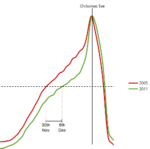
With that in place, I attempted to answer an age old question suggested to me by our good friend and Last.fm founder RJ, “Does Christmas really get earlier every year?” – a question which refers to the perceptual creep of seasonal products, music and decoration further and further towards the summer each year. I normalised the scrobble volume in the run up to Christmas by the Christmas Eve volume for each year to yield a comparable listening curve for each year. I chose the point at which listening volume becomes 50% of the December 24th volume to call “the start of Christmas”, then compared that date across all the years for which we have complete and reliable scrobble data (2005-2011).
The result was a weak trend in the opposite direction, suggesting that in fact Christmas might in fact be getting later each year by as much as one day each year. This graph shows the difference between the listening curve for 2005 and 2011:
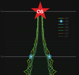
During the initial graphing for the above, Elliot noticed that without the 7-day moving average the graph looked a little like a Christmas tree on its side with the day-of-week variation creating the branches. Pursuing this I made a concept for a “Scrobble tree”, which I then handed to Graham – one of our design team – and he worked his magic to produce this awesome Christmas card.
If that’s not enough festive cheer for you, then you should check out last.fm/christmas created by web developer Marek. It shows data about the current Christmas music being listened to and a live indicator of what percentage Christmas it is right now.
Merry Christmas everybody!
]]>If you want to see a bigger version of this image, click it or click here.
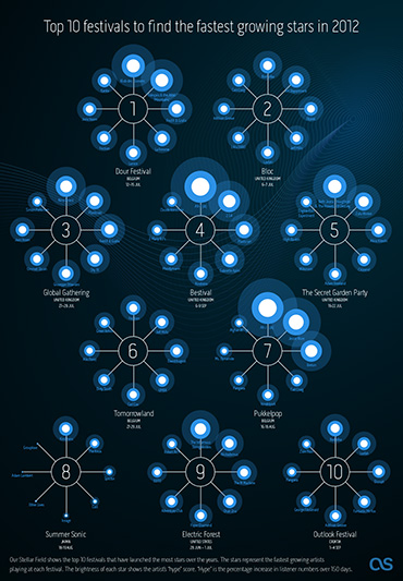
Omar started by looking at new artists playing in festivals this summer to see which have a high “hype score”. Hype is our measurement of how fast an artist’s audience is growing over a short period of time. Then Omar looked at historical data for all festivals over the last few years to see how many artists had become successful (i.e. grew in audience) directly following the festival. This gave us a ranking of how influencial festivals were in growing new artists. We pulled out the top 10 for our infographic, and then highligthed the artists with the most hype.
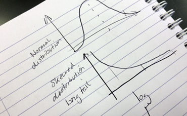
As we tend to call artists that have big audiences “stars” I thought I would use stars in my infographic (I find these dazzling leaps of lateral thinking exhausting). The hype scores would be represented as the brightness of the star. However, when I tried to convert the hype scores into percentages to scale the circles in my infographic, some were massive and other came out microscopic. So I called Omar over and he said “ah yes, skewed distrubution. Just use log or square root”.
Eh?
It must be strange for Omar to be working so closely with an idiot. A short math lesson later and I had a nice range of percentages to play with (and I felt a bit smarter, almost ready for my own PHD ;).
* staffers are given 10% of their time to work on self-driven projects, providing the work is related to music data (I have been told off for spending too much time working on a diorama of Jabba’s palace for my Star Wars figures)
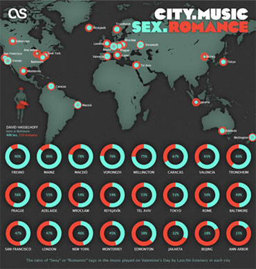
]]>“We don’t have the time for psychological romance –” Larry Blackmon, Cameo
As my missus will testify, I’m not very romantic and greetings cards make me nauseous. So I wasn’t looking forward to designing a feature for Valentine’s Day.
Then I realised it might be interesting to use music data to see if anyone else felt like me or if the world was full of hopeless romantics playing Somebody To Love by Jefferson Airplane back-to-back like saps. So I went to see Omar…
I don’t pretend to understand what Omar does.
I like to think his job involves “running things through the computer”. Actually, he works for the Data team at Last.fm. He is always very patient with me, even when I ask stupid questions like: “Do you think David Hasselhoff‘s audience was affected by the drunken cheeseburger vs floor-as-plate incident?” (The Hoff gained an extra 400 scrobbles that week).
Omar was more than happy to dig into the Valentine’s Day stats, especially when I said I wanted to compare “romance” with “sex” (he’s always running the word “sex” through the computer – it never takes long).
To get a clean set of Valentine’s data to analyse, Omar compared the listening behaviour on 14 Feb over a number of years to the behaviour on any other day of the year, thereby sifting out the tracks unique to Valentine’s Day. Then we went to work with the location and genre tags. In his own words:
I had a little look at our tags pages and selected two sets of tags to investigate:
‘Romantic’ Tags: love, love songs, love song, romance, romantic
‘Sexy’ Tags: sexy, sex, erotic
Each city was then given a score based on how many people listened to sexy or romantic tracks on Valentine’s Day, and how many people have tagged these tracks with sexy or romantic tags. This gave us a ‘sexy’ and ‘romantic’ score for every city. Balancing these scores (there was a global bias toward romance) allows us to compare them, and find out which way a city leans: is it more sexy, or more romantic?
Usually, if you run a chart for a given day of the year, the same answers keep emerging; Adele, Lady Gaga, Coldplay, or Radiohead. This time Omar tried to find something a little different: how do listening behaviours change on Valentine’s Day? I’ll let him explain again…
To do this I found out how females and males usually listen to tracks, on an average day. This involves counting daily listeners for every track listened to since the start of 2006.
Then I ask exactly the same question, but for Valentine’s days only.
So, our Valentine’s charts show you the tracks which see the largest, most consistent increases in listeners on Valentine’s days. These are the tracks that ladies and gentlemen turn to on Valentine’s Day.
You can see who topped those charts yourself!
If anyone needs me, I’ll be in Fresno.
Earlier this week we released our Best of 2011 charts. 2011 saw you spend over 71 thousand years listening to music and scrobble more than 11 billion tracks. We’ve been churning through all of this data to find out what truly defined 2011.
New for this year is the discoveries chart. We went back to the beginning of time (well, to 2003) and checked every one of your 61 billion scrobbles to work out which artists were first scrobbled in 2011.
We’ve also broken these charts down by country and tag. Whatever you’re interested in, from experimental music in Mexico, the latest innovations in Finnish pop, or just what’s Big in Japan, you now have a means to browse them.
Following on from last year we are providing you with a data download. Musicbrainz IDs are now included in this data (where we have them) as part of our continued collaboration with Musicbrainz.
Producing the ‘Best of’ Charts is a very different process to our usual weekly charts. What follows is an overview of the process. In particular I’ll explain how we determined the new albums and discoveries of 2011, and how we turned these into the charts you see on the site.
Our top artists are calculated based on albums released in 2011. One issue with albums is that they are typically released many times in many locations. To get around this we used a new version of the Musicbrainz database to find track listings for albums that were first released in 2011.
Of course, that isn’t the end of the story. Our library doesn’t always match up with Musicbrainz. Such issues need to be handled when we align album information from Musicbrainz with our own scrobble data. It’s one of the reasons we’re improving our Musicbrainz ID coverage .
We label an artist as a new discovery if they were first scrobbled in 2011. As I mentioned previously, this can only be decided by checking through all of the scrobbles we have ever received.
This task is complicated by misspelled artist names, collaborations, and remixes. A nice example is Britney Spears’ collaboration with Sabi. Britney is certainly not a new discovery, even though this incorrectly-titled artist was first scrobbled in 2011. We avoid this by mapping artist names to their correct versions, before sorting through their scrobbles.
Our final step was to send the charts to our secret weapon: the music team. They pored through thousands of the top artists of 2011, matching them against their own databases and removing/adding artists that were incorrect or missing.
This year we have two data downloads: the first – like last year’s – contains the top artists and albums of 2011; the second contains only the top artists, because they do not all have associated albums. In the data you’ll find all of the artists and albums from Best of 2011, along with play and listener counts, top tags, and image links.
In both cases we have added Musicbrainz IDs to the data. You can use these on our own API, BBC Music, and The Guardian. Use the data as you please; we look forward to seeing what you come up with!
]]>Every year when Best of rolls around, we look at the chart to see if our data could have predicted who’d make it big. While there are a few in there we saw coming * cough * Adele * cough * the reality is that every year things get harder and harder to foresee.
That’s one of the reasons we launched our New Discoveries chart; to show off just how diverse your year in music really is.
Sure, it’s full of credible indie acts; Purity Ring, Death Grips and Work Drugs all did fairly well, while Wugazi – an album of mash-ups between Wu Tang Clan and Fugazi – made it to 13th place after getting huge buzz over the summer.
Someone we might have expected big things from was former Oasis frontman Noel Gallagher. He made it to number three on the New Discoveries chart, but only to 69 on the overall UK chart. That’s not quite as high as we might have expected. Similarly, Gaslight Anthem side project The Horrible Crowes made it to number 12 on the New Discoveries chart, largely off the back of Gaslight Anthem fans trying it out.
Further down the list GLaDOS makes an appearance. The Aperture Science Psychoacoustics Laboratory made it to number 7 on the chart after Valve released several albums worth of material from Portal 2. Soundtracks often jump to the top of the Hype Chart after hardcore fans flock to new releases, and while none of the artists on Drive were eligible for the New Discoveries chart they all got a huge boost when that came out.
Up until the last minute it looked as if the New Discoveries chart would be topped by none other than Rebecca Black. The “Friday” singer was number one on the chart right up until December, but while her video has collected some 17.5 million views on YouTube Last.fm’s music community only played the song 320,000 times between them.
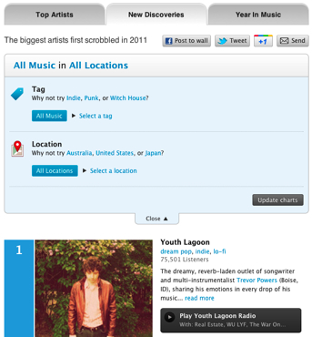
Our first New Discoveries list is actually topped by Youth Lagoon, the project of Boise, ID native Trevor Powers. His dream-like album shot up the Hype Chart in autumn, and appeared to become a fixture throughout the winter for many listeners. He also creeps into the US overall top chart at 100.
For a taster of what these artists have to offer, listen to our New Discoveries playlist on the recently launched Discover app.
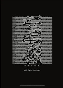
In case you missed it yesterday then our design team played with an early cut of our New Discoveries chart to create this neat little poster as a bit of a bonus. Don’t forget that you can also filter the chart to find the New Discoveries that best reflect your tastes using the Country and Tag options.
Here’s to another unpredictable year in music!
]]>Best of 2011 is a reflection of the year in music, highlighting the most popular and hottest new artists all based on the tracks you’ve been scrobbling.
This year’s ‘Top Artists’ chart was compiled by looking at scrobbles for albums released between 1st January and 31st December 2011. As in previous years, we aren’t counting live albums, greatest hits collections, EP’s and singles. You might not be all that surprised when you see who’s sat at number one, but dig a little deeper using our lovely new Country and Tag filtering options to find the No. 1 which suits you!
Another new feature for 2011 we’re really excited about is our ‘Top New Discoveries’ chart. This was compiled by looking at the number of listeners for artists who had their first scrobble between 1st December 2010 and 31st December 2011. Discovering new music is core to the Last.fm experience; so we wanted to highlight the artists who caught your attention this year and who you should keep an eye on during 2012. Again, use the filtering options to personalise your view.
Additionally, we took a look at the Year In Music to see what our data had to say about 2011. We hope you’re as fascinated as we were by the impact of music news on your scrobbles.
For developers, we have provided the chart data as TSV and XML files. Download and start hacking, we’d love to hear what you come up with.
Finally, as a little easter egg, we’ve created a commemorative poster of this year’s New Discoveries chart. The eagle-eyed amongst you will notice that it’s slightly different to what you see online; we made this before taking all of December’s data into account. You can download the poster here.
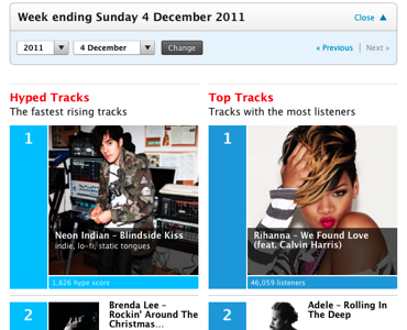
]]>This week we have launched the first in a series of improvements to our charts section to make them more relevant, giving you a more dynamic picture of what is popular from week to week.
The most important set of charts is now our Hype Charts. The Hype Charts are core to what we do at Last.fm – drawing attention to upcoming artists – so it was an easy decision to make these more prominent.
We’re also emphasising how much things change in our weekly charts by making it easy to go back and view them by a weekly pull-down menu.
Each chart now has its own page, and we’ve added buttons to each entry so you can quickly add artists to your library, love them, buy their music or add tags.
Every year at this time, most music sites give you a run down on the best acts of the year. We’re also going to have a Best of 2011 feature, but we have pushed it back to January this year in order to include a full year of data. While everyone else’s lists are pretty similar, we think you’ll be surprised by the story that Last.fm’s data is telling about 2011.
We hope you enjoy these changes and we look forward to hearing your feedback.
]]>
Photos by Thomas Bonte
All awesomeness hype aside, the Hack Day really was a nice experience, and even the 3 hour marathon that was Sunday's demo session was a joy to watch because of the great quality of the hacks. It was my first hack day, and I was truly impressed (see Wired's and Insider's take on it). So what did we do?
You may have noticed from my previous blog posts (Anatomy of the UK Charts, Parts 1, 2, 3, 4 and 5) that we have put quite a lot of effort into finding a mix of well-tested and newly developed audio features that capture distinct attributes of audio recordings, such as energy, harmonic creativity and smoothness. Just to be totally clear: no Last.fm tags and no Last.fm scrobble magic are involved, only pure audio features, retrieved directly from the original recordings.
We calculated 21 of these features on 2 Million of our most scrobbled recordings and Mark built a neat, very fast service to host them. Since Friday this service has been publicly accessible through our outward-facing Last.fm API, thanks to Duncan's API magic. You can either ask for certain feature ranges and retrieve a list of songs that satisfy them, or you can retrieve the audio features themselves by providing the track's artist and title. Of course, bringing even the shiniest of APIs doesn't qualify as a hack...
Since I'd been very impressed with Spotify's new app integration I persuaded Sven to help me build a hack that nicely exposes how good our new API is at audio feature playlisting. And because it puts you in control of steering your music we called it Driver's Seat (screenshot). Below you see a video of the resulting Driver's Seat Spotify app in action.
According to your preferences you select a preset, or adjust feature sliders and hit "Go get playlist!" and the app will fire a http request to the Last.fm API that looks like this
http://ws.audioscrobbler.com/2.0/?method=track.findbyaudiofeatures&filter[]=bpm:80:91...
The result is a list of tracks that we then get the Spotify URI of using another brand new API of ours that loves requests such as this:
http://ws.audioscrobbler.com/2.0/?method=track.getPlaylinks&artist[]=radiohead&track[]=creep...
We really liked our hack because it allows music discovery to be uninhibited by artist genre or history — it just gives you the kind of music you request. The Spotify team liked it so much that they gave us their hack prize, which we share with a hack called CTRL — two of the 18 Spotify hacks.
Sven and I weren't the only ones hacking away though. Alex produced some intriguing visualisations of how PitchFork reviews influence Last.fm listening stats... and received one of the two prizes from MusicMetric. Marek also made a cute little virtual album store as an antidote to the all too modern iTunes and Amazon stores. And Coffey re-worked a previous hack of his to scrobbling tracks at gigs you go to: it uses the set lists available through setlist.fm's API—find the hack here.
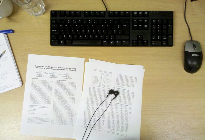
]]>Let me give you a personal account of the work involved for my research on Efficient Record Linkage with MapReduce in Very Large Data Sets.
Say for some reason you are given two sheets of paper with customer data. The first one contains the customers’ names and addresses while the second one lists their names and the results of a recent survey on their favourite colour. Your task is to connect all customers with their favourite colour.
You start with the first line on the one sheet, look at the name and try to find what this customer answered as their favourite colour on the other sheet. You continue doing this until you reach the end of the list.
While doing this customer record matching you notice a few things. Some customers have listed their favourite colour more than once, sometimes it is the same colour but sometimes it is not. The address data also is far from perfect; there are customers with similar names that all live at the same address. Conversely, one customer with a very unusual name seems to own several houses in the same street. These problem cases demand that you decide whether the same person is meant or not. If so, you pick one address and colour and write down each connection just once.
Now imagine this matching thing becomes a regular task that you have to complete at the end of each week. Oh, and the size of your customer data has also magically increased; it does not fit on two sheets of paper anymore but suddenly takes up billions of them. In this case it is time to invite your friends over to help you with your matching task.
You will have to agree on how you handle duplicate customer records and also distribute the work equally. Then, how do you even determine all the matches in these vast amounts of paper? I mean, hanging out with friends is excellent but going through many pages looking for all occurrences of just one customer quickly becomes dull, as most comparisons will be made unnecessarily. You will have to think of a way to minimise work.
This example illustrates some of the issues we face daily at Last.fm. We often have to integrate data that we received from our partners into our own music catalogue.
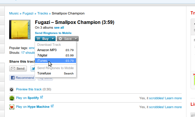
For example, in order to provide those sweet links to Spotify, Hype Machine, Amazon and iTunes on track pages we have to find corresponding entries that relate to similar artists, tracks, or albums in two or more data sets. Generally, this task is known as record linkage, which is a very active research field.
The specific question posed for my dissertation was: “What approaches are there that we can use to improve our data matching tasks at Last.fm?” My findings and conclusions will be used in the future to do this.
I first compiled a list of promising and interesting techniques and evaluated them in a small scale. These included approaches for pre-grouping entries that share a certain similarity in an efficient manner to later minimise the number of comparisons that need to be made (for example, an inverted index and a spatial index) and several metrics that can state how similar two entries are (for instance, metrics introduced by Levenshtein and Dice, but also approaches that first map strings to vectors and then measure the enclosed angle). This allowed me to come up with three combinations of techniques that performed best for our kind of data.
Still, the problem of scale remained, as working with large files and data sets introduces another layer of complexity to the initial problem of matching data. In recent years, MapReduce has become the number one choice for working with Big Data. One reason for its success is that MapReduce makes it very convenient to distribute data processing over a number of computers. Instead of having one computer doing all computations one after the other, many computers can work on small tasks at the same time, and the combined efforts generate a final result. The most commonly used implementation of MapReduce is Hadoop.
MapReduce removes a lot of work for the programmer (for example, writing code that distributes work, collects results and reacts to failures), however it also demands that a problem must be expressible within the constraints that MapReduce introduces. These make it necessary to investigate if MapReduce really is the right tool for a given task. For example, techniques that worked well with small amounts of data might suddenly not perform as before when the size of the data is scaled to a certain size.
For the adaptations of the previously identified combinations to MapReduce, I switched to the Cascading framework. As mentioned, when you develop a program for MapReduce you will have to “think” in its programming model, which can sometimes be a painful and slow process. Cascading, however, abstracts the underlying MapReduce model using workflows and allows one to write very complex distributed programs in shorter time. We have been using Cascading extensively in the data team and we love it.
In brief, my findings were that you shouldn’t rely on MapReduce alone for data matching, as the record linkage process is difficult to map in whole to the MapReduce model. For example, the biggest performance bottleneck was the sorting and distributing of entries prior to making the comparisons — the step that is supposed to speed up the matching by pre-grouping entries with a certain similarity. I concluded that it is better to introduce another system for storing intermediary results (for instance, a distributed key-value store like memcached) or to evaluate other approaches that I didn’t have time to cover in depth.
Last.fm is a dedicated bunch of people and it was great to learn from them how to tackle a problem properly. This environment quickly drew me in and motivated me. I remember sitting at my desk during my first afternoon and thinking: “This is exactly what I have been looking for.” I was trusted with steering my research in the right direction. I was in total control of my decisions, and could freely experiment and make mistakes (on one occasion one of my experiments on the Hadoop cluster went berserk and managed to hog terabytes of storage space), and everyone on my team supported me as much as possible; they were always approachable, no matter how busy they were.
I enjoyed every day although it was, of course, much more work than I had expected; I was fine-tuning my dissertation and polishing my paragraphs right up until delivering it to the printers. Then, on Friday about one month ago I finally submitted it to my university.
What else do I take with me from six exciting months in London? I went to lots of great gigs and consumed vast quantities of excellent coffee. I was introduced to many people and ideas, had countless interesting conversations and got a good introduction to the local tech scene.
I must also have made a valuable contribution to my team. That is why my stay in the data team has been extended for a couple of months (“at least”, to quote a colleague). After all, there’s just so much more to learn.
]]>By “they” he’s referring to his brother’s favourite band, Westlife, and the modulations he describes are an old trick you can find in many a songwriters’ toolbox: the gear shift!
So is Grosvenor an intellectual snob, an arrogant piano kid? Well, he seems to be quite a nice guy, and he certainly isn’t alone in his disdain of gear shifts. There’s even a website which features a Hall of Shame of supposedly abhorrent examples of this phenomenon, eight of which are by Westlife. The book author Wayne Chase, too, dedicates a section of his songwriting manual How Music Really Works to what he calls “Shift Modulation”, and the section’s heading warns the eager reader in large letters: “Don’t Do This!”.
So let’s have a look at the symptoms. The video below demonstrates the 1-semitone gearshift in Westlife's song “I'm Already There”, see if you notice when it happens.
The chroma visualisation at the bottom of the video shows you which notes (from A to G#) are present in the piece at a certain time. You can easily spot the point where all notes move one semitone up, can you also hear it? The video also suggests that there may in fact be a few good reasons why some musicians should find gear shifts hard to bear.
Firstly, gear shifts are easy to compose. If you have a song in the key of Eb major (as in the above example), then all you need to do is play/sing everything one semitone higher from a certain point; in this video, the song shifts from Eb major to E major, and that’s pretty much it. This makes gear shifts a relatively superficial means of creating complexity in a song, much easier to accomplish than, say, a whole new part of a song, or indeed a more complicated key shift. The reasoning is then: if you need such a simple means of making the song more interesting, it can’t have been interesting in the first place.
Secondly, gear shifts actually sound very cheesy. They have a predictably uplifting feel, so they tend to be used in sentimental songs such as “I’m Already There”, or crowd-pleasers like Bon Jovi’s “Living On A Prayer” (check the gear change at 3:24 in this video).
And there’s a third reason, which we will find out about soon with the help of our music processing methods.
Since the last blog post, we’ve filled a few holes in our collection of UK charts recordings, and I have looked a bit more into harmonic descriptors of audio. One of the outcomes is a gear shift detector.
Like our measure of harmonic complexity in an earlier blog post, the gear shift detector is based on the chroma feature that you saw in the video above. By matching the chroma feature of a song section to profiles of musical keys it is possible to estimate which key fits best. The gear shift detector makes use of this technique: it goes through all song positions and matches two kinds of key profile pairs to the data: those that model a gear shift (the key after the song position is one or two semitones higher) and those that don’t (the key stays the same). If the best gear shift model fits better than the respective model without a key change, we have good evidence for a gear shift.
In addition, to filter out tracks which fit both models badly, we use a feature which is sensitive to any large scale modulation, but will remain low if there is no such large scale modulation. We ran the gear shift detector on the whole charts database, and found a strong trend that would please our gear shift haters!
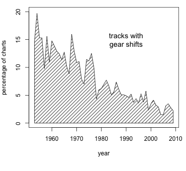
The proportion of songs with gear shifts is substantially declining over the history of the charts, from a staggering 15% in and around 1960 to consistently lower than 4% in the first decade of the current century.
The high frequency of gear-changing songs before 1970 is our best guess for the third reason musicians dislike them: there are just too many of them. Perhaps gear shifts were overused? For the moment it’s mere speculation to attribute the decline of the ratio of gearshifting songs itself to their high frequency in the early days of the charts, but it is quite easy to imagine that they just ceased to be special (if they ever were).
I wonder at which point the gear shift turned from a relative novelty to an established songwriting tool, rendering anyone who uses it less ‘cool’? Even The Rolling Stones, definitely one of the coolest bands of their time, could get away with 'shifty' songs, as can be heard in this excerpt:
However, later on, gear shifts seem to have become irreconcilable with artists who consider themselves to be cool. For example, our detector does not find a single U2 hit with a gear shift. And it’s conceivable that consumers, too, started considering themselves as cool and to shun gear shifts. However, there is a time of year where songwriters seem to catch music buyers off guard — at Christmas, as the figure below impressively illustrates.
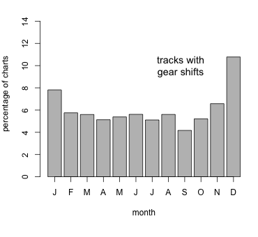
The graph shows the percentage of gear-shift songs in the months they hit their highest position. It is substantially higher in December than in all other months, and more than twice as high than in September. It doesn’t come as a surprise, then, that considering only tracks that feature the word “Christmas” in their title even has a gear shift ratio of 31%.
I personally think we shouldn’t be so harsh as to condemn all gear shifts in the charts (though if you’re interested in doing so here’s the list) — there are some true gems.
Some of you might have recognised the section heading as a (slightly punned-up) line from the song “Man In The Mirror”, famously performed by Michael Jackson. While Jackson was never in danger of out-gearshifting Westlife, he certainly came up with some juicy specimens. “Man In The Mirror” does in fact contain one, nicely placed on the lyric “change!” (see video, gear change at 2:52), but really that’s just a warm-up exercise. Other examples include “Rock With You” (video, 2:31), “Earth Song” (video, 3:46), and the more recent “Cry” (video, 3:11).
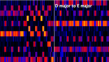
During the last decades of his career there was also a tendency to increase the number of gear shifts per song. The songs “You Are Not Alone” (video, 3:31, 4:10) and “Heal The World” (video, 4:33, 4:58) include two each, and “Will You Be There” takes the prize with three (video, 2:06, 2:30, 2:53), making the King of Pop the true King of Gear Shifts. The figure below shows the chroma representation of the first gear shift in Will You Be There, click to see a longer excerpt.
And why not? To be sure, a song has to offer a lot of other goodness to justify gear shifts, but maybe I could even convince Benjamin Grosvenor that without them pop music would be poorer. I quite like the effect it produces, and as long as you don’t overdose...
But tell us what you think! Would you like to be able to exclude gear shift songs from your Last.fm radio? Or even seek them out?
Percussiveness and the Disco Diva - on the rise of disco in the mid 70s
Clash of Attitudes - on automatically telling punk from art rock
The Curse of the Drum Machine - on how 120 bpm dominated the 80s
Survival of the Flattest - on the Loudness War and decline of dynamic range
King of Gear Shifts - this post
If you want to visualise chroma for your songs, check out the free Sonic Visualiser, and get the free NNLS Chroma Vamp plugin.